PRS for Music’s new workplace designed by Ekho Studio combines multi-use spaces with abstract references to music.
Ekho Studio has designed the second phase of PRS for Music’s new London HQ, creating an agile and hybrid working environment, for a mix of everyday tasks.
Ekho is an independent creative studio, founded by Sarah Dodsworth and Rachel Withey in 2021. They tackle interior design with the view to shape how people live, work and play for the better, based on the belief that design can completely transform people’s lives and environments.
For this project, they used their expertise to complete the second stage of PRS for Music’s workplace - the home to the Performing Right Society (PRS), who ensure royalty payments for members whenever their music is performed, broadcast, streamed, downloaded, reproduced, played in public or used in film and TV.
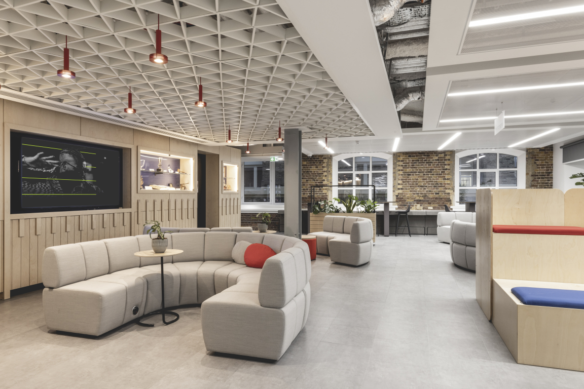
Ekho Studio was appointed to design the workplace scheme at Hay’s Galleria at London Bridge in January 2022. A first, smaller phase of work had already been completed, with Ekho Studio Founding Partner Sarah Dodsworth having worked on this previously. This larger second phase, comprised of 150 desks over 18,600 sq ft, was designed to bring the organisation’s full team together for the first time in its central-London location.
We tested out ideas and took on feedback, ending with a very clear direction and a dedication to both agile and hybrid working, with many different work missions to be accounted for - Sarah Dodsworth
The design narrative had a clear and simple aesthetic rationale, which aimed for coherence with Phase One of the project, whilst also encompassing new opportunities to evolve the scheme’s branding elements, specifically in terms of how these contributed to the team’s experience of the new workplace. These needed to exemplify PRS for Music’s contemporaneity, for example, and its vital relation to today’s music industry, with visual reference to ‘the textures of music’ to be integrated in a nuanced and abstracted way, and with an increased use of colour, alongside the main scheme. The scheme’s tone of voice was to be ‘confident, open and warm.’
"The new scheme has a minimalist and architectural feel overall", Ekho Studio Interior Designer Ellie McCrum commented, "with clean and simple lines, areas of exposed London brick, bold graphics and some great pieces of joinery. Feature elements, lighting, planting and artwork provide colourful punctuation, whilst a subtle electric undercurrent of music permeates throughout and is mostly expressed through abstract allusions."
The design team sought to re-use existing materials and treatments wherever possible for cost and sustainability reasons, with any replacement items having to win a strong functional argument for inclusion. Acoustics had a high priority in the base build, for example, including an existing, acoustic-sprayed ceiling soffit with downstand beams and galvanised duct work.
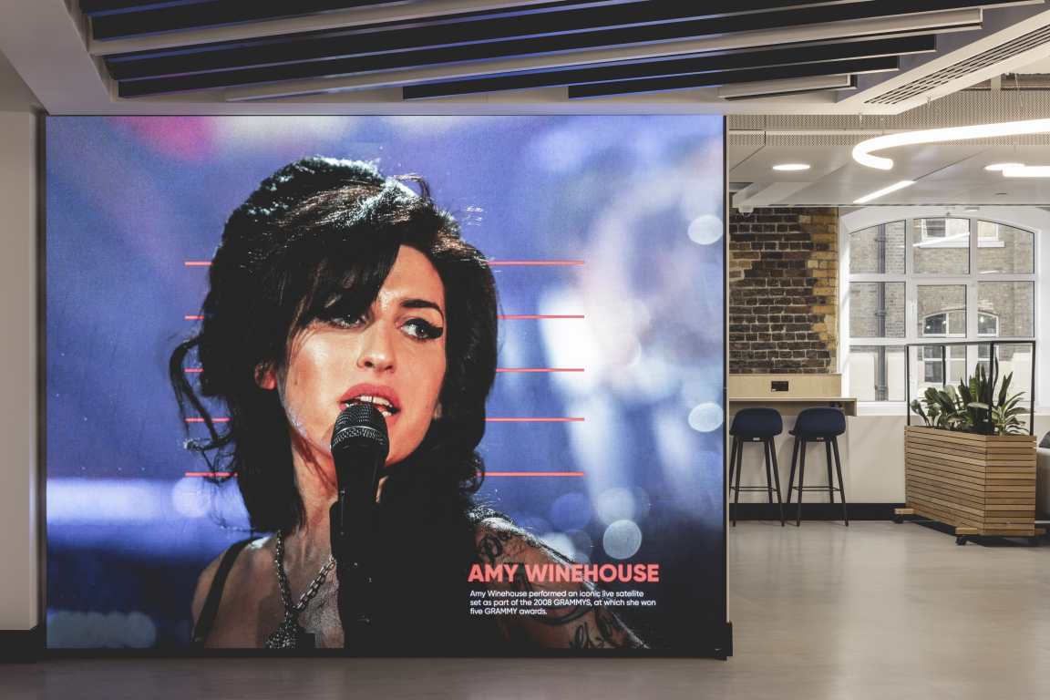
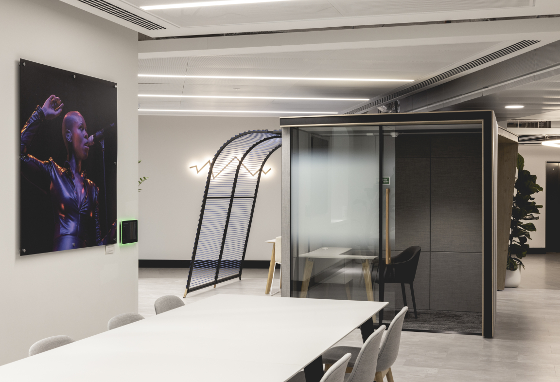
As well as a reception area with a video wall, open plan work areas and a large series of meeting rooms, this second project phase also needed to include a dedicated, soundproofed Filming Room; an Innovation Room for new content creation and a Collaboration Corner, as well as a larger multi-use breakout event space. There were also to be several phone booths and five 2-person meeting pods. As much furniture as possible was to be UK-sourced or UK-manufactured, both to showcase the best of British design and to reduce the carbon footprint during travel and delivery.
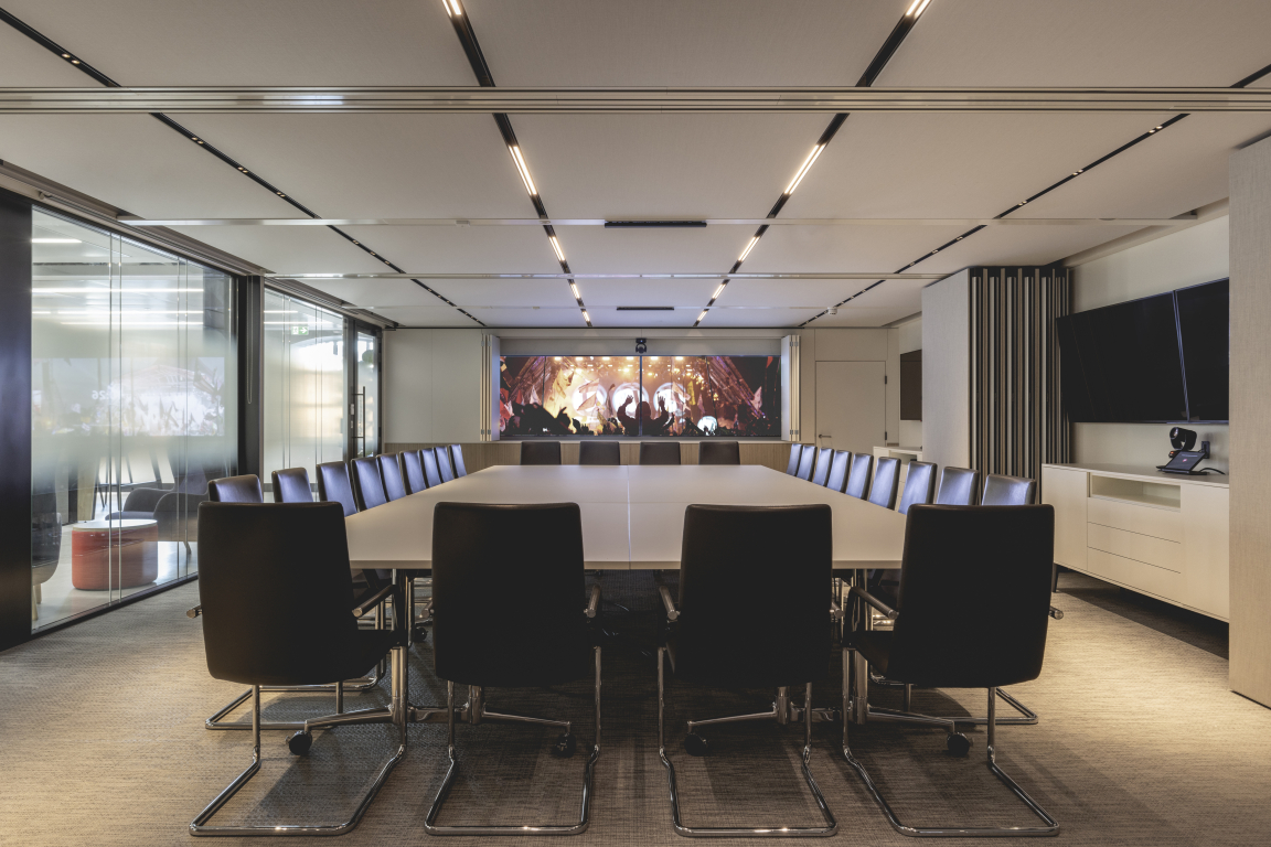
Ekho Studio were thinking about the scheme’s BREEAM rating from the outset, with consideration of energy ratings informing the specifications of materials, products and upholstery, and with a high percentage of repurposing existing furniture from previous sites, with a dedicated external consultant advising at all stages of the project.
Dramatic ceiling lighting is featured above the reception. The Alphabet of Light by Artemide immediately catches the eye, taking the form of an open-ended, single, tubular abstract bending loop as an expression of musicality and rhythm.
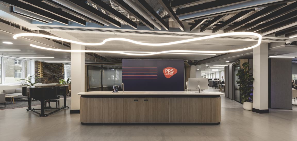
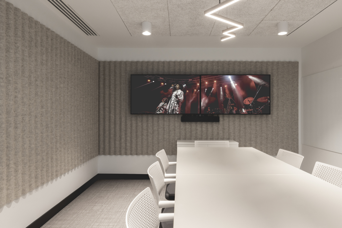
The new office space-plan features desk seating along both walls to benefit from natural light, and with two blocks of meeting rooms of varying types down the centre of the space, behind reception. The scheme’s Collaboration Corner is then nestled into a purposely formed nook and features fabric-wrapped wall panels from Camira Fabrics for acoustic enhancement and reverb control, as well as back-painted glass whiteboards and a feature ceiling raft with acoustic properties. Directly next to this is a Filming Room, with whiteboards, AV screens and an iteration of the ceiling raft grid, this time playfully integrating acoustic foam panels using a 3D sculpted form, typically associated with music studios, along with striking black and red linear lighting.
The Forum is a modular, multi-use breakout, event and collaboration space, where a mix of casual, drop-in furniture clusters are focused around large-scale AV facilities. These include bleacher seats, so that the space can be easily re-configured in different ways within an area that can hold up to 80 people for events.
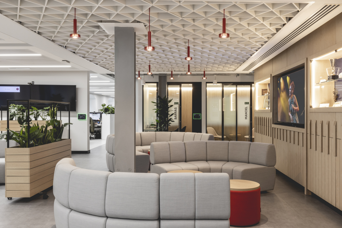
A large bespoke ceiling raft features iteration of the small red pendant lights, helping to delineate the presentation zone. An integrated AV screen allows for a mixture of scrolling news stories and PRS for Music creative content, sitting between two inset ‘artefact showcase’ areas, showcasing some of the many unusual artefacts and gifts given to the organisation over the years. The bespoke joinery wall surrounding these elements is formed out of birch-faced plywood with an embedded relief detail which subtly alludes to the theme of musical rhythm and instrumental keys.
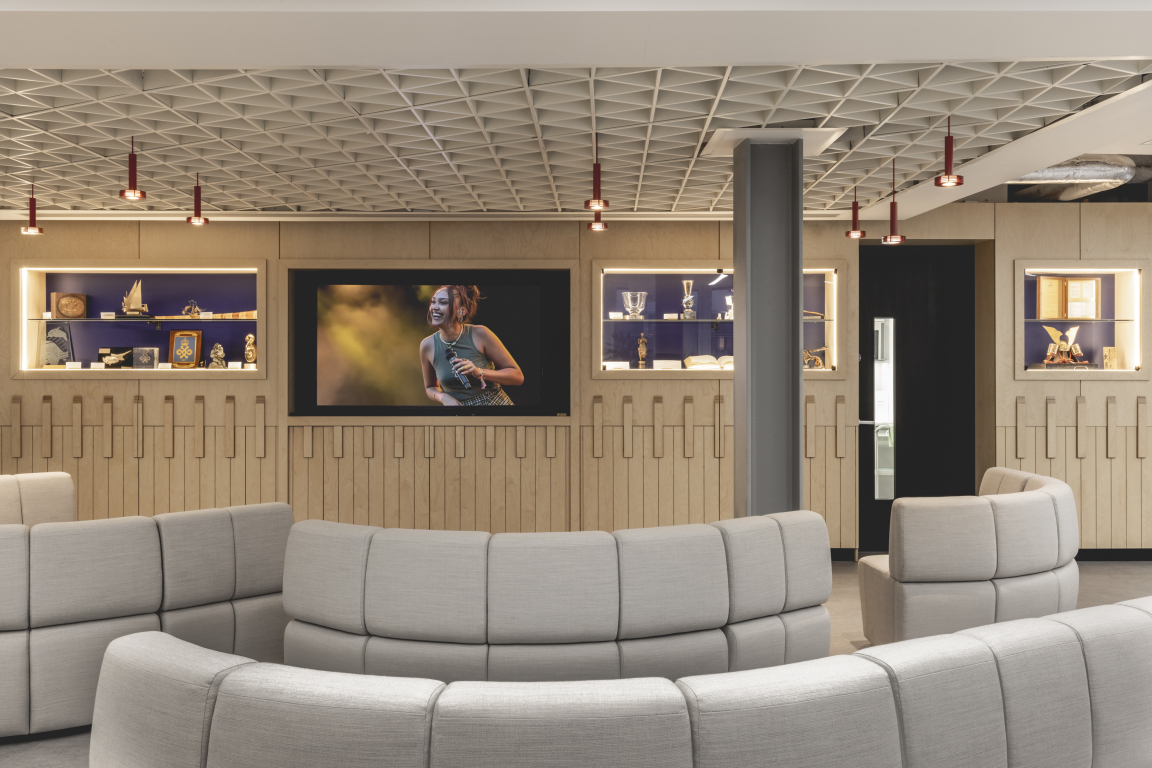
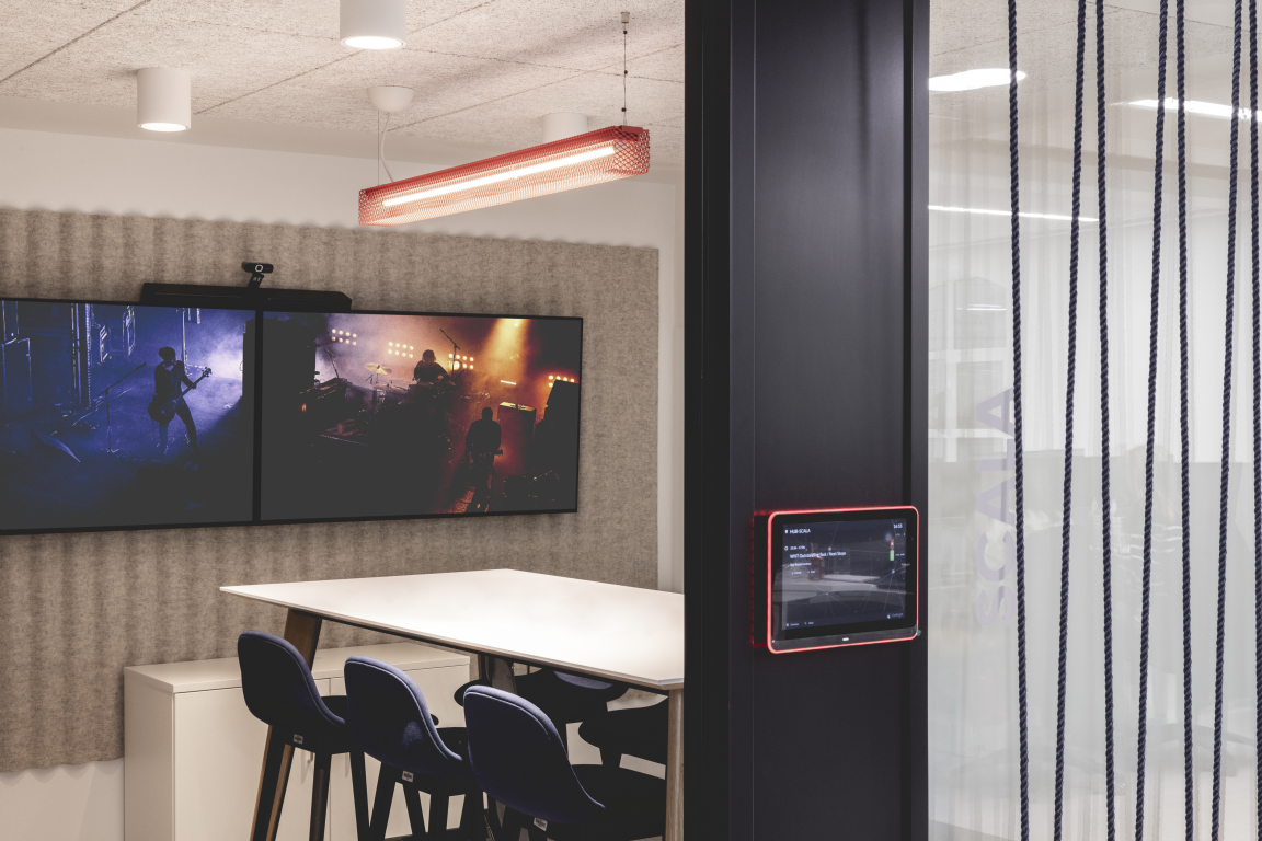
The neutral, tonal colour palette of the scheme includes a two-tone grey ‘monolithic’ flooring design, using a luxury vinyl tile from Amtico, with paler grey for working areas and a darker shade for circulation. Ribbed acoustic wall panelling in the meeting rooms is in recycled felt and is highly sustainable, making it a permittable exception to the UK-manufacturer directive, with the material sourced from Scandinavian company Devorm. The meeting room ceilings are made of ‘Woodwool’ by Troldtekt Acoustics, which is a wood and paper composite that adds texture as well as acoustic quality.
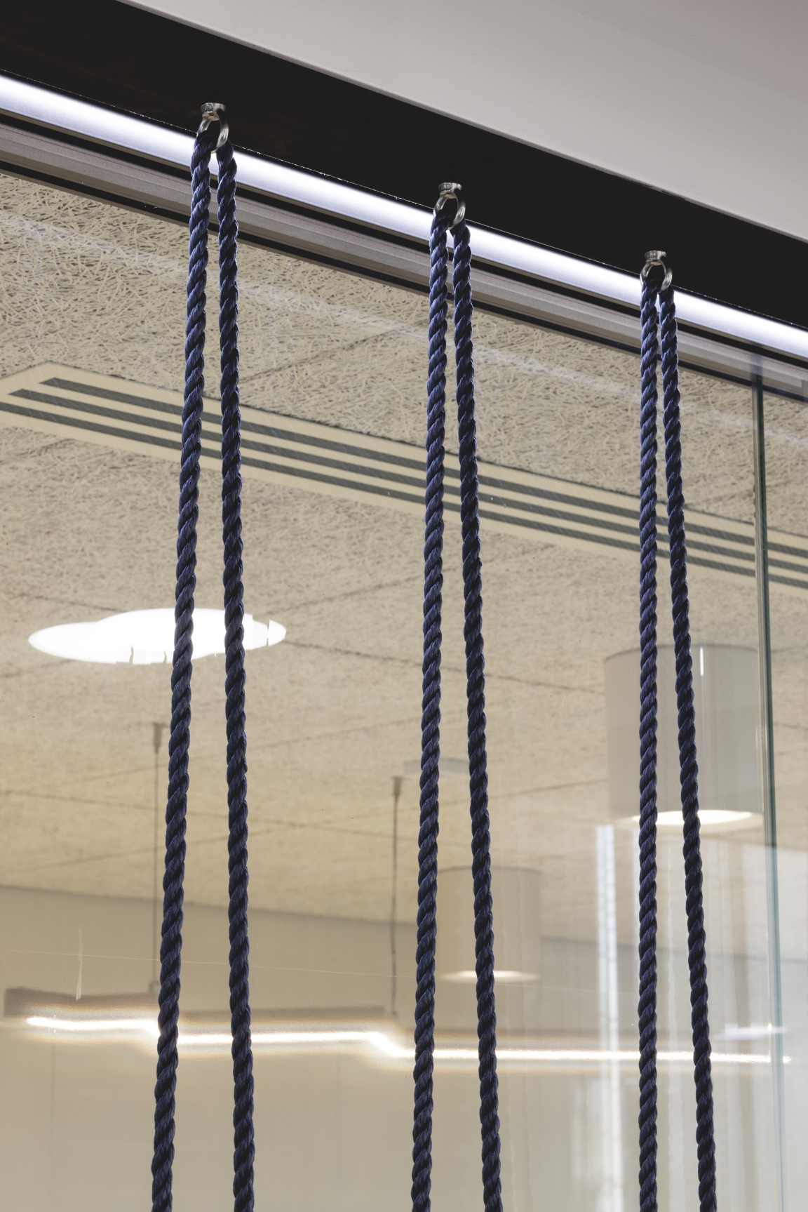
Ekho Studio worked closely with Delta Light on the lighting scheme throughout, especially on the architectural lighting, whilst decorative lighting is a fun element of the meeting room designs. Further musical elements incorporated into the meeting rooms include an allusion to stringed instruments in the form of bespoke navy rope detailing outside the glazing, helping create visual privacy between spaces.
All desks are new, whilst task chairs by Knoll were imported from the previous office, as these were in great condition. Wheeled planters offer flexibility when it comes to demarcating different areas, with some zones more geared towards collaboration and other areas quieter.
"Overall, this scheme is a very good representation of the direction of travel of contemporary workspaces", Sarah Dodsworth summarised. "PRS for Music now has an integrated HQ for all its staff in a high-profile London location, with a big enough footprint to ensure all its needs are met and all staff functions can take place with ease – and style! At the same time, the project is nimble, agile and clever and looks to the future in terms of sustainability, technology and ways of working."
All image credits: Billy Bolton


