74 creates stunning landmark and interiors at Knight House, University of Sheffield, for iQ Student Accommodation.
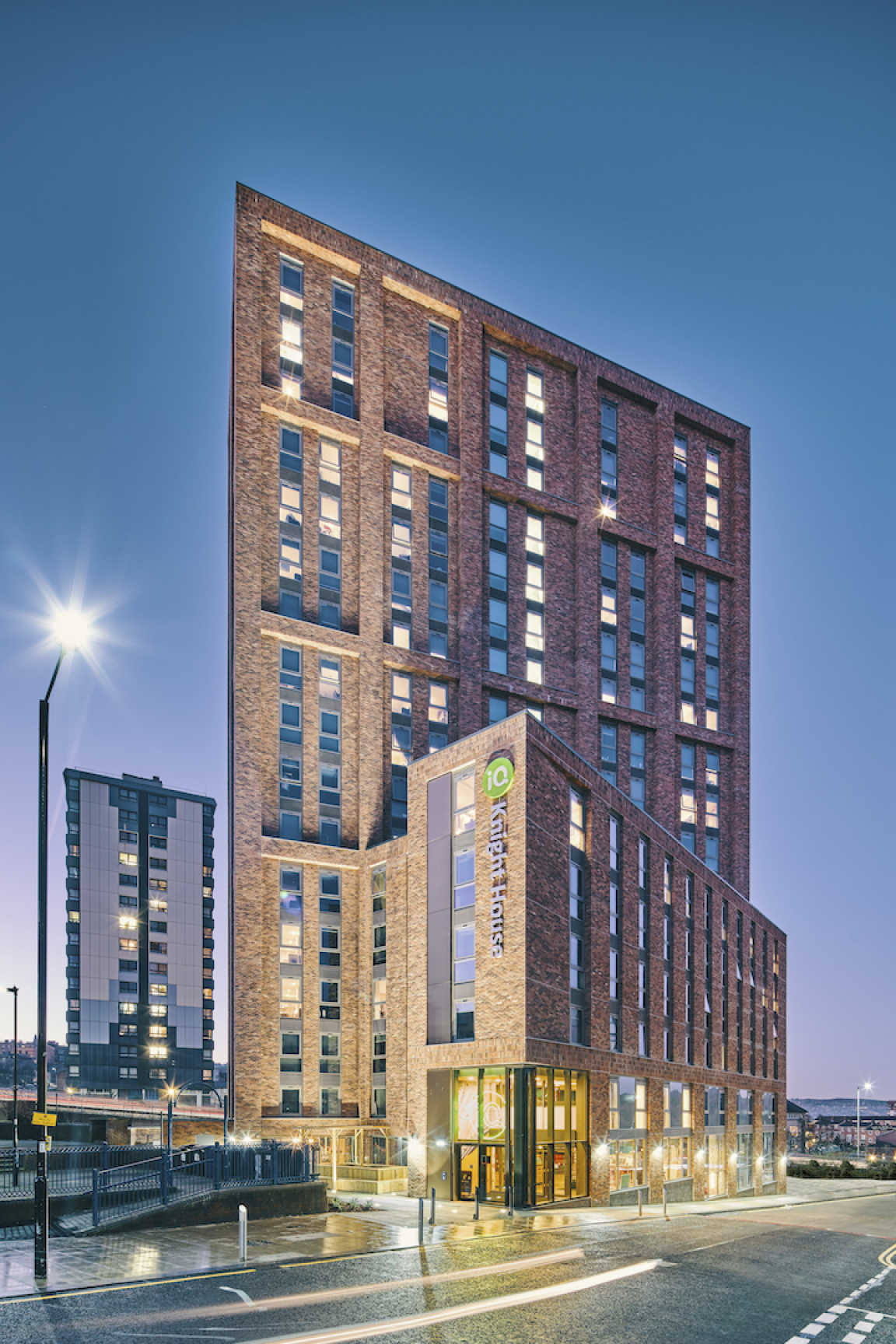
Knight House, Sheffield for iQ Student Accommodation.
New landmark student accommodation Knight House in Sheffield has been masterplanned and designed by Manchester-based architects and designers 74, who additionally created the project’s full interiors scheme, including bedrooms, corridors, wayfinding and all amenity spaces.
The new-build architecture for the class-leading student accommodation offer was implemented by Leeds-based architects Cunniff Design, with 74 acting as client-side architectural advisor.
’We worked on this project from its very earliest days’, 74 Founder David Holt commented. ’74 was initially engaged to examine the ongoing strategy of iQ Student Accommodation’s Sheffield campus, made up of three buildings adjacent to the University of Sheffield. The brief was to re-organise the existing buildings on the site, but further study of the plans and immediate environs revealed the potential of an adjacent site that turned out to be in the company’s ownership, in use at the time as a car park. A promising further discovery was a lapsed planning permission for a 12-storey building on the site, whilst under previous ownership. Once we had the client’s go-ahead to propose a new building, we sought to maximise the development volume and created the design for a 257-bed, 17-storey student accommodation building, which we are delighted to say has now completed and is set to become a key part of the iQ Student Accommodation Sheffield campus.’
Architectural Brief
The brief for the building was to design a high-quality landmark structure to serve as a focal point for the area and to sit harmoniously within the context of both large- and smaller-scale existing buildings in the vicinity. The design proposal consisted of two main forms: a 6-storey podium and a tower element which rises above the podium by a further 11 storeys to create the final 17-storey building.
‘Although the planning process was challenging, we developed a very positive relationship with the urban planning team and planning permission for the proposed scheme was eventually obtained’ David Holt explained.
74 designed the building form, the proportions of the apertures and spaces between to create an elegant overall building appearance, exemplified by the slender vertical emphasis of the façade articulation, which includes bronze, anodised metal feature panels. Large windows run along the full length of the ground floor and lower ground floor amenity spaces.
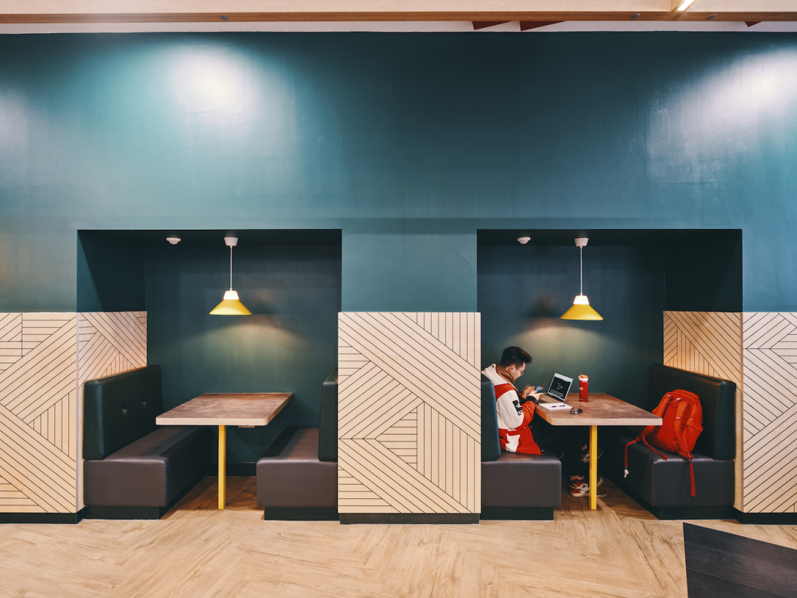
Study booths.
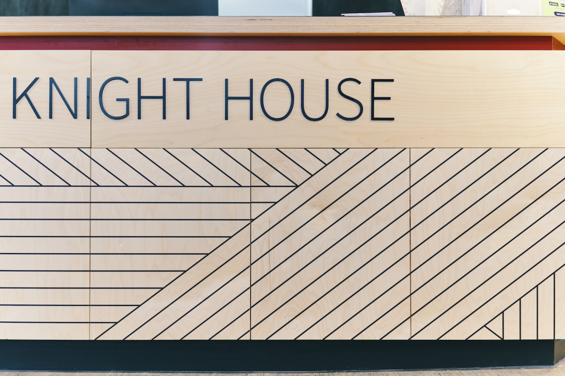
Welcome to Knight House
Anne Knight Lobby Artwork
Knight House was named after feminist pioneer Anne Knight (1786-1862). A notable public art piece dedicated to Anne Knight now greets visitors in the building’s lobby, in the form of a mosaic wall installation by artist Coralie Turpin. 74 was closely involved in the initial artist interviews and design-stage review process for the commission, as well as inputting into the final colour scheme, using the same yellow as used within the interior scheme.
Entitled ‘Anne Knight and the Dawning of the Women’s Movement in the UK’, the mosaic was constructed by the artist in her studio at Yorkshire Artspace and installed by Anglian Tiling. Anne Knight was a Quaker and anti-slavery activist and formed the first women’s suffrage society in Sheffield in 1851. The mural represents Anne’s legacy as a pioneer feminist, and the cyclical progress of the women’s movement in Britain from the era in which she was born to our present day. Like this mural, the women’s movement has developed in waves, but consistent throughout has been the aim to achieve equality for women in political rights and representation, education, work, health, sexuality and in the family.
‘It is something special that Sheffield is the birthplace of a campaign that finally attained its objectives when Parliament passed the Representation of the People Act (1918), and, a decade later, the Equal Franchise Act (1928)’, Julie V. Gottlieb, Professor of Modern History, University of Sheffield, who created the historical timeline for the commission, explained. ‘These achievements are not to the credit of great leaders alone but to the power of collective action, solidarity and sisterhood. An artwork conceived as we marked the centenaries of women’s (partial) suffrage and women’s entry into Parliament, artist Coralie Turpin gives visual form and texture to the uneven and fluctuating yet overall progressive movement towards gender equality in Britain.’
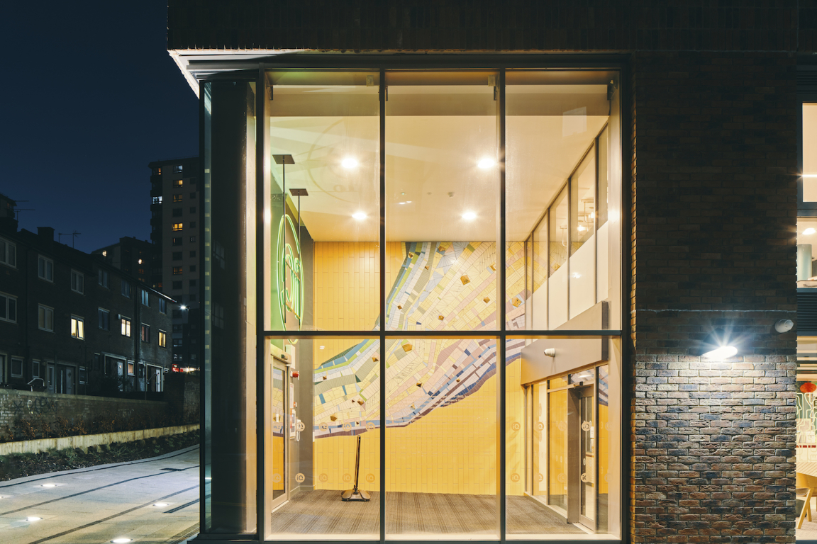
View through entrance lobby.
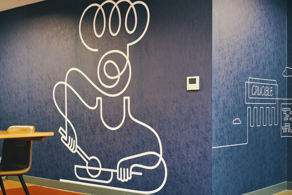
New iQ brand illustrations - the chef.
Interior Design Scheme
After the lobby, visitors go through to the reception and waiting lounge area, allowing glimpses down to the main amenity space on the lower-ground floor. There are postboxes in red for each student directly opposite, sourced from The Safety Letterbox Company. The reception zone to the left features a bespoke desk with a ply geometric pattern-printed front, designed by 74, and an emerald green marmoleum desktop, along with green wallpaper to the rear and a green ceiling area above, whose shape directly reflects the deskfront. The new logo for iQ Student Accommodation sits behind reception in neon, whilst three pendant lights with an orange knot hang over the reception desk,
‘The interiors concept was inspired by the surrounding landmark architecture and great natural landscapes all around the city’ Bianca Yousef, Associate at 74 commented, ‘as well as by the city’s industrial ties to the steel industry, taking form in both a bold colour palette, with a core emerald green supplemented by red, yellow and orange and strong geometric patterning throughout.’
Alongside reception is a waiting lounge, with a variety of seating arrangements. Acoustic panels on the ceiling are a motif used throughout, whilst in other areas, the ceiling is treated as a part of the design canvas and features green timber slats, interspersed with strip lighting. Pillars throughout are in a half-and-half colour scheme, using one of scheme’s three main colours, together with a marble-effect film, adding a playful take on classicism in the midst of an otherwise highly-contemporary treatment. Curtains are also split at the same level as the pillars (1500mm), in a green and orange colourway.
Furniture in this space includes high-level red chairs at a laptop table, with a bespoke red rope back feature, another motif of the whole amenity-space the scheme. Flooring is a two-tone Amtico vinyl in an oak effect, with a darker-toned floor set at ninety degrees to designate the circulation areas. Feature inset carpeting in a geometric pattern beneath the casual seating arrangements is from Newhay.
A new set of iQ Student Accommodation brand language and illustrations was employed on this scheme. As well as the new identity, the branding also includes a series of bespoke, new, playful and location-specific illustrations, with the first iteration applied to the glazing here, in the form of a continuous line tracing out icon silhouettes of, for example, mortar board hats, pens, hands and laptops.
To the left of reception is the private dining area. A further brand illustration is located here, depicting a chef, whilst a wraparound linking wall features iconic images of Sheffield, from music to parks to famous buildings such as The Crucible Theatre. The private dining room features a blue Howdens kitchen with a stainless-steel splashback and geometric-patterned wallpaper on the opposite wall to the illustration. The communal dining table and chairs are by Telegraph Contract Furniture, who supplied furniture throughout.
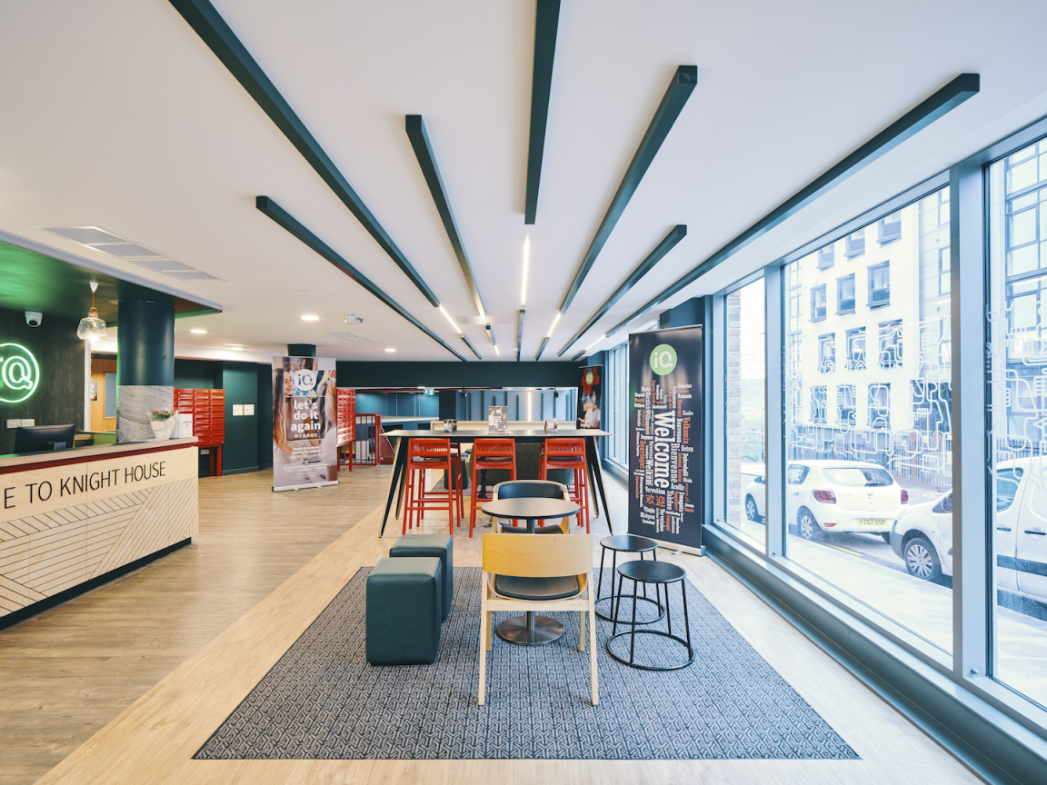
The ceiling is treated as an additional part of the design canvas.
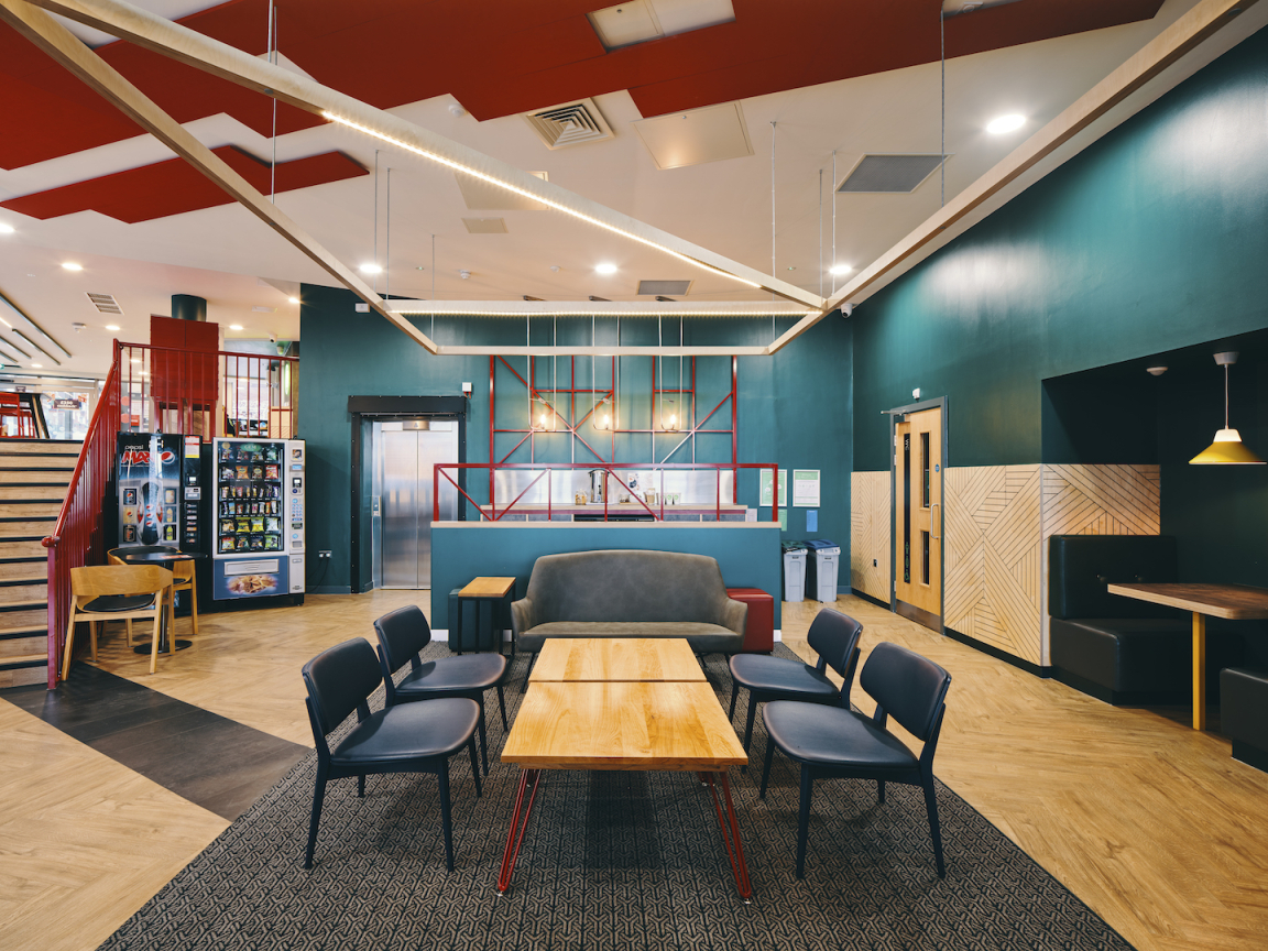
Huge-scale overhead ceiling rafts are in plywood with integrated lighting.
To the right beyond reception, a red feature stair leads down to the lower ground floor, where the scheme’s social and activity spaces are located. The first area is an inset lounge area for board games and hanging out, with the printed plywood treatment used on the reception deskfront applied once again to the lower wall ply cladding that wraps around the inset seating booths and the TV and gaming screens. Yellow pendant lights and table legs add a bright highlight to the booths. Further illustrations from the new branding are used on the glazing here, featuring faces and hands to denote social exchange, whilst faux leather booth seating is complemented by freestanding furniture, once again featuring red rope-threaded backs. A small nook area has a darker and quieter feel, with a backing of geometric wallpaper, in grey this time. The metal studs on the banquettes here allude to Sheffield’s great steel industry heritage.
Huge overhead ceiling rafts over the lounge and gaming areas are in strong geometric patterns and are made of plywood with integrated lighting. A dry bar features bespoke lights and three sets of demarcating red metal grids in powder-coated steel – two zoning the lounge area and one forming the back rear wall of the kitchen, where cupboards are in a dark grey concrete-effect laminate. Three lights on giant steel U-shaped loop frames against the kitchen back wall were bespoke-made for the project by Enigma Lighting.
Leading off to the right from the social area is the TV amphitheatre, where pegboard ply steps and integrated seating with emerald green faux-leather seat pads are arranged to face the screen wall. The ceiling slats continue into this space, as do the two-tone curtains and the oak-effect flooring, although laid in a straight, non-herringbone pattern.
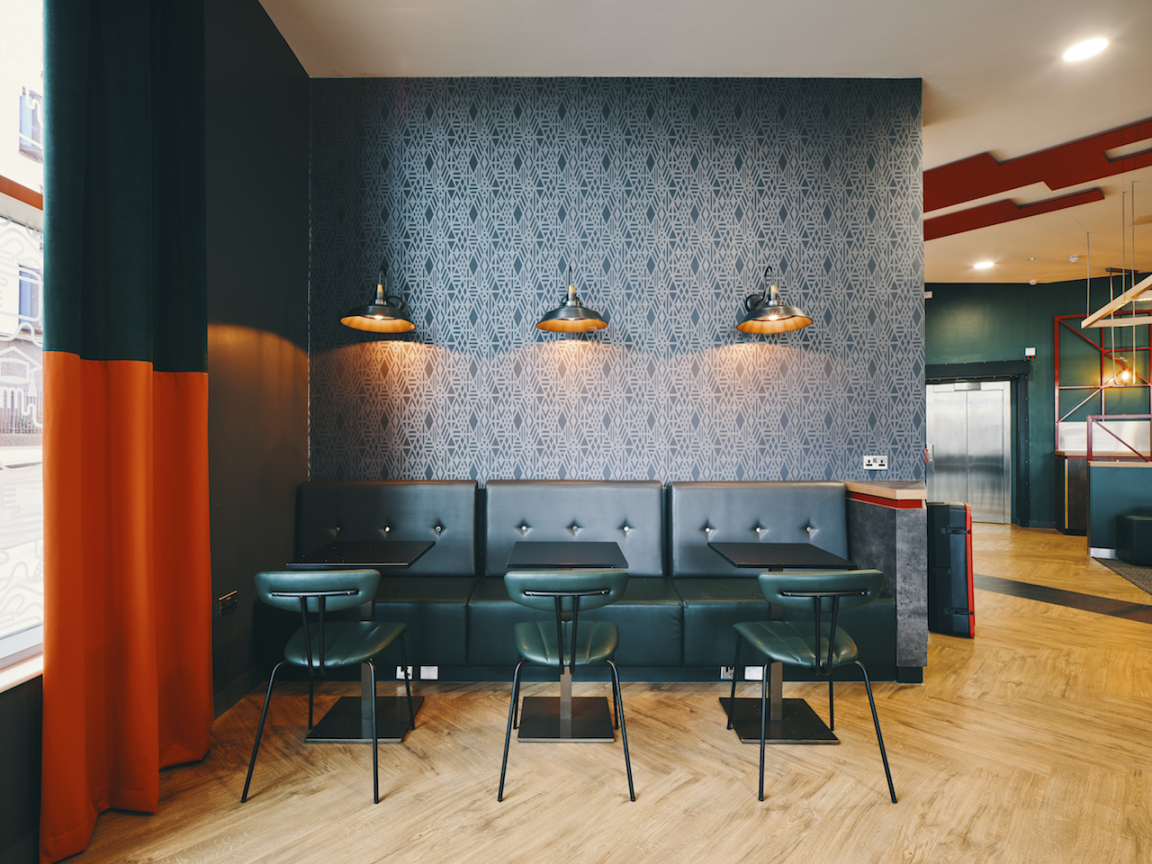
The Snug
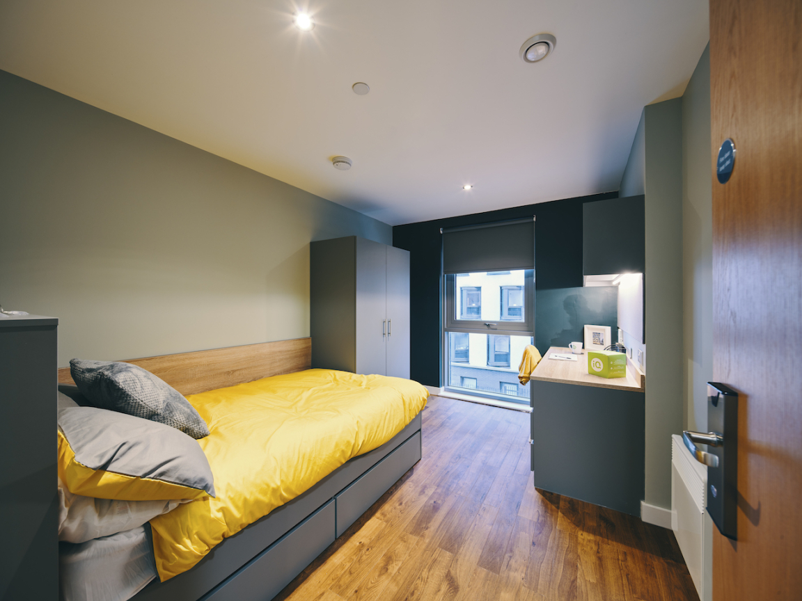
Individual Room
The game area to the rear of the main space includes pool, table tennis and table football. The same long pendants used over the main reception, with orange knots, feature here and there are also acoustic panels in red in the ceiling. A window bench seat in emerald green faux leather is by Telegraph Contract Furniture, whilst black demarcating panels in the flooring echo the acoustic ceiling panels in their zigzag shape.
Up on the first floor is a further amenity space, overlooking the entrance lobby, in the form of a small study area with a teapoint, herringbone flooring, two curving banquettes, geometric wallpaper, acoustic ceiling panels, faux-leather benches in green and grey with metal studs, plus a herringbone timber effect floor. Other elements of the ground-floor amenity space also repeat here to link the spaces, including two-tone columns, inset Newhay carpets, red geometric frames to demarcate separate areas and a ‘student at work’ brand illustration on one wall.
The bedroom designs, with each room slightly different, feature a similar palette. Dressed with a strong use of yellow, the furniture is in oak, grey and white, with a feature wall in dark green and others in papyrus white with a slight grey-green tint. Flooring is oak-effect by Amtico. Two-tone pillars feature in some of the rooms, which are arranged either as cluster rooms, with a communal kitchen, or as individual studio rooms with built-in kitchens. The bathrooms feature an acrylic-panel pod design and were pre-fabricated and craned in, with shower pods and backlit mirrors, manufactured by Walker Modular to 74’s design.
More about 74.


