A new chapter: SpaceInvader designs residential amenity space for Novella overlooking the River Irwell.
Credit: Andrew Smith at SG Photography
Designer SpaceInvader has completed the 540 sq m ground floor amenity space for Novella, a new-build residential development on Stanley Street in Salford, facing directly onto the River Irwell and located within the vibrant new riverside district of New Bailey.
The scheme has been created by client The English Cities Fund (ECF) - a strategic partnership between national developer Muse, Legal & General and Homes England, the government’s housing and regeneration agency - and forms part of ECF’s £1bn, 50-acre Salford Central regeneration. Novella is comprised of 211 luxury one- and two-bedroom apartments in a 23-storey landmark building by architects Hawkins\Brown and combines striking design with luxury amenities, including a 24-hour concierge and communal lounges, podium roof gardens and a residents' gym and wellness suite.
The brief to SpaceInvader, who had previously worked with ECF on the multi-award-winning Riverside office project in Salford, was for the amenity design to target both young professionals and older empty nesters in a scheme that offered potential residents easy access to the city of Salford and its vibrant centre and amenities. The design needed to embody a high-end feel with a strong personality, and be aimed at tenants with an appreciation for design and quality, who were looking for peace, quiet and comfort in an environment that would also enhance their living experience and offer the possibility of social interaction.
“We are delighted to have worked with The English Cities Fund again on this scheme” John Williams, Founder of SpaceInvader commented. “It’s also great to be working on such a high-quality project in Salford, further building both our project portfolio in the region and extending the studio’s experience in the high-end residential domain.”
SpaceInvader’s inspiration for the project came from the scheme’s riverside location and also from the etymology of Salford itself, which derives from the Old English ‘Sealhford’, meaning ‘a ford by the willow trees’, referring to the willows that grew alongside the River Irwell.
"Our design concept was influenced by the branches of the willow tree’ SpaceInvader Senior Interior Designer Beth Evans commented, ‘and by the way the willow draws your eye down in a cascading movement, as well as by the scheme’s glazed views over the River Irwell, which had to be allowed to be the star attraction, through the creation of a calm and contemplative interior that complimented rather than competed with that view."
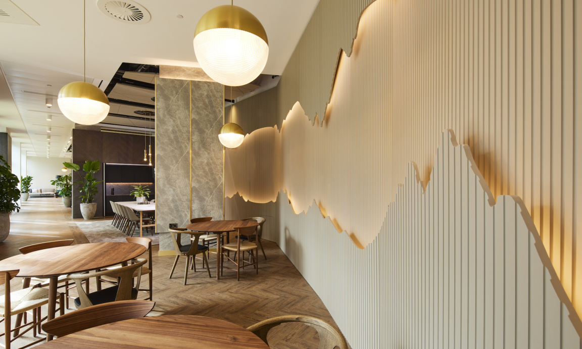
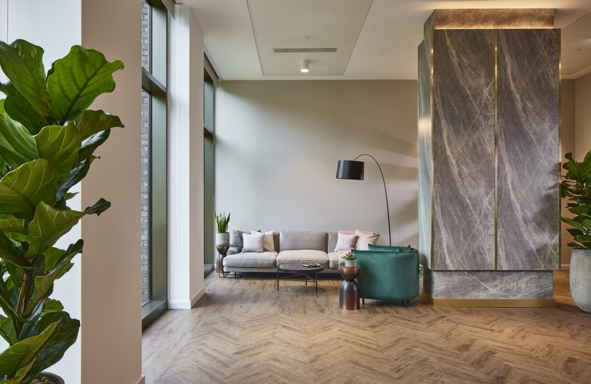
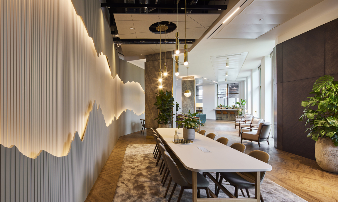
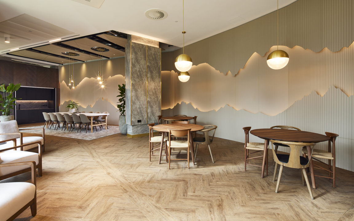
A tonal colour palette was directly inspired by the willow tree and river, including silvered timber joinery inspired by its ageing bark, the use of earthy tones throughout and the introduction of Nature’s greens through planting and the use of a teal green to reflect the river. The fixed elements feature brown-tones, whilst wall colours are richer, with the final layering of the space adding subtle extra colour. Brass is also used as a gold accent in both the scheme’s feature lighting and as an edge to structural and freestanding furniture items. The scheme’s stand-out feature, a 15m-long rear joinery wall, with two curving lines revealing a stepped-back, lit central section, was also inspired by the way the willow tree’s cascading branches draw the eye down.
Credit: Andrew Smith at SG Photography
Credit: Andrew Smith at SG Photography
Credit: Andrew Smith at SG Photography
Credit: Andrew Smith at SG Photography
The scheme worked in an integrated way from the outset with the development’s ‘Novella’ branding guidelines, primary palette of midnight green and gold and secondary palette of dark green, eagle green, dusty rose and ghost white. The Novella logo features a strong ‘N’ letterform, surrounded by a simplified shape representing a book or novel, creating the marque and usable either as a framing device or standalone element. The branding also incorporates a book-inspired strapline - ‘Start your story’.
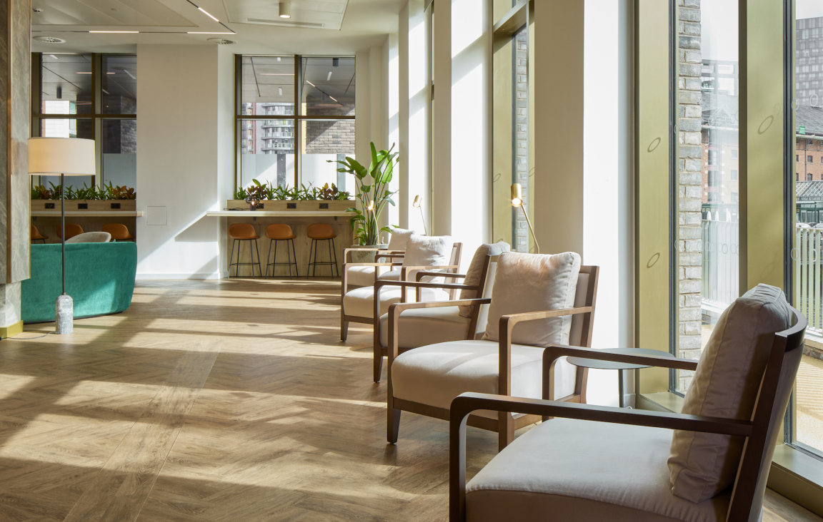
"The interior introduces a very natural language of greens and timber right from the start when residents and guests enter", Beth Evans added. "It was very important that the base palette remained simple, tonal and considered to achieve a sophisticated look and feel. We were not only conscious of the primacy of the views, but also of the way the light enters the space too, falling beautifully onto the new timber walkways and changing throughout the day.”
One of the scheme’s standout features is its use of lighting. The SpaceInvader team responded to the building’s architecture and landscaping, which have been designed to maximise sunlight to the lower levels of the building and specifically to make the most of the trees directly outside, which create a dappled lighting effect. Ambient lighting is therefore present but doesn’t overpower the natural lighting to allow the latter to take precedence and is supported by decorative and task lighting throughout.
Lighting was also key in adapting the space for either work or leisure use. Avoiding bright and harsh lighting allows for a more hospitality-led feel for relaxation, whilst task lighting features throughout to facilitate working, without compromising on the atmosphere, allowing residents to use the space in whatever way suits their needs at any time of the day.
Credit: Andrew Smith at SG Photography
Credit: Andrew Smith at SG Photography
Credit: Andrew Smith at SG Photography
Credit: Andrew Smith at SG Photography
The amenity spaces offer places to meet and socialise, as well as to work, relax and exercise, embodying a variety of missions that help create a good work-life balance for residents. As well as a gym and separate wellness studio, there are lounge and co-working areas and spaces for quiet contemplation, plus a communal table, which can be booked for private dining. The 24-hour reception also offers residents concierge services, including dry-cleaning.
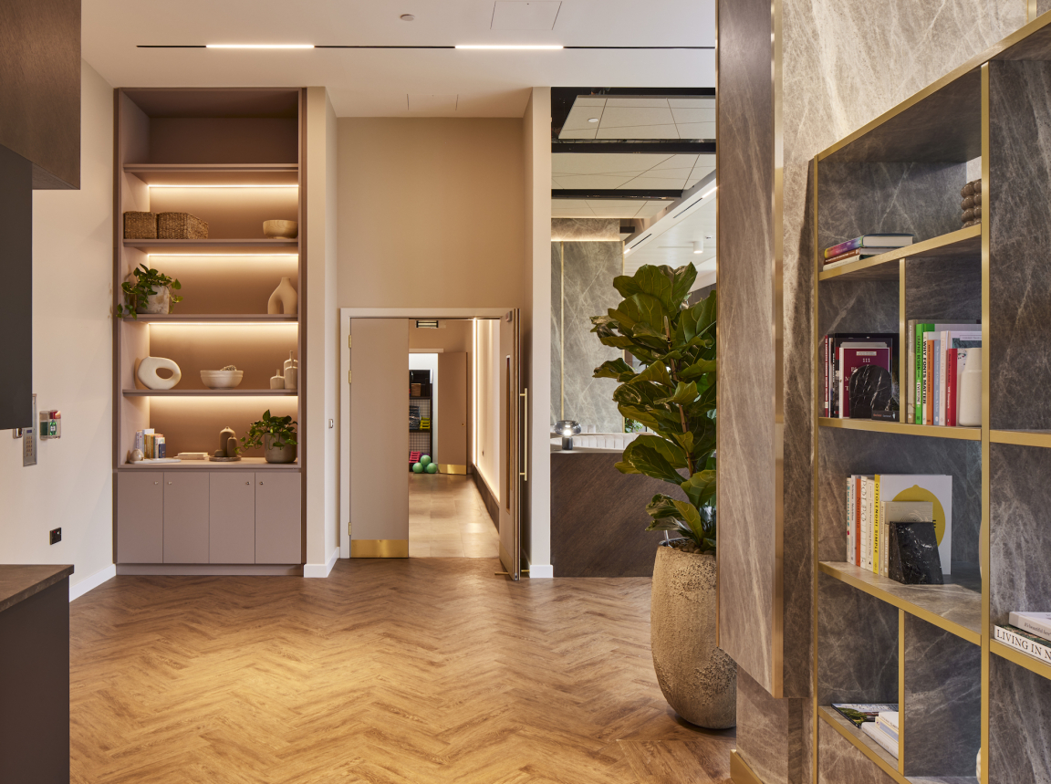
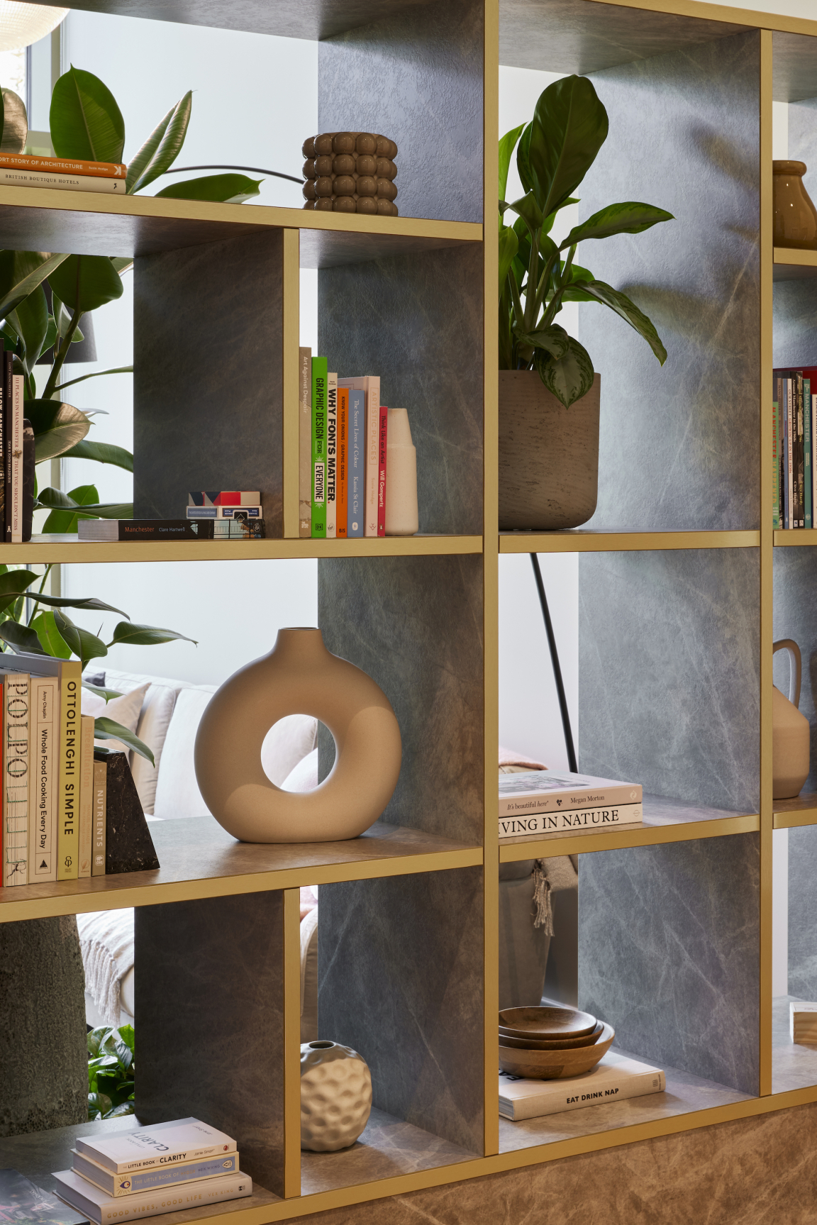
Through intelligent space planning, SpaceInvader created pockets of space with an overall openness to provide an approachable atmosphere, while maintaining some privacy when required. The use of dividing joinery walls and bookshelves built into columns create zones which are sophisticated as well as comfortable. The space is designed to help with the creation of a sense of community and to add social value for residents, with the placement of each setting carefully positioned to encourage chance encounters and allow residents to build connections with their neighbours, facilitated by the openness between the dwell and circulation spaces.
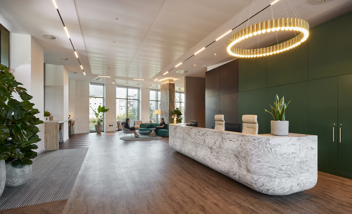
The reception offers residents a hospitality-style greeting and features a timber and matt green panelled rear wall. A hidden cloaks cupboard provides an extra level of service, enabling guests attending a meeting to hang their coats. The reception desk, set at an angle that matches the building’s façade, is a bespoke, curved-edge, lozenge shape with swirling-patterned Corian cladding and an offset Lee Broom circular pendant above. Recessed ceiling lights from Delta demarcate the whole of the rectangular reception zone. The reception desk is inspired by moving water and the way in which, over time, harsh angles are eroded, leaving behind a smoother form, whilst its cladding refers to the patterns made by lichen and fungus in Nature.
Credit: Andrew Smith at SG Photography
Credit: Andrew Smith at SG Photography
Credit: Andrew Smith at SG Photography
Credit: Andrew Smith at SG Photography
Opposite the desk, along the glazed wall, high perch seats overlook the river, suitable for laptop working. To one side, a high bench, 8-seater work zone is set beneath three Lee Broom polished gold and tube lights, as well as a first small lounge area with one-to-one seats and small tables, followed by three clusters of four-seater tables for dining and lounging, with Lee Broom glass-and-brass globe pendant lights above.
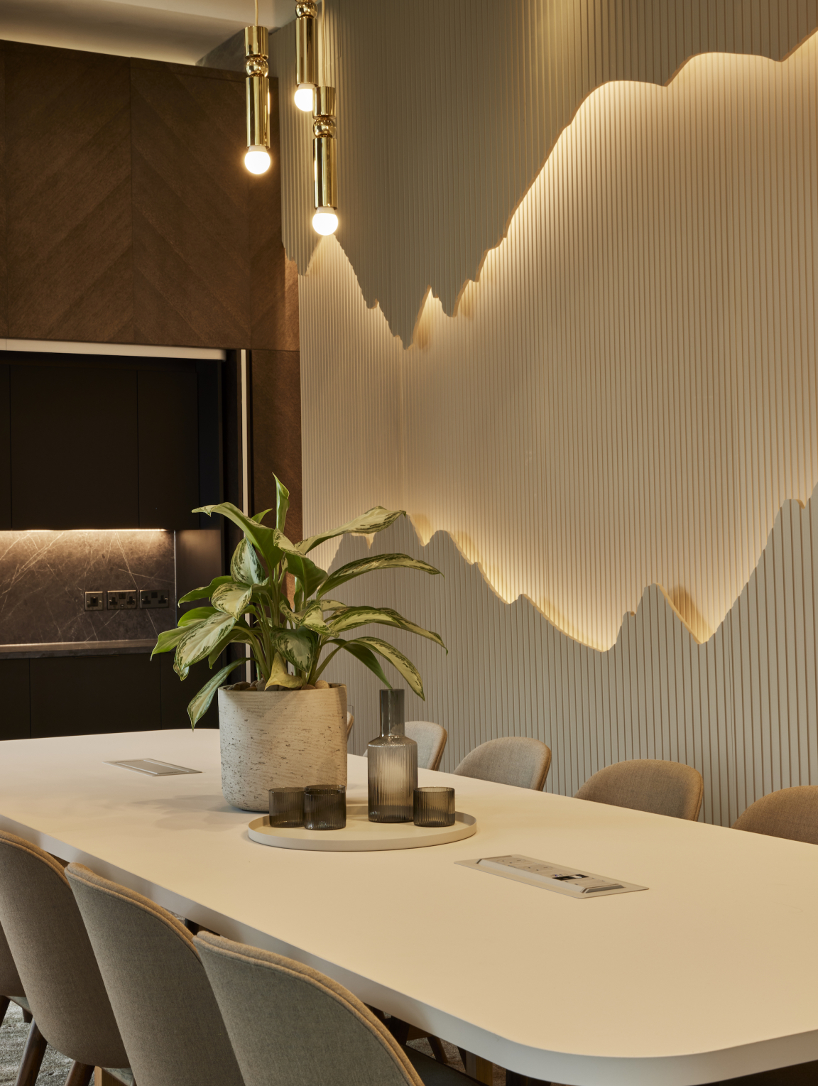
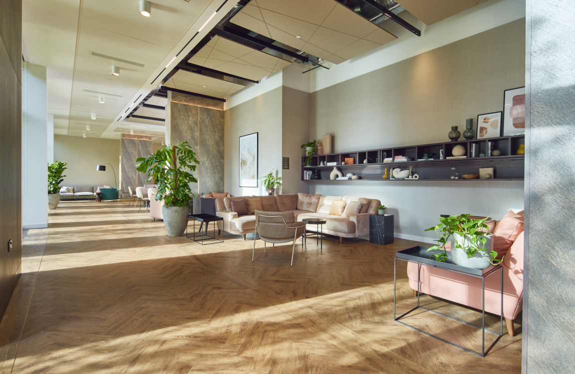
A long walkway section follows, with full-height glazing allowing the external view to dominate and zoned areas sitting behind the walkway. Toplit structural columns in the space are clad in a Formica laminate with a grey marbled aesthetic with brass edging. A separated but unenclosed area follows offering seating for 12 people. Two sets of three-piece Fulcrum Chandeliers by Lee Broom hang over the 12-person table here, whilst a large, loose-lay rug from Changespace sits beneath to help demarcate the zone. This is a bookable space for private dining, to be served by incoming catering, with the inset tea point station to the side offering drink and refrigeration facilities. These first two zones are also home to the scheme’s stand-out feature wall, designed by SpaceInvader, made up of undulating, painted timber with a concealed LED light set within the central 1.3m-wide gap.
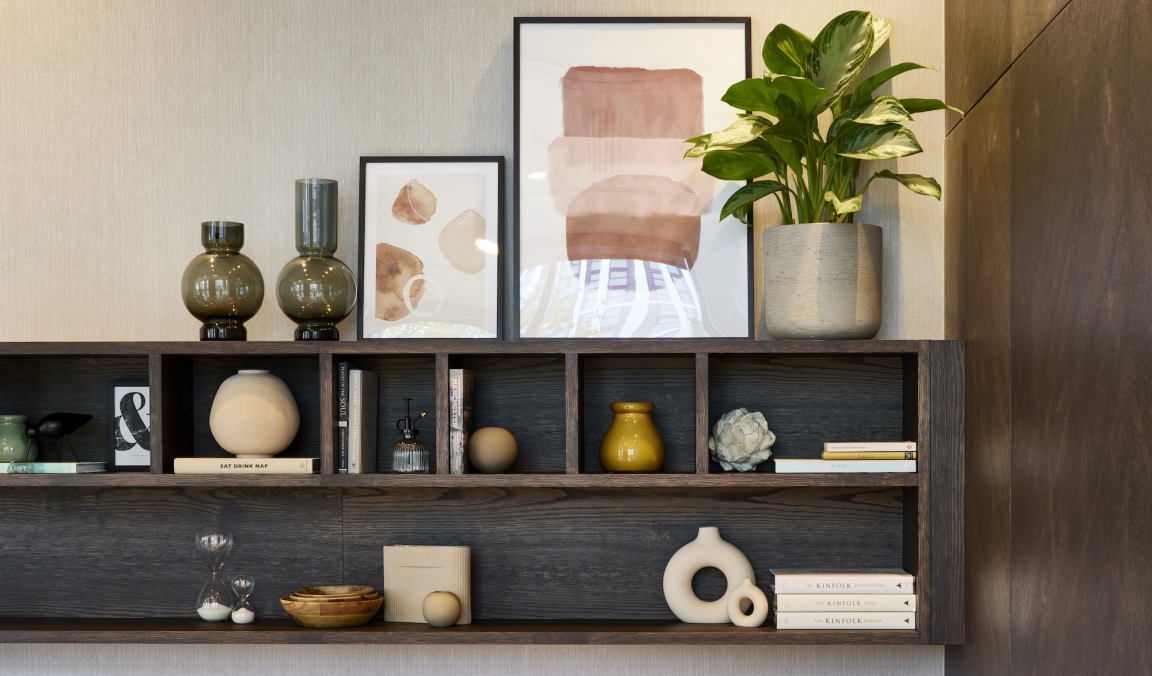
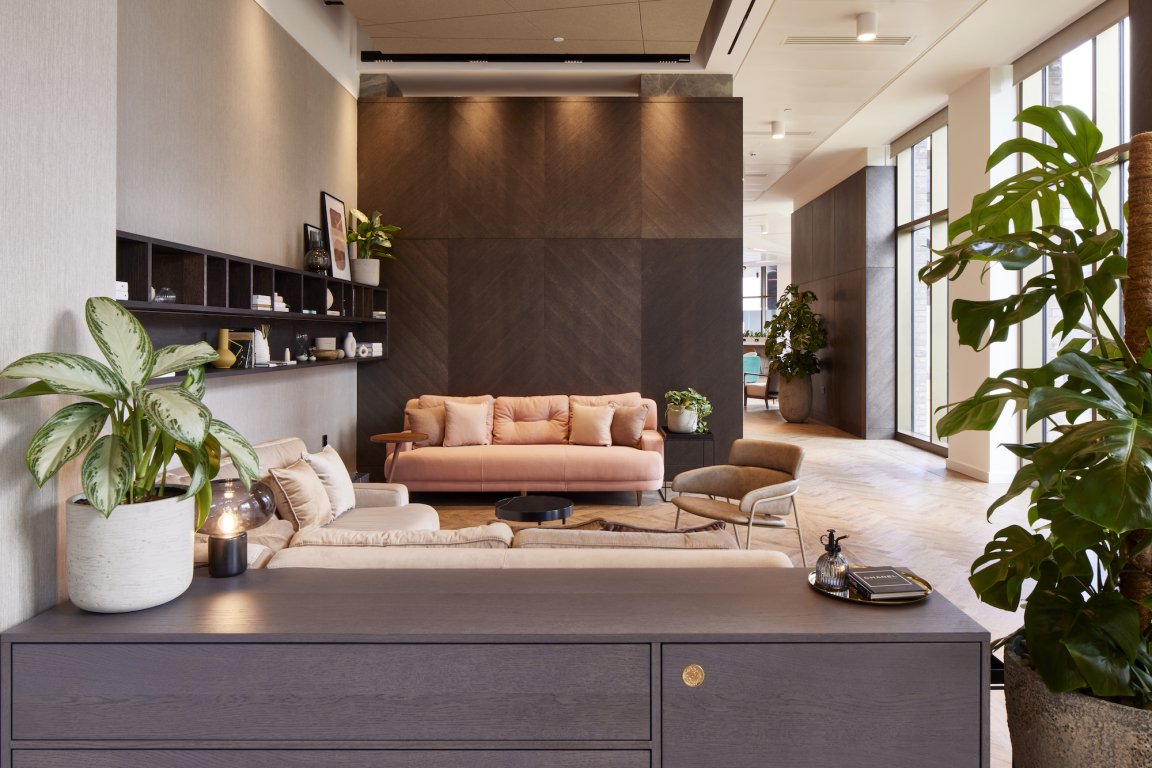
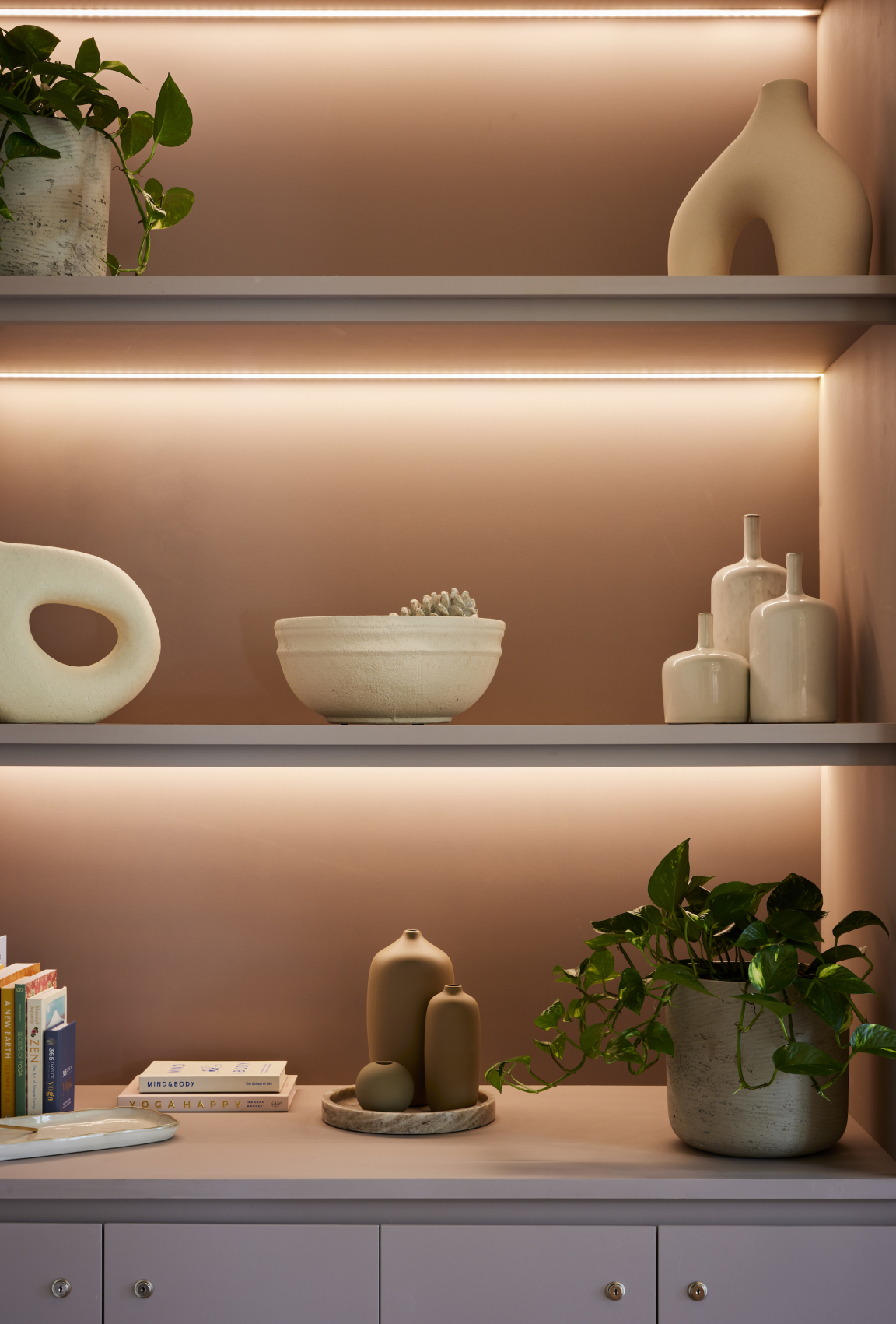
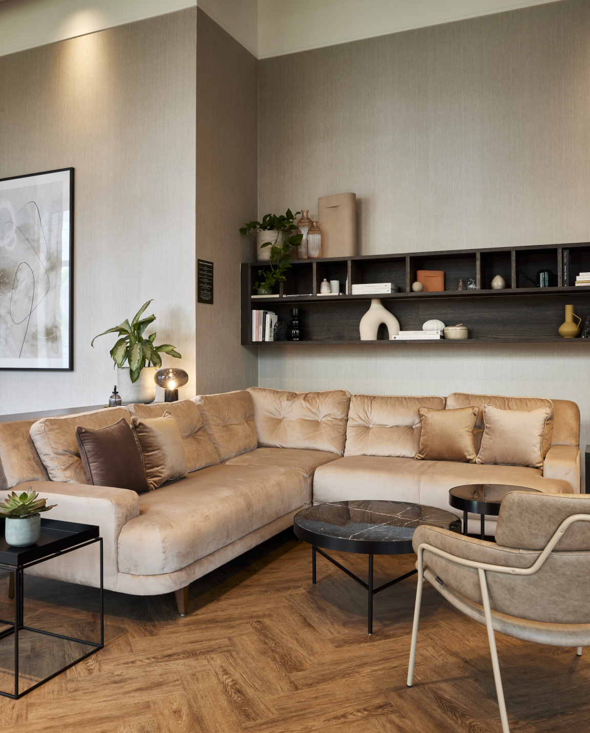
The long, lounge section that comes next is an inviting, comfortable and homely area with three sofas, including one large, L-shaped sofa. Loose furniture here and throughout follows the base colour palette of rich browns, marbles and taupe, with occasional accent pops of colour in teal or dusty rose pink. A long, dark timber wall shelf is full of interesting visual items, along with lifestyle publications (such as Kinfolk) and books, tying in with the scheme’s Novella branding, about both writing and art, but also focusing on the Manchester and Salford location. Two booth seating areas follow, with sumptuous velvet upholstery, set against a textured wall covering from Tektura. Acoustic metal panels by SAS, featuring a geometric line design, form the ceiling treatment over all these areas, which also feature wall art by Desenio and planting, set both into large floor planters and smaller table and shelf pots by Urban Planters.
Credit: Andrew Smith at SG Photography
Credit: Andrew Smith at SG Photography
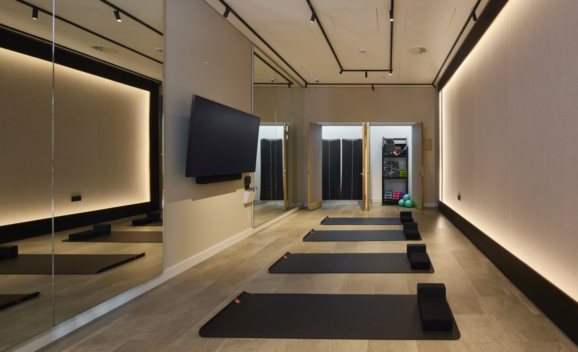
A final small work-or-relax lounge area is located at the end of the timber-look walkway (a mid-tone parquet timber Amtico laminate), which then dog-legs away towards the gym and wellness studio. The first wellness area focuses on physical and mental wellbeing, offering pilates, yoga and meditation, with a softly-lit joinery fabric screen and a thematic book selection on wellbeing. The second wellness space is the gym, where the focus is on physical fitness, with books here also for residents’ use, this time focusing on exercise, repair and stretching, plus healthy eating recipe books. The gym equipment was installed by a specialist installer, although the ceiling treatment and panels ties in with the rest of the amenity scheme to ensure design unity.
All feature lighting throughout was supplied by Light Forms, along with a number of floor lamps, with architectural lighting specified as part of the building’s shell and core treatment by Hawkins/ Brown. The ground floor also includes a bike and bin store and a back-of-house space for staff. A remaining space is likely to feature retail offers in the future.


