Architecture, Theatre Design and Changing Times with Pippa Nissen of Nissen Richards Studio.
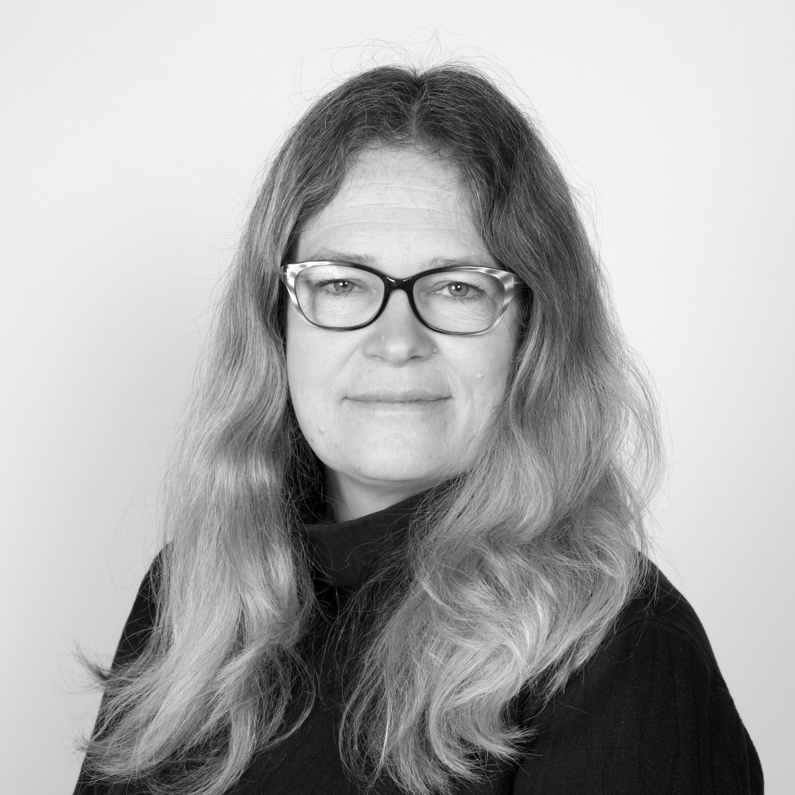
Pippa Nissen, Director, Nissen Richards Studio.
Nissen Richards Studio are a London-based design studio that evolved from a collaboration between architecture and theatre design.
Today, they are a multidisciplinary practice that works across architecture, exhibitions, graphic design, theatre, story-telling, film and animation. They create spaces that stimulate experiences.
We caught up Pippa Nissen to learn more about the studio.
Pippa, this year is the 10th anniversary of setting up your company. You must have imagined a very different celebratory year?
It felt like quite a milestone to get to 10 years. We’ve been thinking about it a lot over the last year and reflecting on how far we’ve come. We’d been planning some kind of celebratory event, so naturally, this will now fall into next year. However, where we have got to as a company is very much a testament to our incredible team and clients, something the last four months has pulled into very clear and sharp focus - and I have been so grateful for this.
It’s taken the best part of this decade to build our catalogue of work and discover clients who really understand who we are. Then, when lockdown came, I was struck by what a team we’ve developed and how lucky we are everyone could be so adaptable, thoughtful, and human in their approach to this situation. It’s a privilege too to be working on such interesting projects, a distraction in itself from everything going on around us. This is truly the best celebration of our first decade we could wish for!
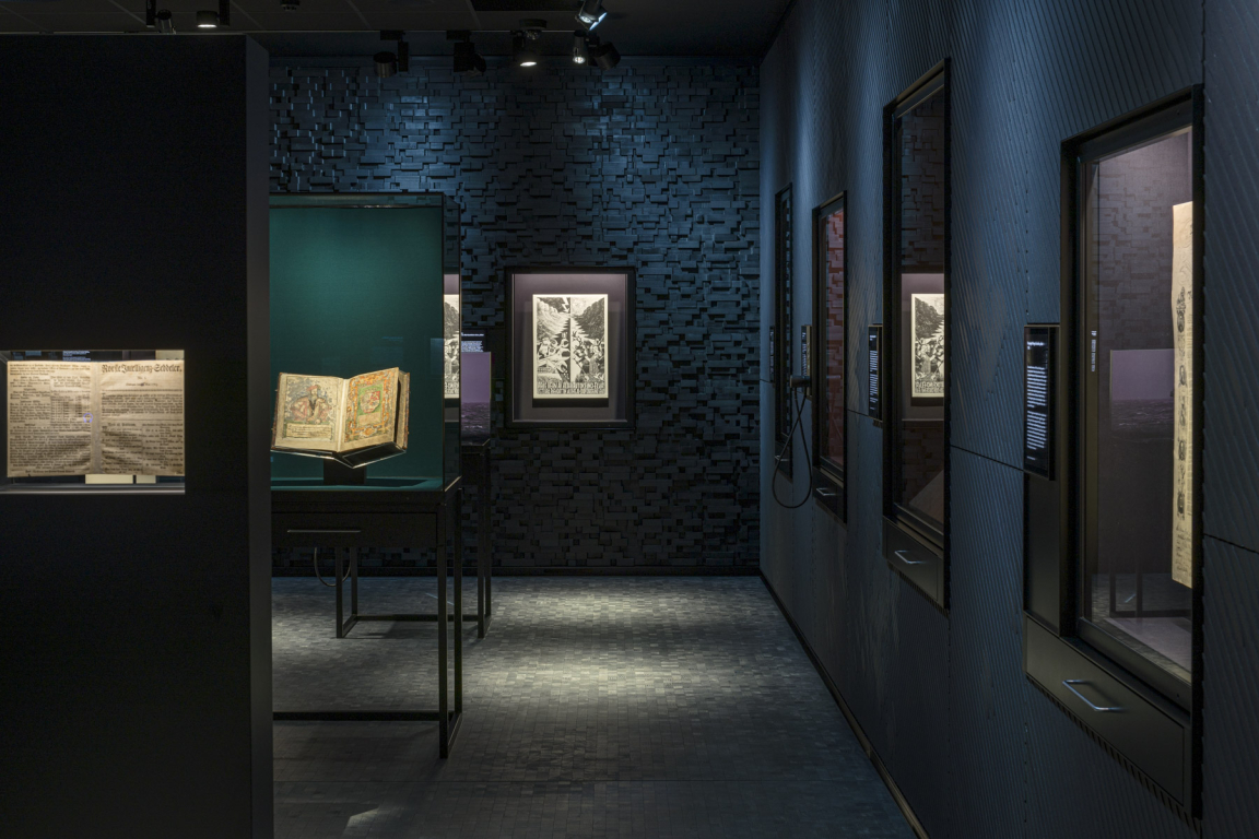
Opplyst at the National Library of Norway.
What was your vision when you started the company, and what is it now?
The company was founded on the principle of seeking out arts-based projects. My last company had a more commercial approach, but I fell in love with exhibition design when I worked on Telling Tales at the Victoria and Albert Museum. I’d also been working with different hats previously, both as an architect and theatre designer, so we started Nissen Richards Studio to pull together lots of different strands of interest, from theatre to graphics, film, and buildings working together to create a multidisciplinary practice.
In the beginning, I’d always conceived of the studio as being very small and bespoke and being able to choose our projects one by one, but this has evolved very naturally over the last ten years into something larger, currently settling around 20 people, which is a very nice number. We fit into one large space and have a studio feel of experimentation, while being large enough to be able to take on more substantial work - and be efficient at doing it. Our vision going forward is to continue to grow the different in-house disciplines so that we can be even more of a one-stop-shop. Plus, to continue to work on larger projects where we’re building the buildings, which we then fill with experiences.
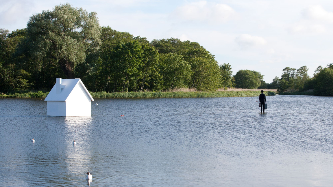
The Way to the Sea, Aldeburgh Festival.
How has the crisis affected your studio?
It was very difficult initially, as most of our exhibition and cultural projects stopped immediately, and then the rest over the next few weeks until gradually, the majority of projects moved over to 2021 or 2022. Luckily, as we have such a diverse range of work, some of our architectural work was able to continue steadily, as well as some exhibition work. We’ve just had to sit it out, working on what we can.
The shock at the beginning and trying to juggle everything was very hard too. Combining this with two teenage daughters at home was a difficult balance! But, of course, initially, it was all about everyone’s safety within the office. We started early with our emergency planning, preparing IT systems carefully in the few weeks before, so everyone could work remotely by a VPN connection. Largely this has worked really well as an emergency stopgap, and our staff has been brilliant. We’ve tried to keep a studio feeling going too, to stop people feeling disconnected. So, lots of catchups on Zoom, Cisco, and Teams. And a daily tea party that people can join optionally and chat loosely about work.
We miss the intangible things though – walking past someone’s desk and asking what they think about something; a shared joke, a cup of tea, and the ‘off-time’ that so often leads to new ideas. And being able to pin up thoughts and sketches and drawings and debating this in a group – something we’re really good at, feeding off enthusiasm and the joy of collaboration. We can still do it virtually – it just takes quite a bit longer. The crisis has also led us to realise just how vital this part of our practice is – feeding off each other’s imagination – as well as understanding just how well we collaborate.
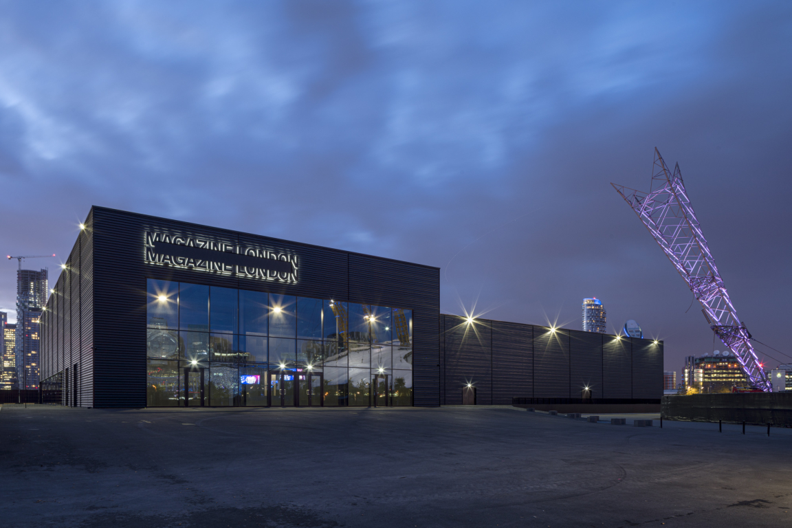
New-build venue Magazine London.
How have your clients reacted?
Our clients have been incredibly thoughtful, supportive, and generous. Some, so much so that I will now do anything for them – forevermore! I will never forget the generosity of spirit and kind words that kept us going, which really made a difference initially. They’ve worked flexibly with us to find new ways of working and have gone on the ride together. Some projects have barely broken pace through the pandemic, which is extraordinary in itself. Others started up during lockdown or were at their earliest stages, and it’s been fascinating to find ways of talking through loose ideas as part of the process in different ways. Some meetings actually have worked much better online, and I’ll definitely think twice about travelling to a meeting in the future, especially where we’re able to talk through a spreadsheet or a list and can clearly follow an agenda.
I’ve relished the informality that’s come with working from home with clients too, often ending up talking about much more profound things that we usually would in meetings and seeing everyone’s taste in art and wallpaper in their backgrounds! While being professional is an essential part of working with large numbers of people, a sort of controlled informality has emerged, which we can bring with us into the future.
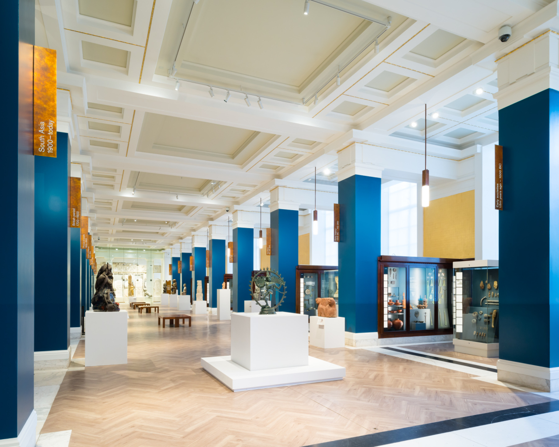
Sir Joseph Hotung Gallery of China and South Asia, The British Museum.
How do you think it will affect design in general, going forward?
I think there will be quite a lot of ramifications over the coming months and years. In some sense, trends that were already there are accelerating into the future. Sustainability, for example. There will be no excuse now for waste and excess. We need to think carefully about everything we do, reusing, thinking broadly for combining more projects and using materials that can be recycled entirely.
I also predict people will be more accepting of imperfections, thanks to our new understanding of the fragility of our situation and of life. We need to accept a background of visual noise potentially for our safety, but we can then frame the experience differently. Conversely, we will really appreciate the joy of beautiful details and craft – where we see the hand of the maker and how something has been made. Things that have their own character or which change through time. Basically, it will be about perceiving the human in the things around us as a counterpoint to the homogenous computer screen, where everything is reduced to a surface emulating light.
I think there will be a new appreciation of fantasy and imagination and designing in a celebratory way. Large, colourful designs, full of energy and life, are what we will gravitate towards in the coming months. At the same time, we need to embrace the use of our imaginations that have been bursting to explode during lockdown by creating more out of less. I feel there is a new creative spirit simmering and ready to explode in our museums, galleries, theatres, and performance centres.
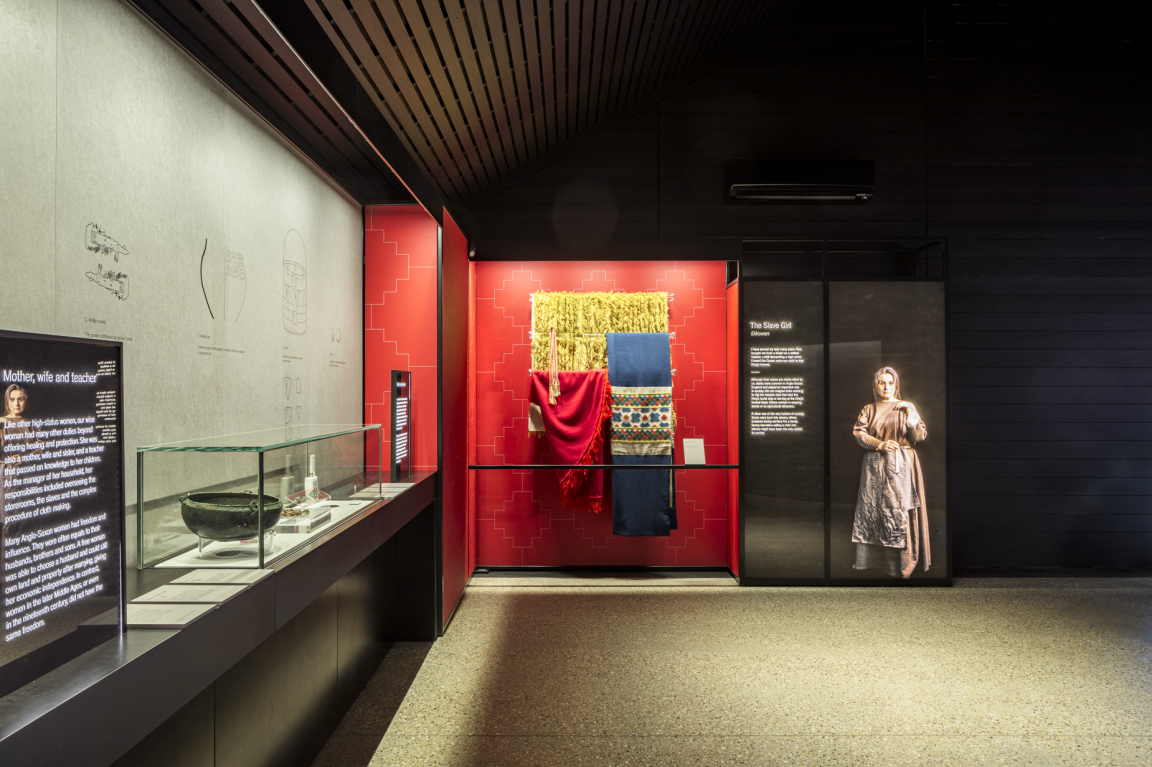
Sutton Hoo for the National Trust.
Do you see technology playing a more significant role in the future of exhibition design?
Yes absolutely. I think technology will be used in fantastical ways to create immersive moments that pulse and change and show us, via film and sound, places, and people we cannot access directly. Simultaneously, rather than layering all information in situ within museums and galleries, there’ll be more accessing information via phones or links that lead to reading and deeper dives.
Barcode Apps haven’t caught on in quite the same way as they have in some countries like China, for example, but perhaps now this will offer an effortless way to quieten down displays and rely on time after the exhibition to gather information and reflect, while the gallery and museum experiences themselves focus on the present. The other area of technology really yet to take hold in exhibition design, though just about to, is augmented and mixed reality, using game technology to add layers of activity you can control yourself. We’re looking into this at the moment, and I can’t wait for it to happen!
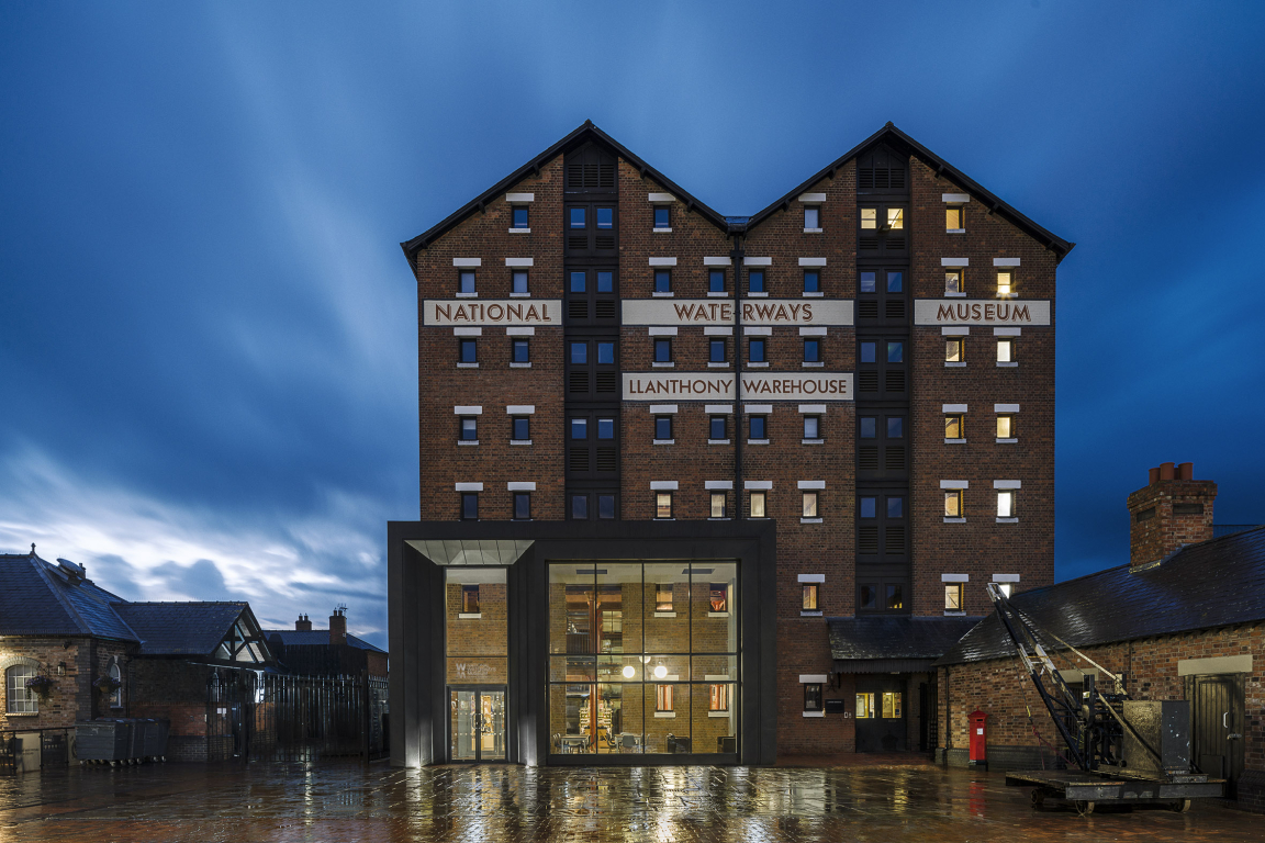
National Waterways Museum, Gloucester.
Pippa, you studied architecture and theatre design – what do these disciplines bring you when you approach exhibition design projects?
In the studio, we always think about exhibition design being in the middle of architecture and theatre. It’s about form and designing spaces that resonate – and then it’s about the narrative side of theatre and people; what they’ve made, experienced, and seen. We also think a lot about pacing in exhibitions, which comes from the theatre. We tend to plot out experiences and objects or works so that the whole experience becomes like a storyboard for the event. Within this, we take people on a journey through imagery, words, sound, film, like walking through another moment in time.
I absolutely love exhibitions – to me, they’re the purest and most exciting art form. They represent your own bespoke experience and are different for everyone, building on our own imaginations and experiences of life. I also feel it’s an art form in its infancy, like the digital arts. We’ve only just begun to understand how we can experience storytelling in exhibitions, and there are so many more possibilities to come.
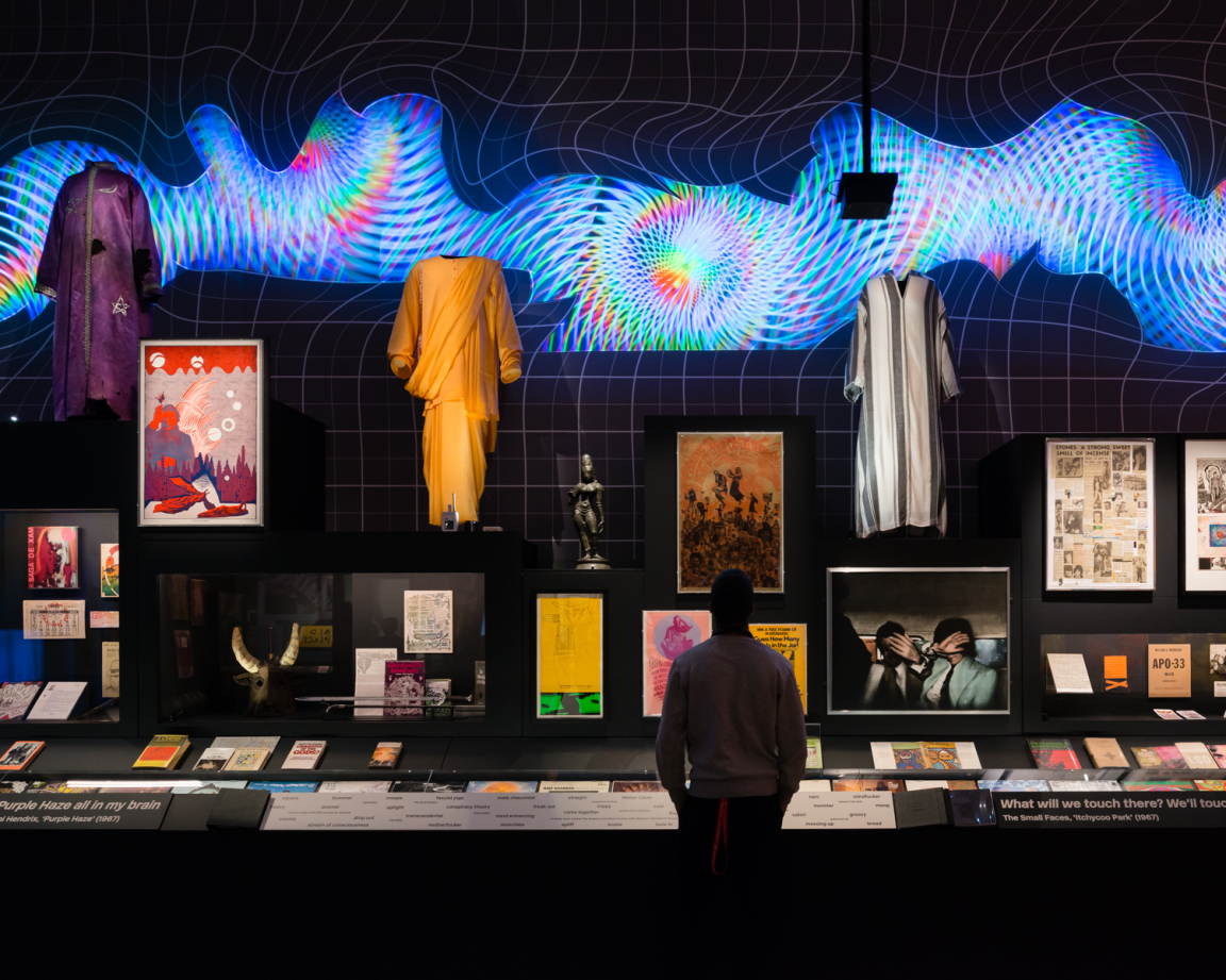
You Say You Want a Revolution at the V&A.
Which materials are catching your eye, and what are the criteria for material choice in exhibition design?
At the moment, probably influenced by staring at a computer screen for several months, I’m particularly enjoying anything with a natural surface, or that feels as if it has a natural pattern. Patinated metals and untreated timber, for example, but I’m also interested in temporary materials such as paper and cardboard. We’re designing an exhibition at the moment out of cardboard, exposing edges, and creating shapes from twisting and rolling it.
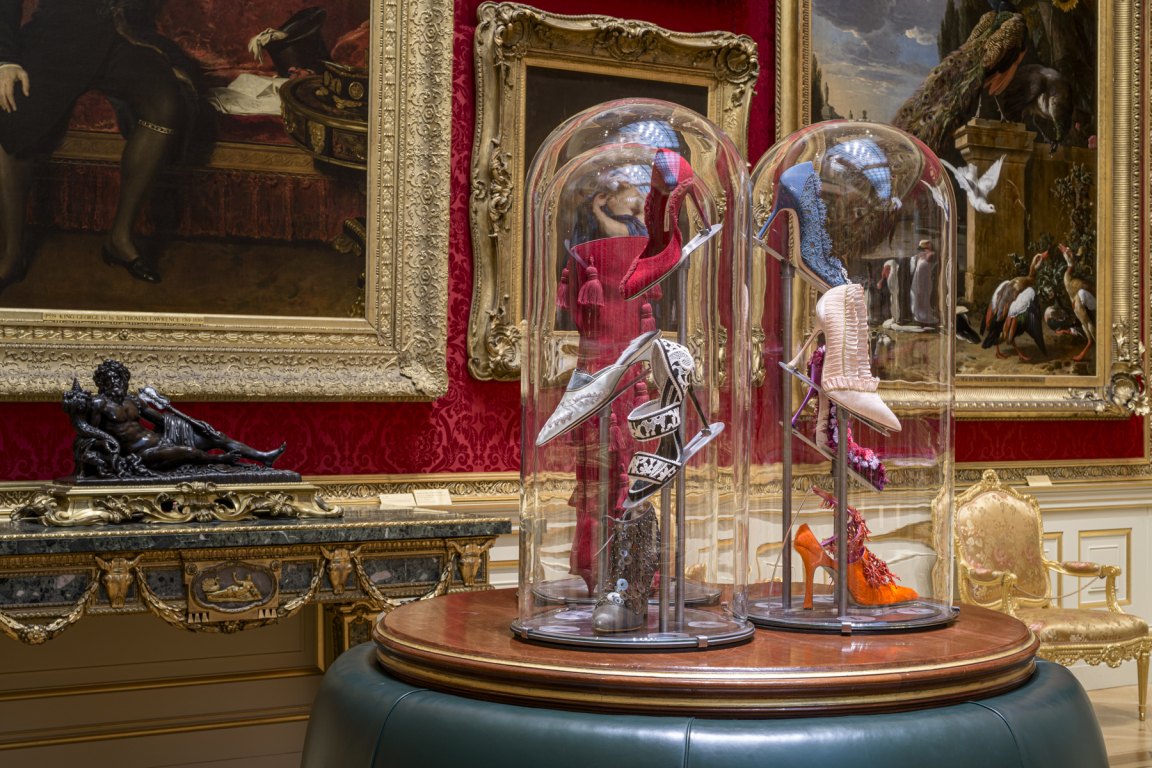
An Enquiring Mind - Manolo Blahnik at the Wallace Collection.
How important is sustainability in exhibition design?
Sustainability is critical in exhibition design - and even more so now. We need to create more out of less and make it work harder too. There’s always challenges about how we use materials that are close to objects, as they need to be very inert to prevent any damage, but finding interesting ways to reuse materials and spaces is where we’re working really hard. We’re looking at how we can transform a space via simple changes to house two or three subsequent exhibitions - using wallpapers or film to transform the same surface for the next exhibition, for example.
Perhaps the acceptance of imperfection I spoke about earlier will help here, permitting materials to adapt and change, so we can reuse them for longer and allow the life of past exhibitions to become part of the next show. Learning how to do this will celebrate both the principle of reuse and our imaginations.
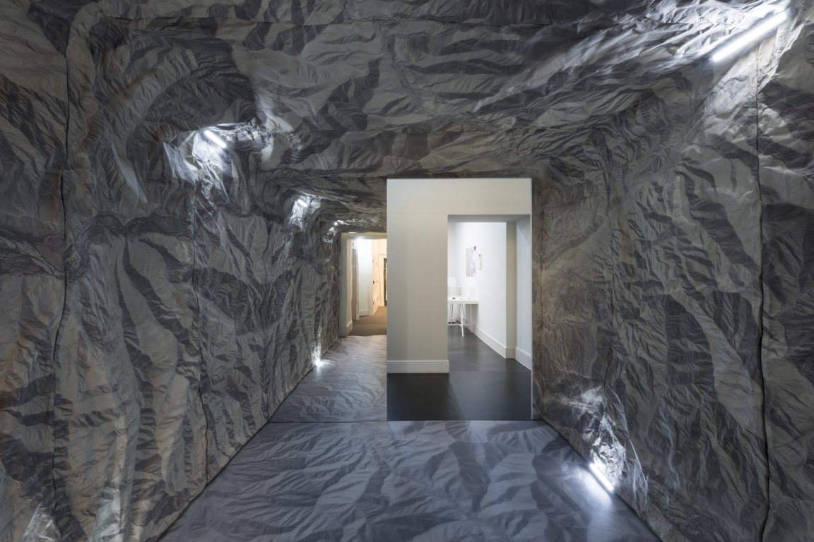
Paths to Utopia, King's College, London.
Tell us about some projects currently on your drawing board?
The first phase of Wordsworth Grasmere will complete this year and a second in 2021; a wonderful experience for the visitor that starts in the landscape runs through Dove Cottage, which is where Wordsworth used to live when he wrote many of his greatest works, and then through a museum that tells us more about his life and works.
Refugees at the Imperial War Museum will open this Autumn - a temporary exhibition exploring refugee experiences throughout history – and we’re also working on a newbuild house and block of flats overlooking the coast in Jersey, converting historical stone barns and associated buildings including a newbuild house into the landscape. Another project is Clwb Ifor Bach, expanding and reconfiguring an iconic live Welsh music venue in the heart of historic Cardiff. We’re particularly interested in music performance and how spaces can contribute to this experience through the architectural configuration and the choice of materials.
There are many others, but a very major one is Courtauld Connects – a wonderful project transforming London’s Courtauld Galleries through a total refurbishment. We’re working on the interpretation, wayfinding, showcases, use of color, and so on, for the opening next year.
Discover more about Nissen Richards Studio.


