Bean Buro designs Warner Music Hong Kong's HQ 2.0.
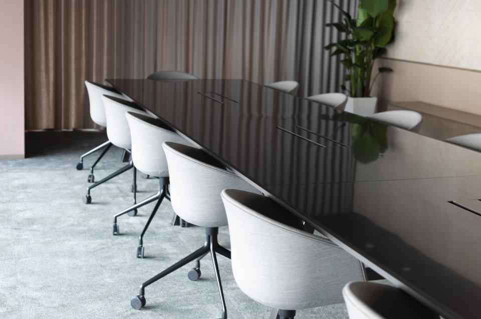
Warner Music has returned to Bean Buro for the design of its new office in Hong Kong. Since Bean Buro’s first workplace design project for them in 2016, the team has doubled. As such, the new workplace is substantially larger, moving into one of the new office buildings in Kowloon Bay, Hong Kong, which overlooks what used to be the Hong Kong International Airport in Kai Tak.
Bean Buro explains: "This workplace would be the third design evolution that builds on previous successes: The first Hong Kong workplace that we had designed was a breakthrough in transforming its previous traditional office. It was a drastic transformation with new workplace strategies, such as creating eventful multifunctional spaces, semi-formal collaboration spaces, and artist rooms with music sampling and demo performances to happen in the workplace. Our second project was for Warner Music Beijing’s workplace, which borrowed much of Hong Kong’s strategies. Still, we took it one step further with a heightened sophistication in material finishes and colours to create a higher user engagement.
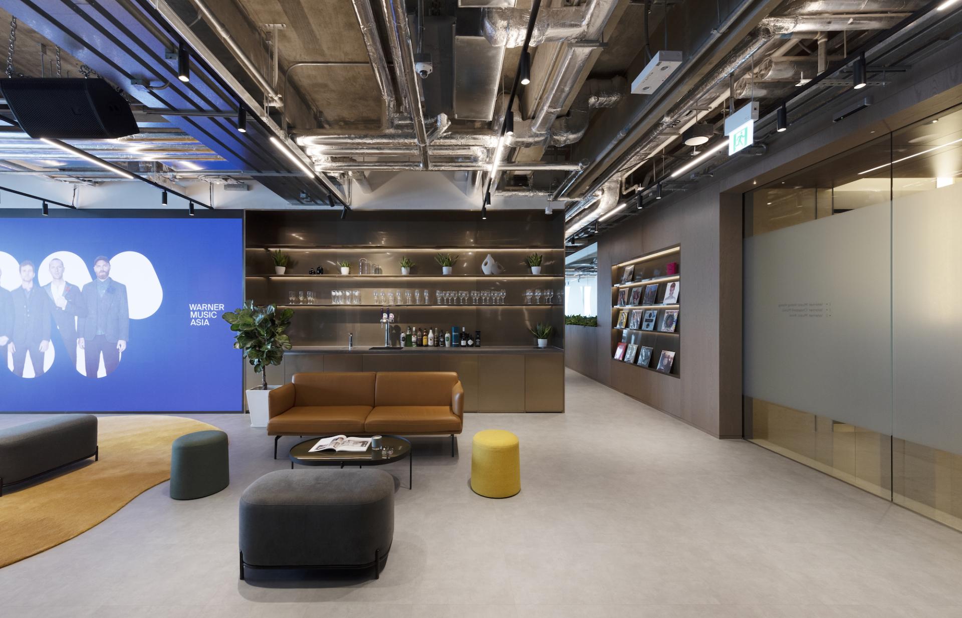
"For the third incarnation, we were tasked with the new challenge of reaching an even higher level of articulation and further promoting the dynamic activities within Warner Music Hong Kong. The new workplace contains the previous designs’ DNA, such as a multifunctional welcoming reception for events, with a clear line of sight to the city skyline in the backdrop. A large LED wall, a raised platform, a DJ booth, and movable lounge furniture allow the space to be used as a performance event space. At the same time, we would satisfy the company’s desire to reach for a higher level of sophistication through the workplace’s design.
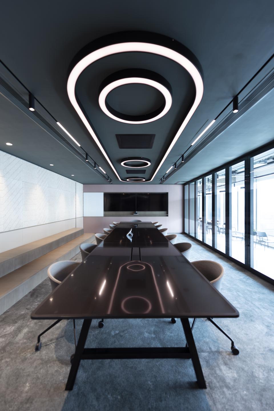
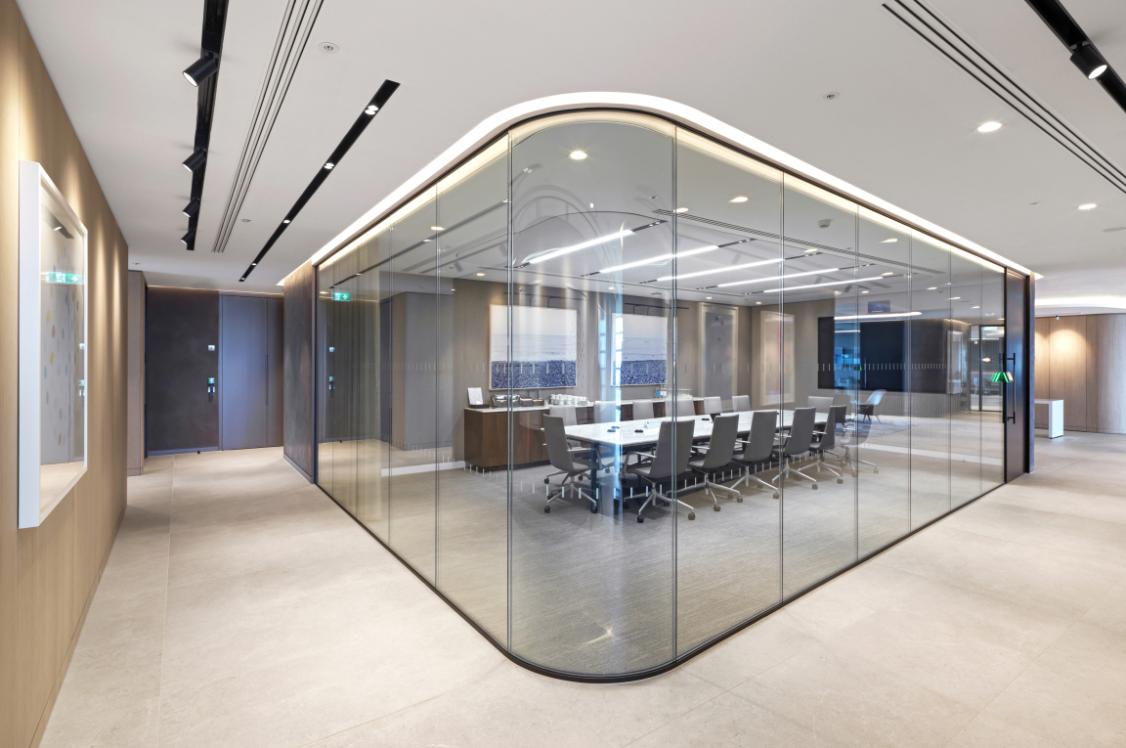
"We were inspired by the idea of the large volume within the large floor plate representing a “music box” that contains all the collaboration functions with flexible spaces. The music box would contain various spaces, including the boardroom and a game room with a pool table, which can be opened by operable glass partitions facing a long window that leads to a pantry with café booths around the back of the volume.
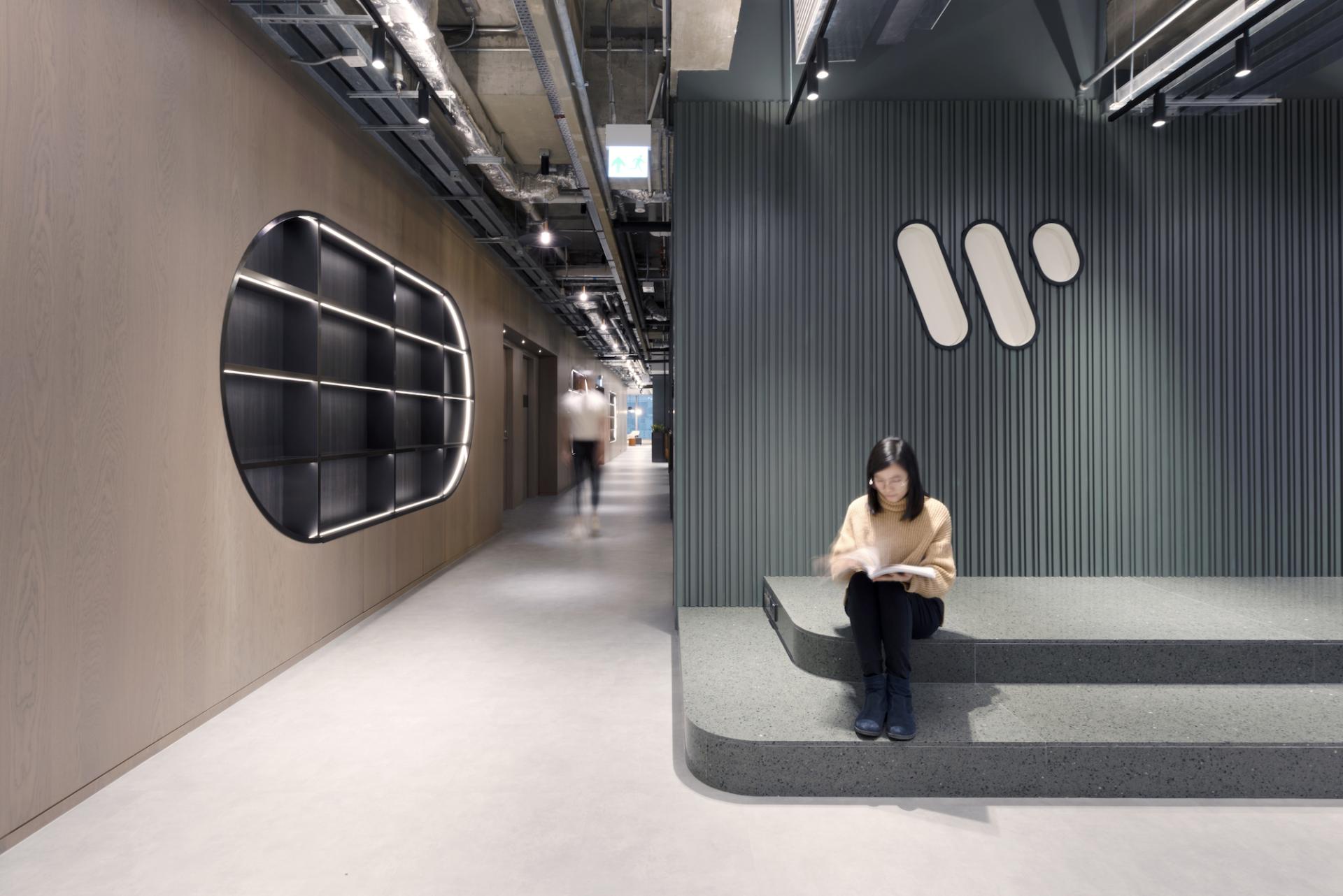
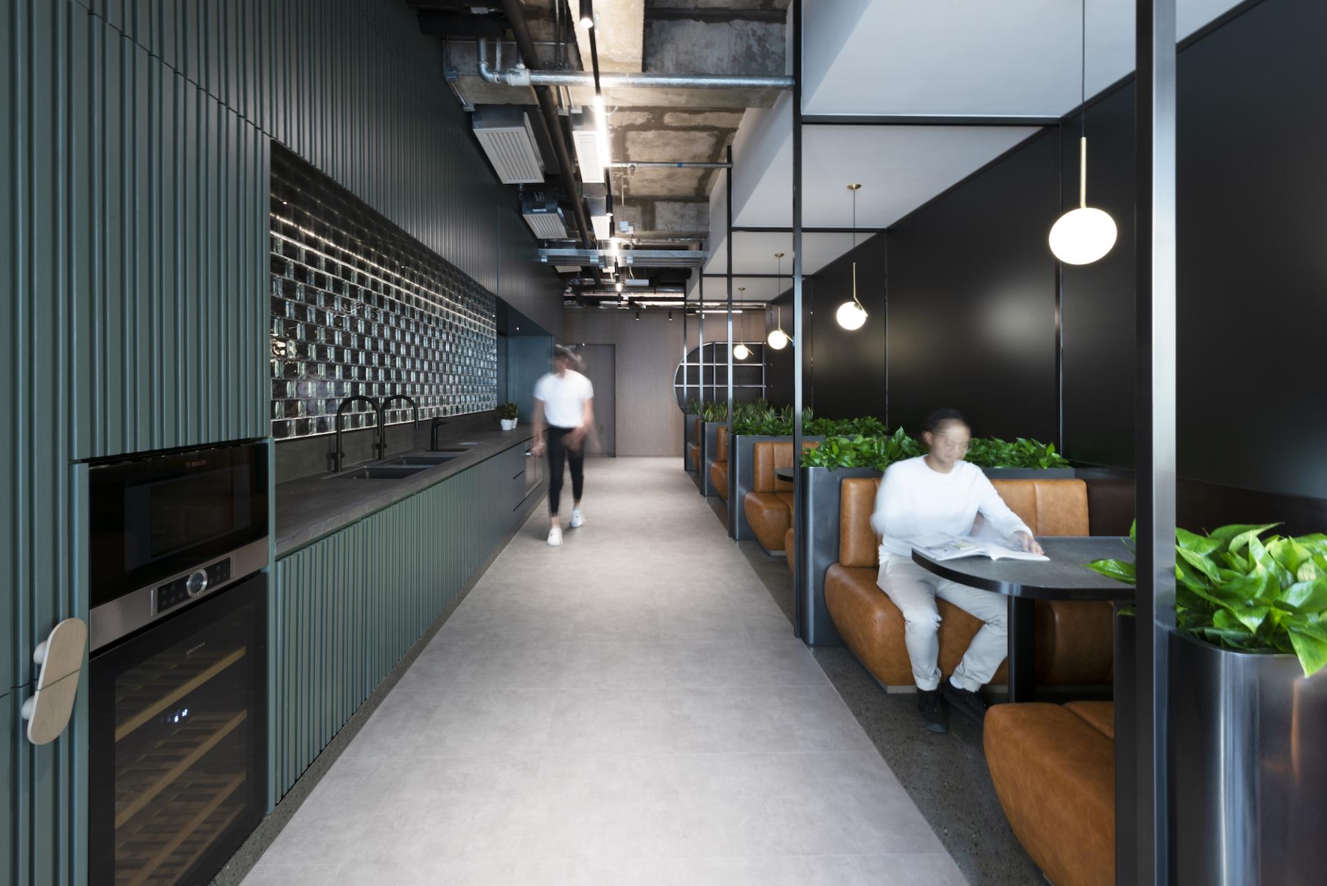
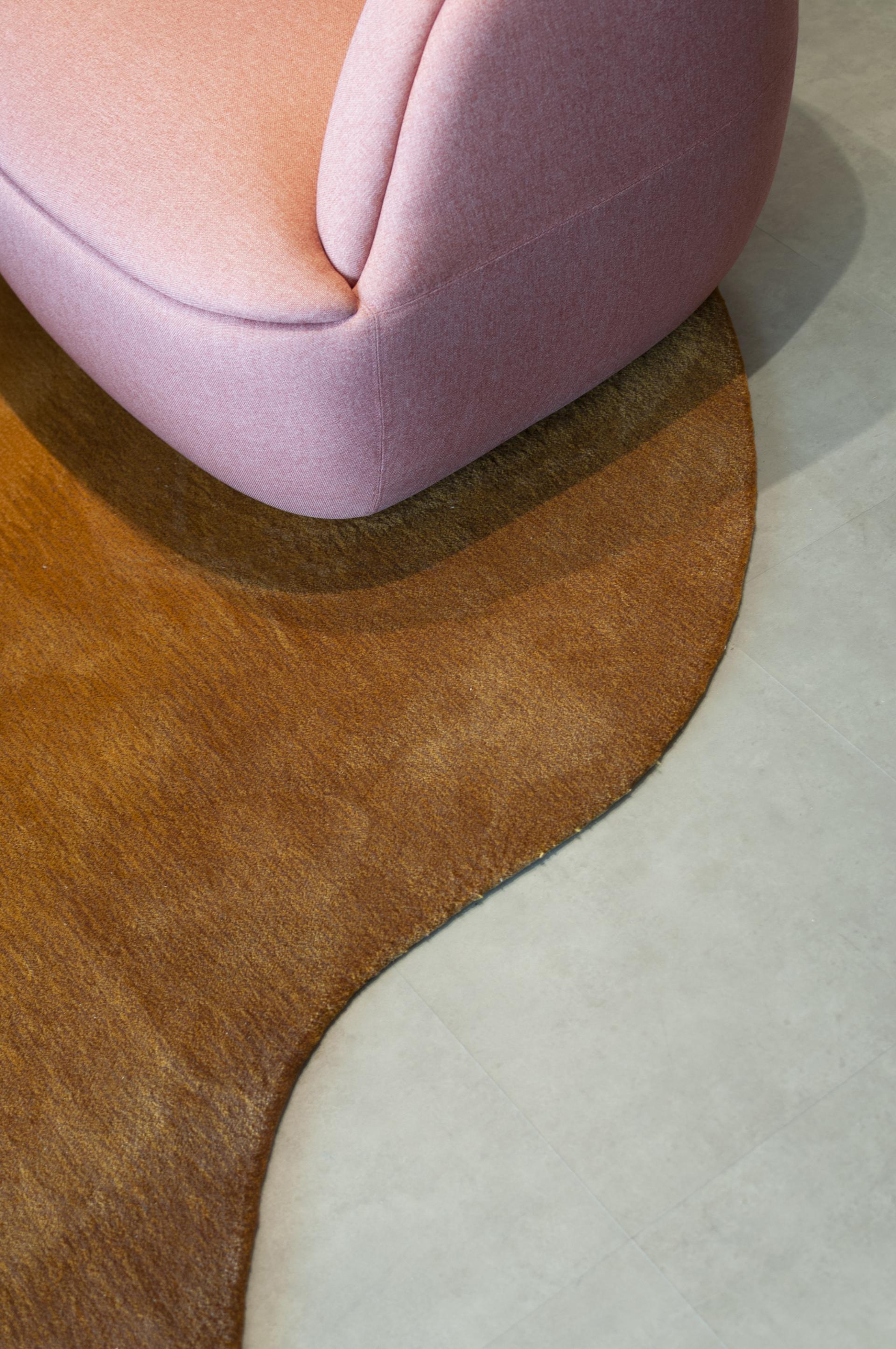
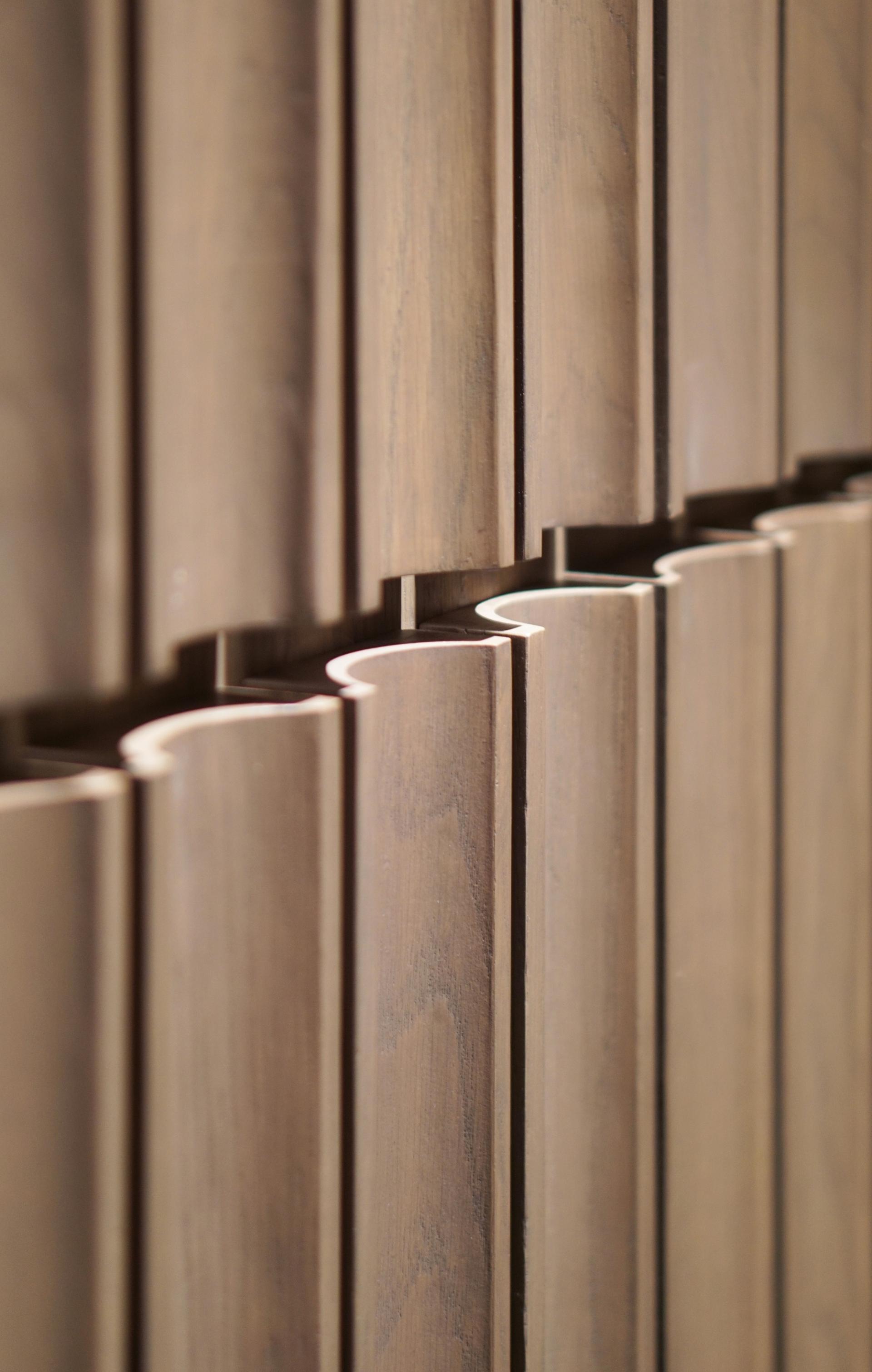
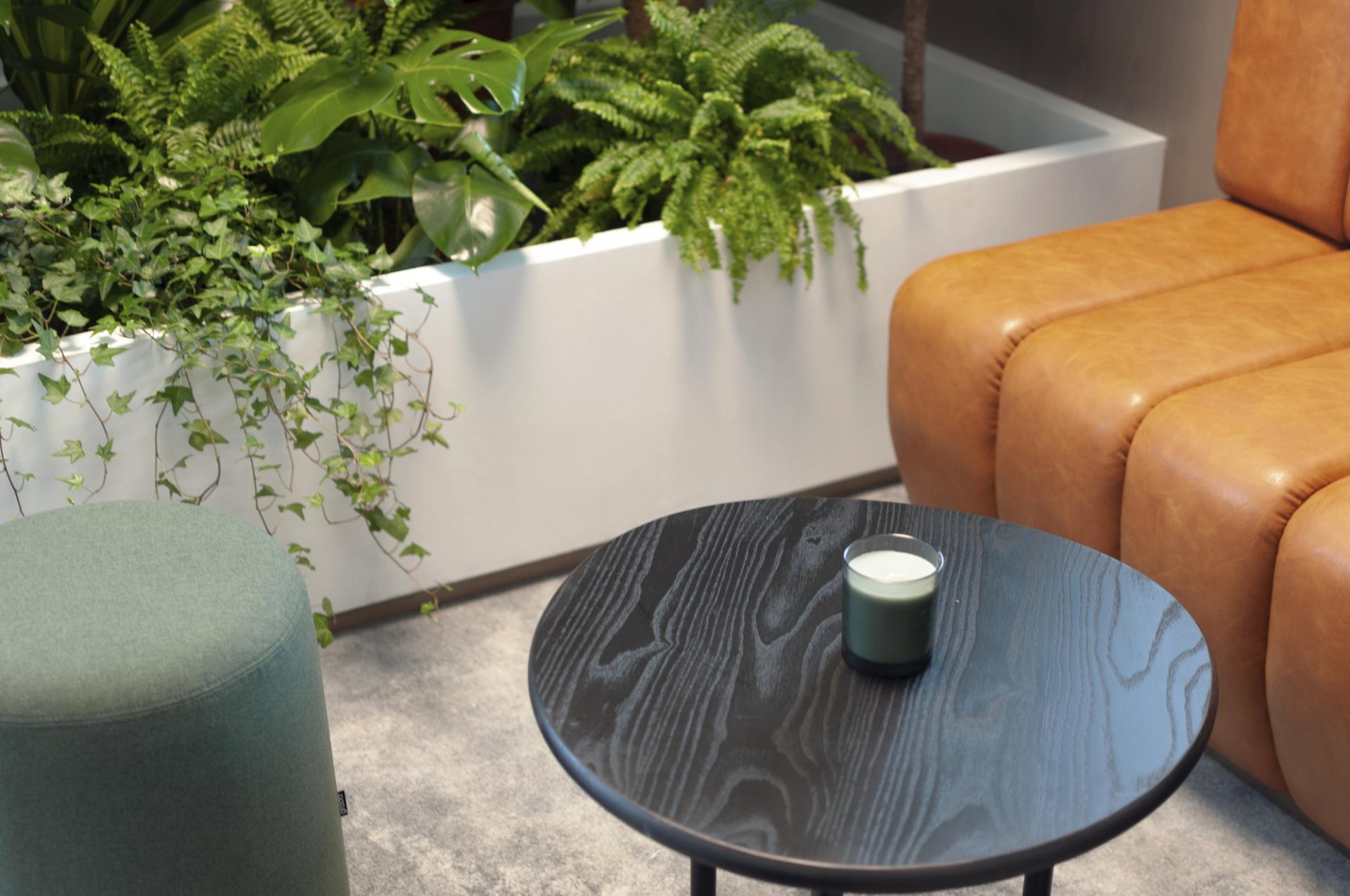
"The volume is located near but offset from the facade to create a light-filled interstitial space with cafe furniture to allow people to relax and work in a social setting. The main front of the music box would face the reception and form the performance stage setting to stimulate exciting and dynamic events around the volume.
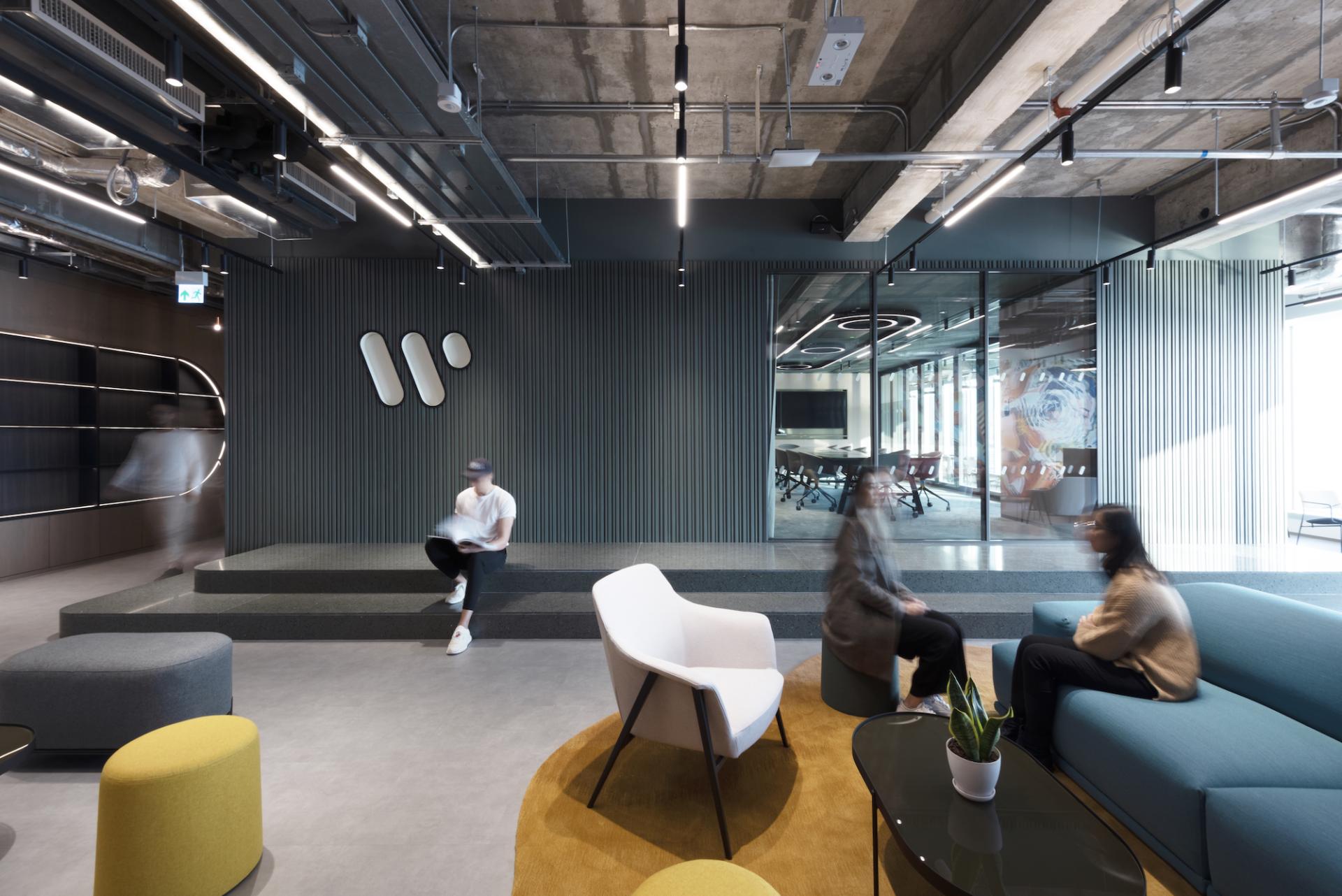
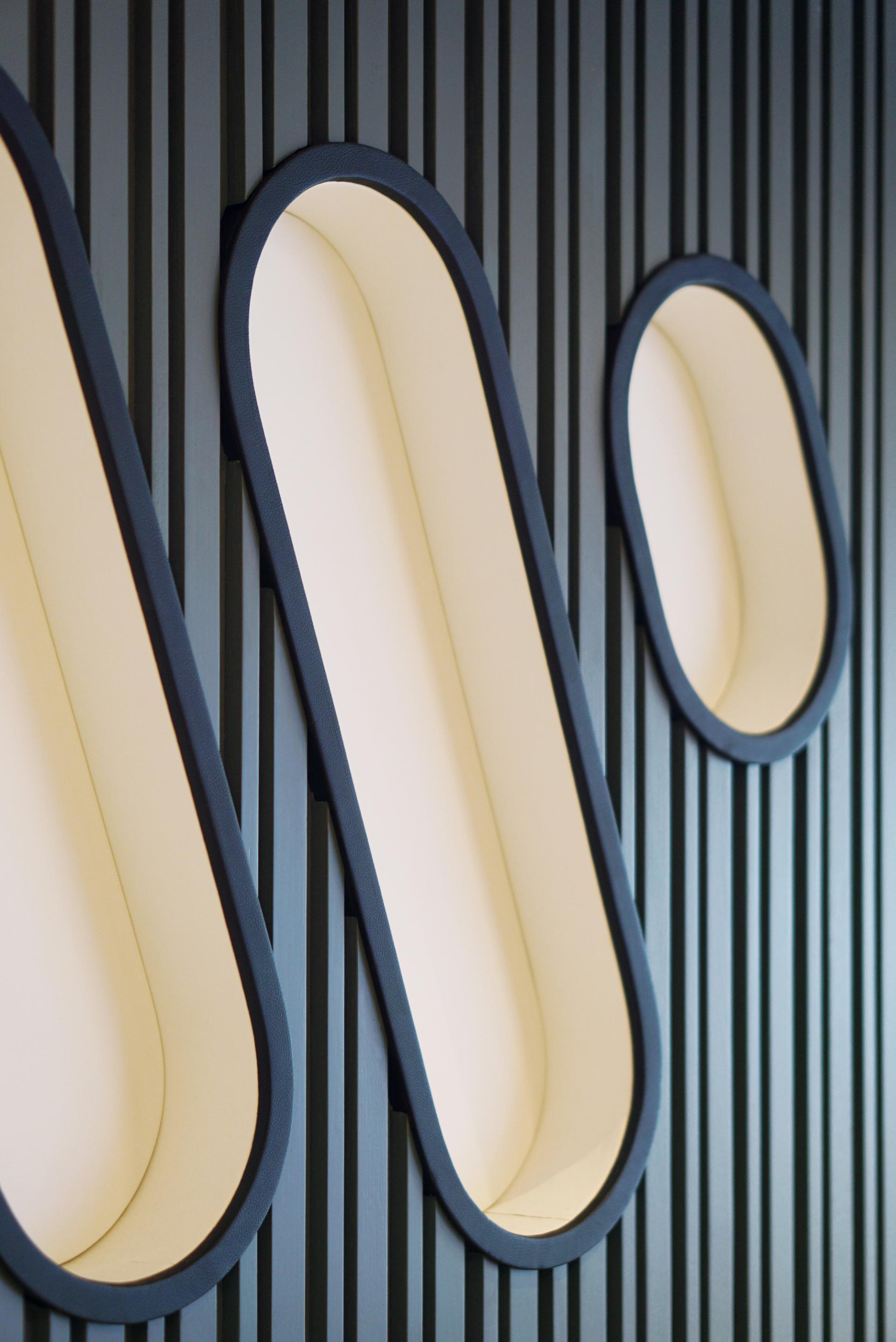
"The muted teal volume is interpreted as a robust, solid, small building, and we have explored a unique slatted detail for its outer walls to break down the large structure visually. We have also recessed the company’s logo into these fine slats, and the shape of the logo is also lined in fabric—inspired by a musical instrument carrying case.
"To find the right design for the slats, we carried out many small-scale mock-ups and one-to-one prototyping."
The solution was a vibrant, sociable and multifunctional setting.
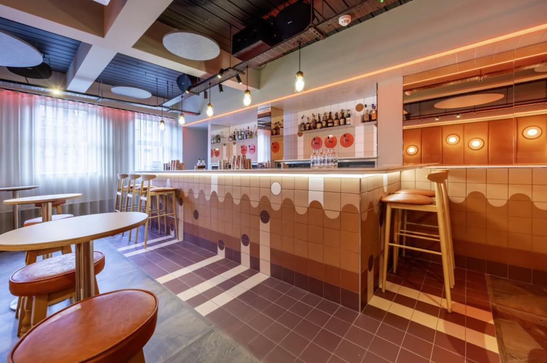
"To preserve the DNA of the previous Warner Music workplaces that we have designed, we kept certain elements consistent: not having a formal reception, but rather a very open lounge with a multifunctional performance stage, LED wall, and guest dry pantry with beer taps and wine fridges, to allow visitors and artists to enter the workplace and engage with the employees.
"We collaborated with a local Japanese artist, TAKA, to create a mural art wall adjacent to the LED wall, creating a dialogue with the post-industrial context and a vibrant backdrop for the social area. In combination with the open ceiling, the artwork responds to the context of the site location by highlighting the post-industrial quality of Kowloon Bay.
"The music box volume is located in the heart of the U-shaped floor plate with two neighbourhoods on either end. Each neighbourhood is equipped with a wide variety of work settings such as collaboration areas, small meeting rooms, in-wall cafe seats, lounges, and phone booths.
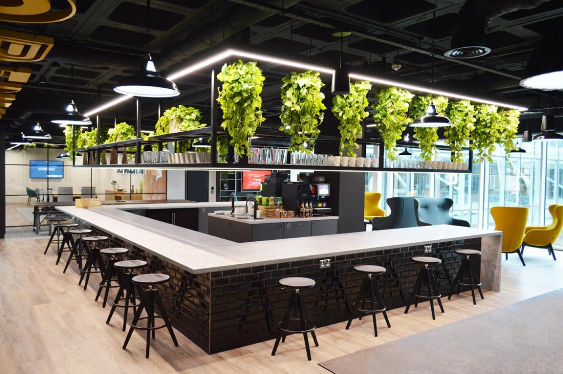
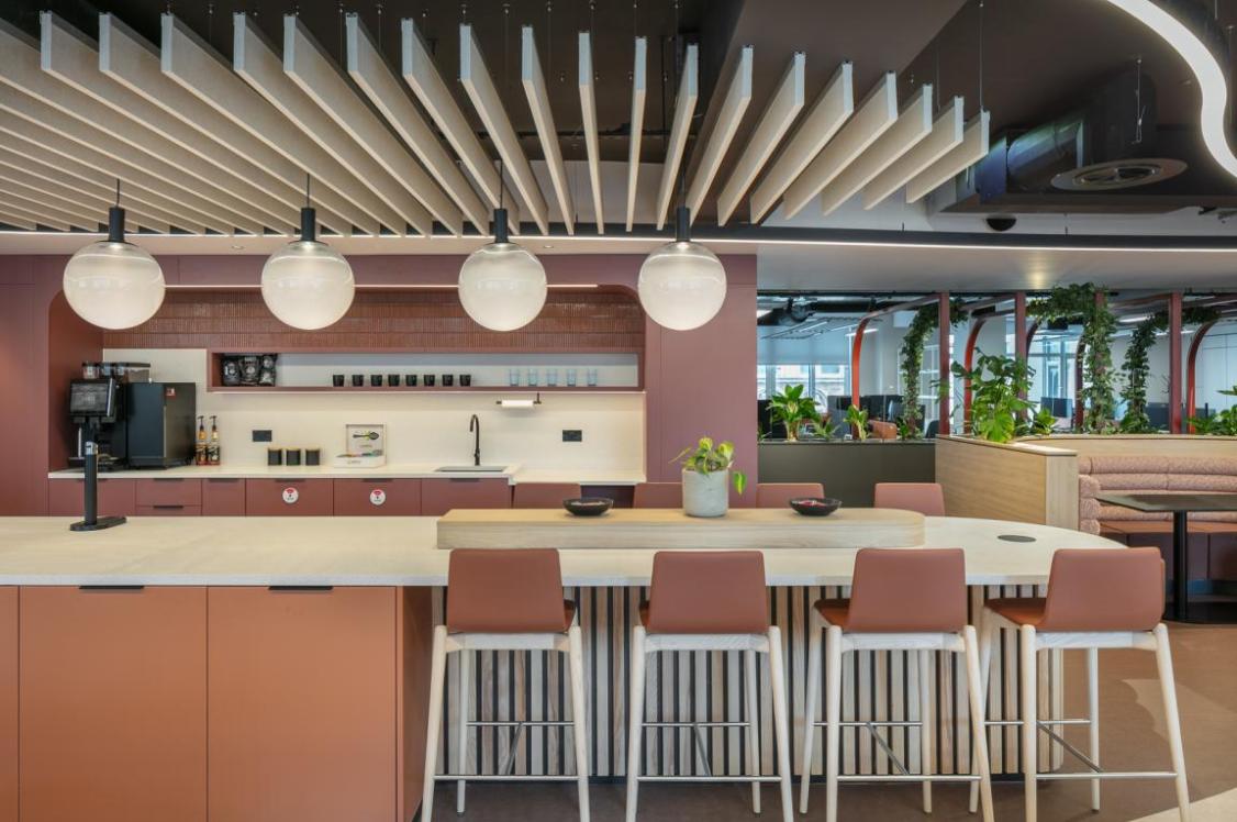
"The other side of the green volume provides the main pantry with all the appliances integrated into the outer wall of the volume, immediately accessible by the diner booths.
"The senior departmental heads are part of the neighbourhood and are roofed with different timber ceilings."
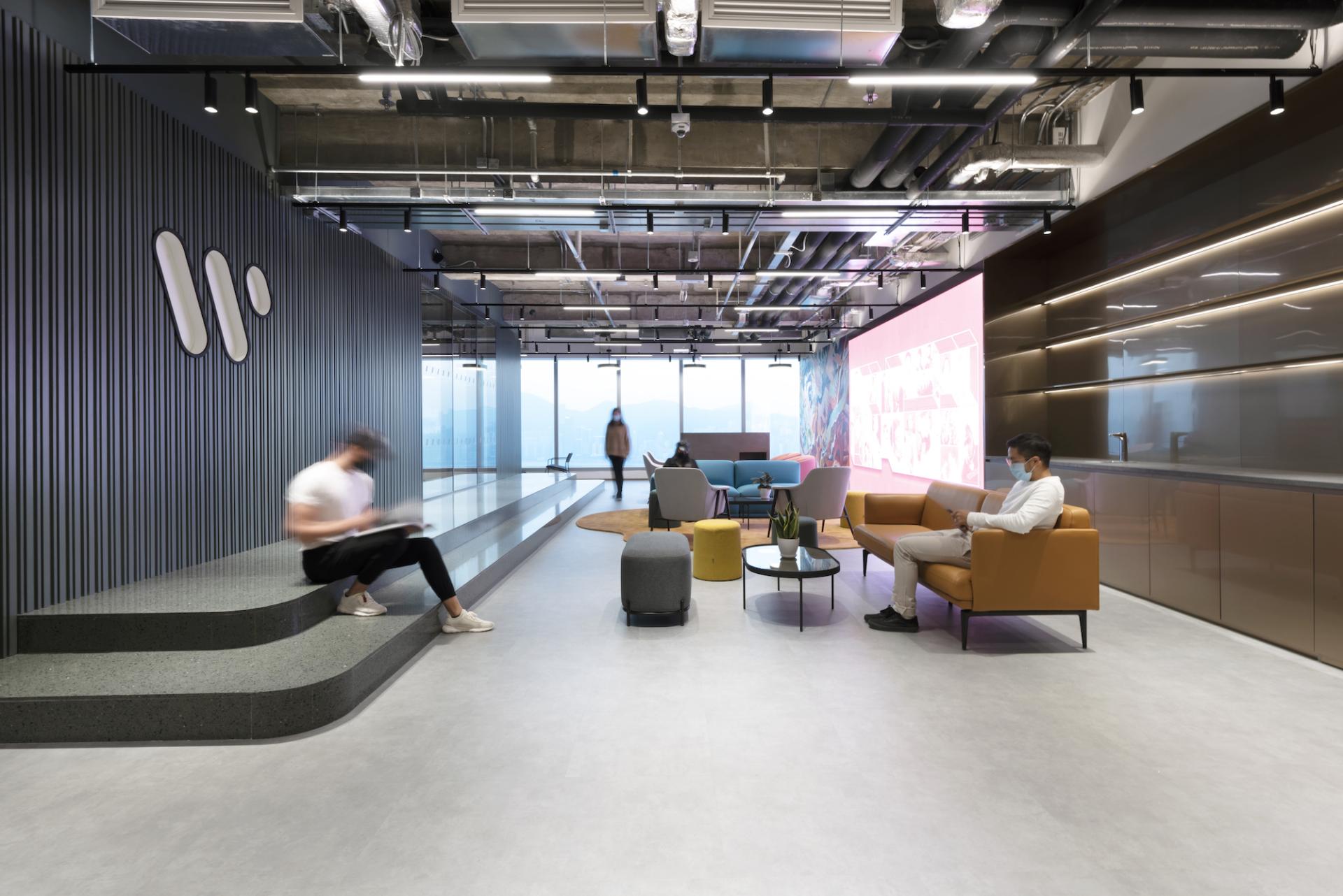
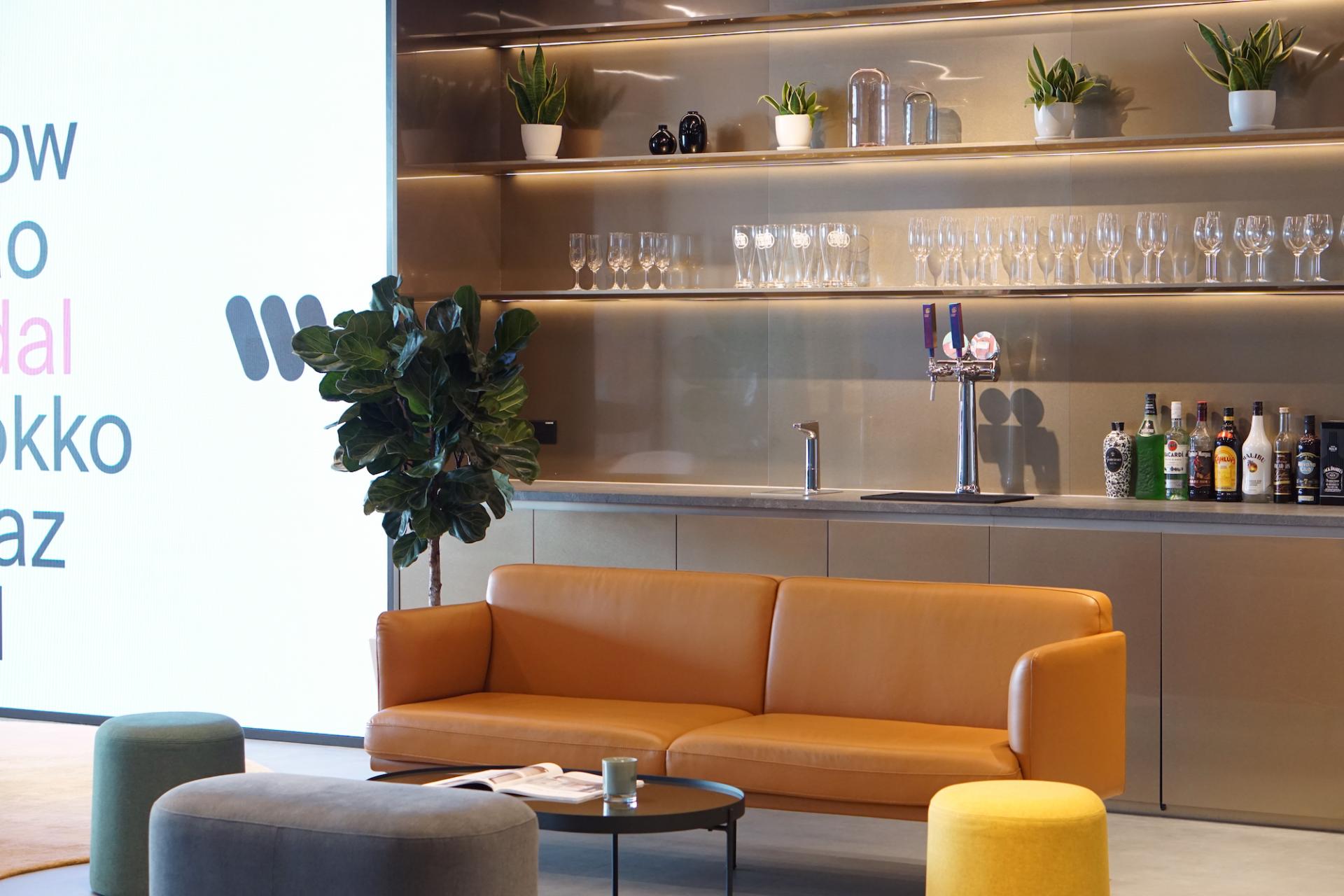
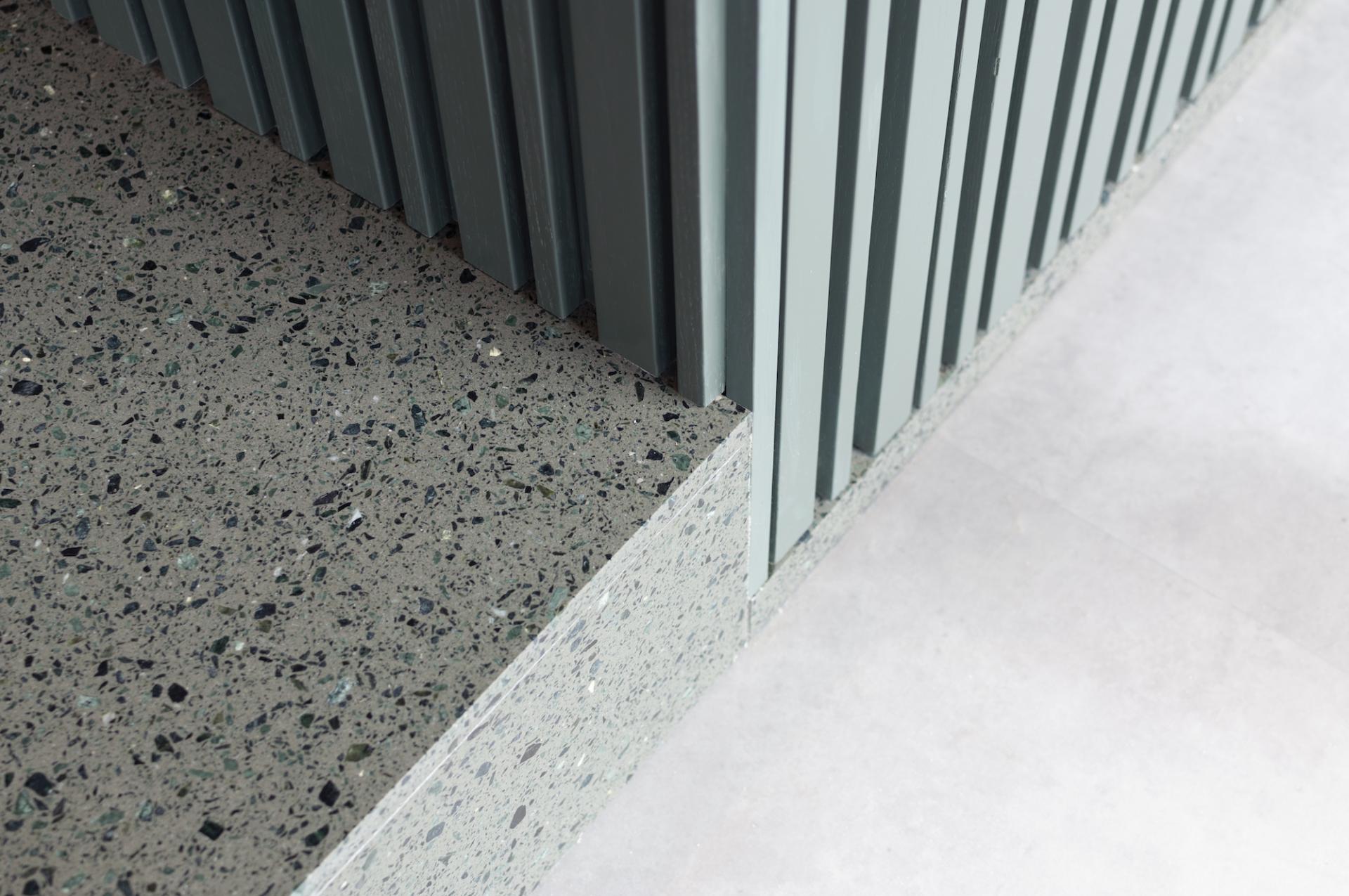
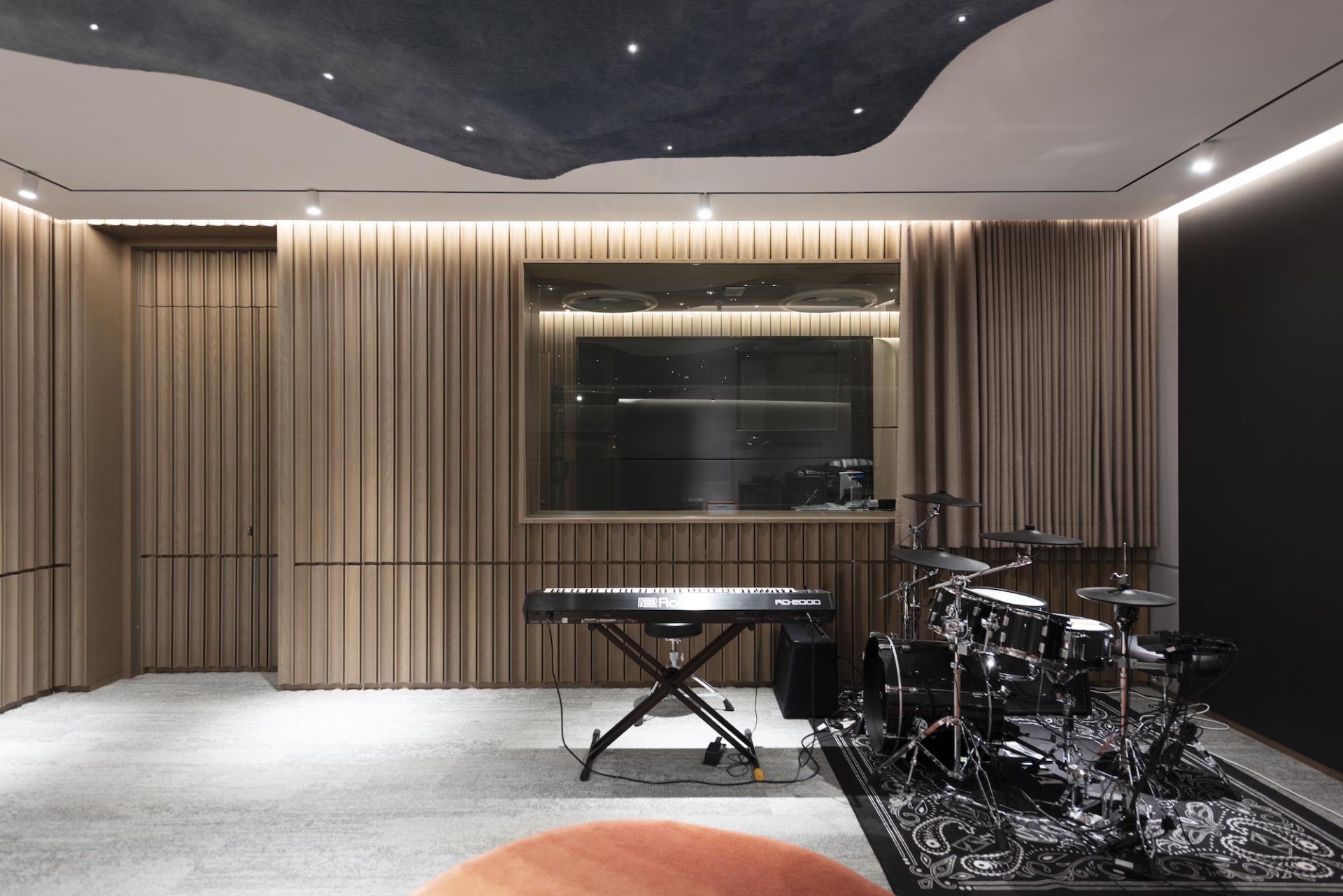
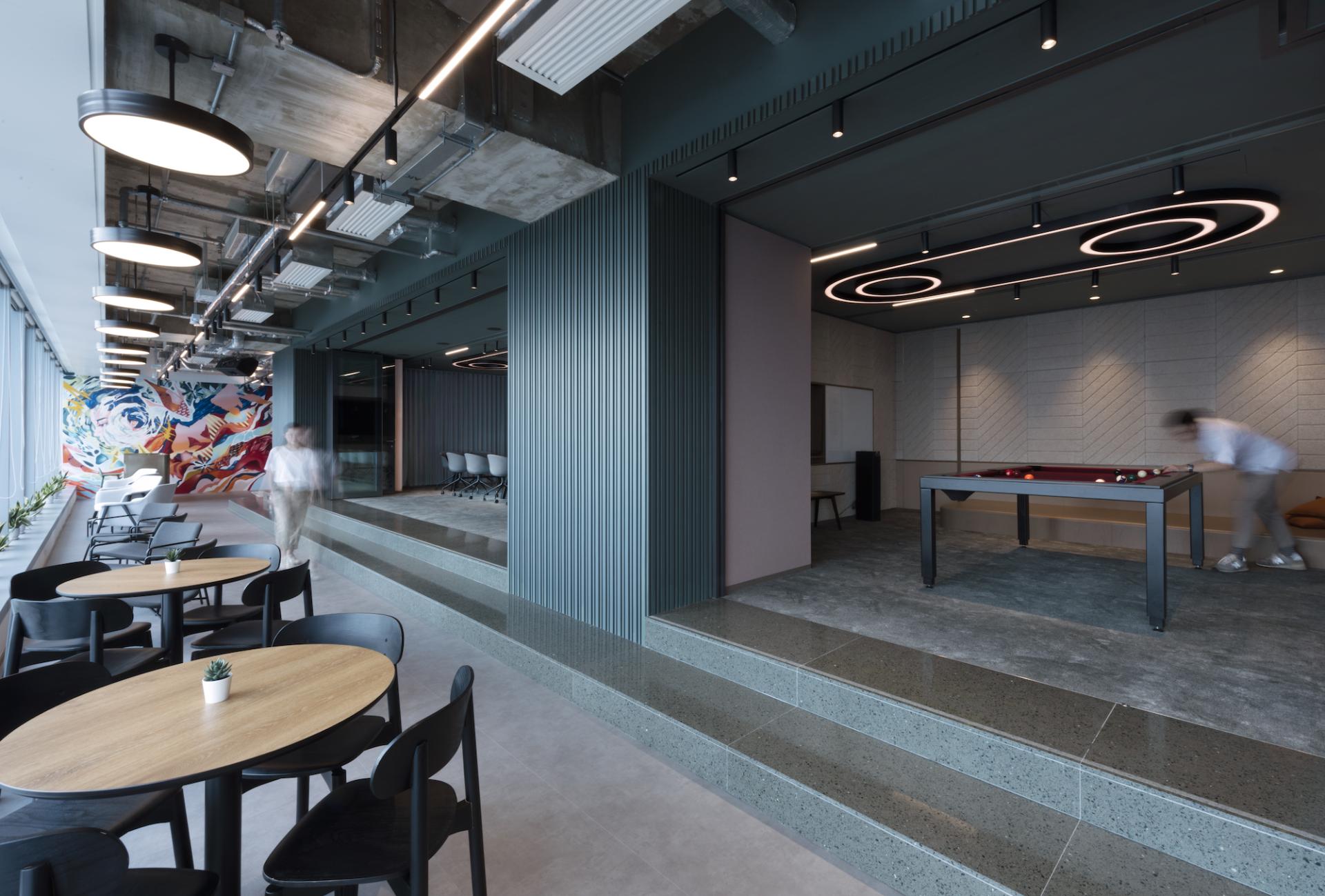
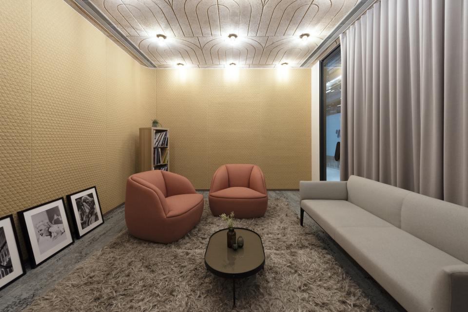
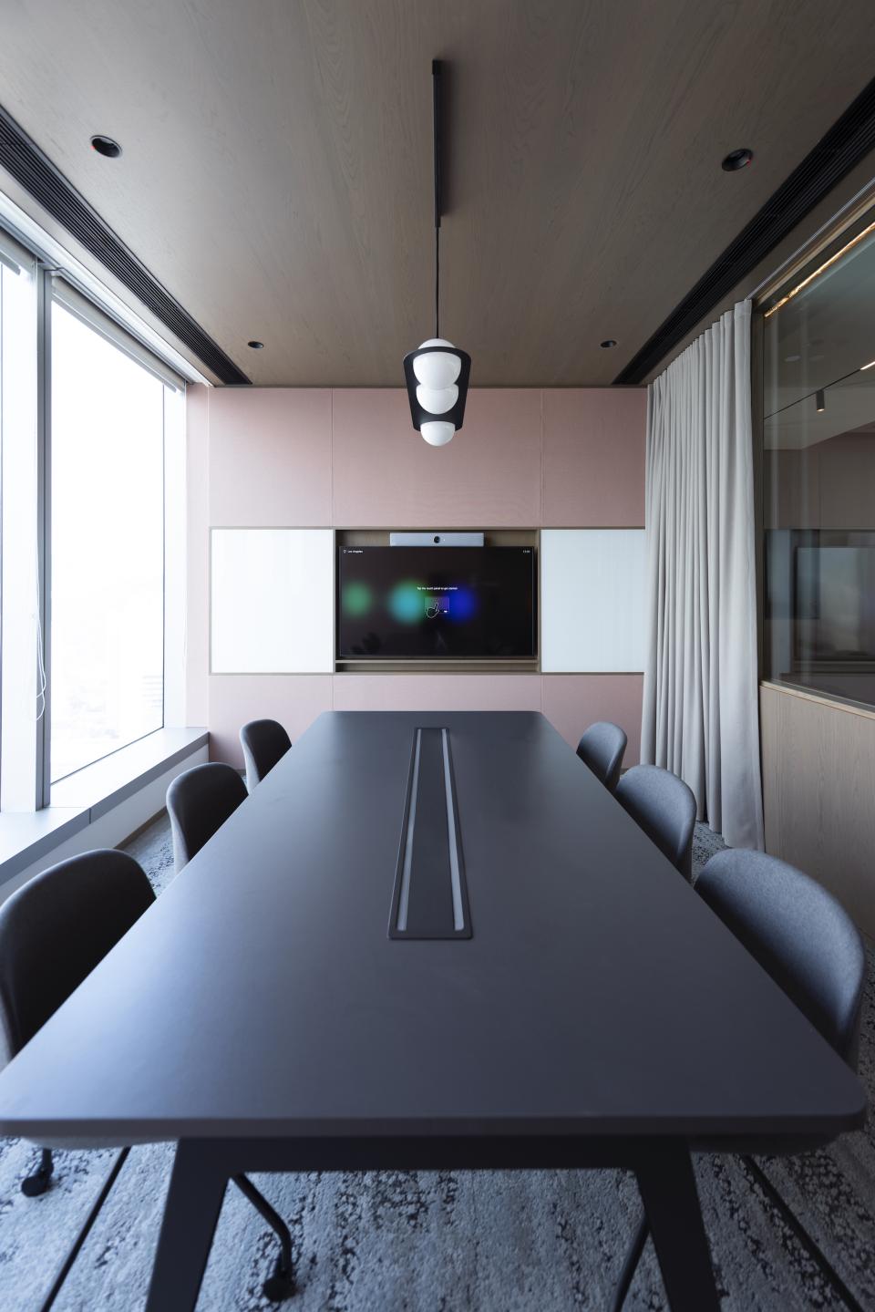
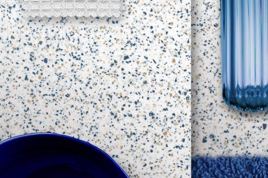
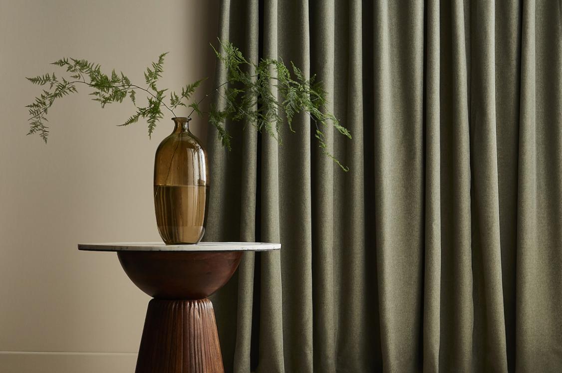
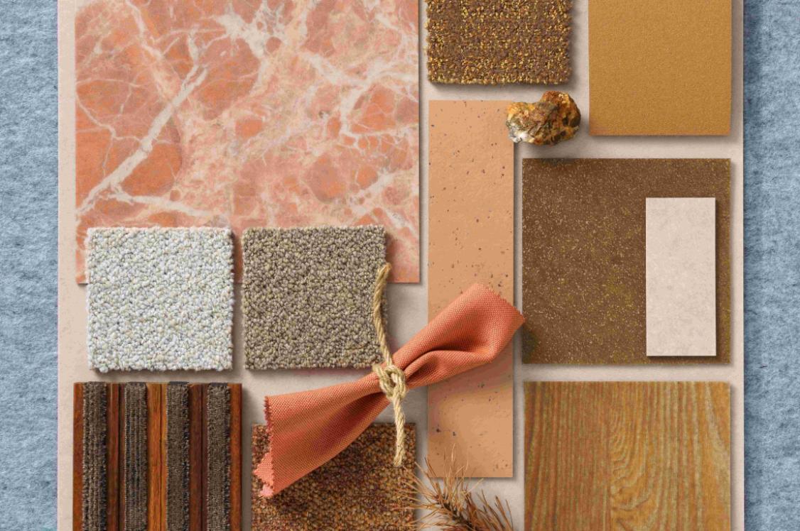
The materials used in the project spanned bespoke elements, and zoning through colour. "We celebrated the joy of music through a palette of colourful materials, such as muted teal colour timber slats for the outer walls of the volume and a green terrazzo skirting forming the platforms of the performing stage and entrances into the boardrooms. Each meeting room has a different coloured concept, expressed through the choice of acoustic fabric wall panels, wall coverings and loose furniture colours.
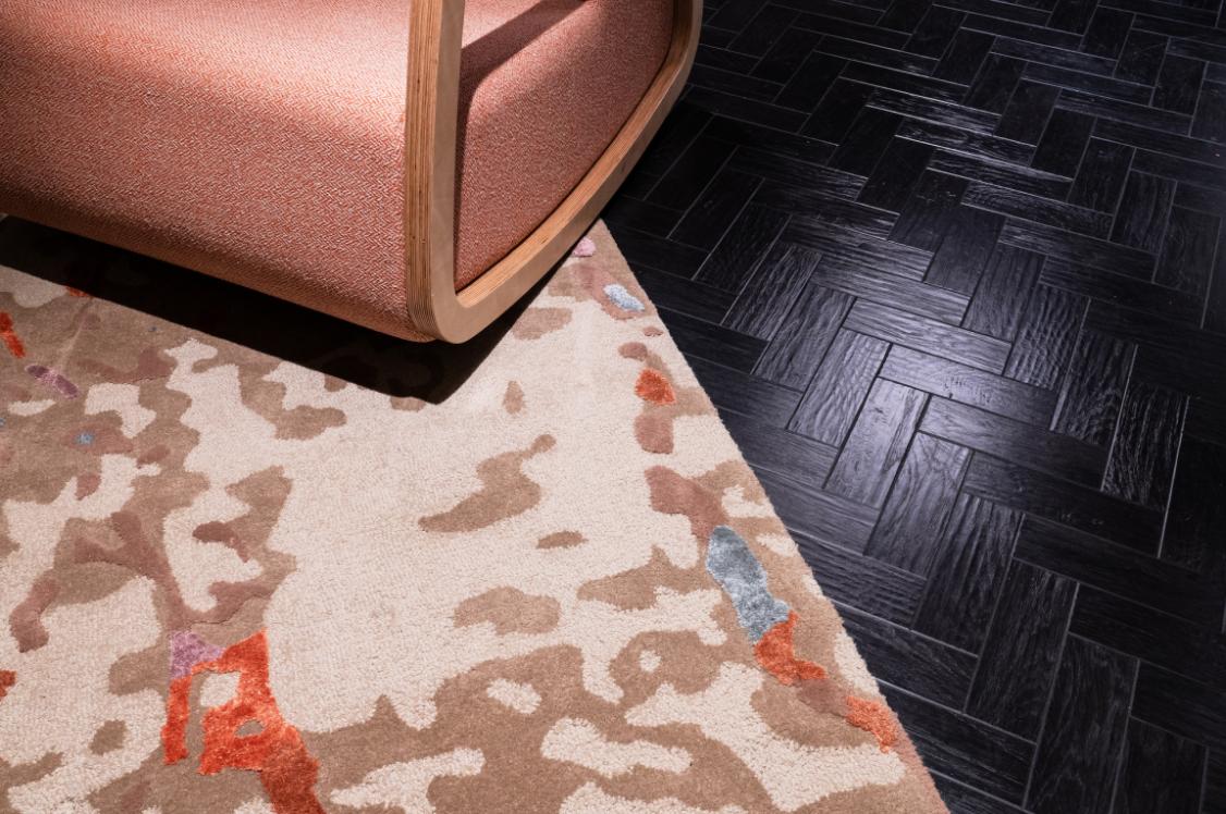
"We created a large bespoke curvy rug carpet in an orange tan gradient effect to stimulate energy for the social area. It is paired with the backdrop of a metallic hospitality dry pantry bar. Another curvy rug is in the recording studio with a reflective shape in the ceiling that functions as a 3D ceiling acoustic panel.
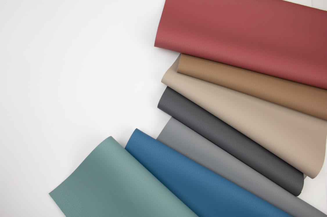
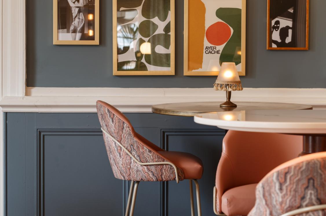
"To ground the colours, we have a mature tan leather for the bespoke seating in the pantry and collaboration areas in the neighbourhoods to convey a high end, luxurious atmosphere."
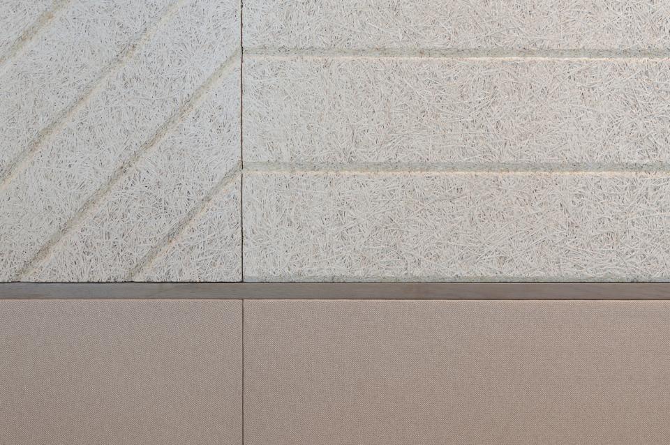
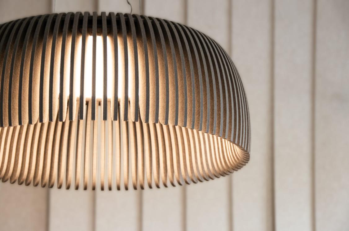
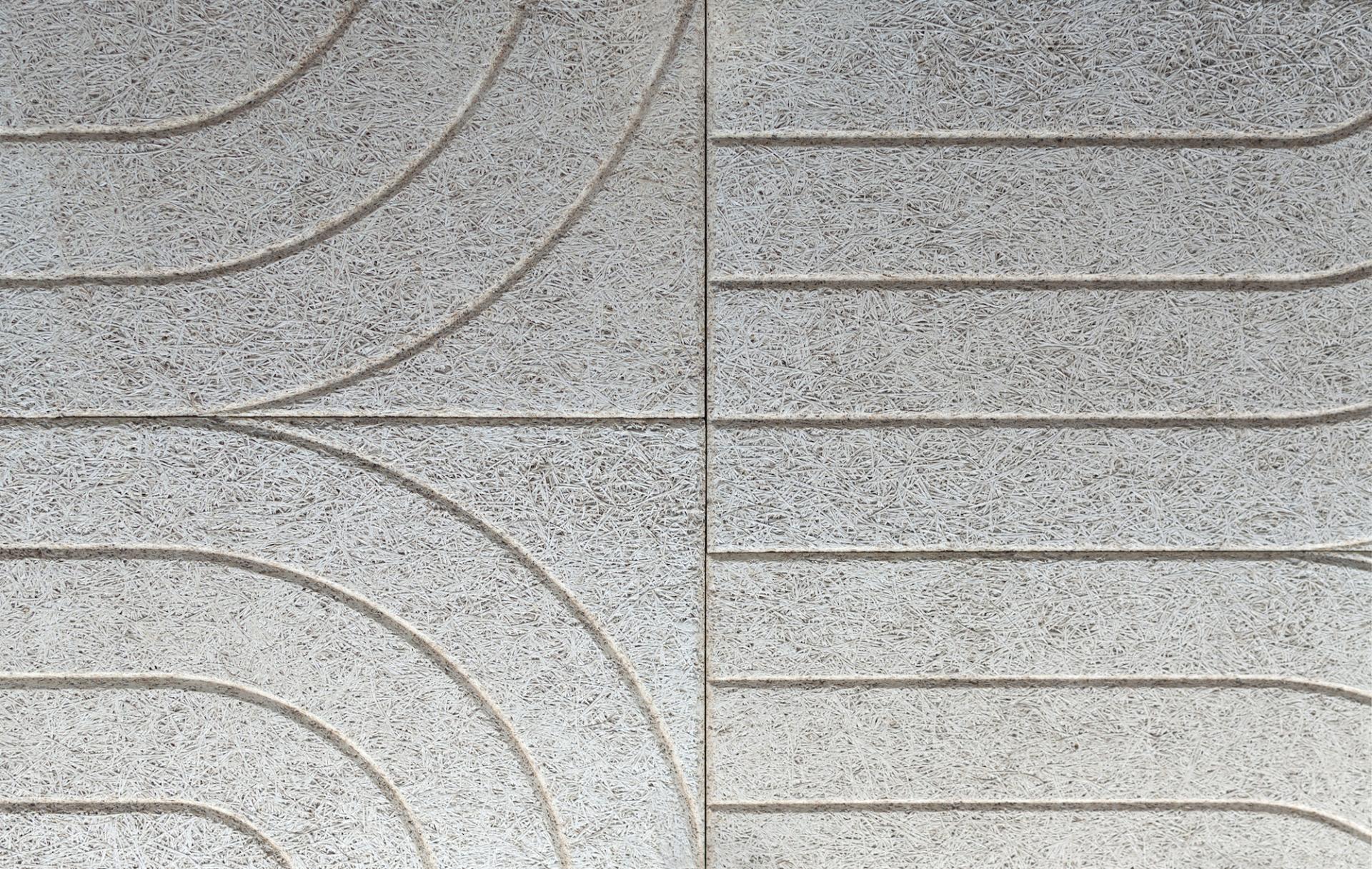
Wellbeing elements were considered across the board, from the acoustics, to the planting and providing access to natural light where possible. Bean Buro also specified high grade environmentally friendly products wherever it could, such as specifying a carpet made from recycled fishing nets and acoustic panels made from recycled materials.
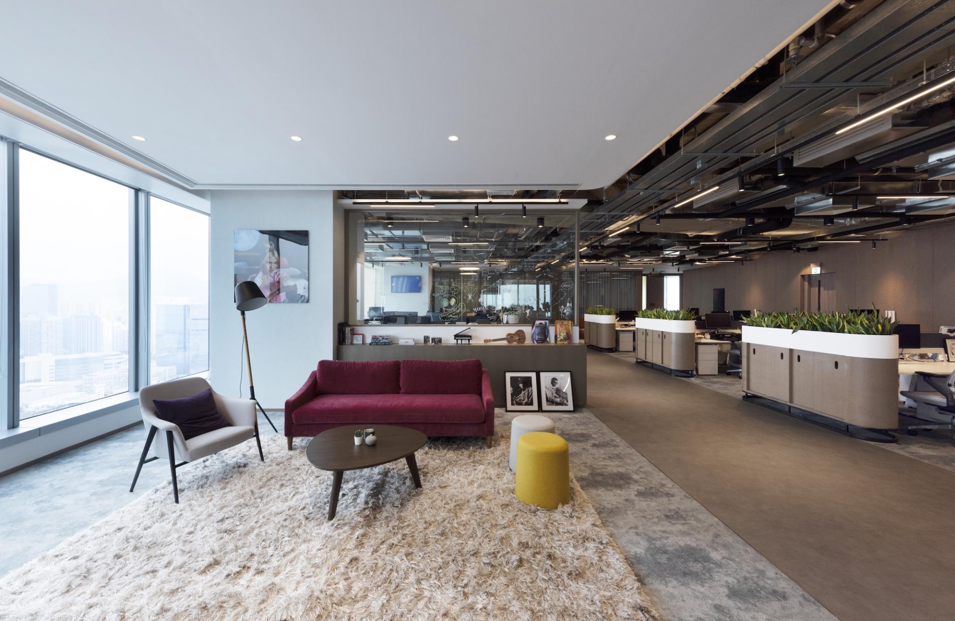
"A challenge of the project was stimulating the right amount of energy to promote a highly sociable workplace where employees could interact with each other while also being suitable as a creative place for music artists to express themselves through music. Overstimulation would not be appropriate for the productivity of some of the departmental staff. Therefore, this project has a very articulated use of natural materials such as timber, leather, and neutral-coloured fabrics to create a sense of peacefulness and calmness in some of the work settings."
