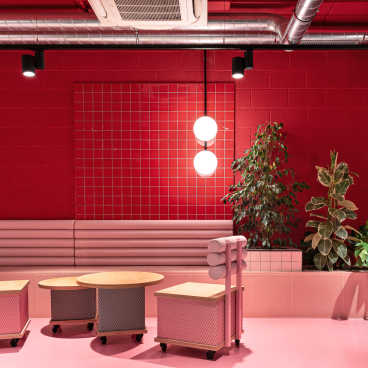
Convention-busting interiors for flexible workspace in London.
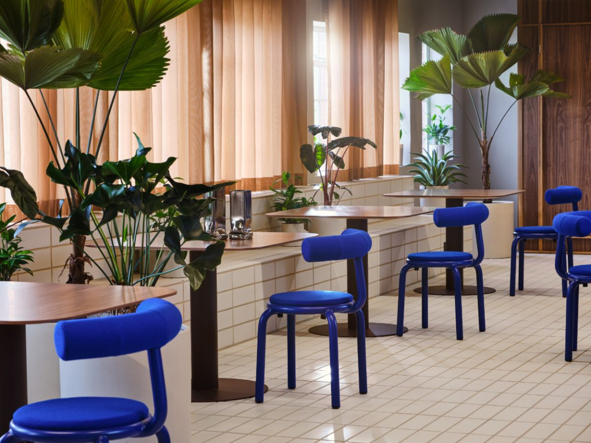
Note Design Studio and TOG (The Office Group) have revealed their vision of what the office space of the future should look like – as expressed by their collaboration in reinventing Douglas House, a new six-floor office building on Great Titchfield Street.
Setting out to create a workplace where people can feel stimulated by their environment and thus be truly productive, Note and TOG strived to fill every inch of Douglas House with personality.
The connection between our environments, our emotions and our productivity informed Note’s design concept for the project. In Douglas House, they aimed to create somewhere that surprises you from the moment of entry, as well as engaging the brain with touches of the unpredictable, administering what Note calls a ‘gentle punch’ to all who step in off the street.
Nasim Koerting, head of design at TOG, said of the project: "Our previous collaboration with Note, Summit House, was different to anything TOG had done before – it was genuinely ground-breaking – so we were confident that working together, we would inject something truly exciting and forward-thinking into Douglas House. We wanted to create somewhere that suited a variety of workspace styles, that broke with the conformity often associated with the office, and which conveyed a sense of journey and discovery.”
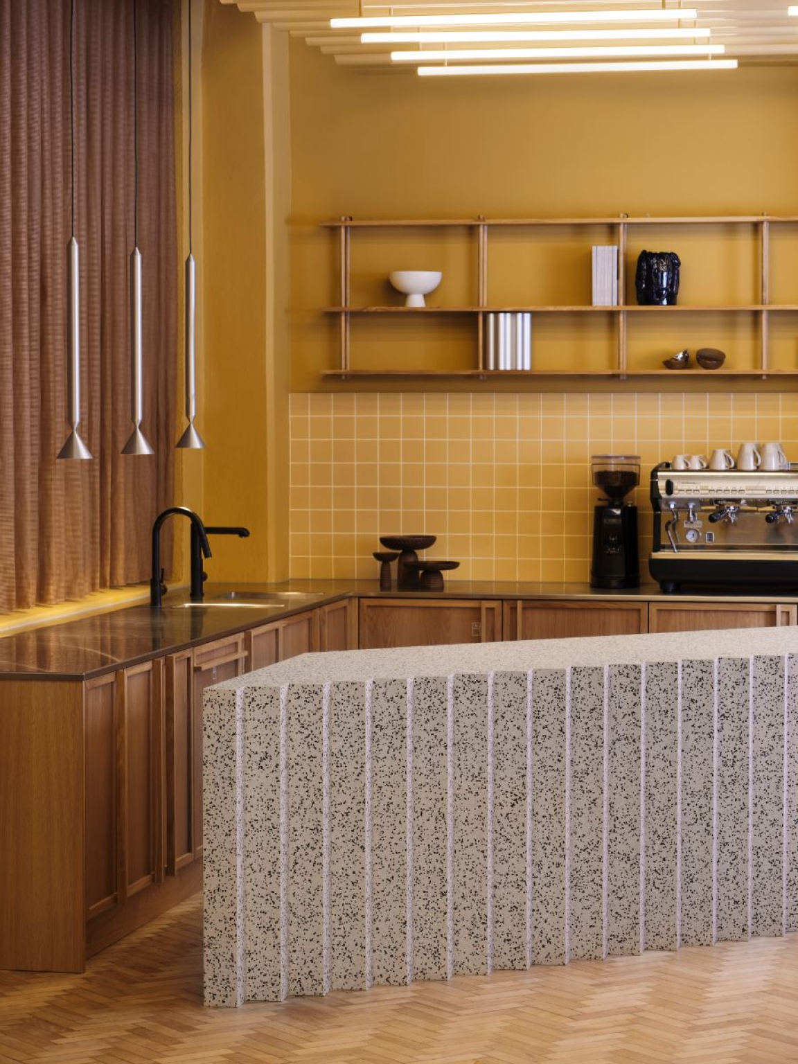
Douglas House is a 47,000 sq ft building at 131–151 Great Titchfield Street on the Langham Estate in the West End.
When TOG acquired the lease, the 1930s block was devoted to functional but uninspiring office space. TOG had previously called on Note to design the interiors of its office space Summit House in Holborn and were hugely impressed with the way the Stockholm-based practice was able to translate the art deco exterior into a high-level contemporary design that complemented and enhanced the Grade II-listed building.
Douglas House’s post-war architecture offers less for both design teams to respond to creatively, so the challenge here was to give it a strong identity that would enable it to hold its own against its more dramatic neighbours in Fitzrovia.
Key design elements of the space include a striking curvilinear wall of glass that runs the entire length of the ground floor. Based on the idea of a hand-drawn line, the wall creates a sense of light, transparency and openness throughout the space, which is split into three ‘rooms’ by the building’s two stair cores.
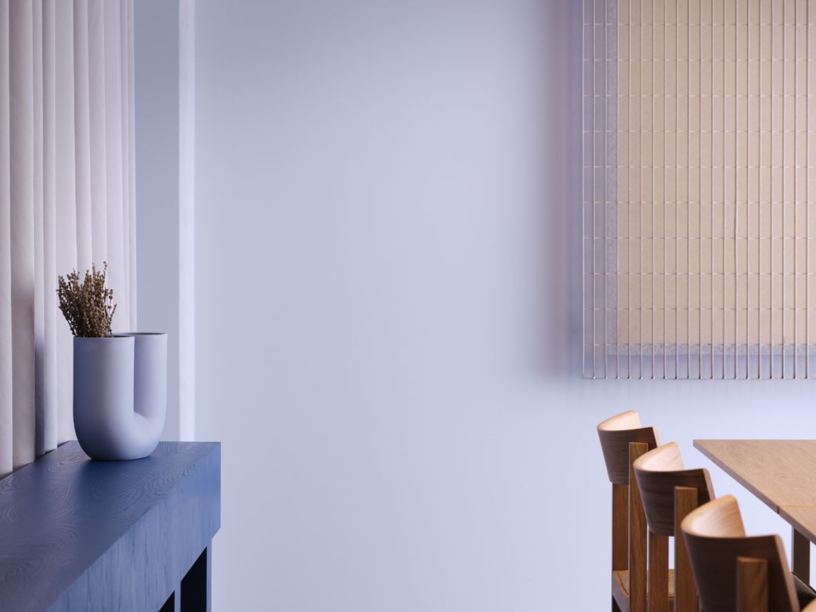
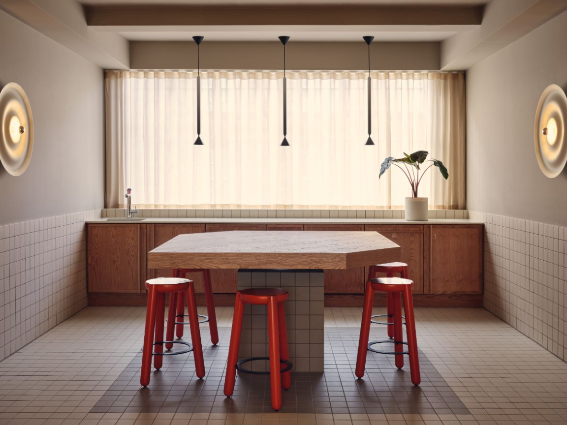
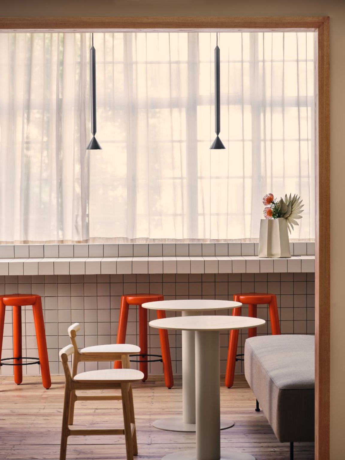
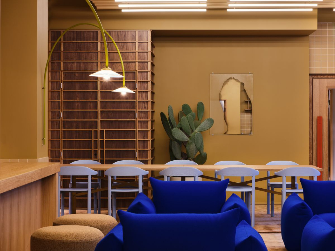
The colour palette comprises warm woody neutrals and desert shades defining the communal spaces and break-out areas, and cooler, softer blues used in the meeting rooms and working areas where concentration and focus are required. Pops of primary colour come in the form of vivid ultramarine Marenco armchairs and sofas by Artrex, Muller van Severen hanging lamps and powder-coated stools in bold red and blue.
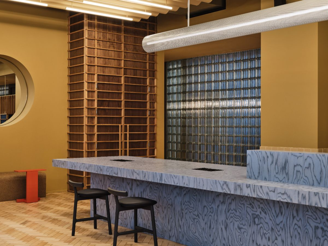
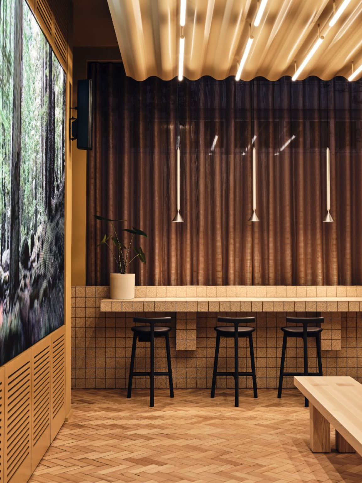
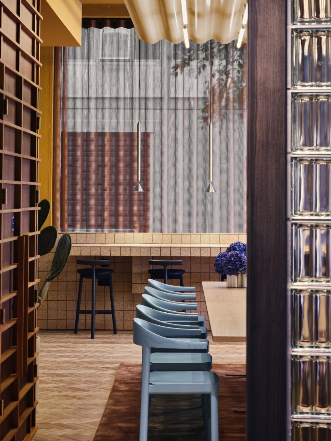
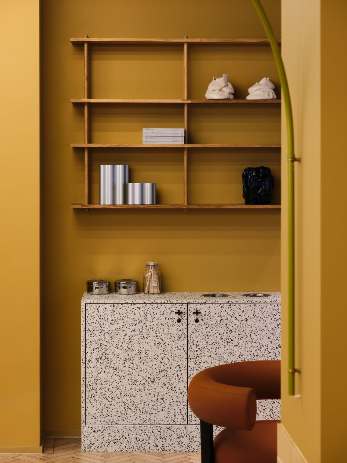
Elsewhere, the inventive material palette draws strongly on natural finishes, incorporating ash stained in various shades, walnut and terrazzo. Designing around a building with extensive wear and tear, wherever possible, Note and TOG agreed to retain the existing materials from the original design.
When this was not possible, materials that would be reusable in future (including steel, glass and ceramics) were selected. Where plastics were required, the team employed the 100% recyclable Tarkett IQ range of wall and floor coverings. Remarkably, they were able to salvage the building’s existing parquet floors in their entirety, lifting, renovating and replacing every last block. Other sustainability-led initiatives include the addition of a bank of solar panels and a green biodiverse roof.
In keeping with its ‘gentle punch’ and ‘breaking the grid’ concepts, Note has ensured there is a striking contrast between the exterior and interior. Outside, the building’s facade is repetitive and grid-like; inside is an altogether richer, more fluid and less predictable experience – beginning at the moment of entry, when you’re confronted with a wide reception desk in a head-turning blue ALPI Sottsass veneer.
It is a contrast not a clash – certain features of the façade, such as its iron detailing, acted as jumping-off points for the design of the interior, and the colour of the bricks was the springboard for developing the colour palette.
Alongside the expected features of a modern workplace – gym, roof terrace and 20 meeting rooms (including 10 informal, collaborative spaces and a traditional boardroom) – Douglas House also includes a number of more innovative additions, including a ‘recharge room' for breakout moments during the working day, a plant- filled ‘oxygen room’ on the top floor in which to recharge and reconnect with nature, a flexible workspace with a café, and a dedicated room for nursing mothers.
