H2R DESIGN create two new locations of a Riyadh favourite; Chunk, the renowned home of delightful pastries and desserts.
H2R DESIGN - Chunk DQ
H2R DESIGN, was commissioned to design two new locations of a Riyadh favourite; Chunk, the renowned home of delightful pastries and desserts made from scratch in Riyadh Park Mall and in the Diplomatic Quarter.
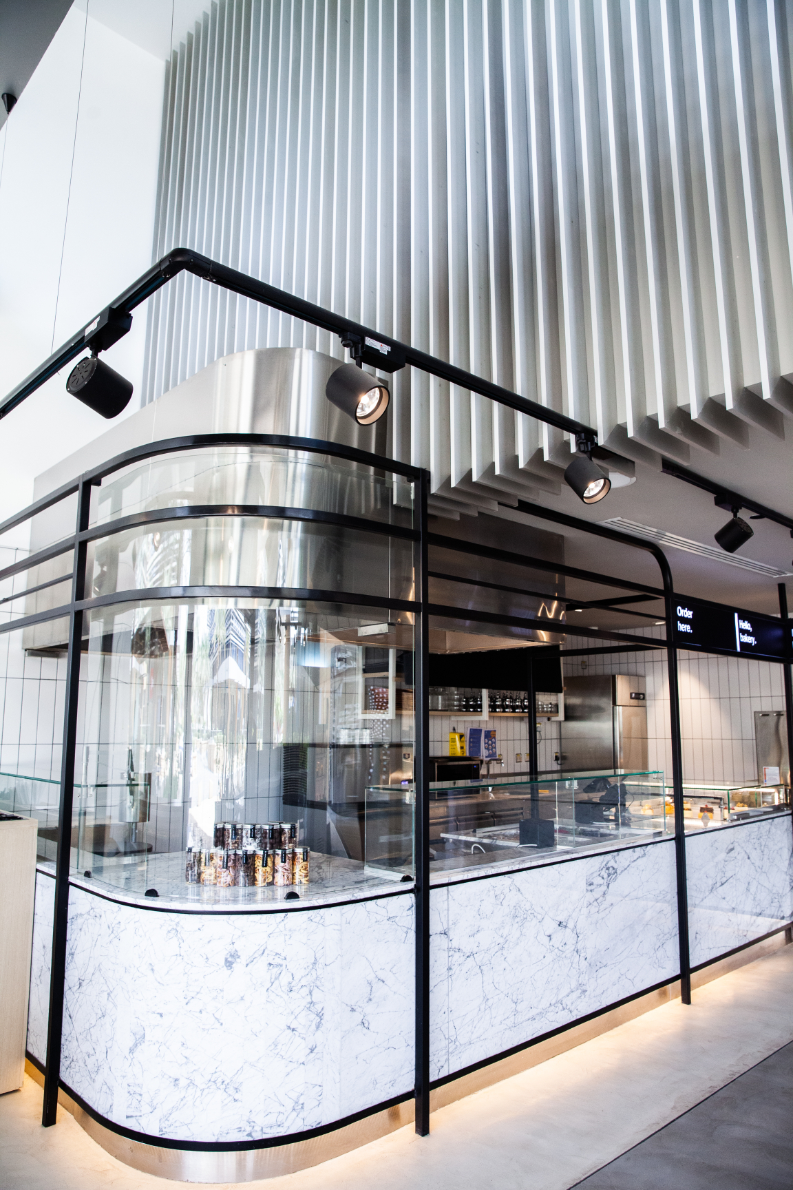
The larger of the two new locations is called Chunk Social as it is a space to leisurely dine and socialise throughout the day, while savouring a variety of dishes. Chunk DQ is on the other hand, is dedicated to take-aways and quick service focusing on cakes, crepes and coffees.
Already having established a successful dessert concept with the first Chunk, the client wanted a refreshed approach to the design of the two new locations while retaining the branding styles and guidelines. The goal was to refine the concept and H2R Design was called in to translate their vision into tangible models.
H2R DESIGN - Chunk DQ
H2R DESIGN - Chunk DQ
H2R DESIGN - Chunk DQ
After studying the brief, viewing the locations, and understanding the client’s vision, H2R Design decided to focus on preserving the identity of Chunk but to also uplift the personality with a design that was more in-tune with the concept. With the inspiration to keep it raw, transparent and honest, a minimal interior design was developed keeping the space clean, fresh and neutral. This allowed contrasts to be revealed against the canvas and to let the menu do the talking.
“The inspiration of this project resulted in a design that is simple and refreshing. The secret to creating something that visually appears to have a modest sophistication and seems quite simple, is actually in the detail, which makes the space flow seamlessly. Whether it is the way the edges of the frames are slightly rounded, or the transitions and trims in the terrazzo flooring are spaced, and how they are aligned with the frames of the perimeter glazing, it’s the detail that unites the space into one,” Hasan and Husain Roomi, Co-Founders of H2R Design said.
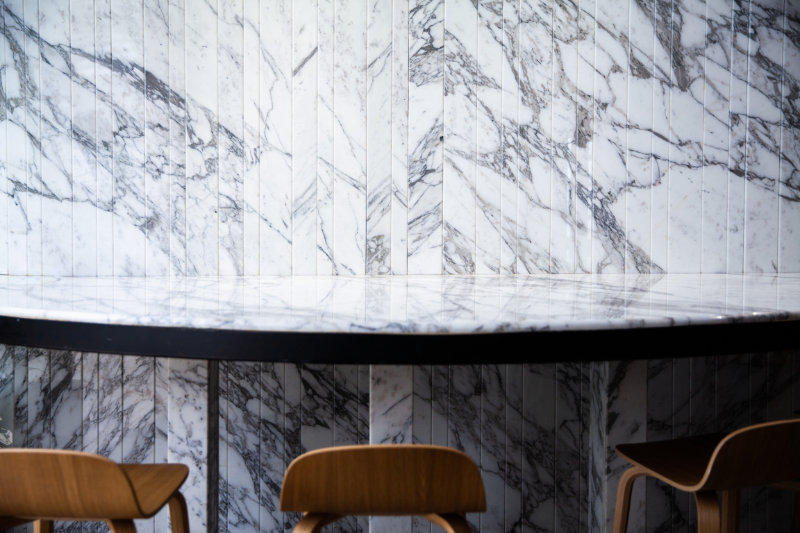
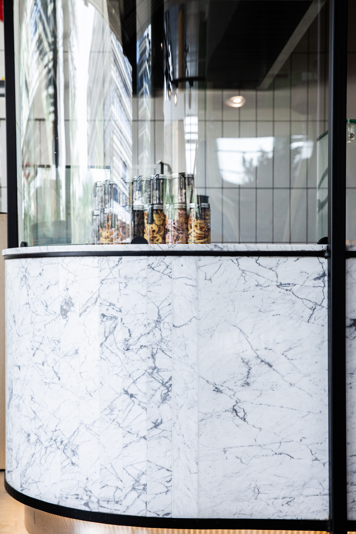
“The delicate routing of the marble slabs or the carefully aligned shadow gaps to each joinery piece, demonstrate the intricacy and the attention to detail reflecting the concept’s ideology. It is further translated through the dinning offering and the overall experience of the space,” they continued.
The colour palette of this project can be defined as refreshing and neutral with concrete, stainless steels and black metal as the predominant chromaticity across the locations.
H2R DESIGN - Chunk Social
H2R DESIGN - Chunk Social
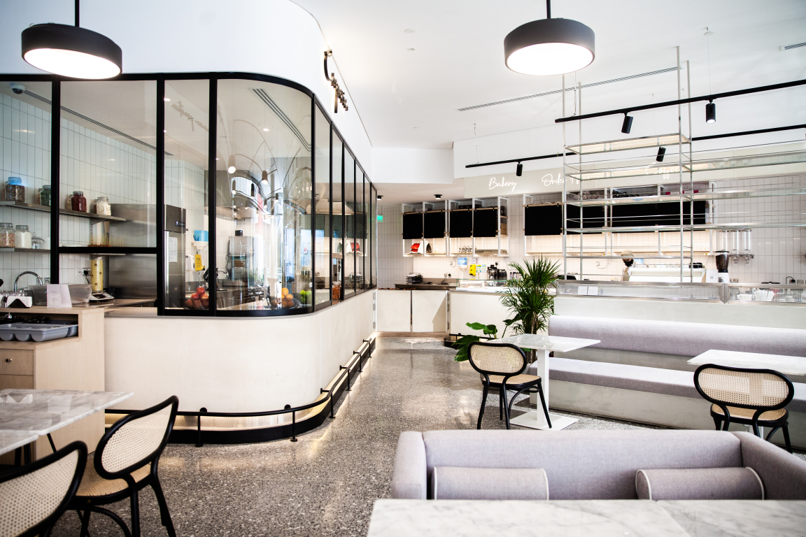
A striking design feature in Chunk Social is the terrazzo flooring, which was placed as a statement facet since the rest of the design is so pure and minimal. However, with the canvas space at Chunk DQ being much smaller, sheer micro-topping was used to cover the floor versus the terrazzo which would have made the space claustrophobic.
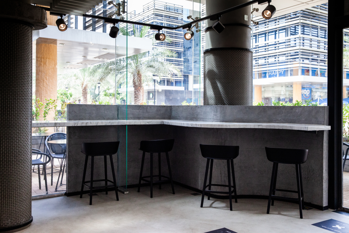
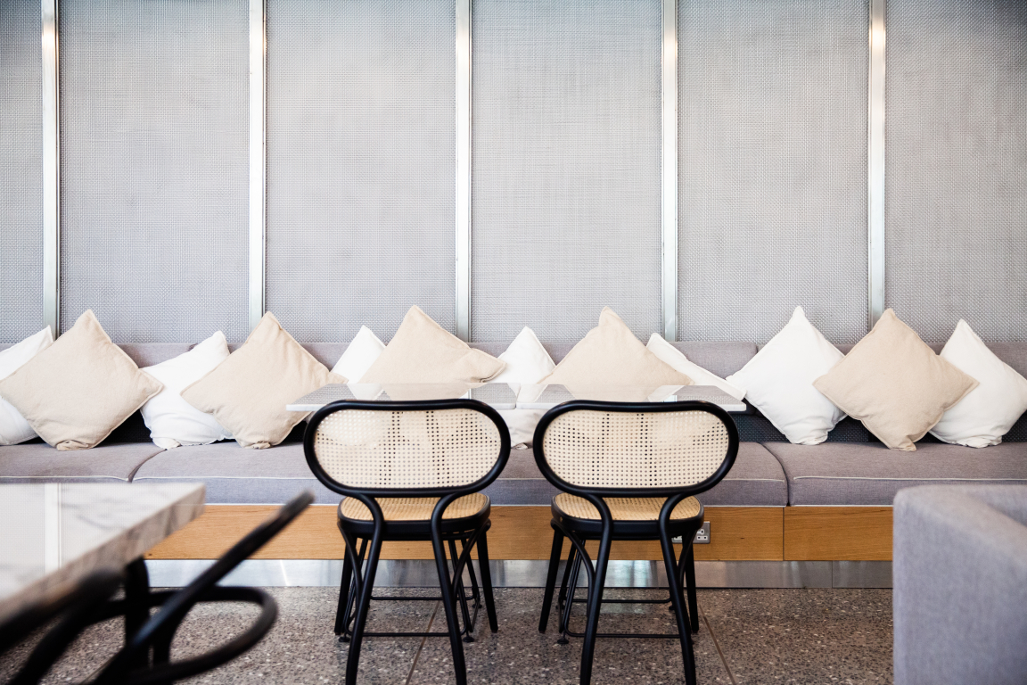
Above the flooring, clean and neutral micro-topping fasciae appear with timber detailing in the banquettes to add warmth, along with rattan and designer furniture pieces. Black framing on the walls, in the furniture and in the lighting grid add an elegant contrast to the neutral materials.
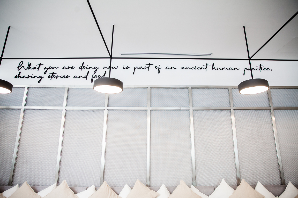
The crisp white ceiling and light grey textured walls reinforce the minimal fresh vibe. Elements such as the hanging shelving in Chink Social subtly divides the restaurant’s dining space and the counters, while maintaining a harmonious connection from one section to the next. Stainless steel is another prominent element. It has been placed in its untainted form, with no powder coating or electroplating. It is stripped back to its purest form for an authentic look. Concrete micro-topping on the counters and the joinery items has created a powdery neutral mood. In contrast, black metal was implemented into the design to juxtapose the neutral toned materials.
The space in Chunk Social celebrates transparency from the way the creperie and the open counter are designed. Minimal and accessible, with visible shelving, the open counter and creperie tease diners with glazing for the smell of the mouth-watering desserts and speciality coffees.
The contrasting features of the design are expressed by the white tiles against the dark walls or the micro-topping facets with stainless steel counter tops and framework of shelving. In Chunk Social, marble table tops umbrella-ed by marble walls, subtly convey the refinement, the unassuming luxury and savvy sophistication of the space. Additionally, there is a marbled column where H2R Design has created a cantilevered style ledge as well as the shopfront’s main signage panel.
H2R DESIGN - Chunk Social
H2R DESIGN - Chunk Social
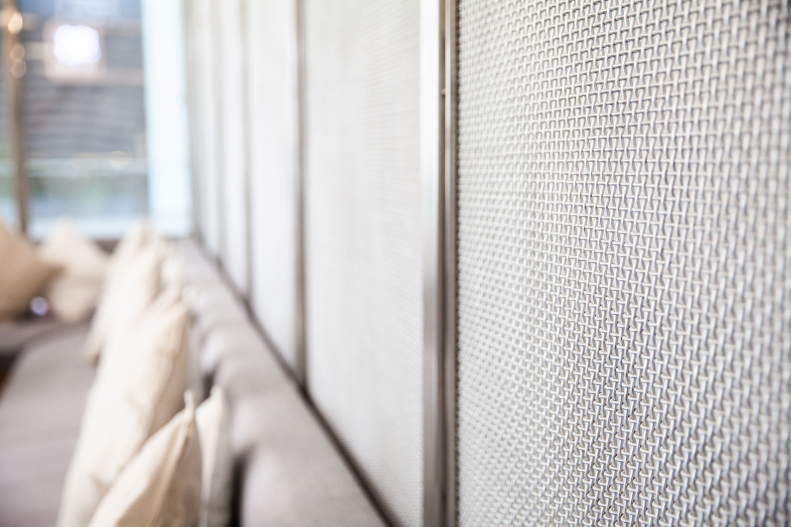
Fine mesh was added to create some depth and layer to the raw materials. It was also artfully used as a partition between the central banquette, the shelving display behind it, and to the perimeter wall and windows, to add depth and texture.Elements of greenery that pop against the canvas, almost feeling like a fresh calm oasis were adopted to create a sense of zen.
For the lighting, a simple grid was drawn, illuminating the space with large round fixtures over the dining area and track lights at the edges. All of the lighting features are in black creating a contrast against the minimal clean white ceiling. The feature lights also highlight the dining spaces, and the spots accentuate the perimeter, shelving, and façades.
While the majority of raw materials were made in Saudi Arabia, the furniture is sourced from the Italian brand Pedrali, along with an original rattan chair from Thonet and bar stools from the Danish designers, Muuto.
In addition to adding the unique design features developed by H2R Design, ideas from the original venue were migrated to the two new locations but with a revamped approach. For example, light boxes exist in the original venue. The idea was kept in the design of Chunk DQ, but H2R Design refined the shape, size and design. The updated version has slimmer frames, less reclaimed wood, more pure neutral materials, such as concrete micro-toppings and stainless steel.
More about H2R Design.


