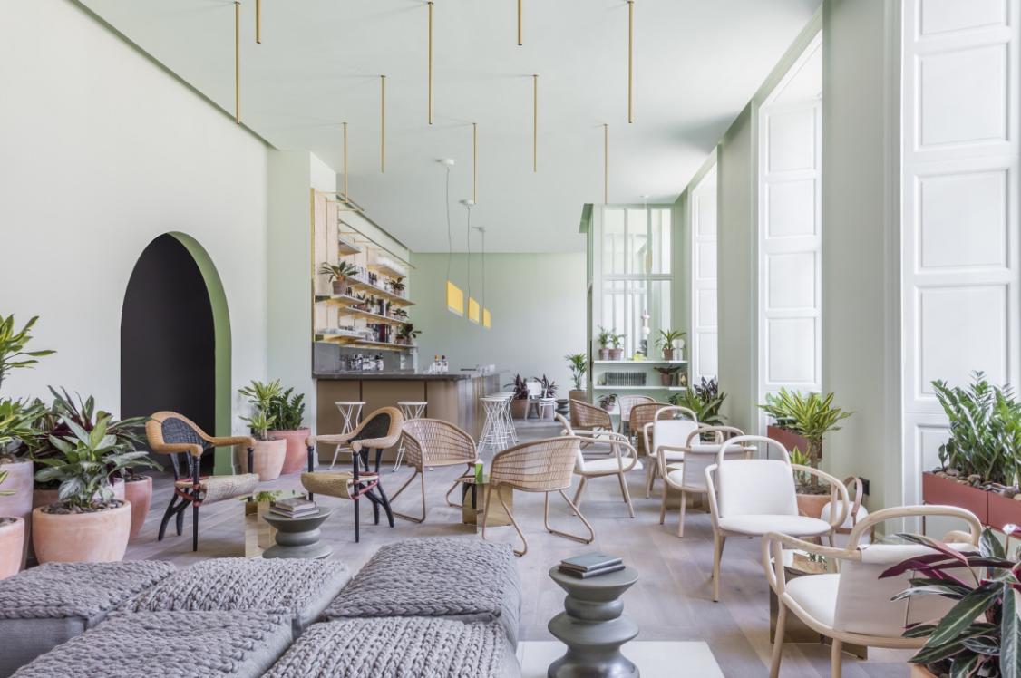
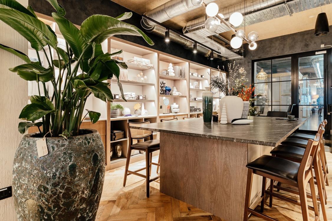
Jasper Sanders + Partners x Manchester International Office Centre: Restoring a hidden gem.
Credit: Gunner Gu
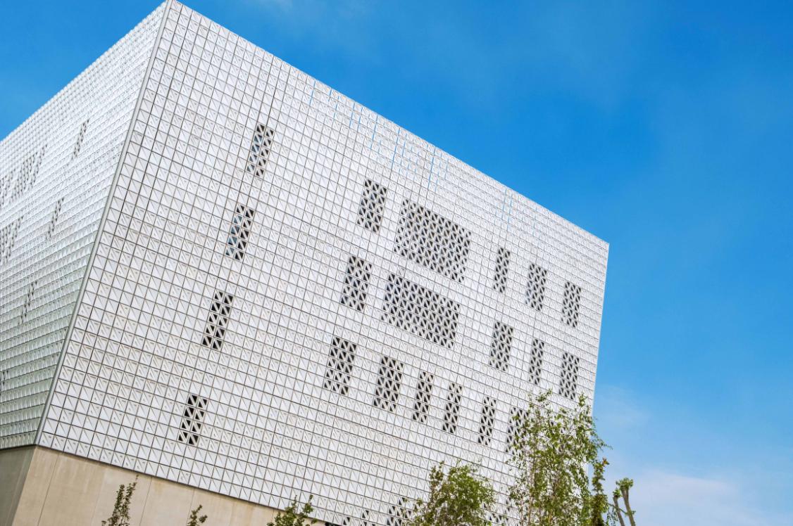
When approached to renovate the interiors of Manchester International Office Centre - a RIBA award-winning project built by Cruikshank & Seward in 1954 - the advice from Dr Richard Brook, Professor of Architecture & Urbanism at MMU (and world authority on Cruikshank & Seward) to Jasper Sanders + Partners was: don't mess it up.
Spurred on by the challenge ahead, Jasper and the team got stuck into researching the origins of the "epic building", starting with an article featured in a 1950s' black and white copy of The Architectural Review. "Interestingly, although the magazine was printed in black and white, the photograph captions gave us some fantastic insight into the colours and materials used in the original build", begins Jasper. "Exposed concrete, marmoleum, cork, leather, walnut, moulded panels and sky blue accents were all mentioned in the piece, and this gave us a great starting point for our design. We were very keen not to make it a 1950's pastiche, but to elevate the space into a destination equal to the workspaces in the city centre."
The Manchester International Office Centre is located out of town near Manchester Airport. Its original design ensured it could double up as a field hospital if needed in the Cold War - very apt that the building should be renovated during the recent pandemic. However it's this proximity to the international airport, plus a huge car park that provides a point of differentiation for potential tenants when comparing the offices to a city centre property.

Credit: Gunner Gu
Credit: Gunner Gu
Credit: Gunner Gu
For the design, in order to give the building longevity, trends were shunned in favour of "classic modern", with the approach to undertake a gradual renovation rather than update every part of the space at once. Jasper Sanders + Partners started with the lobby.
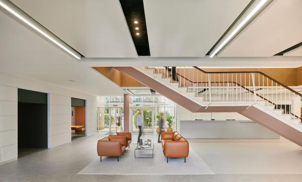
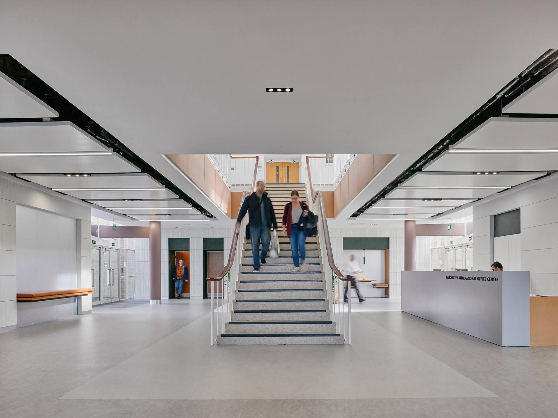
"The aim of the lobby is to make it feel like walking into the lobby of a hotel, with the focal point being a grand staircase in the centre. Being true to the original design, we've used stainless steel for the staircase with a marmoleum floor and cork for the inside of the stair opening. The cork material has been designed as an underlay. It's not designed in a way that you should see it. And it's not particularly attractive. But, on a tight budget it's cheap and sustainable, so very effective.
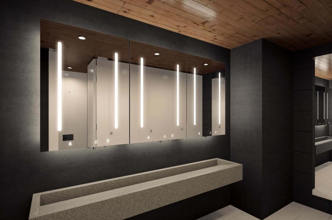
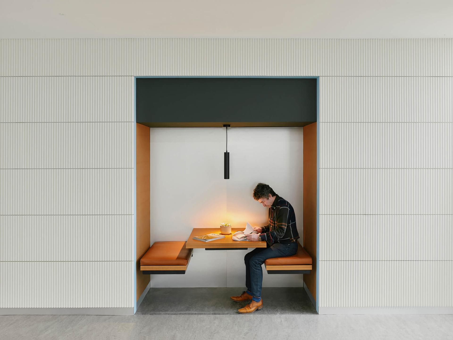
"The lobby is a very big space and there's a huge amount of circulation. So you come in through the entrance, you've got the staircase in the middle, you've got circulation around each side of the staircase, plus a reception desk. We built out at the back by a metre and a half to set the bathrooms into a recess to make them more discreet. And then on the other side we created a four person booth to sit at and then a bench next to the lift for informal meetings. It's a very usable space."
Credit: Gunner Gu
Credit: Gunner Gu
Credit: Gunner Gu
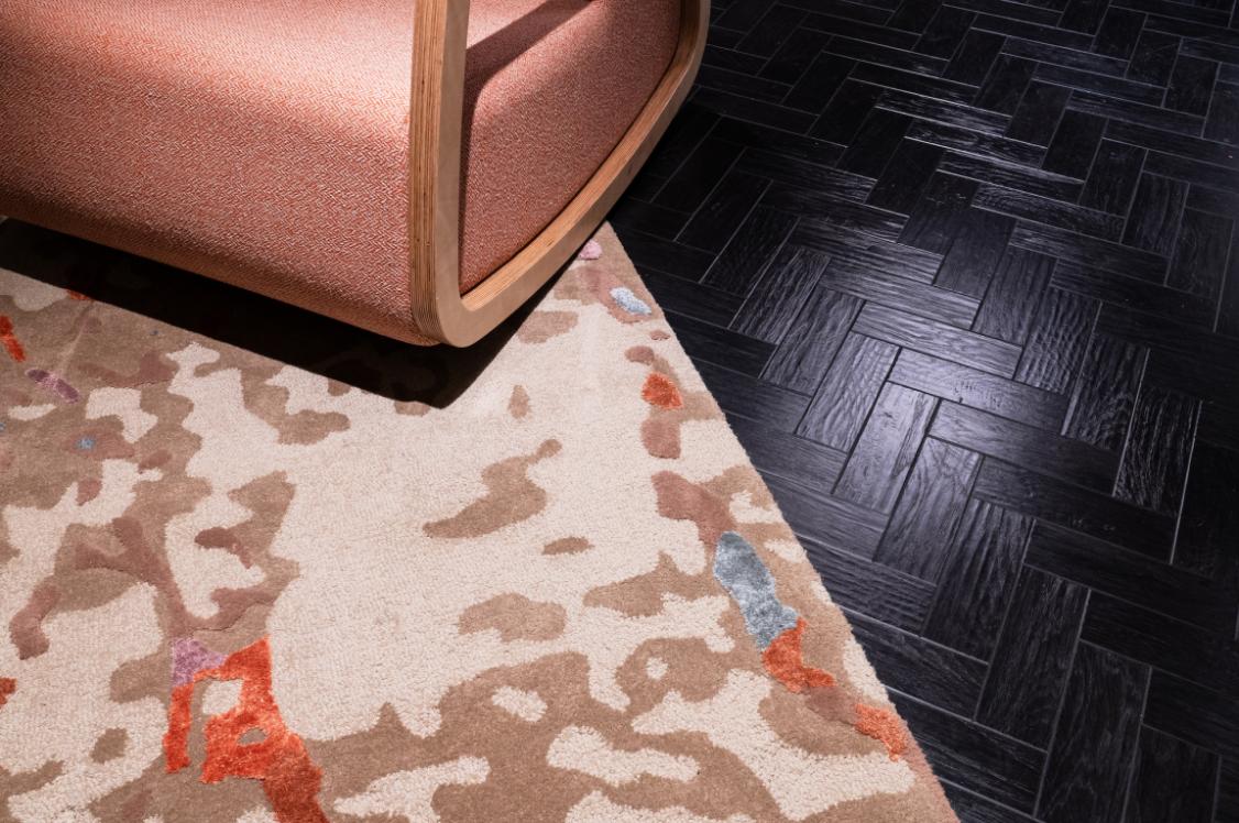
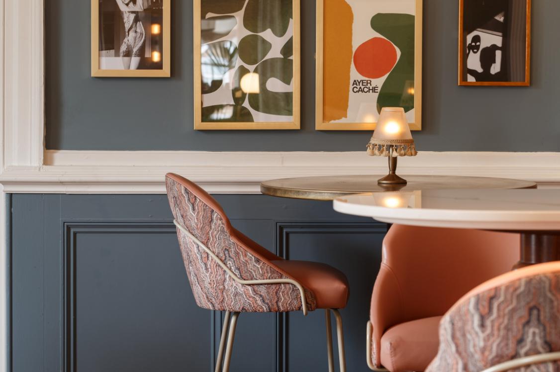
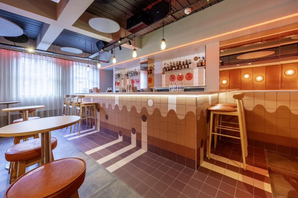
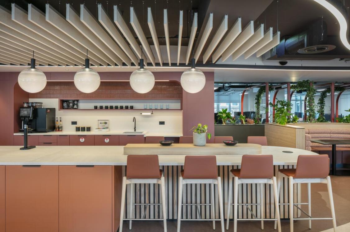
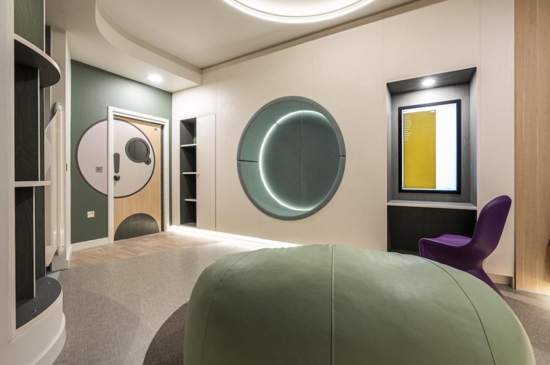
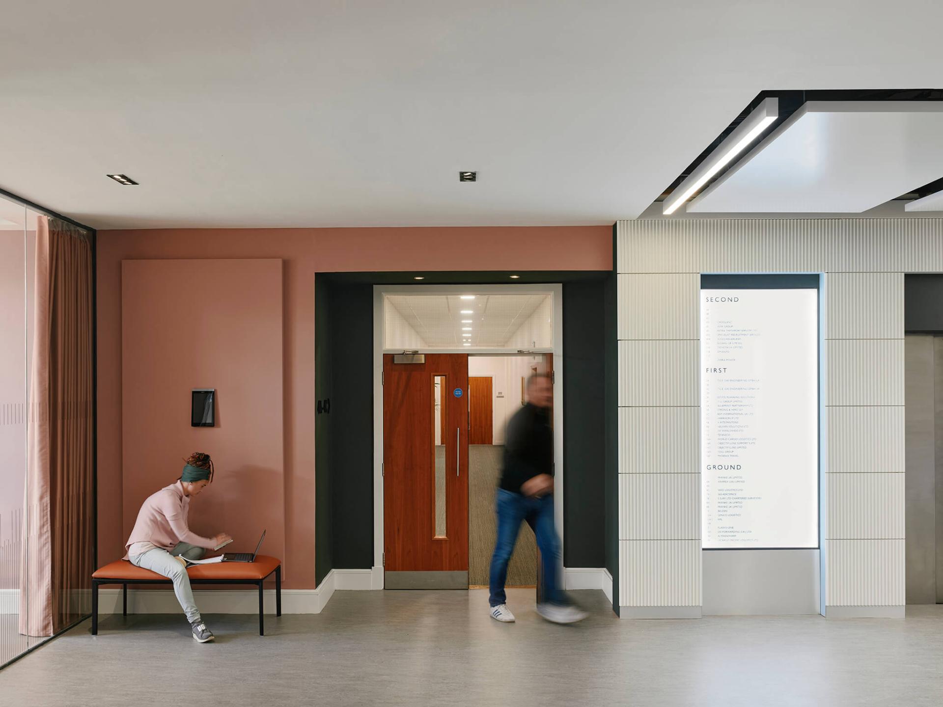
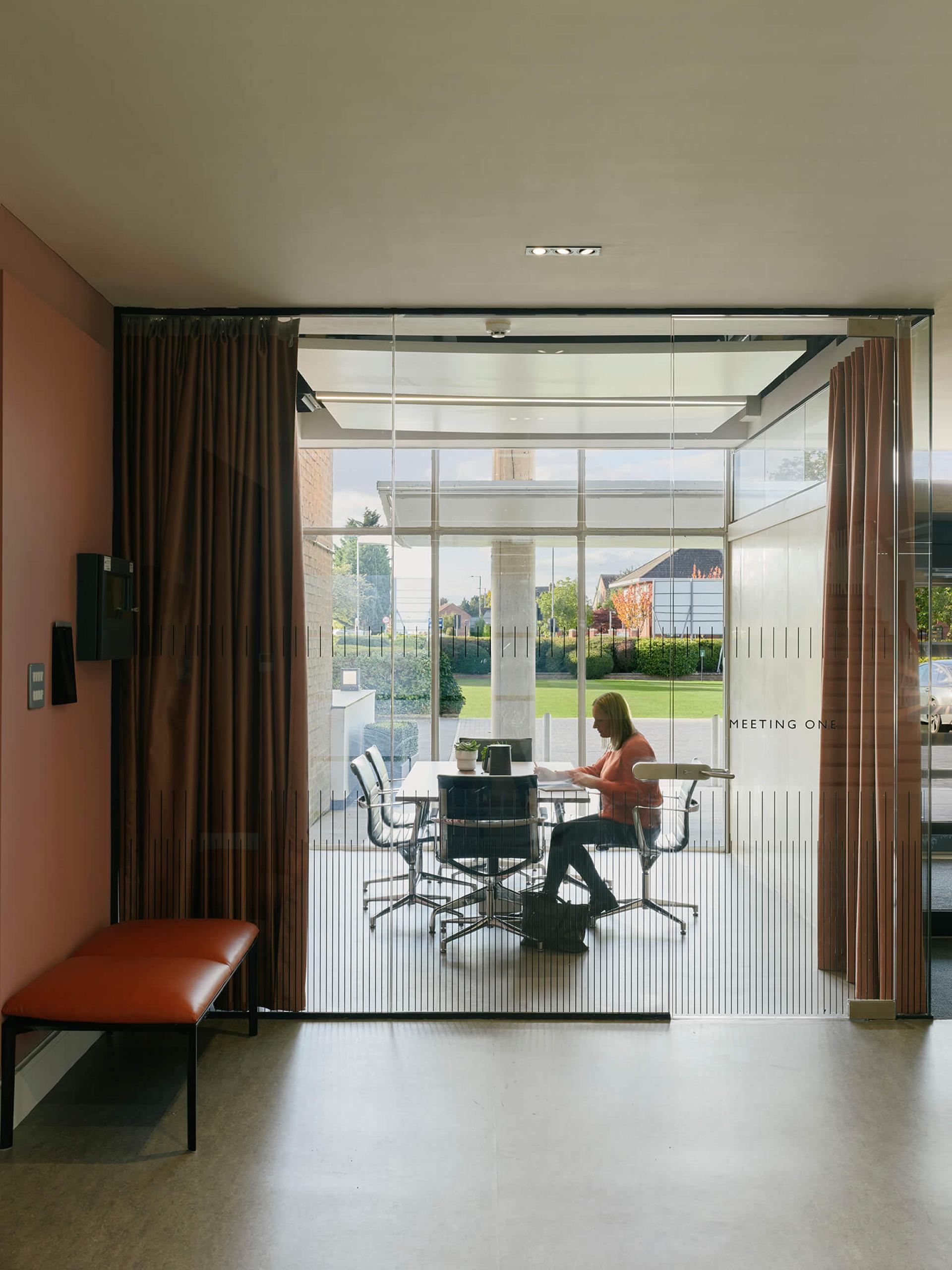
In keeping with the original colour palette - as mentioned in The Architectural Review article - heritage colours of warm pink and dark green are set against an eyeliner of blue. Leather furniture lends to the overall contemporary classic feel.
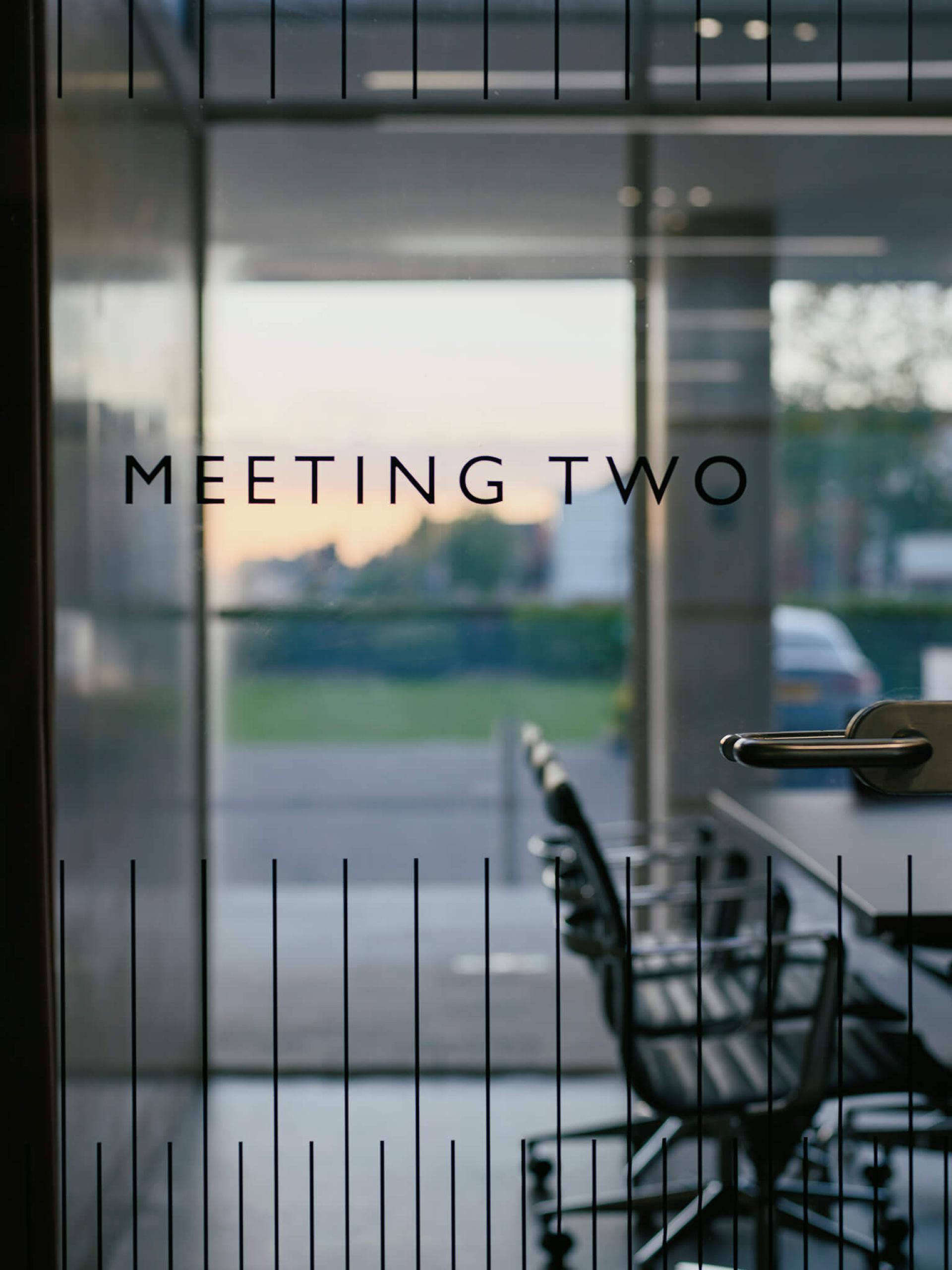
Similarly, the signage was given a modern/heritage makeover. Gill Sans font was chosen as a natural fit for the 1950s' modernist building - also the font of the London Underground, and popular with locations associated with travel, including the nearby airport.
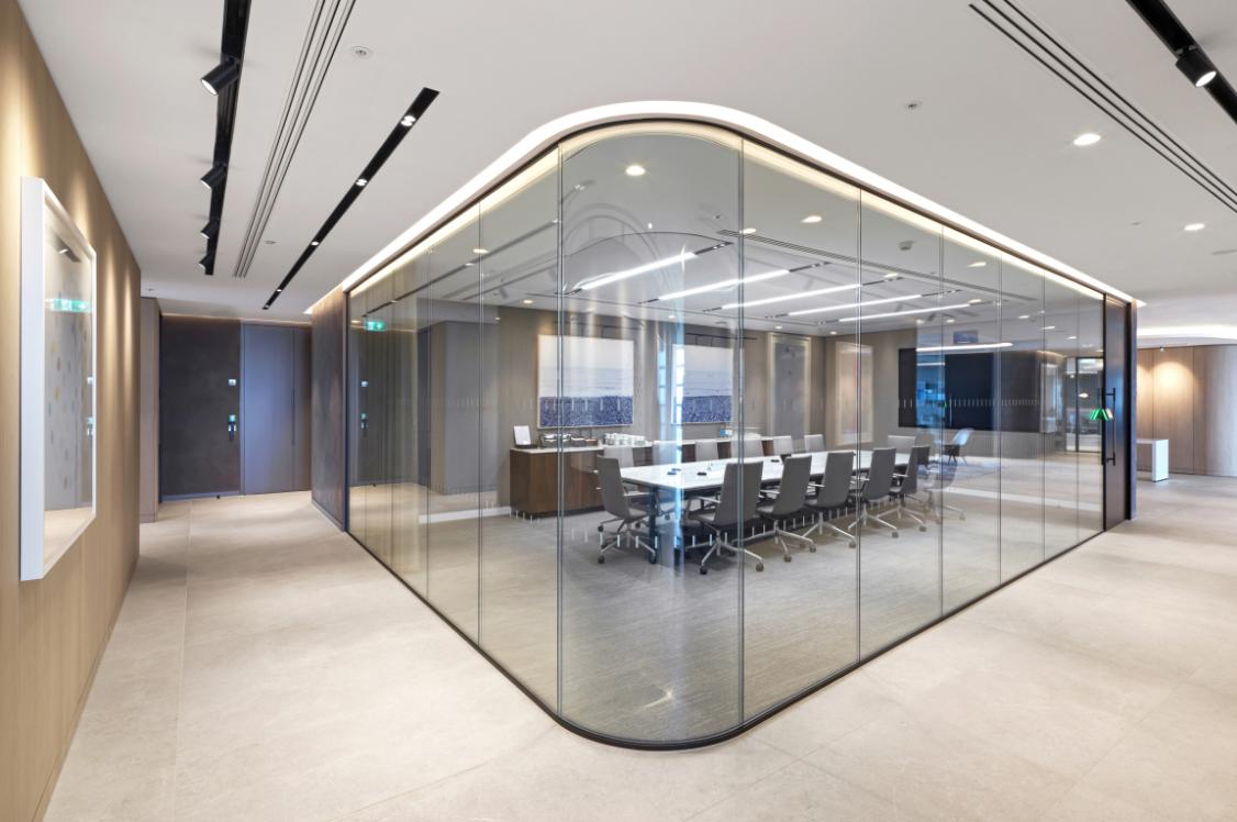
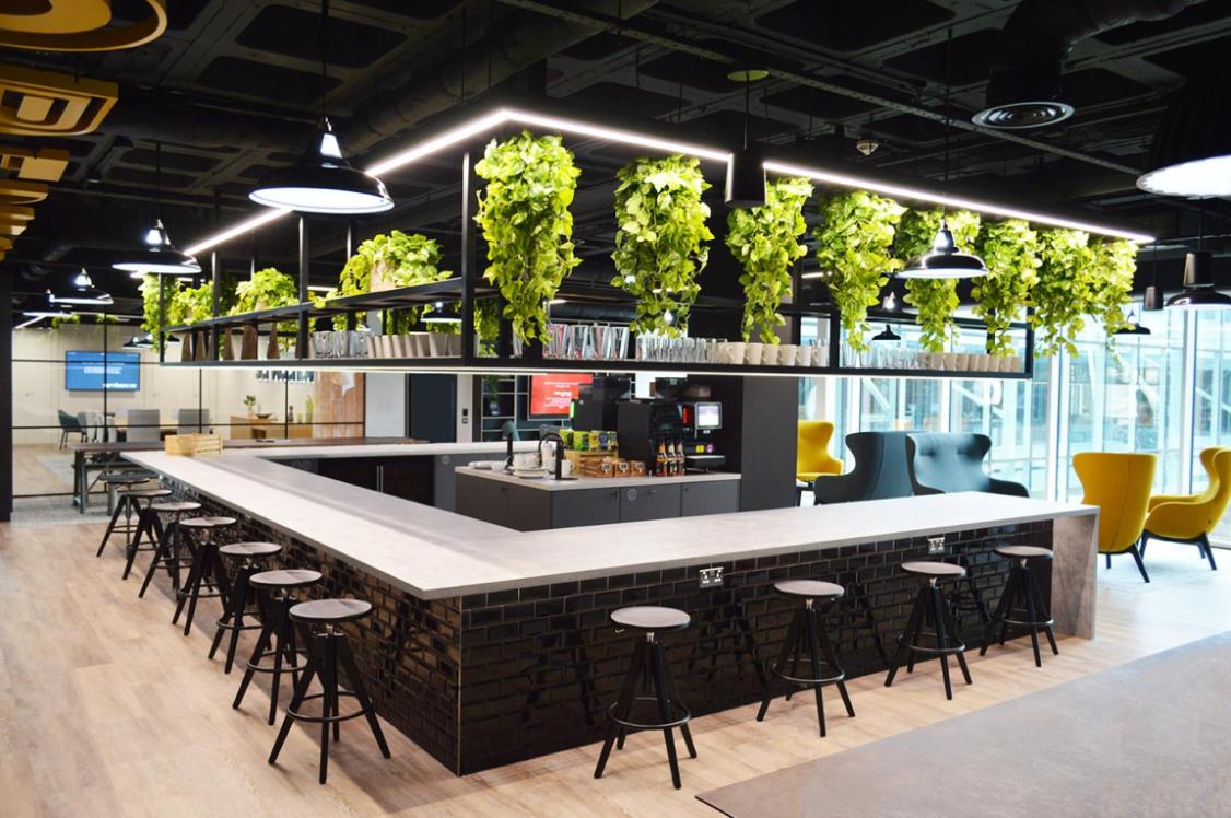
Rather than a restoration, this is a reinvention. While paying homage to heritage we've breathed new life into an architectural icon, making it a facilitator of work fit for the future of workplace.
Client Liam MacCarthy, TillAM commented: "With Jasper Sanders + Partners, we have spent considerable time carefully restoring and refurbishing this landmark building. Manchester International Office Centre is now a successful place for modern business with a unique brand identity. We are thrilled with the studio’s work, which has transformed a series of redundant spaces into vibrant places focused upon delivering business success."


