Jose Kennedy of Auric Design on building a business through grit, determination, care & collaboration.
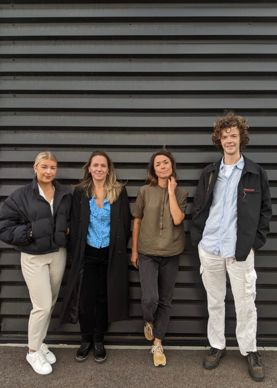
Auric Design is an independent, Manchester-based design studio working within the residential and commercial sectors.
Specialising in creating unique and meaningful spaces that put people first, the team applies the Studio's ethos ‘Collaborate, Care, Create’ to everything they do. And the results, whether for a workspace or an apartment scheme are never anything less than beautiful.
Keen to chat more about Auric's journey so far, we recently caught up with founder Jose Kennedy and her team. From blurring boundaries across commercial and residential, to upcycling and office slides, here's what we covered...
Firstly, can you please introduce us to Auric Design?
"We are an independent design studio based in Manchester, we’ve been trading for 18 months and are currently growing and continuing to build our foundations to cement our position within the industry.
"It has taken a tremendous amount of vision, grit, and determination to build the business which emerged from a belief that everybody should have access to great design that will enhance their home, work, and leisure environments. We consider it a privilege to be able to have a positive impact on our clients’ day-to-day lives and we believe beautiful and considerately designed spaces do exactly this.
"We are dedicated to delivering exceptional customer service and collaboration is key. I like to remind my team the importance of this when developing concepts and communicating with clients. Yes, we are the experts and hold the knowledge and creative skills, but ultimately, we are providing a service and client satisfaction is our number one priority."
You work across commercial and residential schemes – are you finding that, increasingly, there is crossover between the two?
"Yes, particularly if we look at office space and how dramatically it has changed over the last 10 years. Staff well-being and comfort are now vital to the success of any workspace design. This is driving employee retention, and, in a world where those in their 20s are expected to change job roles and career paths more frequently than ever before, there’s a pressure on companies to attract and retain bright new talent. Having a space that is acutely considerate of the needs of its employees could mean securing and keeping the right people.
"We all remember when Google started putting slides in their offices. This was seen as unconventional and whacky at the time. Of course, not every office now has to have a slide! But there is an expectation for more than just a desk and somewhere to make a brew. We are now taking a much more holistic approach."
Is there a crossover with residential?
"There are definitely more ‘home comfort’ type amenities included in office design these days, but we also need to strike a balance, the workplace has to motivate and promote productivity, we believe spaces that nurture collaboration are a significant factor in this.
"We see trends echoed between commercial and residential spaces too, it’s not uncommon for residential clients to ask for something similar to what they have seen in a bar/restaurant at the weekend, be it a light fitting, paint colour, tile etc.
"For us, though, there is still a clear distinction between the two and we do approach commercial and residential schemes very differently. I can’t see this changing any time soon."
Was this a trend that emerged post pandemic? Or was it something you’d seen before?
"This crossover was present before, however, because of the isolation we all suffered at the hands of the pandemic we now crave a sense of community, which brings us back to designing spaces that allow employees to connect and collaborate. More than ever the workplace must engender a sense of community for a business to thrive."
Does collaboration play a part in what you do?
"Yes massively, we could not operate without collaboration. I think I’ve mentioned it several times already! Collaboration with clients, each other, suppliers, contractors; I genuinely believe that open, honest communication and the sharing of ideas is what fosters great design. In fact, collaboration is so important to us that it is one of our three company values: ‘Collaborate, Care, Create’.
"We really do work hard to listen and fully understand our clients and their ideas, design is always a collaborative process. Relationship building is at the heart of what we’re about. We want all parties to feel valued, appreciated, and heard."
How important is materiality, and sustainability, in your work?
"We need to strike a balance between design, cost, and materiality. For us it’s about doing the absolute best that we can do with the resources we have. We repurpose materials wherever possible, in one of our projects an old takeaway counter became a bar top, for example. If a client wants to clear out their old furniture to make way for new, we always do our utmost to make sure it is rehomed via various social/websites.
"Something I would hope makes a massive difference is that we do not subscribe to trends. Working closely with clients and creating spaces that are truly unique to them should mean that they stand the test of time. We commission a lot of bespoke furniture pieces too, quality craftsmanship and items that are built to last are all part of the bigger environmental picture."
You and the team are regulars to Material Source Studio – how is it supporting your work?
"MSS has been an invaluable resource for us. We don’t have an office to speak of, so we mostly work remotely. Of course, we are in constant communication with each other but to have a space where we can collaborate (there’s that word again!) face-to-face is a real godsend. The space is so beautifully designed and the exhibits from the partners so well curated, as a team, we take a lot of inspiration from the space.
"The seminars have been an incredible resource too, knowledge is power and all that! They also give us the chance to network with other designers, manufacturers, and suppliers. To bring the conversation back round to community, that’s how it feels when we are at MSS- part of a very special community."
What are you currently working on?
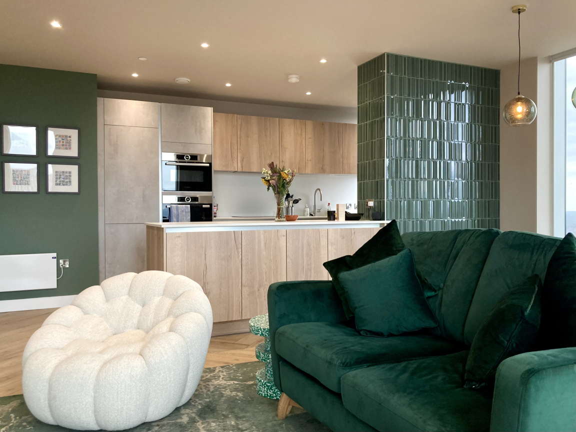
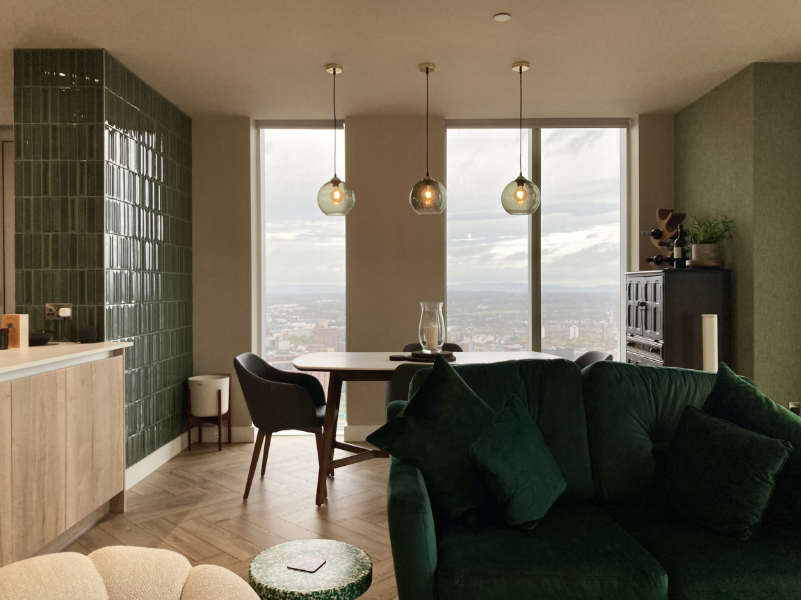
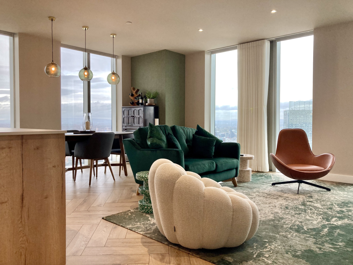
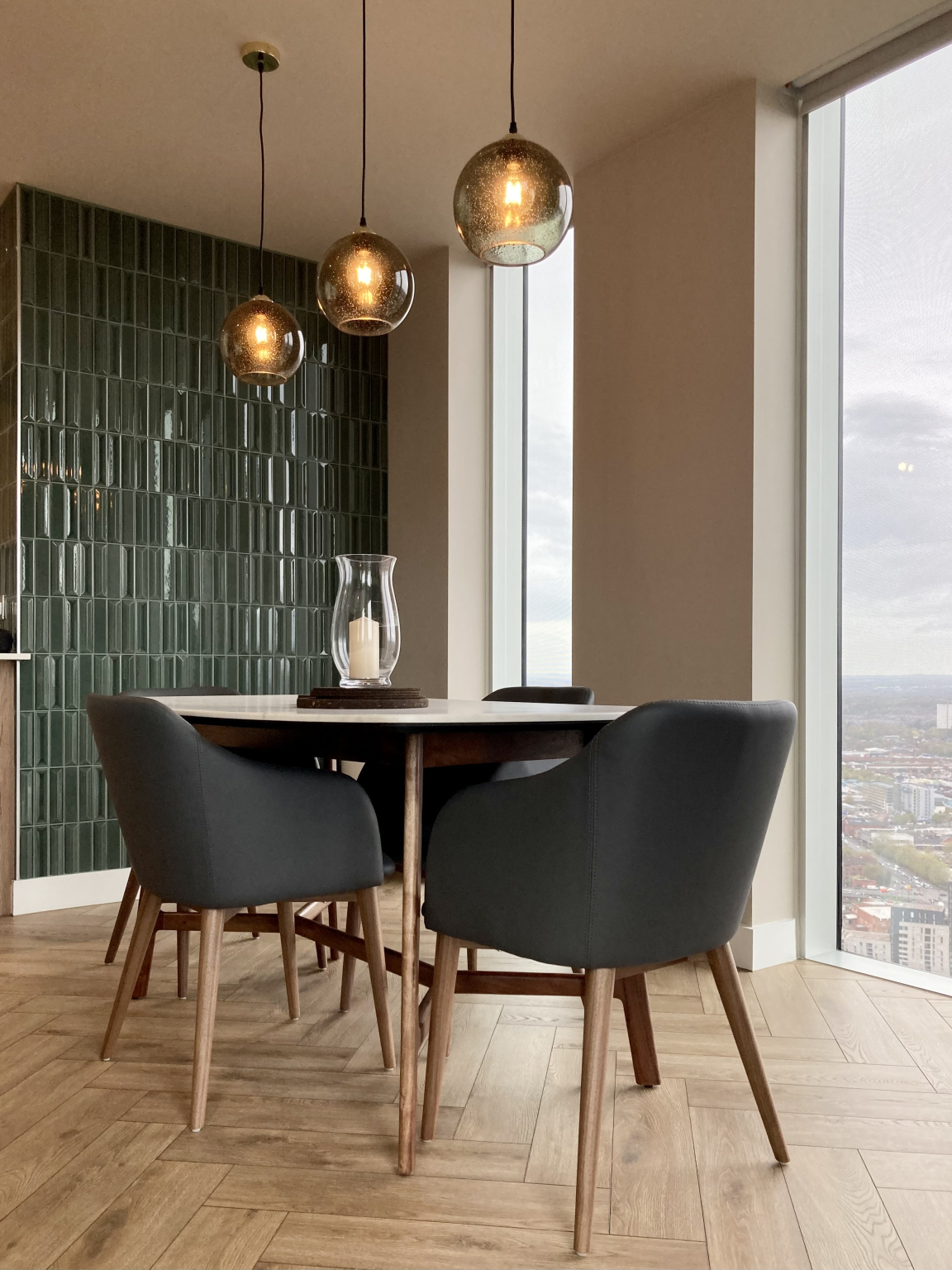
"An apartment on the 47th floor of Elizabeth Tower, Crown Street with phenomenal views across the city. The apartment was a blank canvas and relatively non-descript aside from the most jaw-dropping floor-to-ceiling windows. We focussed our efforts on the natural light that pours into the property in abundance and wanted to create a continuation of the feeling of light and space so that we could extract a sense of freedom. We achieved this by choosing furniture with low-profile forms, allowing the space to feel as open as possible. A large feature rug offers a distinct but very gentle demarcation of areas.
"We also incorporated various biophilic elements, to echo themes of outside within the apartment. This was an absolute must given the views that the property has to offer. Green hues, natural wood and stone, wallcoverings and living plants, particularly of the larger leaf variety, have all been introduced.
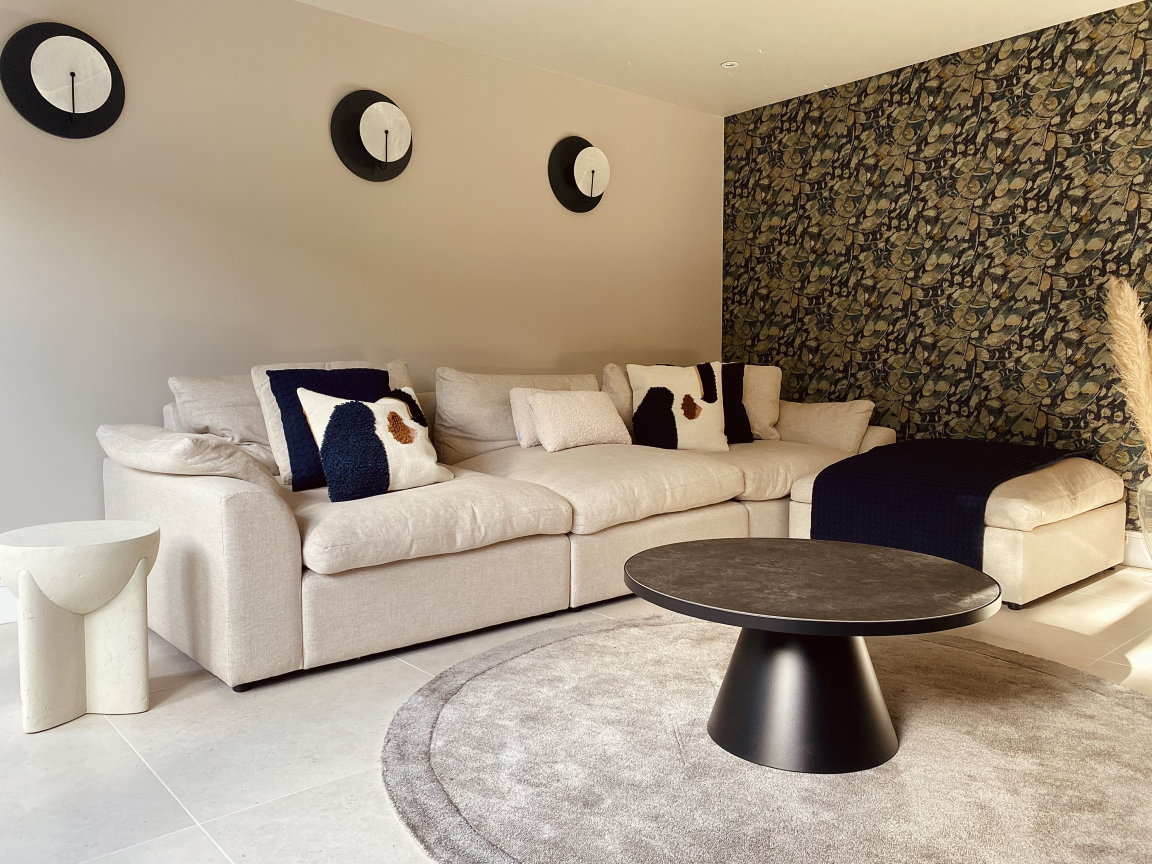
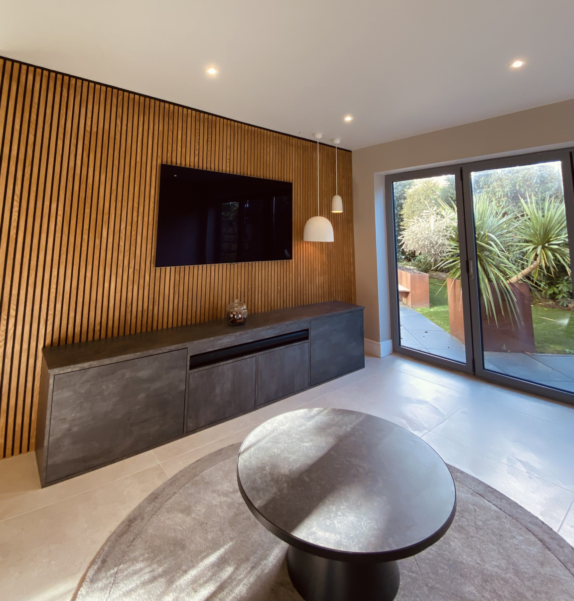
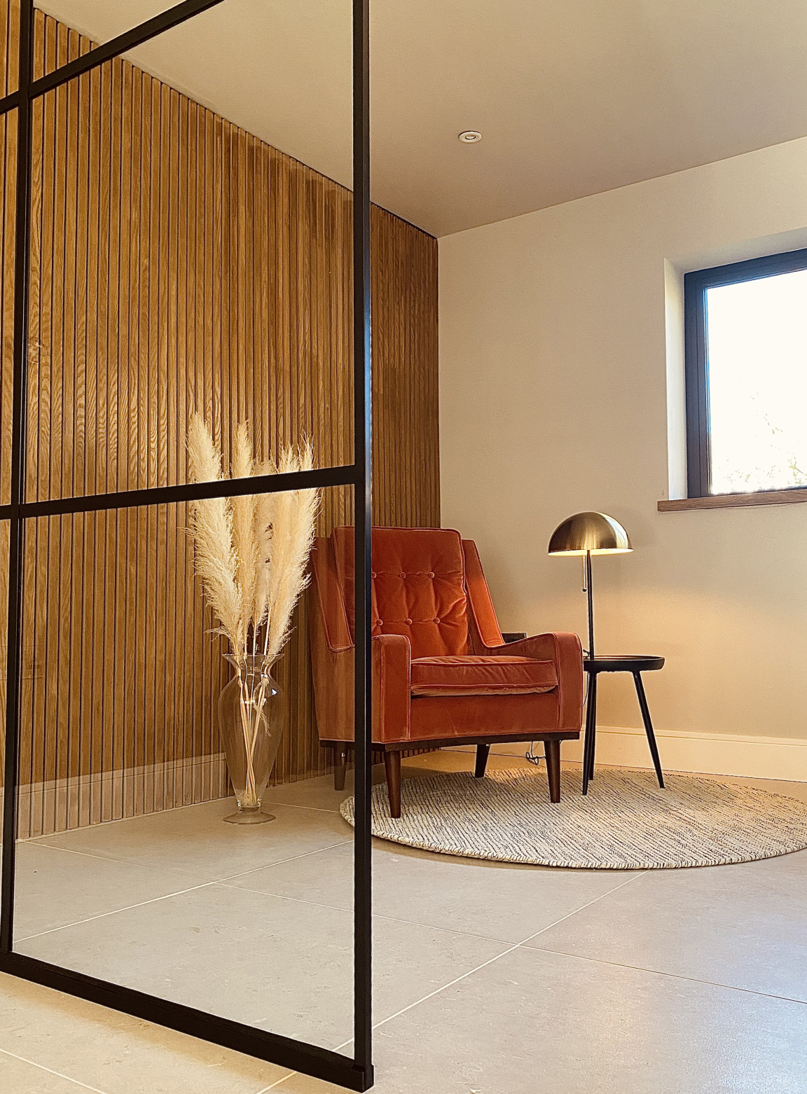
"We’re also working on a residential property in Prestbury. The property required a complete reconfiguration of the downstairs space. Our client came to us with the idea of combining four separate rooms to create one multi-functional family living area. We worked hard to choreograph the space which now boasts a seamless fluidity and is adaptable to each of the family member’s very different needs. The designs relocated the kitchen from the front to the rear of the property, where views of the garden can now be enjoyed. The space feels open yet has very defined areas for work and leisure. Two partition walls and crittal doors were used to help achieve this.
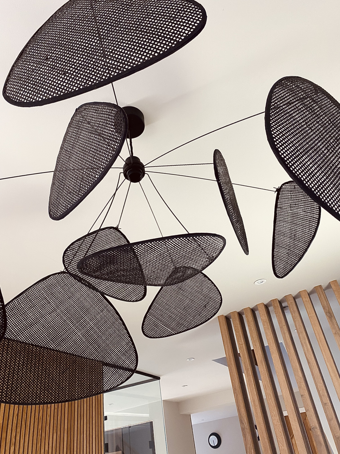
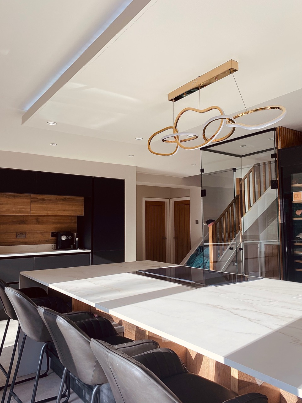
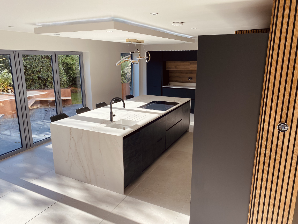
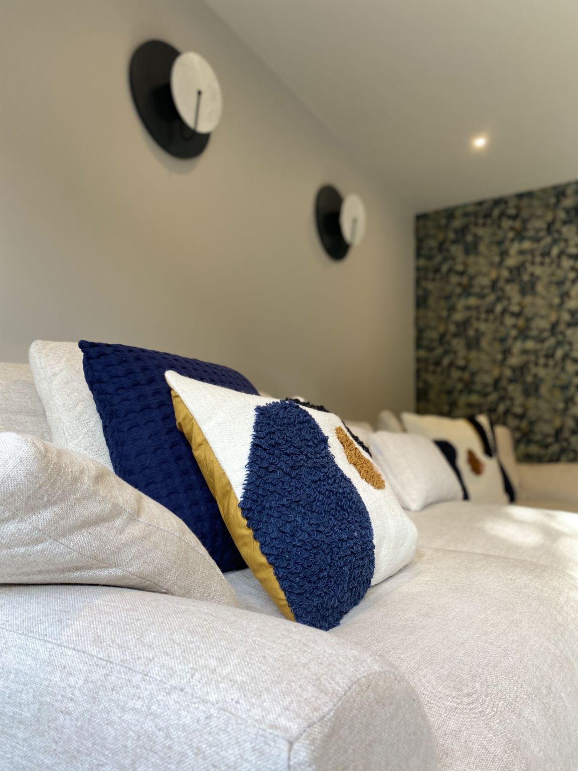
"A striking, contemporary aesthetic is balanced with a homely feel. Distinctive black accents and gun metal furniture pieces are softened with the subtle, warmer tones present in the flooring, paint colours and heavy oak features. We designed and commissioned a bespoke desk and sideboard, both are exceptional furniture pieces and tie the space together well. A highlight of the property is the kitchen island which features a beautiful Dekton worktop spanning a whopping 3 metres!
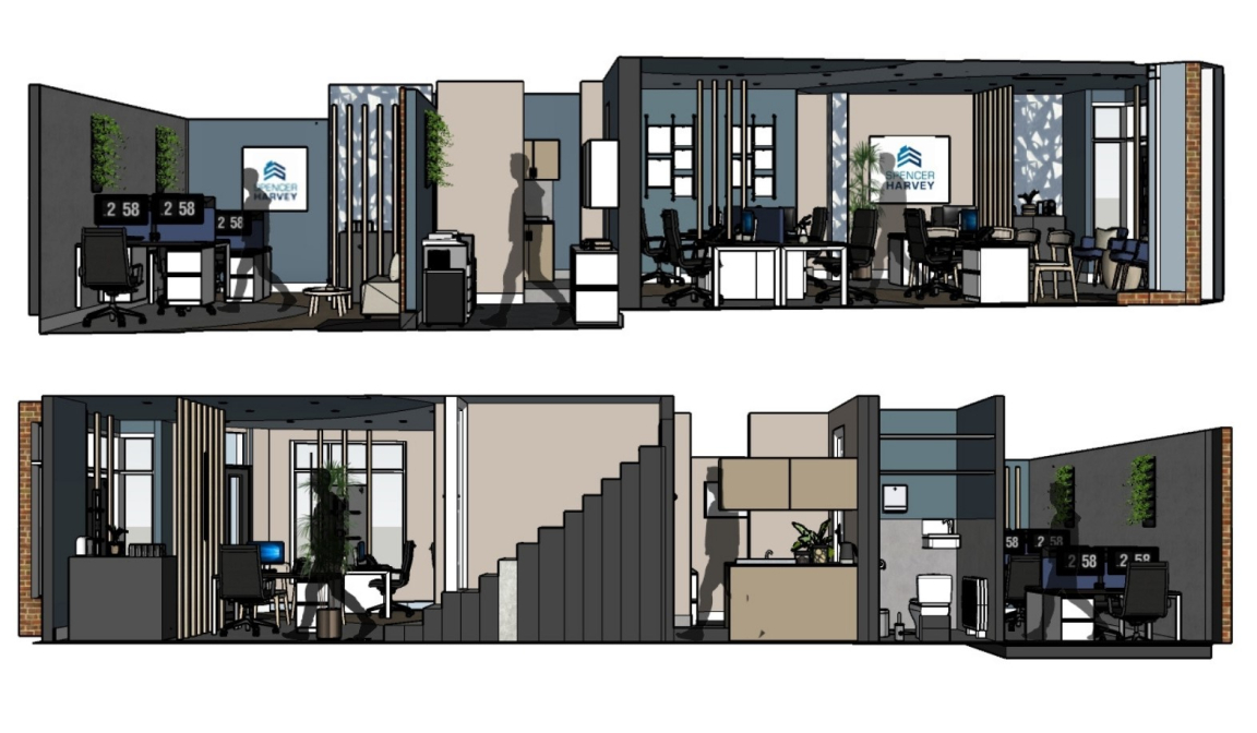
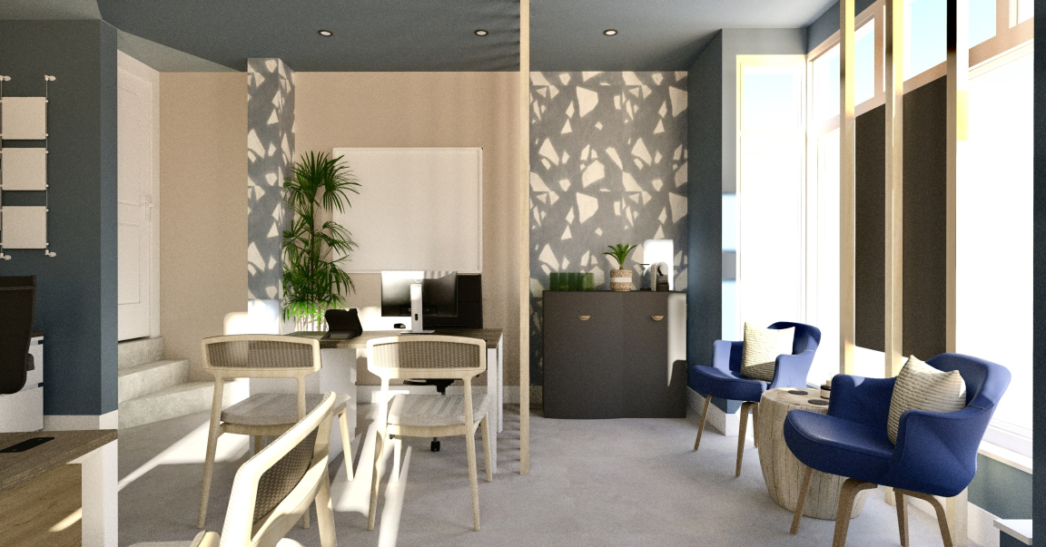
"Spencer Harvey is a well-established estate agent based in Stockport. They wanted to reinvigorate their office space and create somewhere that would energise and inspire their employees. The space needed to be mutli-faceted and incorporate a variety of different working areas. Individual workstations, reception area, storage options, kitchen, staff room and meeting rooms were all priorities. Creative space planning meant that we were not only able to meet these requirements, but we also managed to create extra breakout areas for staff to enjoy.
"The company was keen to reflect their branding throughout the space, we were mindful of this when choosing materials, colours, and finishes. One of the most striking elements of the design are various feature walls finished with a blue and white terrazzo tile from the Ergon Medley range. The tile works so harmoniously with their logo. The space is set to become a physical representation of the Spencer Harvey brand and we’re really excited for its completion!"
And what’s next?
"We are a small team of four, with copious amounts of enthusiasm and talent, we each bring a unique set of skills to the table. It’s now 18 months since we rebranded as Auric. In that time, we have taken on commercial projects and have had a slew of residential work. We want to expand our portfolio even further and thrive on the creative opportunity that each new project brings. We don’t know what the future holds yet but are anticipating great things!"


