Katie Lea, design director at NoChintz on elevating healthcare setting Medika Clinic to a cocoon of comfort.
Manchester-based, multidisciplinary studio, NoChintz, was called upon by its client Medika Clinic to reinvent the traditional healthcare setting for its Spinningfields site.
Keen to avoid any clinical references within the scheme, Katie Lea, design director, explains the team's revitalising concept involved looking back in order to present a timeless yet future-facing solution.
We sat down with Katie to find out more about how NoChintz transformed the notion of a healthcare setting from hospital-like to high-end.
Can you please give us an overview of this project?
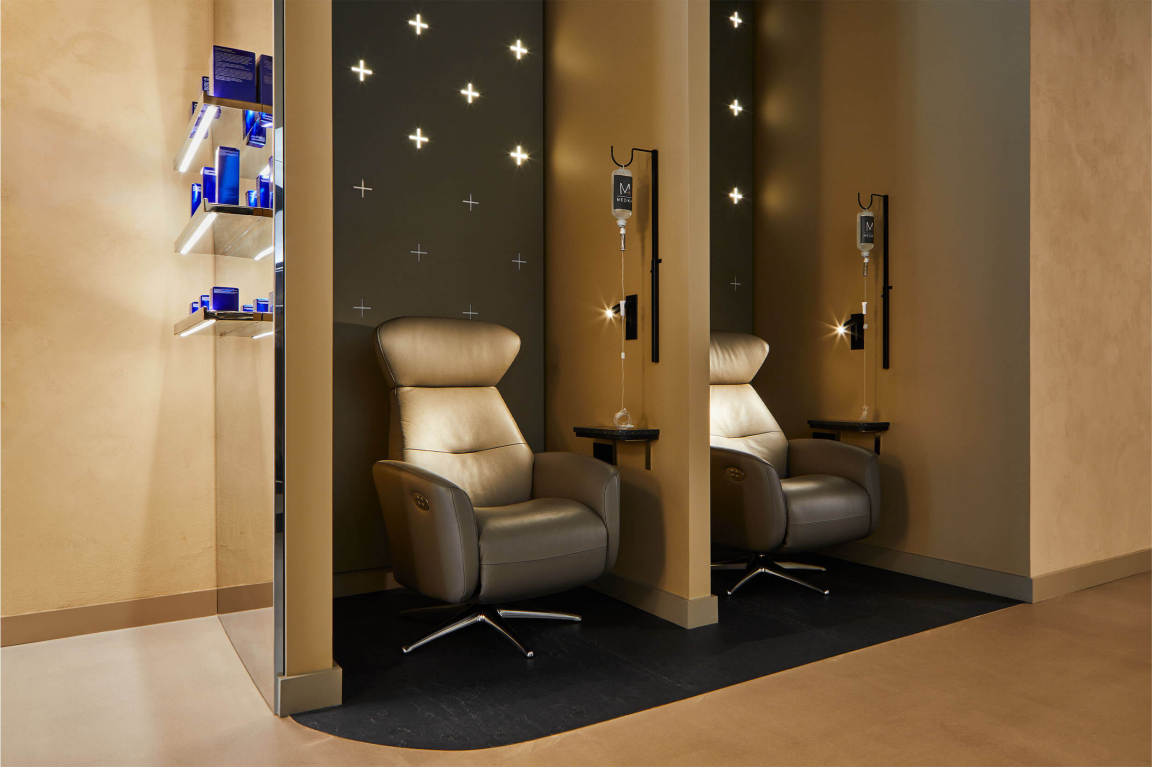
"Medika Clinic is a wellness centred aesthetics clinic located in Spinningfields, Manchester. Founded by doctors and ran by medical professionals, the 100sqm ground floor unit houses 3 private treatment rooms and 2 IV pods, alongside comfortable reception spaces with refreshment facilities and retail products."
What was the main source of inspiration behind the scheme?
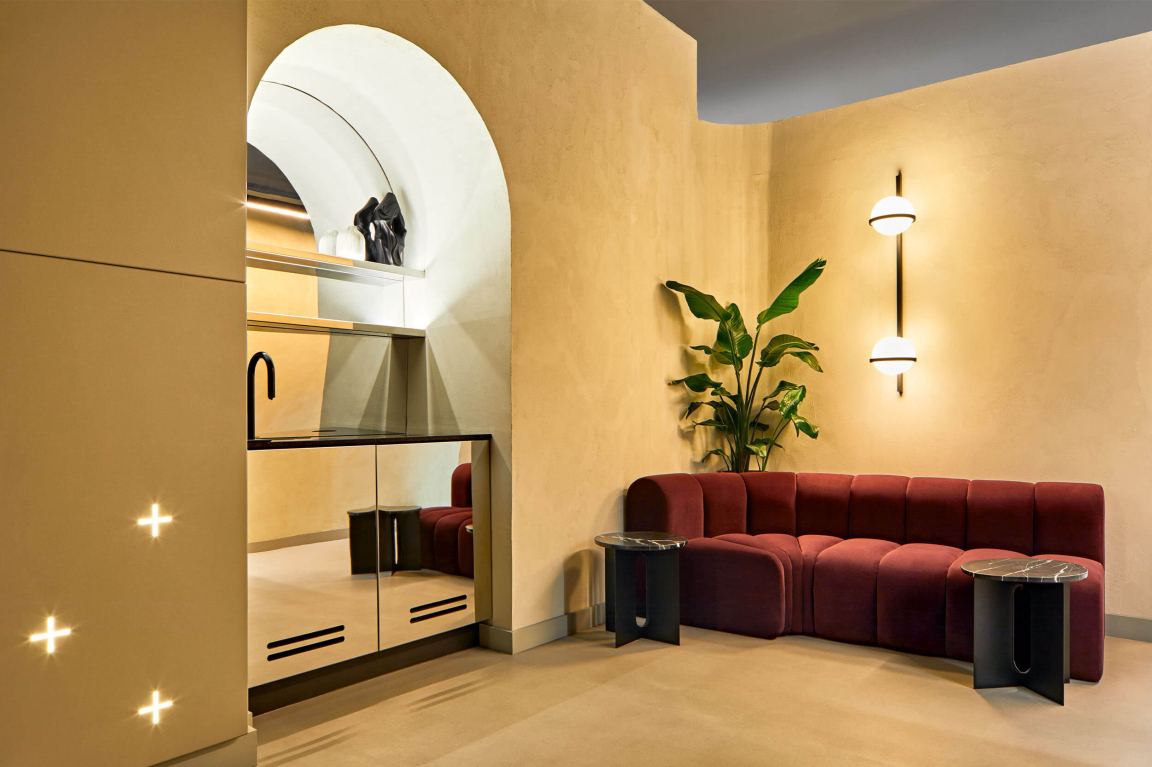
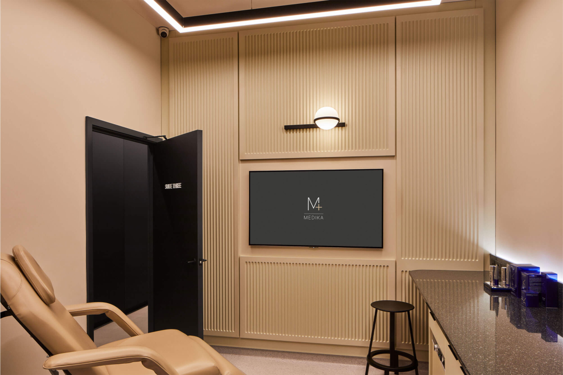
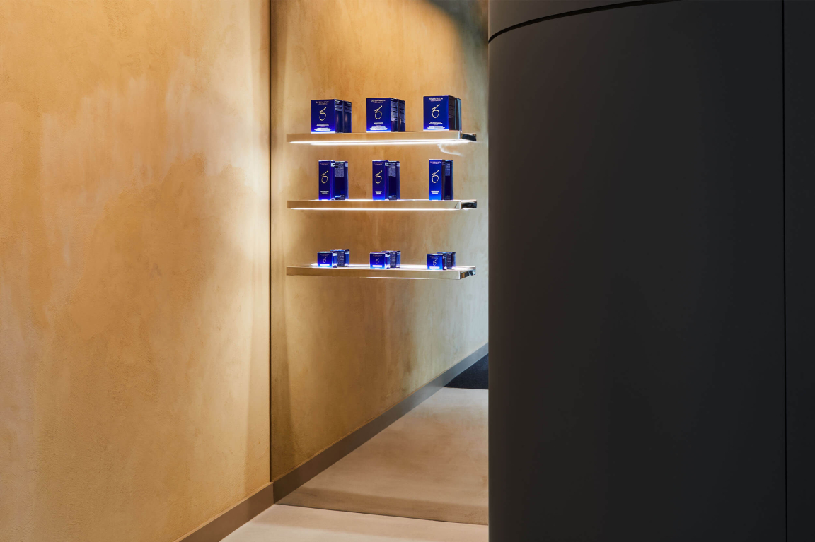
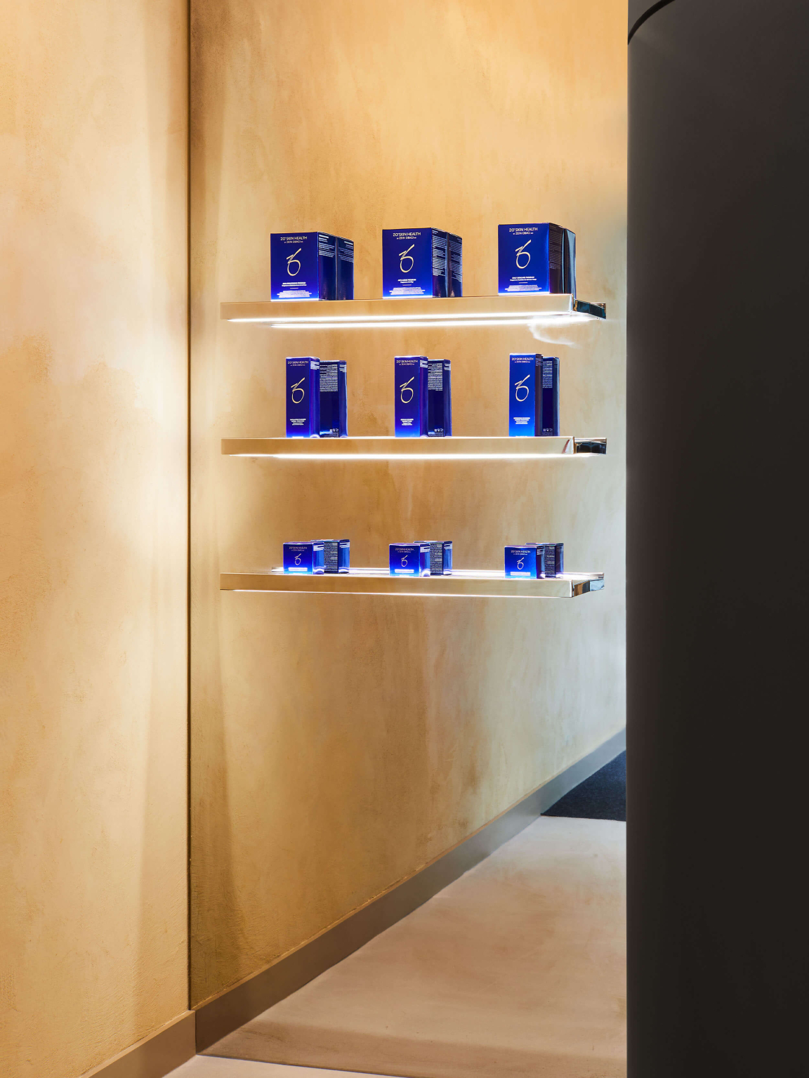
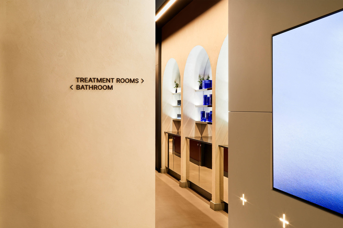
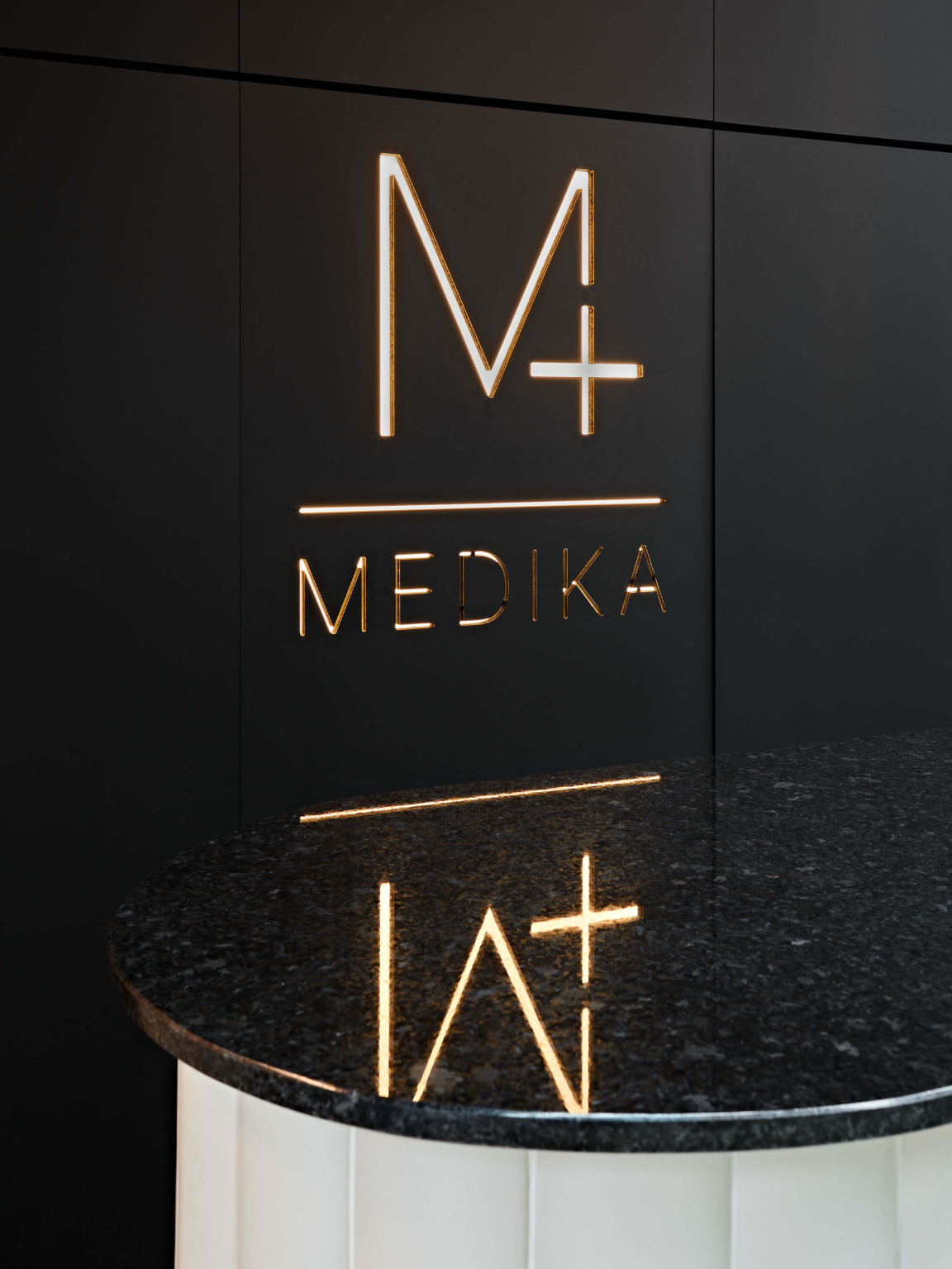
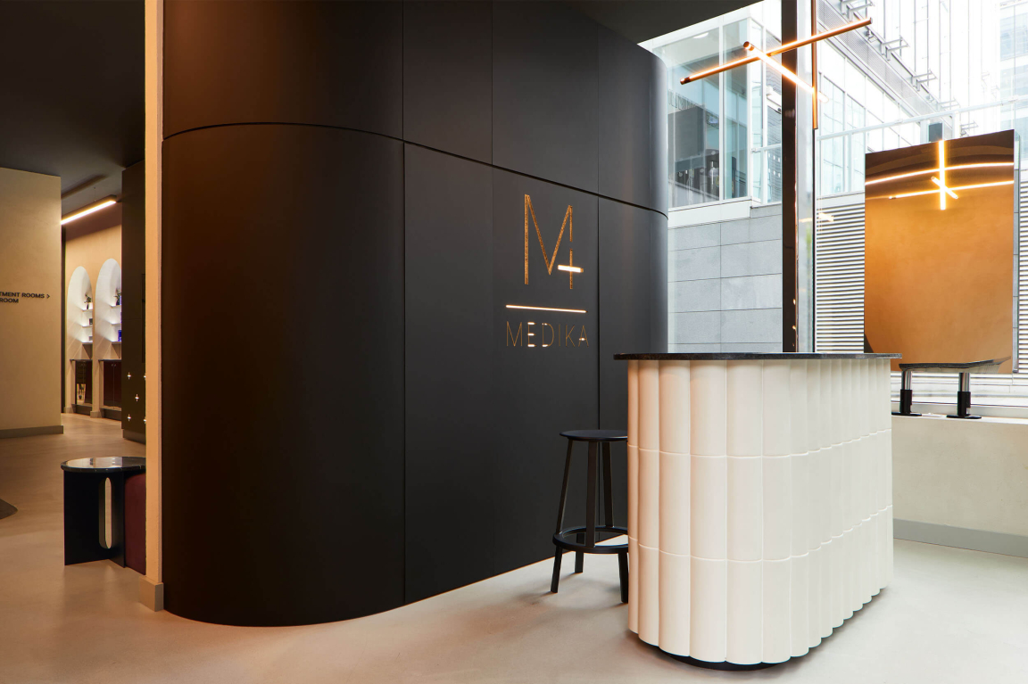
"The concept for Medika was born from a desire to create a clinic which reinvented the meaning of clinical. To be hygienic, functional and professional – but not cold. The interiors create a cocooning comfort and sense of care through the use of soft curves, which sweep the space, and highly polished metals which reflect light and have an almost window-like quality in the narrow unit. Warm neutral tones are a welcoming change from stark white walls."
How do you visually encapsulate ‘wellness’?
"We looked towards the birthplace of modern medicine to encapsulate on an authentic sense of wellness within the scheme. Italy and Greece put forward an almost Mediterranean sensibility and inspire the use of reeded tiles, terrazzo stone counters and terracotta tones. Symmetry, harmony and balance is found throughout the space with an abstract nod to Grecian forms."
Did you encounter any challenges with this project? And, if so, how did you overcome them?
"When working on a clinical space there are certain rules and regulations you have to follow to ensure it will comply to the stringent health and safety requirements needed. All surfaces had to be non porous, highly durable, easy to clean and meet the slip and fire ratings required by UK legislation – whilst still creating an aspirational, luxurious, none clinical feel.
"Detail was key to creating a scheme which allowed form and function to thrive. Bespoke, built in joinery details created high quality custom pieces which sets the scheme apart and allowed us to ensure they were fit for purpose. Sharps bins, hygiene facilities and cosmetics fridges are seamlessly integrated to neutralise the authoritative ‘hospital-like’ feel they imbue."
How did sustainability play a role in your material choices?
"Sustainability considerations play out through the minimalist approach and longevity of not just the material choices but the scheme itself. Founded on strong principals of the origins of medicine; the contemporary styling paired with traditional nods means the spaces emulates a timelessness which resonates with the clientele and is not restricted by trend.
"The materials were chosen for their durability, creating a strong and solid commitment to this physical space which becomes a cornerstone of wellness to its customers."


