Katie Lea, design director & Natalie Gray, creative director of NoChintz on storytelling, nose to tail materiality & facilitating neighbourhoods.
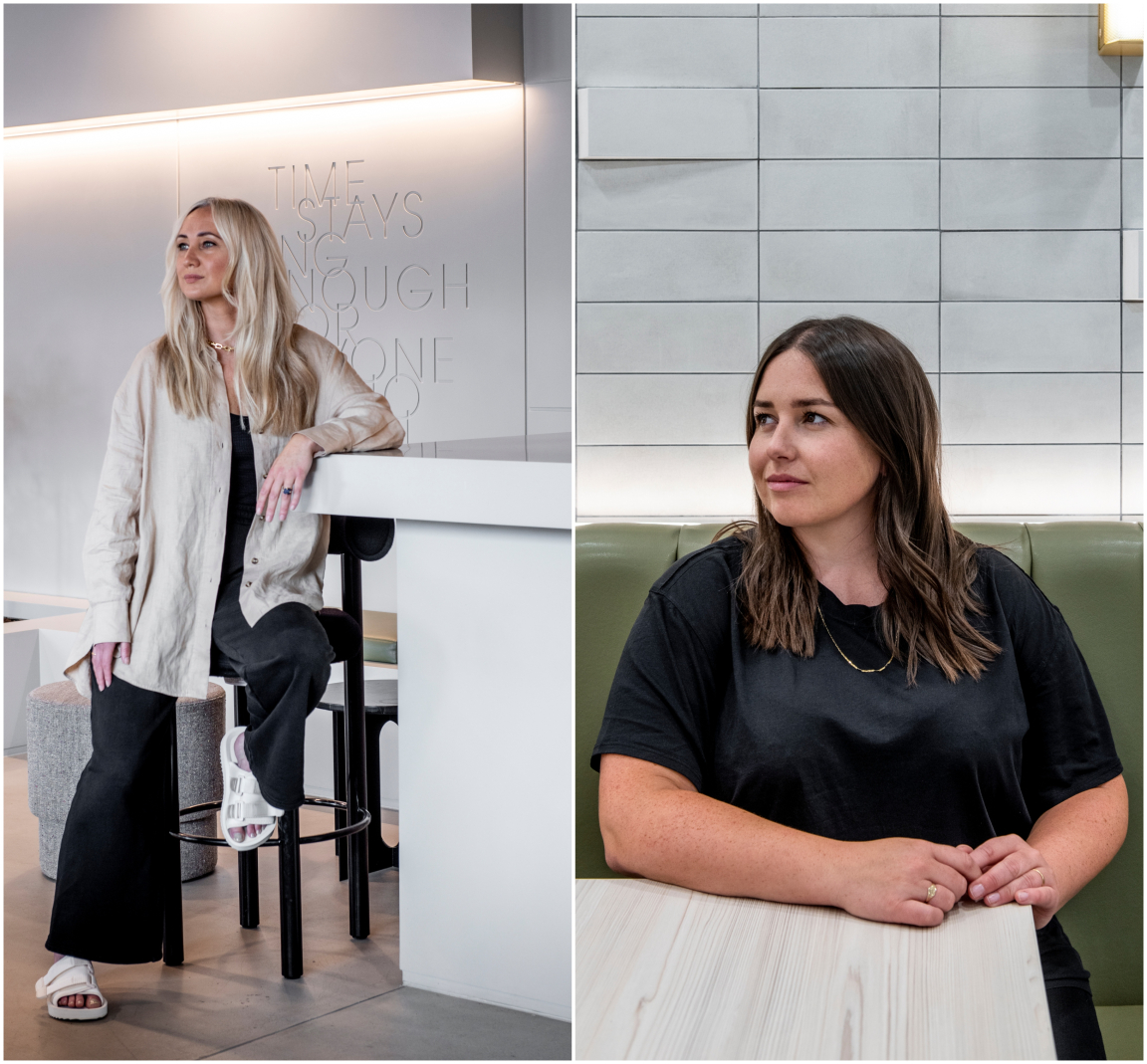
NoChintz is a multidisciplinary studio focused on brand and interior design that’s played an instrumental role in the look and feel of Manchester city centre over the last 15-years.
With an unmistakable approach that combines visual storytelling, bold colour palettes and acute attention to detail, we were extremely excited to welcome Katie Lea, Design Director & Natalie Gray, Creative Director down to the Studio to chat to us about their latest projects. Without further ado…
So firstly, can you please introduce us to NoChintz?
Katie: “Over the last 15 years NoChintz has evolved to become a multidisciplinary studio. We have brand and interior designers in-house and we create full turnkey solutions. We can look after everything from naming a project, branding it - developing the brand strategies and establishing the brand guidelines, and designing and rolling out the interiors.
“We are also the operators of our own F&B business Foundation Coffee House. From running that, what we can bring to clients is an understanding of conceiving a brand, then running the operations and considering the lifespan of a space. It’s one thing making something look great, but how will it be activated? How will it perform in two-year’s time? We think about how a space needs to adapt and perform in lots of different ways, for different audiences.”
The whole world is evolving, and we have to be able to adapt to that seamlessly.
Natalie: “It's more about brand experience now, isn't it? But whether clients come to us with an idea, or we’re developing a brand from scratch, it has to be translated into a living, breathing space. And as Katie said, it’s also nailing that operationally. And also nailing how people can use that space and continue to use it, and how it's going to be marketed as well - that is key.
“We’re big on storytelling and narrative in our concepts. Even for clients that don’t necessarily ask for it, we always make sure we put it in because we know when we come to the end of a project, it brings everything together.”
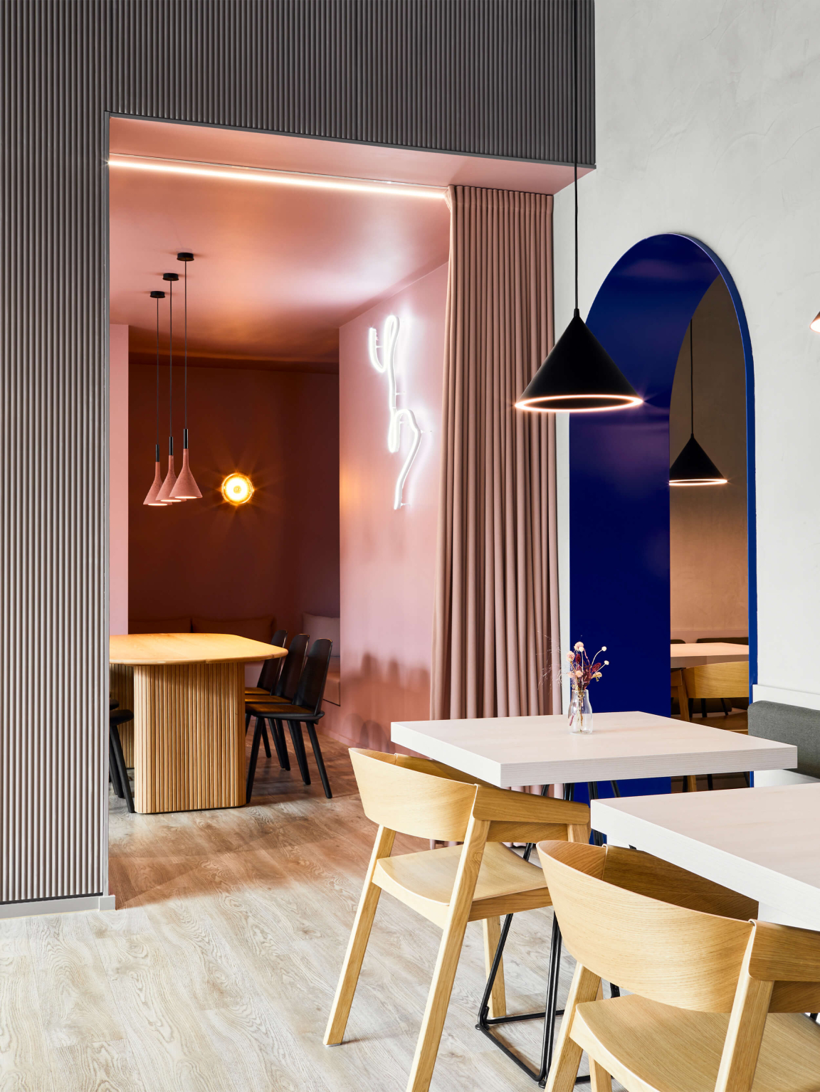
Affinity Living’s River View
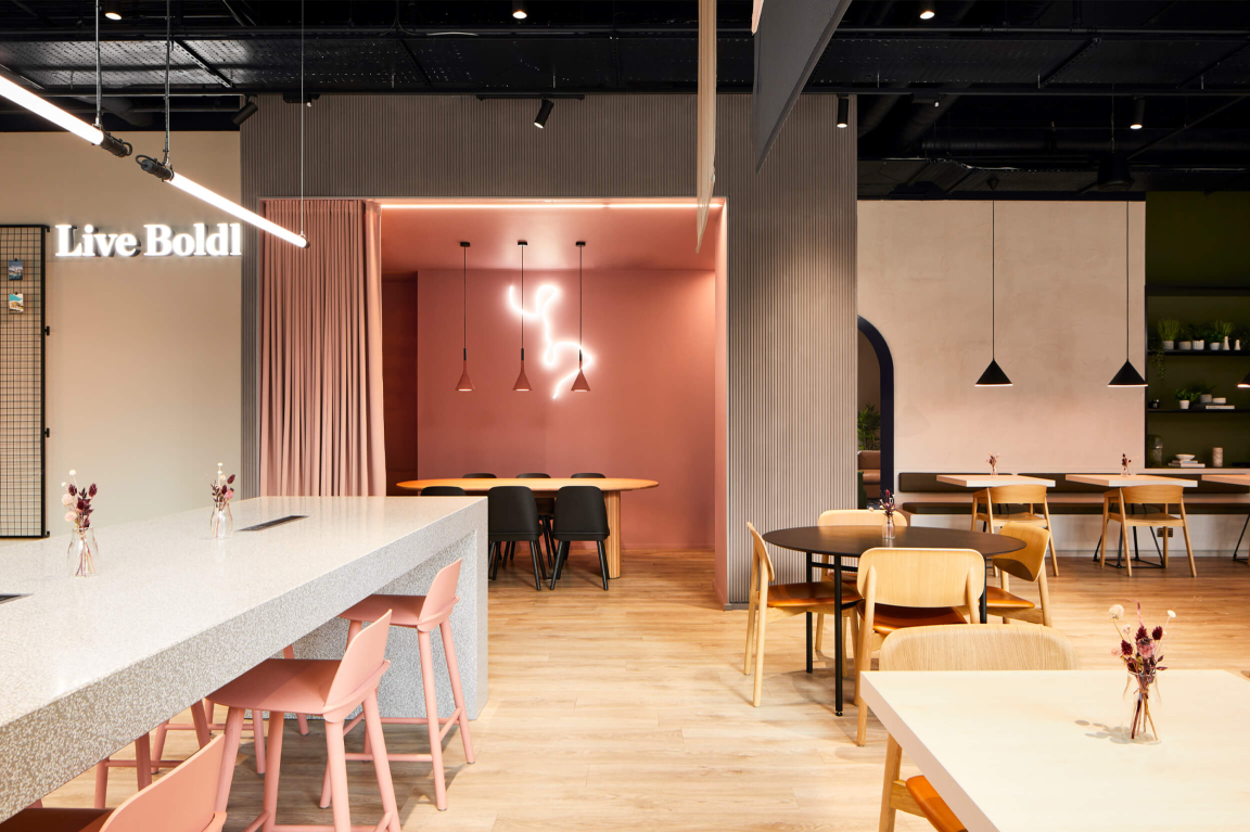
Affinity Living’s River View
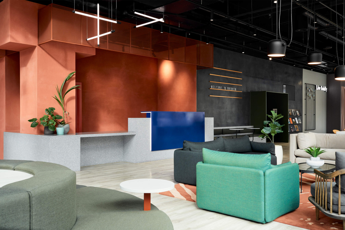
Affinity Living’s River View
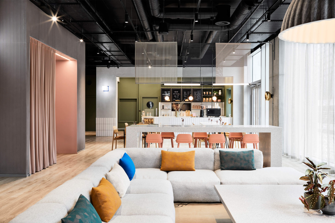
Affinity Living’s River View
Affinity Living’s River View
Katie: “It's taking a holistic approach to it all - it makes the project much stronger.
“Because we're doing both sides: brand and interiors, we can have a lot of fun with it as we’re in control of the boundaries, and there’s no worry we’ll be stepping on anyone’s toes. We can really create moods, atmospheres, and experiences, all the way through from the website to the space itself. And that allows us to really control the experience that we want the end user to have at every moment.”
Is there an extent of not knowing how the space will be used until it gets used?
Katie: “I think as long as you have that really strong relationship with clients and there's a good trust between the two of you to communicate, you can have a good idea. At the end of the day it's for the clients and their end users, and we just need to make the foundation for it to work for them.
“We had a conversation yesterday about how valuable it is to have good clients and good operators as clients because we put so much into design, it’s an emotional process. But you get so involved, you put your all into it and you can walk away from a project and twelve months later go back, and you're just like oh, you just didn't get it. But then when you have an operator that’s amazing at what they do, and, actually, sometimes the space they have doesn't even matter because they're so good as an operator, but them having a space that reinforces their services is just this dream marriage, and it's so nice to be involved with those people because they live out the foundations that you start for the space.”
Natalie: “The other thing we think about is people's wellbeing. It's so important now and I think it is that thing of creating somewhere that enhances someone's wellbeing, whether that's mentally or physically. We've been doing a lot of research recently on inclusive design because it's becoming such an important part of making sure that every person from every walk of life can feel included in the spaces they visit.”
What projects are you working on at the moment?
Katie: “Leonardo Piccadilly East has recently opened, so we've been on site the last few weeks with that. We actually do procurement and delivery as well. So, we've been the designer of the project but then we have a separate arm where we also do procurement for furniture, which is great, being so hands on. It’s something that we do on most of our projects because it means that we're there right through to the end and we can ensure the quality of the detail is in every aspect.
“We’ve also launched Pollen’s second site. Pollen 2.0. They’re an example of an expansion supplier. They were a new client when they had their first site. They made all their mistakes there. They recognised them and they came to us for our experience so they didn’t make those mistakes again. For their next site they wanted support in moving them to the next level. Their first site is so small and they're so busy, they're so popular, which is a great problem. So, we went in and said, yes, let's figure that out and make a space that doesn’t have those problems so that it's a better environment for all the customers and staff. And for us to work with a brand like them, it’s great. Especially when they bring cakes to our meetings!”
“They're so skilled within their area and they respect the skills we bring. It's just been a really great project. We’ve shared the work of local artists and makers. We've had this big concrete table made locally and we’ve been able to specify loads of nice pieces. They understand the importance of detail."
Affinity Living’s River View
Affinity Living’s River View
Affinity Living’s River View
Affinity Living’s River View
Affinity Living’s River View
Did you see trends change during the pandemic that have affected your work since?
Katie: “Even before Covid we could see that trends were changing. People wanted more comfortable environments to live and work in. Now everyone’s doing it so it’s an easier message to push.
“We’re looking for materials more locally with circular design in mind, and more of what we can repurpose. For me, it's not necessarily a visual trend. I think the aesthetic will naturally come from what's available.
Depending on what materials are widely available, that's what people are going to start using more of and that will naturally translate into the visuals. Like when chefs started with nose to tail cooking – it’s the materiality version of that.
So, in terms of spatial design, you felt boundaries were already blurring, but that Covid just sped it up?
Katie: “Yeah, I think it's just bled. In workspaces, we want flexibility and we all value that collaboration space. What was missing during Covid was that human connection and that collaboration. So, for me, it's providing balance. Teams can come together, collaborate, but then also feel like they're in more of a comfortable environment and they don't have to be sat at a desk all day.”
Natalie: “It's almost like making the workplace a retreat, because I suppose at the end of the pandemic, everyone was getting sick of working from home. But it’s about giving choice to the individual.”
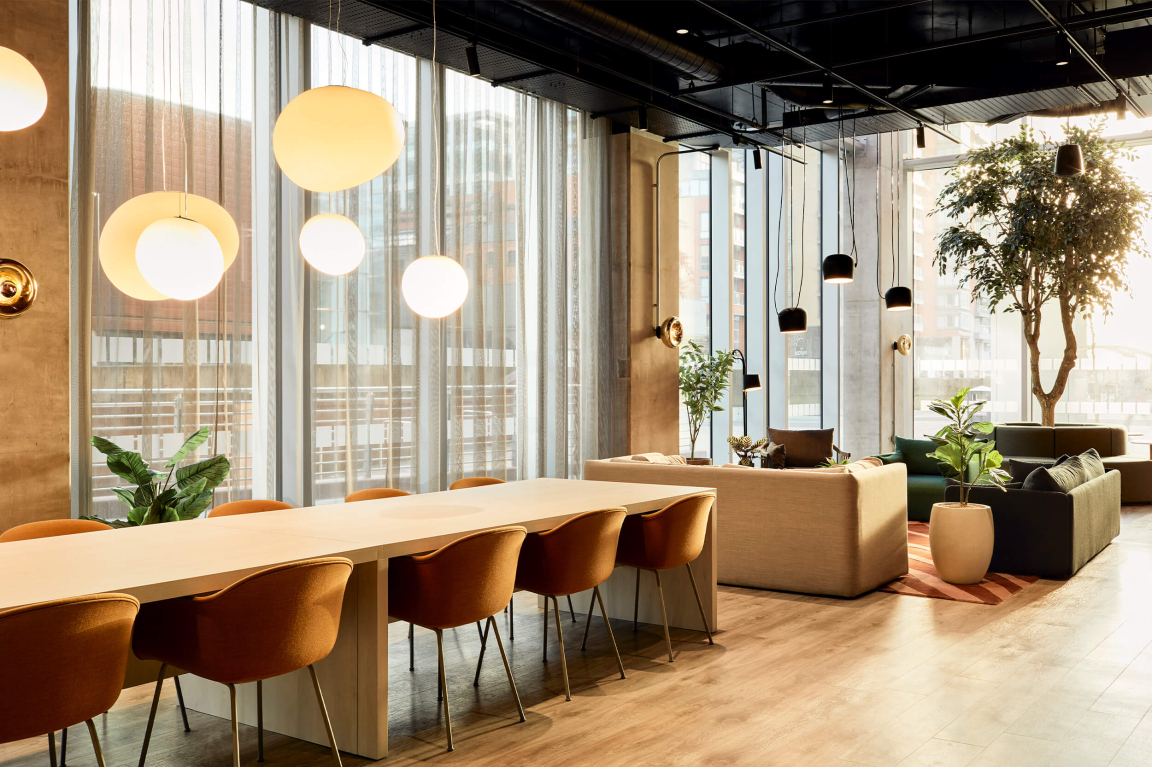
You’ve recently completed a project at Affinity Living’s River View apartment scheme. Can you tell us more?
Katie: “We did the sister building, Riverside, which completed before Covid. And then this building was finished last year. It's two towers on the river – a lovely setting.
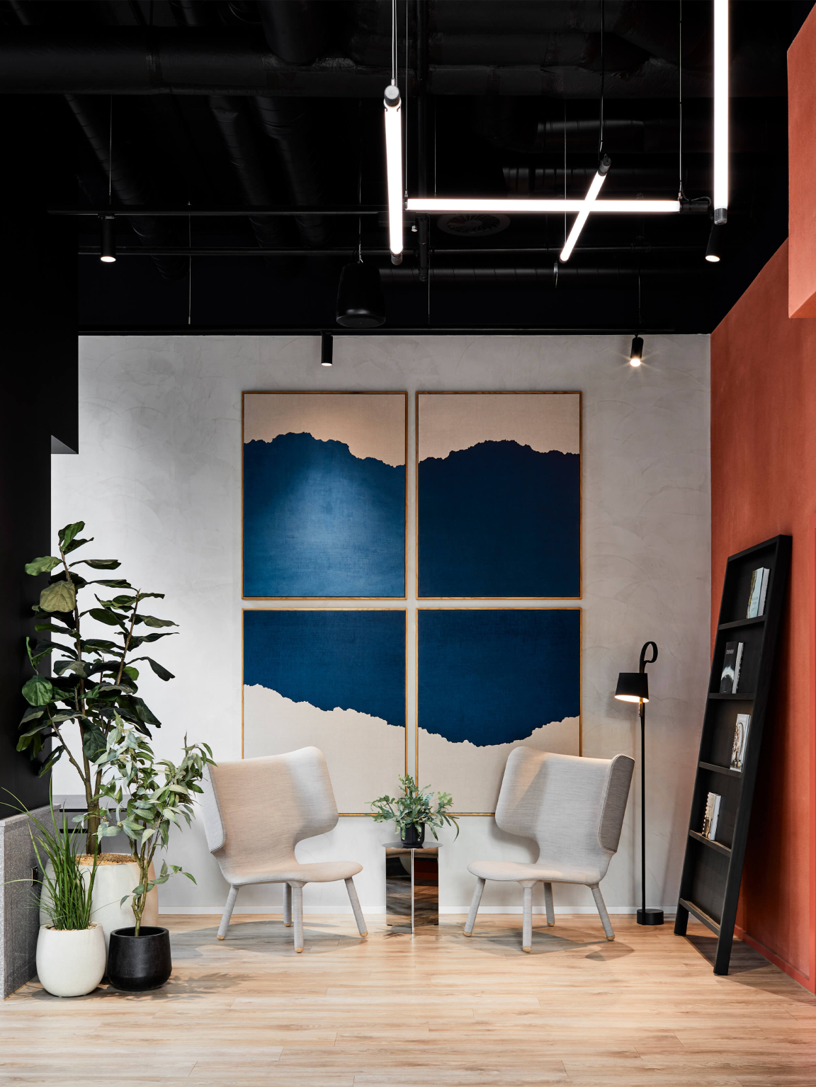
“The brief that came to us from the client was to create a community space. They wanted to build neighbourhoods within these buildings. So we had the opportunity to really bring people together and offer something of value to the residents living in that space, which they could then activate. Where they could put on things like workshops or lectures, or parties. But day to day, it was assessing what the residents needed, what they wanted and how we could give them something extra.
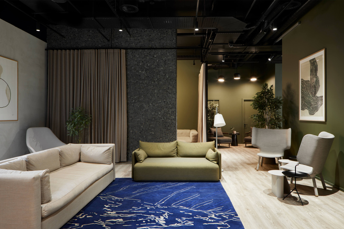
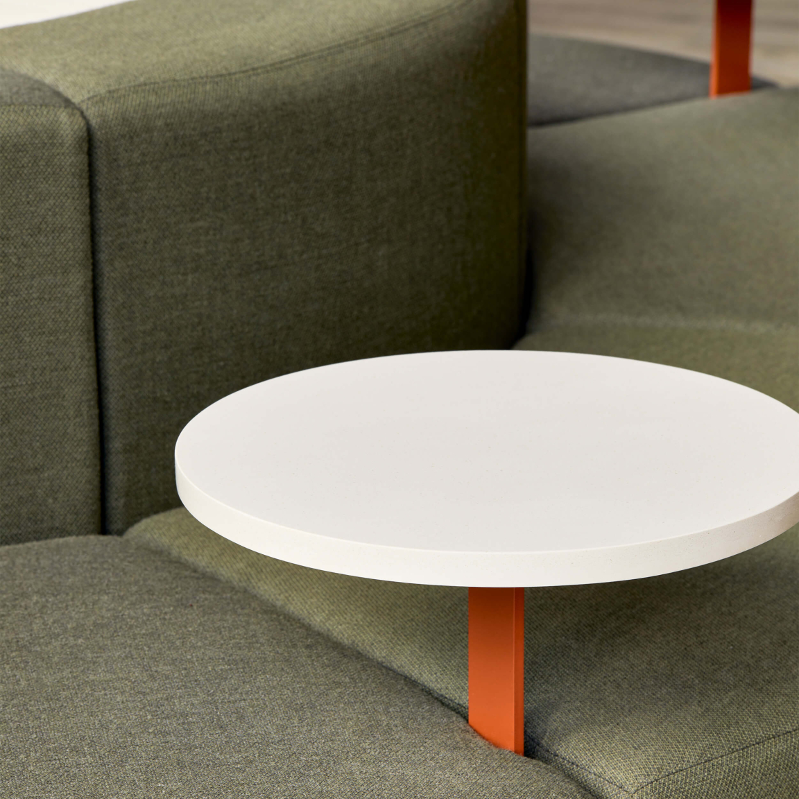
“So, the way that we designed the space has a pacing and a flow that as you come in, there are quiet moments where you can relax, and there are more communal spaces where you can sit and work. There are large format lounge areas where a whole floor of flat residents could actually come together and sit and hang out. But also, in the way it's designed, it's big enough that you could sit there alone.
“In the aftermath of Covid, it’s been very much about community. The purpose of the space is all about connectivity. Whether it's being connected to other people within the building, or from elsewhere, as it's also publicly accessible through a coffee shop, which we also designed.
“There’s a media room for sporting events, or cinema nights, and residents can even bring a games console down there. We’re facilitating all these activities people want to do at home, but making them accessible outside of the apartments too. Even though the apartments are a good size, it's about facilitating these communities.
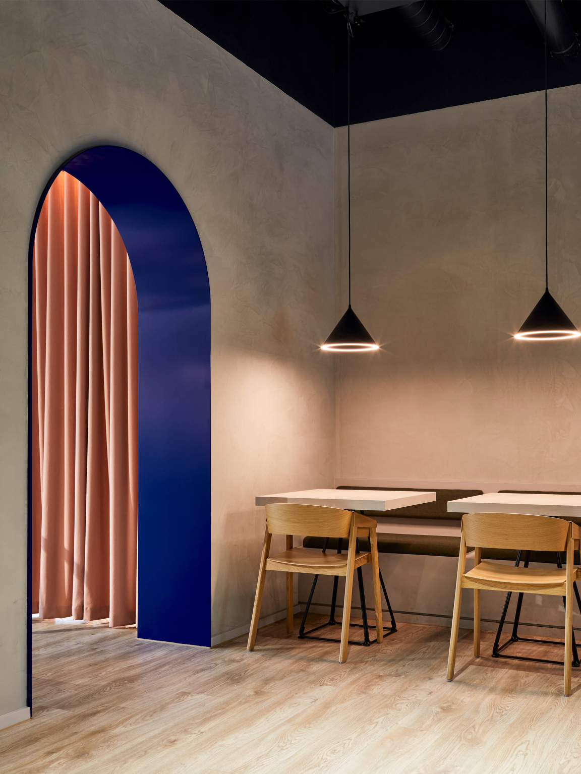
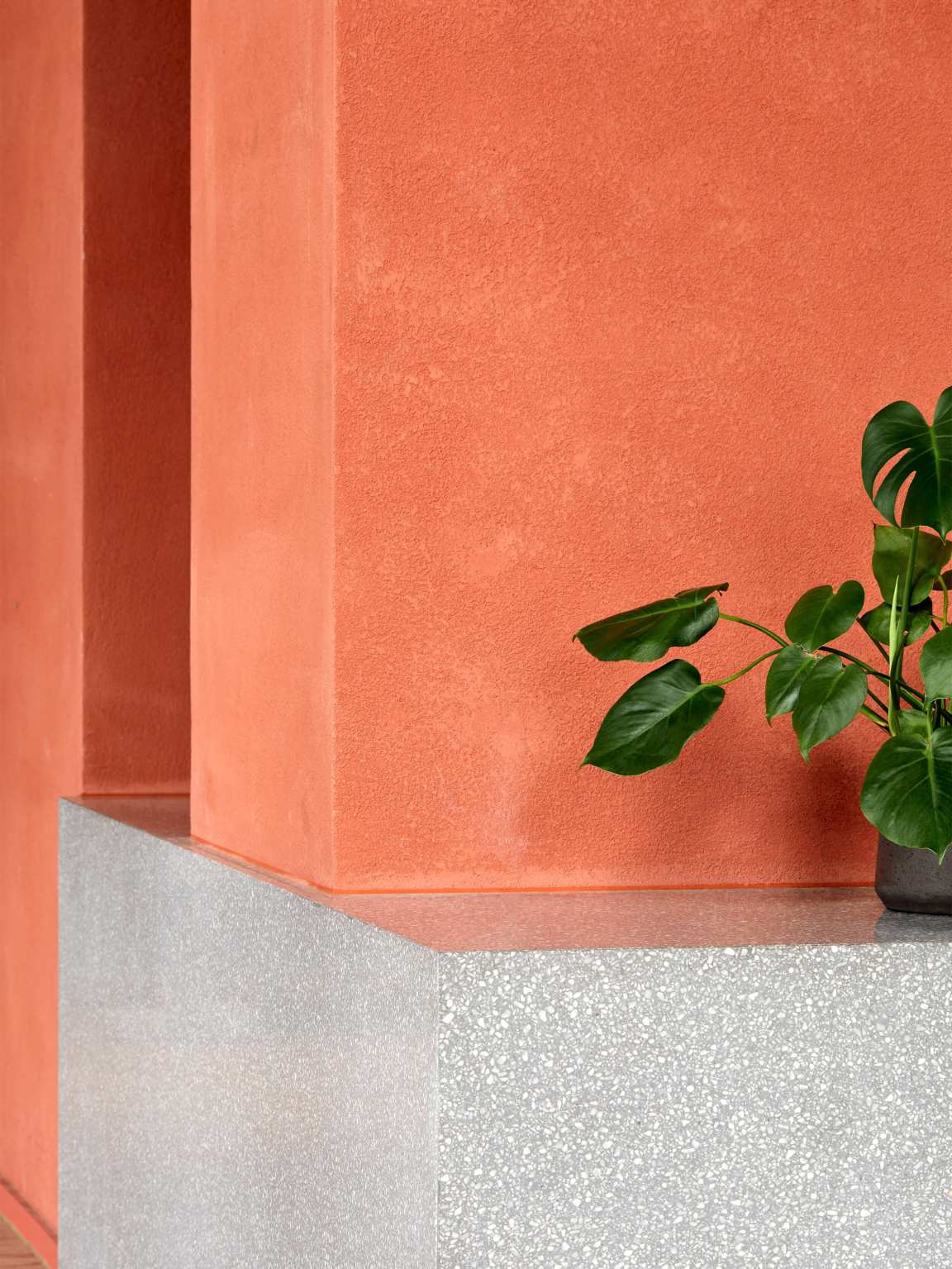
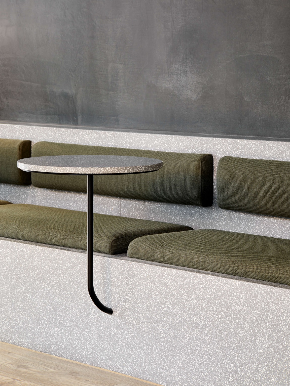
“Our concept stemmed from the fact that the apartment scheme is located on the river. The colour palette takes visual cues from a stony riverbed, with bursts of bright colour to coincide. In some areas, you’ll see pops of blue mixed with pinky soft tones. There was a conscious choice for it to be a bit bolder and a bit more dynamic because of the fact it’s a neighbourhood. It's not singular. Not everyone's the same. It's not this beige, beautiful, straightforward space. It's got to have different moments for the different people that live there, who are going to find a connection with that space, with the river, with the water itself.
Natalie: “Talking about our connection with nature. There is so much beauty within nature. Ultimately, everything we have done here has been driven from what we see in symmetry, shapes, and forms. It guides us in creating a much more sympathetic interior that you feel inherently connected to as a human. And I think you sense that in this space. The different lighting, the pebble-esque forms of it, the soft curves, and the surprise tones and movement that just feels completely natural. It's unprescribed.”
Affinity Living’s River View
Affinity Living’s River View
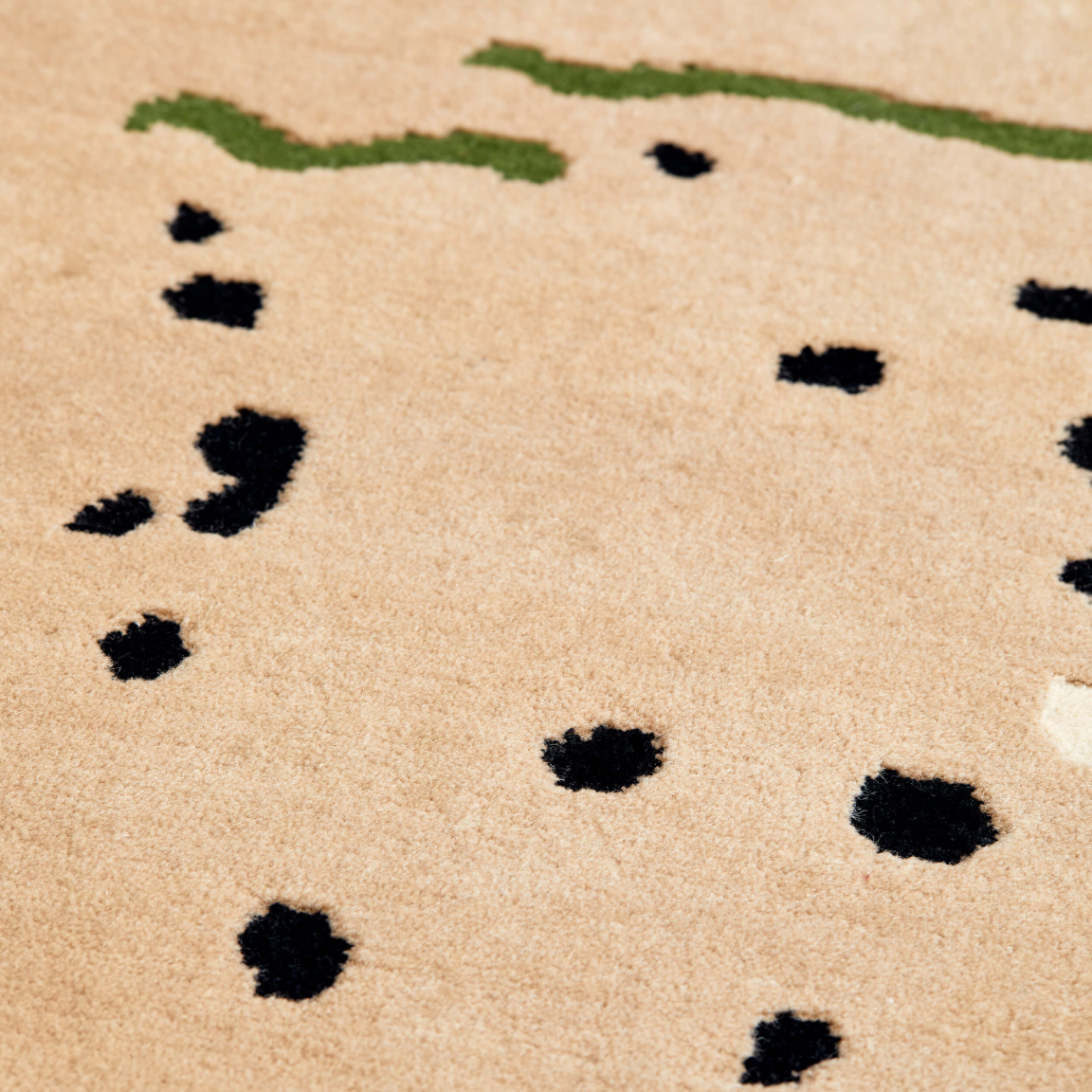
Affinity Living’s River View
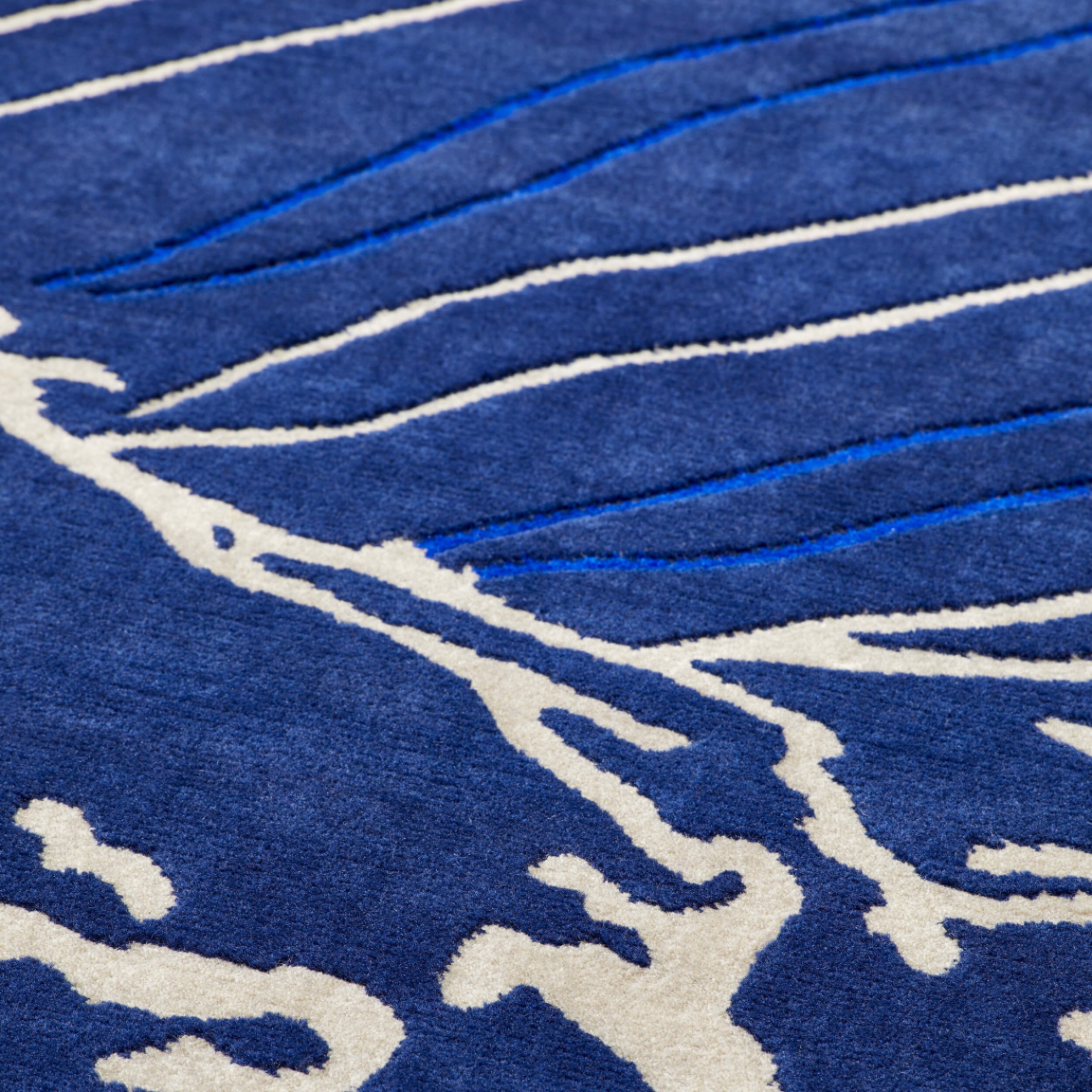
Affinity Living’s River View
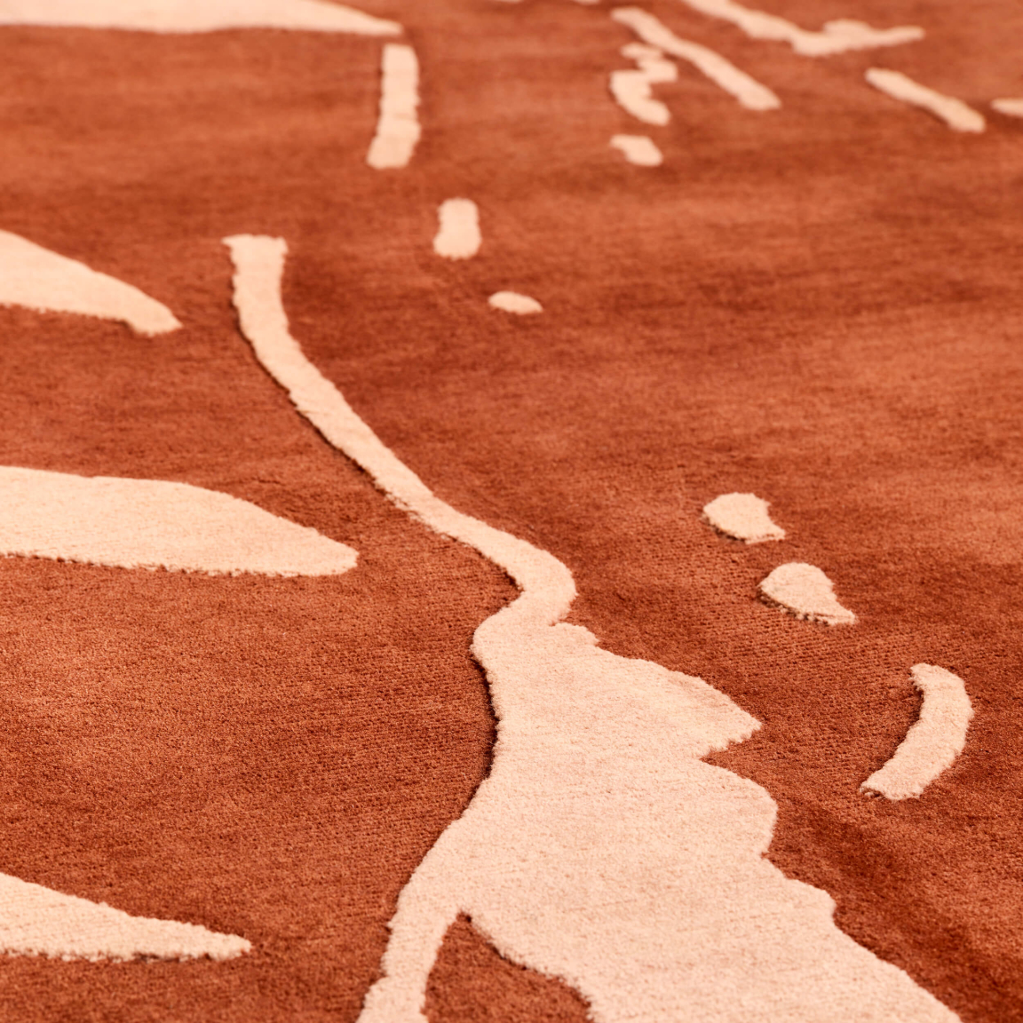
Affinity Living’s River View
Has collaboration played a role in this project?
Katie: “It’s so nice to work with and collaborate with other designers; to be able to say: this is what we're doing, we really like this idea, and they take it and go, yeah, I really like that, how about this? It's an amazing opportunity as you don’t always get the chance to partner with other creators. And the results have been great.
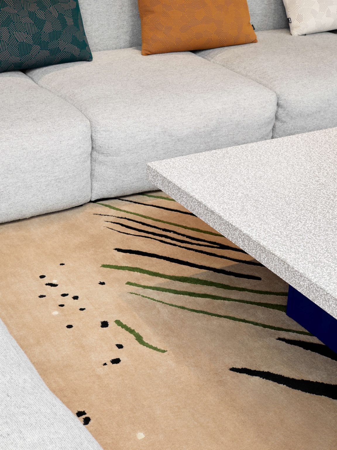
"Like these rugs, they're all different colours, and they're pieces of art. They embody so much of our original concept, like the contours of riverbeds. Some people will just see a rug, and that’s fine, that’s the point. But there's just so much meaning within these handmade rugs as well. It's all the details that create a feeling, isn't it? You don't necessarily know why, but you just feel a certain way because you feel the attention that someone's given to the space.”
Click here to see more projects from the NoChintz team.


