London-based architecture studio CAN has radically transformed an Edwardian semi-detached house into a colourful family home topped with staged mountain scenery.
CAN - Mountain View - Jim Stephenson
London-based architecture studio CAN has radically transformed an Edwardian semi-detached house into a colourful family home topped with staged mountain scenery.
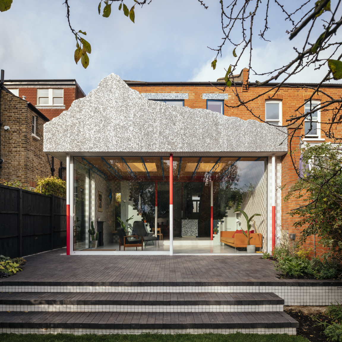
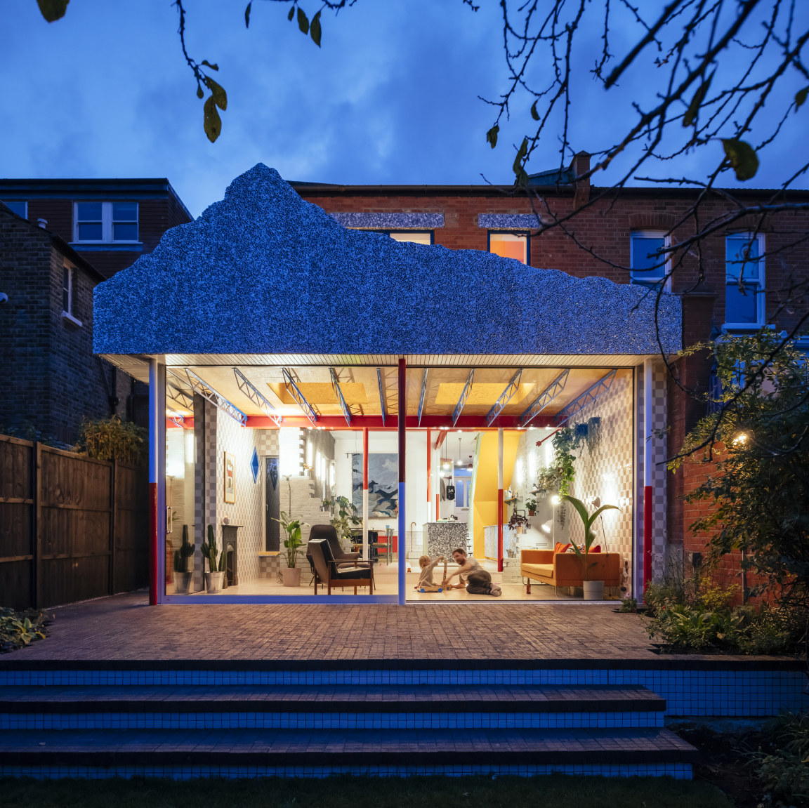
Taking cues from theatre sets, geography, a fake Disneyland mountain and an Edwardian bread plate, ‘Mountain View’ was designed by CAN Director Mat Barnes for his young family. The unusual idea of the mountain roof came to Barnes after coming across images of the Matterhorn Bobsleds ride at Disneyland during its construction; a surreal mountain top aloft a skeletal frame.
“I loved the idea of elevating this heavy mountain on an unfeasibly thin structure”. Mat Barnes, Director, CAN.
CAN - Mountain View - Jim Stephenson
CAN - Mountain View - Jim Stephenson
CAN - Mountain View - Jim Stephenson
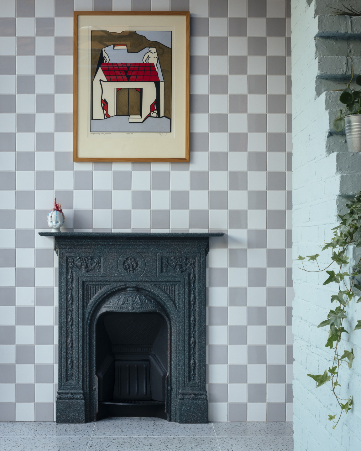
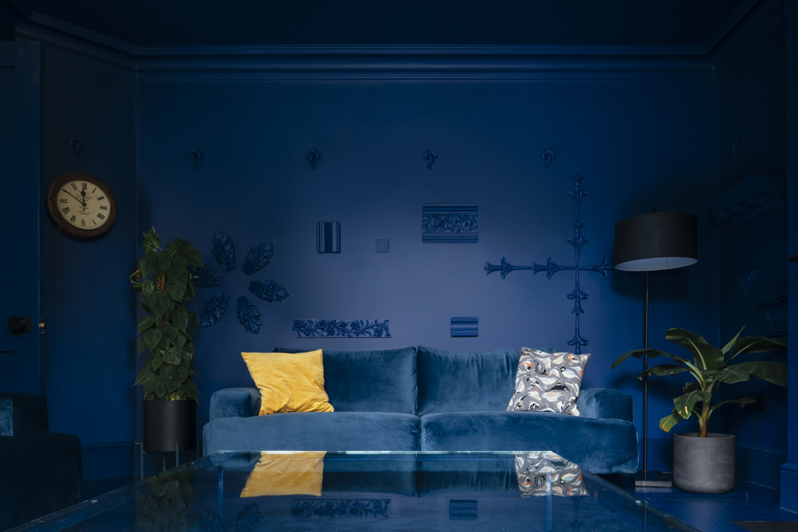
From the street, the two-storey building blends neatly amongst the neighbouring red brick houses, with the distinct design details reserved for the interiors and unique rear extension. The house opens gradually, moving from dark to light like walking from the shadows of the wings onto the theatre stage. Visitors are greeted by a long hallway and monochromatic, striking blue lounge with Soanian-like architectural fragments arranged as sculptures on the walls. The fireplace is the only fixed item left untouched by the deep blue hue, which covers the walls, ceiling, and floors.
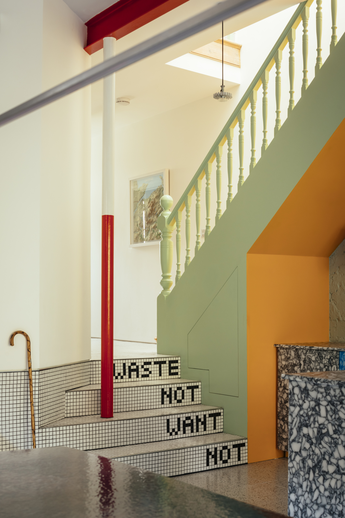
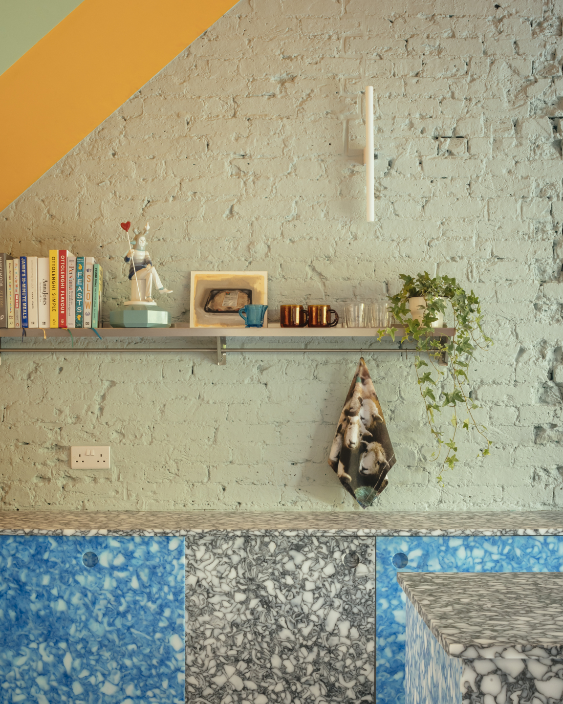
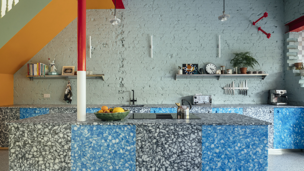
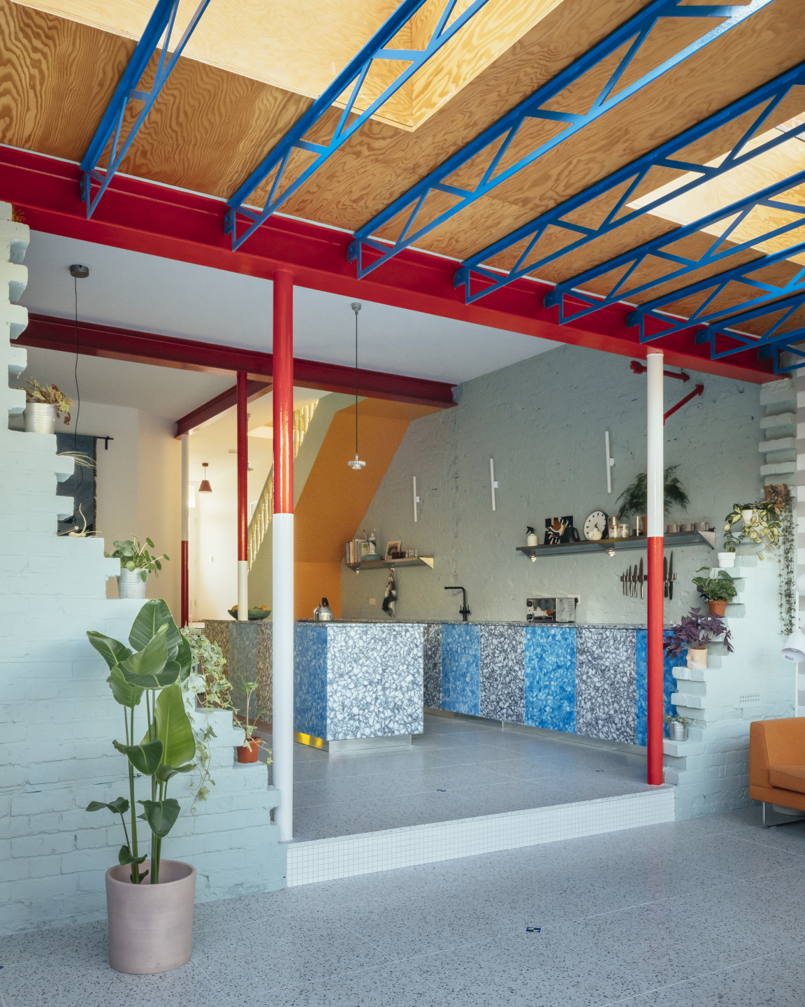
A bright hallway progressively widens and steps down into the East-facing, open kitchen and dining area. Two waist-height kitchen benches made of recycled chopping boards and milk bottle tops anchor the room, designed to accentuate the huge 3.4m ceiling height of the open plan space.
“We alternated the colours of the cabinet doors to keep the eye moving up; we didn’t want the kitchen benches to stretch the space horizontally. We kept the bench height uniform because we didn’t want any high level cabinets encroaching on the space. The height of the room brings us such joy. It feels somewhat grand or cavernous, with the variety of materials bringing texture and an unexpected warmth.” - Mat Barnes, Director, CAN.
The space continues to unfold into the rear extension, with a small step leading through the partially demolished brick wall of the old house into a living area of exposed steel, timber and glass. Beside the dining area is a small window seat-cum-hallway that enjoys views to both the side passage courtyard and large rear garden.
CAN - Mountain View - Jim Stephenson
CAN - Mountain View - Jim Stephenson
CAN - Mountain View - Jim Stephenson
The purposely expressed steel beams above the living area nod to high-tech architecture and the lighting rigs of theatres. Mountain View also draws on geographic and topographical themes. Structural columns are painted to mirror red and white ranging poles and a foamed aluminium mountain cut-out sits atop the new extension. The steel beams, ranging poles, and partially ruined brick wall all add to a sense of the surreal, while the floor to ceiling glazing opens the home into the garden. CAN have cleverly intersected materials, finishes, shapes and colours throughout to create highly textural and tactile spaces.
“We’re surrounded by so many colours and textures in the outside world that to me it feels natural to bring many different patterns and fabrics inside too”. Mat Barnes, Director, CAN.
Upstairs, CAN added an extra bedroom and bathroom to the floorplan, cleverly remodelling the home to be comfortable for a growing family. In contrast to the vibrant ground floor, the clean white walls lining the pastel staircase begin to relax the occupants as they climb up to bathe or sleep. The bedrooms and hall are intentionally neutral to provide a sense of calm and quiet. The ceiling of the hallway has been left open with structural timber beams painted in pastel blue and pink, allowing plenty of light to filter in.
CAN - Mountain View - Jim Stephenson
CAN - Mountain View - Jim Stephenson
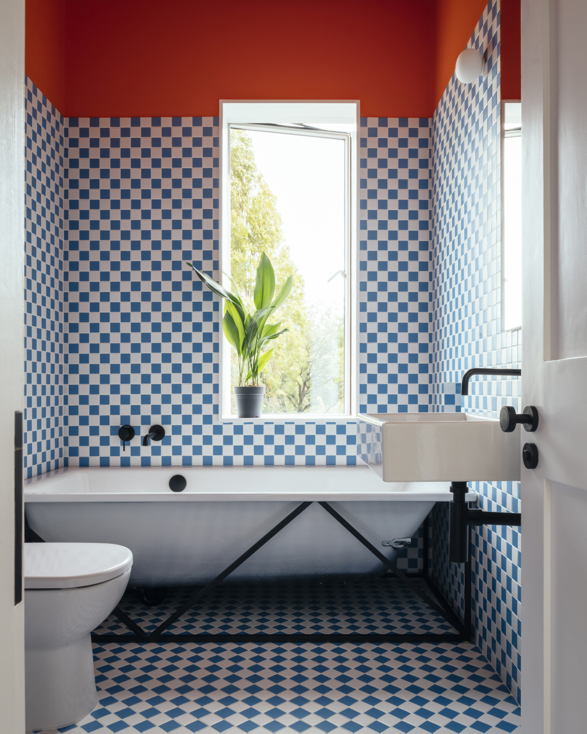
The bathroom is the only upstairs space where pattern reigns. When demolishing the existing house, the owners found a blue checkerboard tiled hearth at one of the old fireplaces. Not wanting to erase the history of the Edwardian semi entirely, CAN used similar tiles in the bathroom, broken only by a large window, black and white fixtures, and a tangerine ceiling.
“Our back garden faces east, and this lovely dappled light comes all the way up the hall in the mornings. It’s a lovely house to live in, for the kids to play in, and for us to enjoy. It is also great to hear our daughter tell everyone she has a mountain on top of her house!” Mat Barnes, Director, CAN.
More about CAN.


