Lynn Lindley of Arcadis IBI Group on facilitating the future of work at Queen Mary University of London.
Credit: ACE Collective
Arcadis IBI Group believes that "cities that thrive are resilient, connected, and inclusive". And that's how we should build for the future.
With future-proofing in mind, its recent project at the Queen Mary University of London saw the transformation of the professional services department into a space fit for the post-pandemic workforce.
Incorporating sustainability, flexibility and a little bit of luxury, the new space focuses on wellbeing. As such, it is beautifully light and airy while providing choice. Keen to find out more, we caught up with Arcadis IBI Group's Lynn Lindley, studio associate director & interior designer for more details...
Firstly, can you please give us an overview of the project?
"Queen Mary University was exploring options of introducing new ways of working to their administrative staff that would allow them to free up space on their constrained campuses for more academic facilities. The site presented an ideal location for re-locating 623 full-time equivalent staff from the University’s professional services functions including Estates, IT, HR, Finance and Registry. The project’s objectives were twofold: to enable agile hybrid working in the new space for professional departments, and to optimise 4000m² of vacated space for teaching and learning.
"The strategy originally sought to maximise individual and collaborative working, alongside informal breakout areas, by providing new ways of working within and across departments with a sharing ratio of 7:10. Due to Covid, the strategy changed entirely, with a 4:10 ratio using the design as an incentive to encourage staff to return to the post pandemic office, with improved social interaction and collaborative working.
"We approached the design by developing a vertical relationship structure through the building based on preferred departmental adjacencies and floor areas of the different levels. The floorplate layout situated ‘itinerant’ and collaboration-based working closer to vertical circulation, with more traditional desk-based working situated to the perimeter with greater exposure to natural light.
"Our ambition was to create a place staff would want to come to work in and an environment which offers flexibility, variety and choice. We drew upon the richness of the local area, the history of the building and its architecture to develop our concept and create an internal landscape - our proposals combined the original character with a contemporary aesthetic."
Credit: ACE Collective
Credit: ACE Collective
Credit: ACE Collective
How did you go about material selection – did sustainability play a key role?
"Sustainability and wellbeing are at the heart of the design. The project uses furniture sourced in line with the SKA HE criteria from FISP compliant manufacturers and all new timber is FSC/PEFC certified – elsewhere wood was reused including re-hung doors.
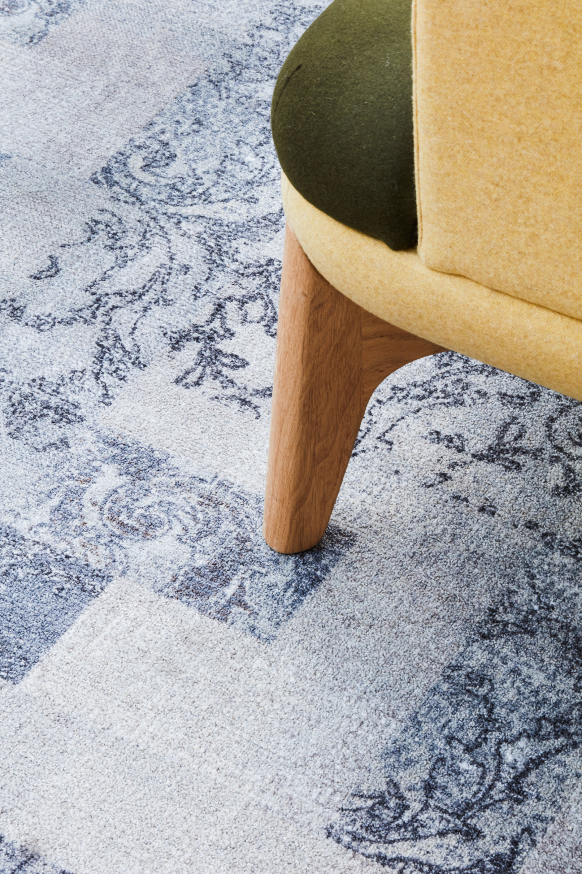
"Internal Finishes focused on products with Environmental Product Declarations (EPDs). New carpets offered 69% recycled content with any offcuts returning to the manufacturer for further recycling. The building also utilises low energy lighting and natural ventilation systems.
"Assessed against the SKA benchmark, QMUL achieved an overall HE Gold Certificate rating."
What are the top standout features of the design/project?
Heritage, Elegance, Opulence
"Housed within the historic Wickham’s Department Store – a building renowned for its landmark Spiegelhalter's façade, the design celebrates and showcases the building's heritage with a modern environment offering new ways of working.
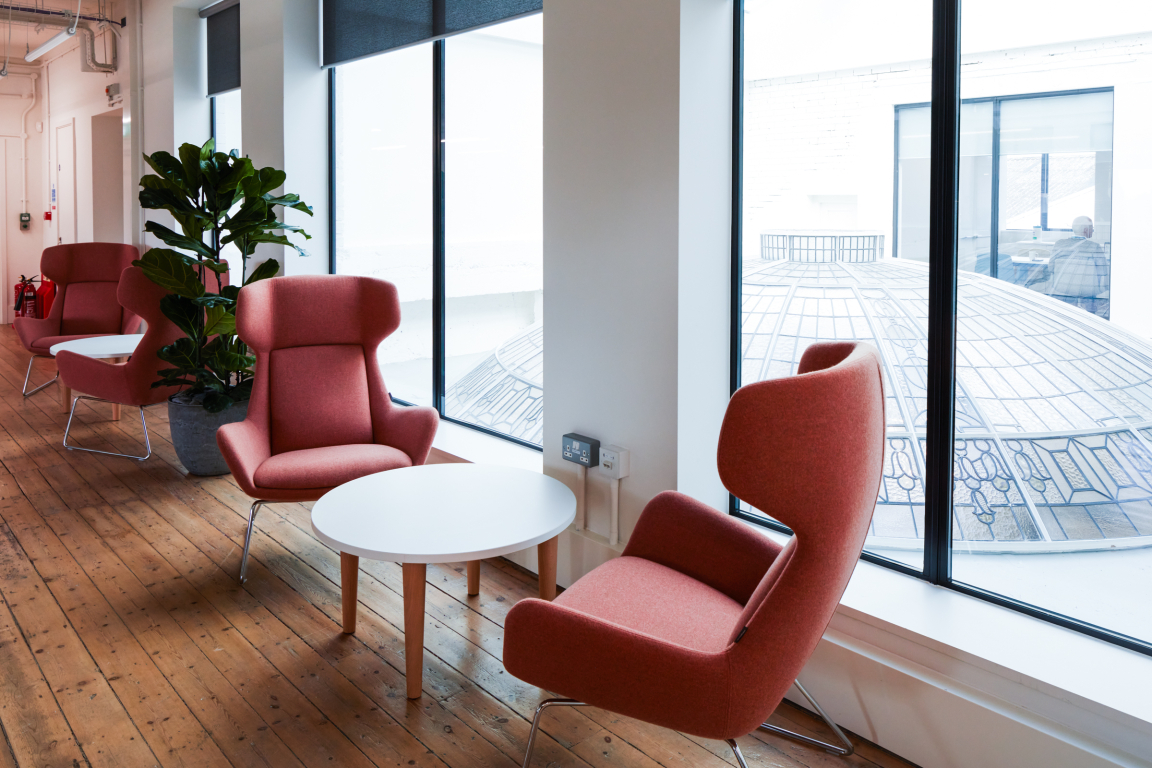
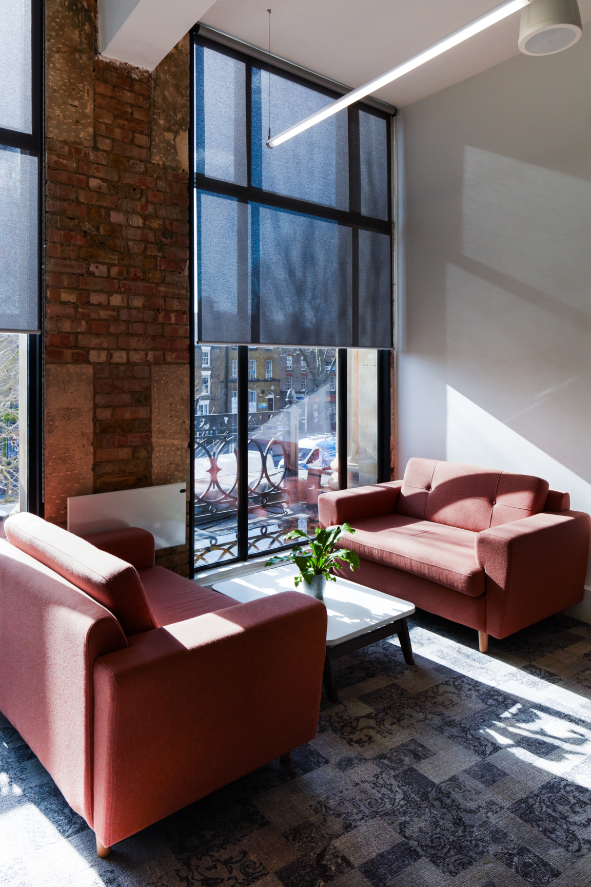
"We drew upon the richness of the local area, the history of the building and its architecture to develop our concept and create an internal landscape which celebrated the building's heritage, its materials and elegance. The finished palette blends natural tones and textures with rich injections of colour to complement the warmth of existing pine flooring.
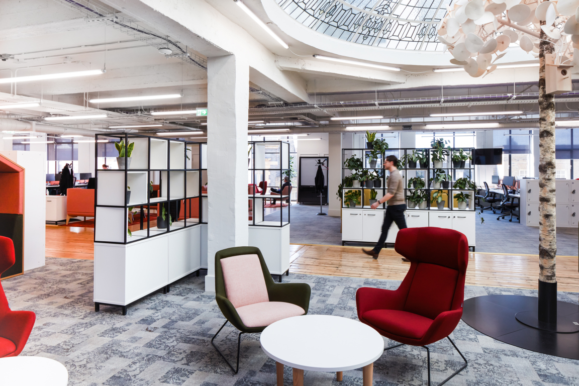
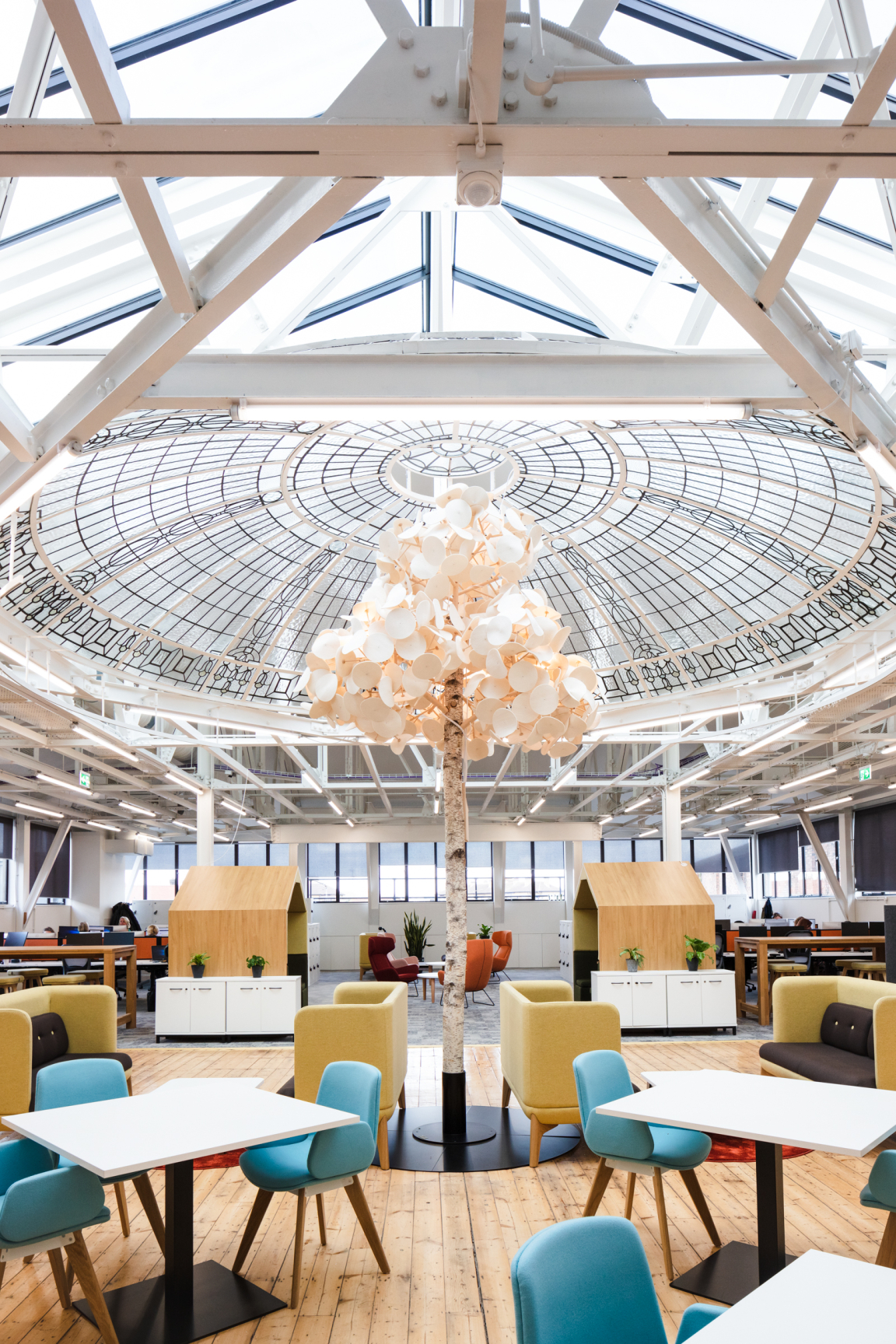
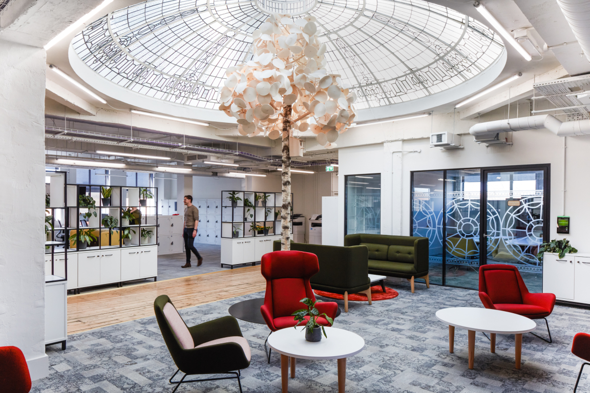
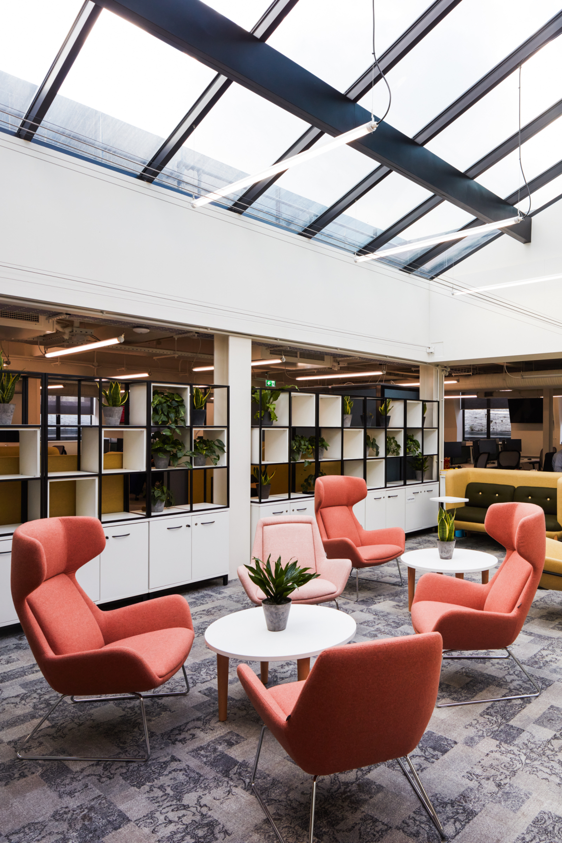
"The building is home to two highly decorative domed glass skylights beneath which were placed acoustic trees, both enabling noise absorption and celebrating the building's history. Pattern details found in the skylights inspired imagery for the manifestation applied throughout the interior."
Credit: ACE Collective
Credit: ACE Collective
Credit: ACE Collective
Credit: ACE Collective
Wellbeing
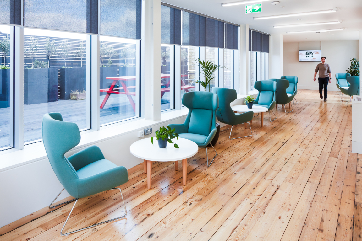
"In terms of wellbeing, we took a biophilic approach, incorporating natural textures and light, roof top views and outside spaces.
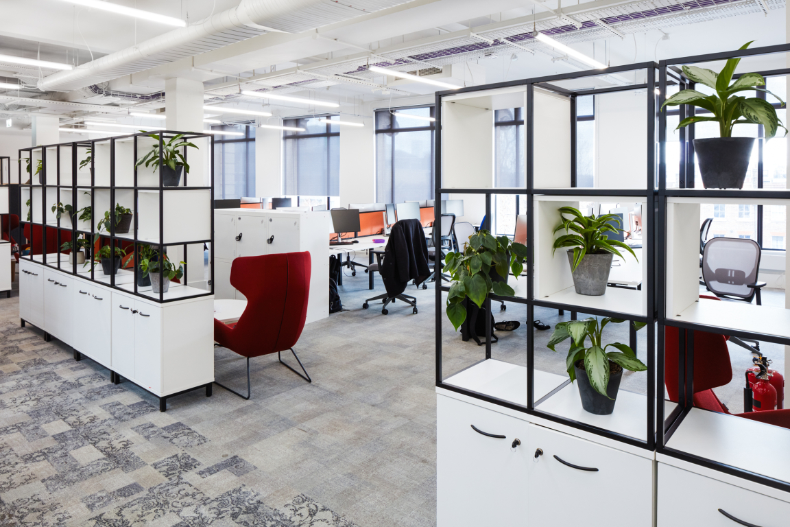
"Engagement with nature has a positive effect on our health and wellbeing. The building benefits from good external views and access to outside spaces with lots of natural light. Carefully positioned open storage walls give a level of enclosure and layering of space and a place include planting walls.
"Breakout spaces and access to refreshments in key central locations on each floor provide space away from the work areas.
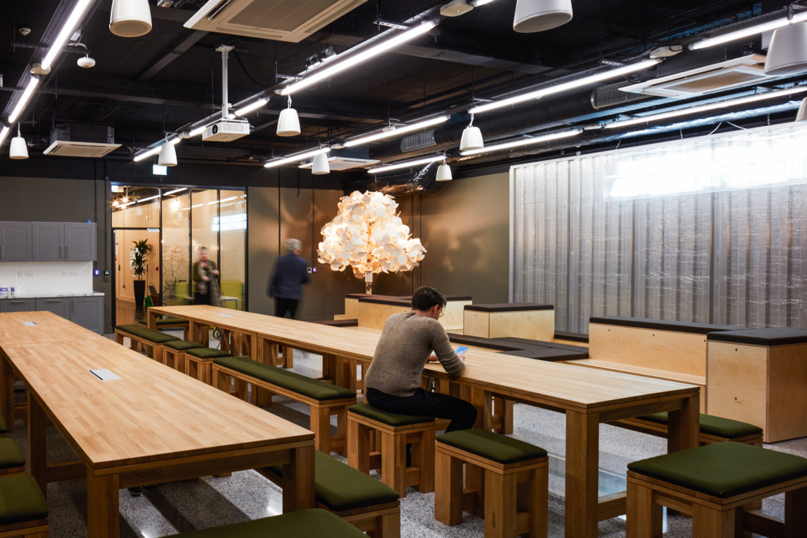
"Parklife is found on the ground floor, a nod to the local Mile End Park and a space to move away from the office floors to have an indoor picnic. This artificial landscape is designed to be flexible with an interchangeable seating platform and can be remodelled to adapt to requirements of the space for presentations or group gatherings.
"Internal finishes, fittings and furniture reference organic textures, and elements, including natural timber and an acoustic tree in the breakout space, along with indoor planters for acoustic comfort. Externally, planters and an insect hotel installed on the roof terraces attract flora and fauna."
Credit: ACE Collective
Credit: ACE Collective
Credit: ACE Collective
Flexibility & Choice
"This included mobile screens, transferrable furniture and supportive technology.
"The internal landscape is planned around neighbourhoods that reflect the different work typologies, connected by natural walkways to assist in orientation and ease of movement throughout the building.
"Each space was defined by placing the furniture to create ‘rooms’ within the floorplan without full enclosure and to encourage and enhance communication and socialisation whilst allowing choice and privacy.
"Dedicated collaborative zones, quiet areas and individual option for personal space to work promote a flexible culture and sense of community.
"A series of different sized pre bookable meeting rooms with full technological support enable meetings both physically and remotely.
"Informal breakout areas encourage collaboration and new ways of working."


