Minimal interior with a raw twist for new Dubai coffee shop by Roar Studio.
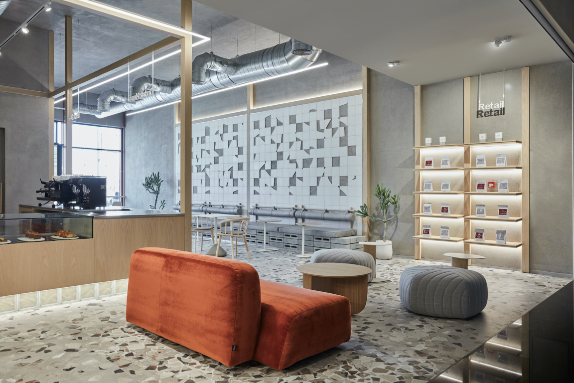
Pallavi Dean’s Roar studio has fused a pared-back design with striking raw accents for the interior of homegrown Emirati brand Drop Coffee’s second location in Dubai’s blue-chip Dar Al Wasl Mall.
Roar was asked to create a minimal space, which accommodates the flow of customers coming from the two different entrances - one connected to the outdoors and the other to the indoors of the mall.
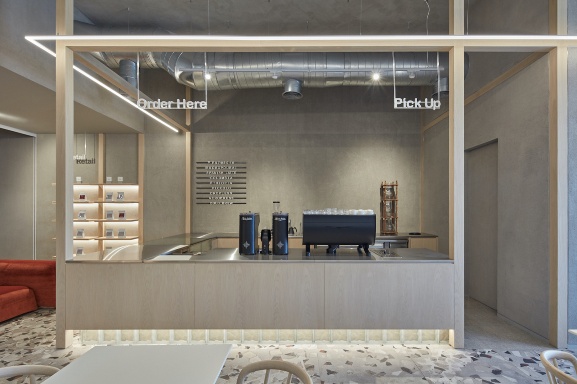
Pallavi Dean, founder and creative director of Roar, explains: "It was important that our design addresses both of these access points leading us to place the grab-and-go bar centrally. We used very simple framing to form a structure around the bar, which anchors it within the space and highlights its prominent location."
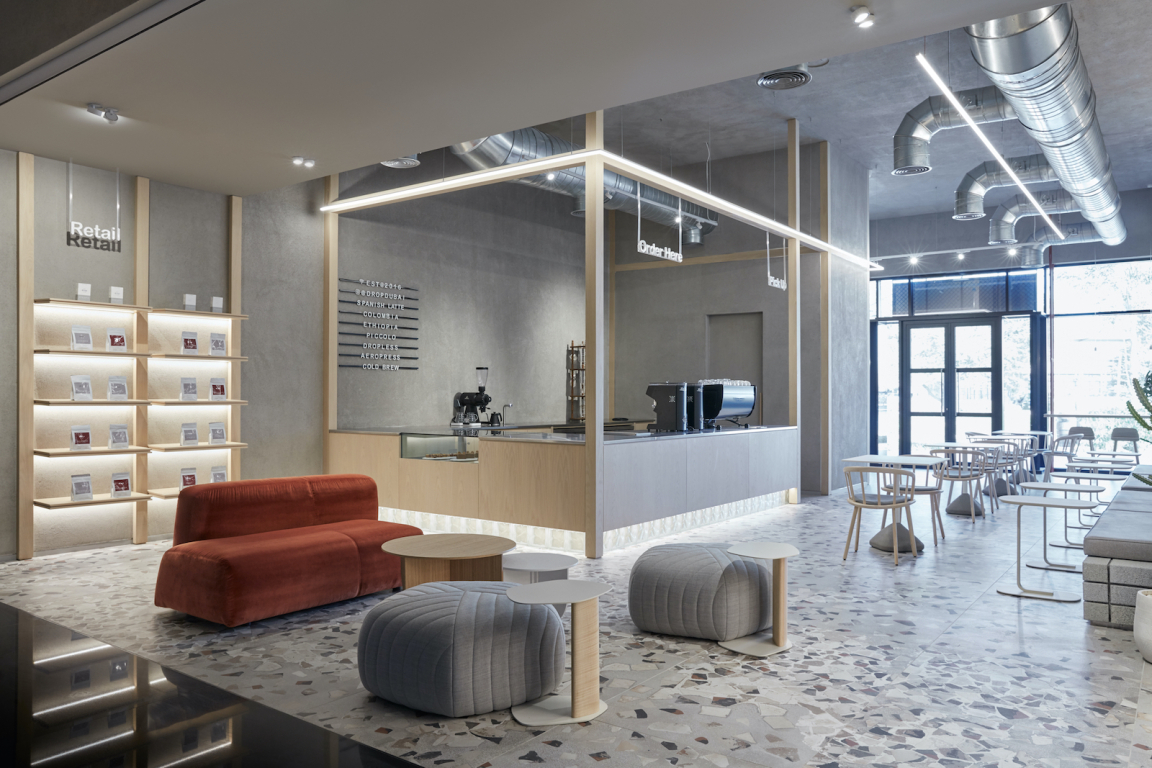
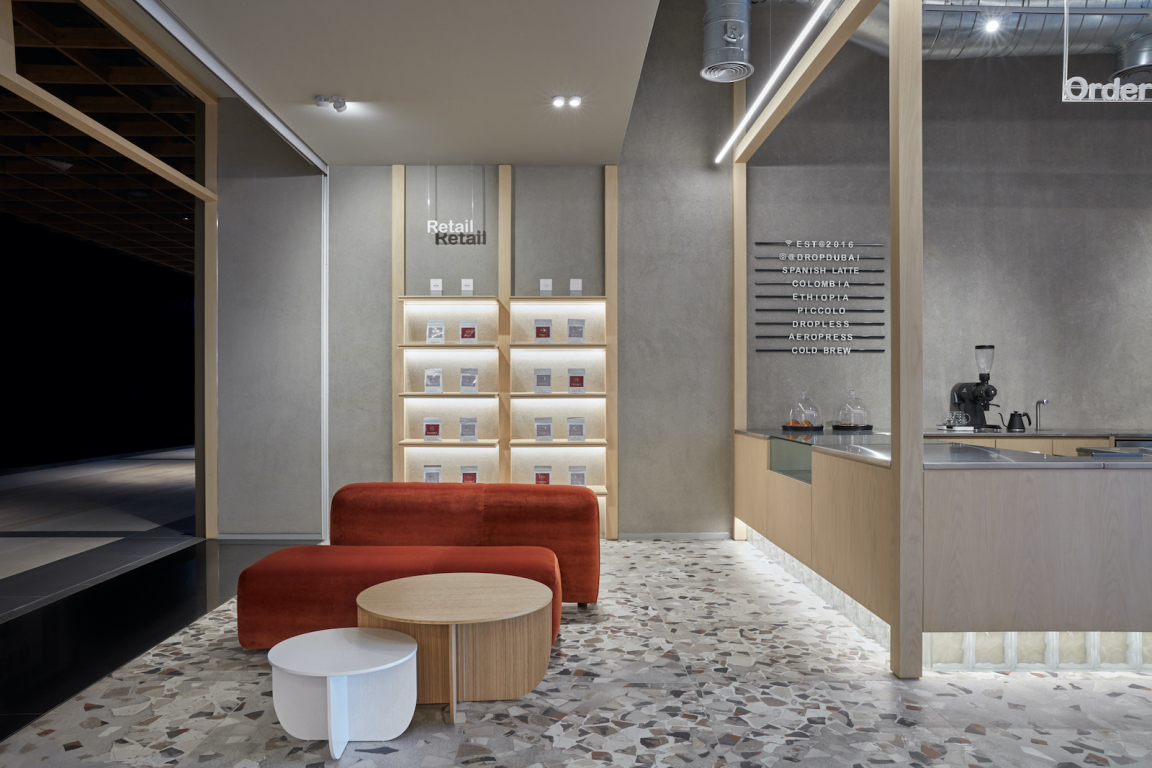
Adjacent to the central bar, two symmetrical retail shelves flank both sides of the mall entrance, echoing the same framing language complemented with down-lit features.
The bar itself gives the illusion to be floating as a result of a lighted skirting made out of glass blocks and supported by a wooden structure, which runs across the base. As well as being a very durable surface, the reflective, stainless-steel countertop adds to this levity while mirroring the decks left exposed on the ceiling.
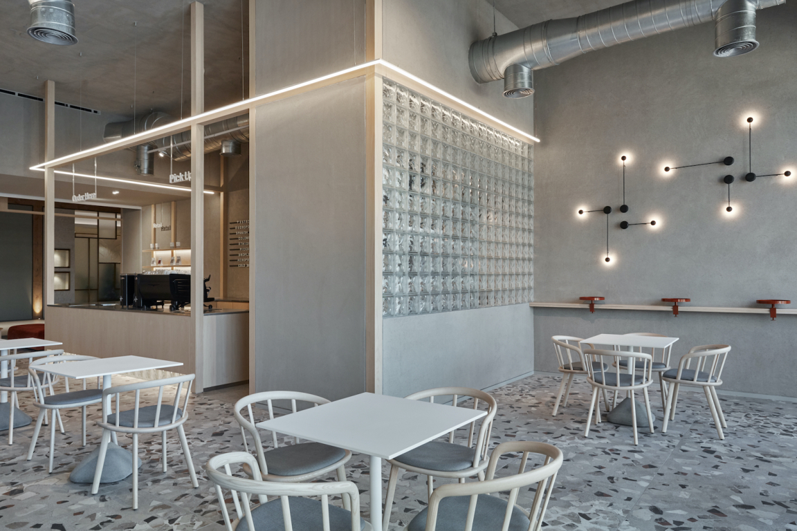
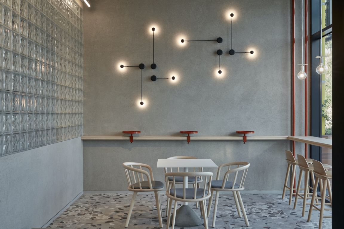
A variety of seating options - from bar stools to freestanding tables and chairs that can be pulled together for larger groups as well as a sofa and a purpose-built banquette - combined with distinctive hints of colour, gently disrupt the overall minimalist aesthetic.
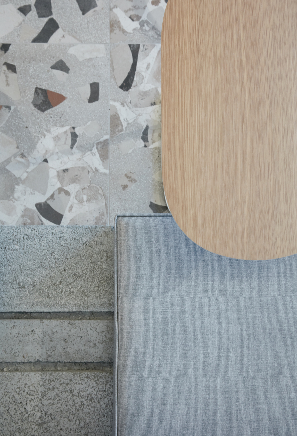
Pallavi Dean comments: "The colour palette was guided by the roasting process of the coffee beans. For example, the terrazzo effect tiles include mixed-tones of rusted brown and dark terracotta while the dominant hues of the scheme, consisting of a very light oak wood coupled with a concrete paint finish, serve as a calming backdrop.
"The client had this idea that each of the different branches would be associated with its own specific colour. For this location, the colour of choice was burned orange, which can be seen on the La Cividina sofa as you enter the space as well as on the clamp-style coffee tables we created for customers to have a quick shot of espresso while standing up."
Next to the standing area, a glass-block wall has been built to enclose a small kitchen, allowing the natural light to flood in from the nearby outdoor access while also shaping interesting silhouettes when the staff uses the space.
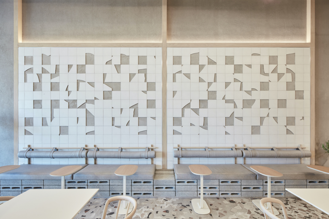
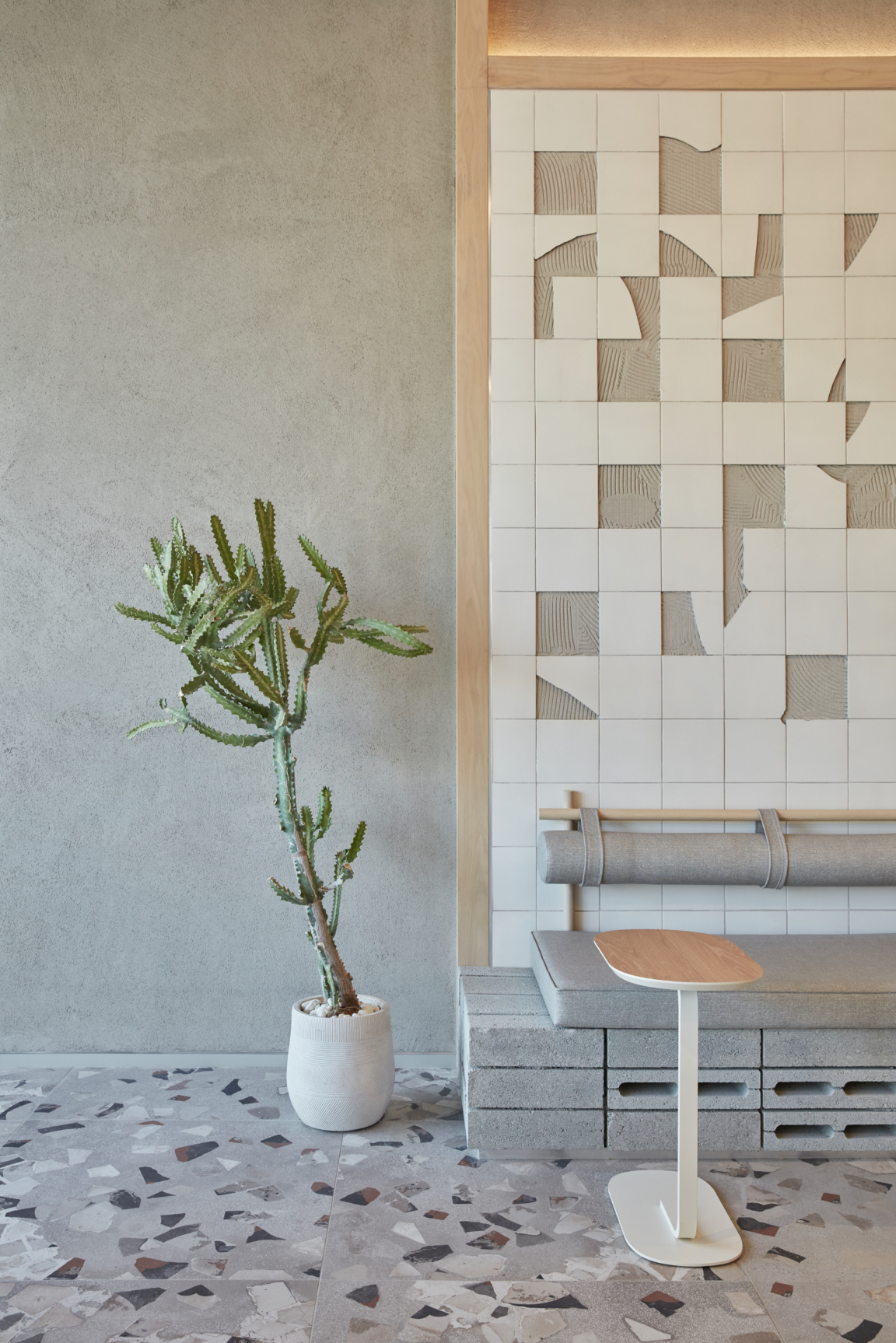
Another key feature emerges behind the banquette area where an assortment of white broken tiles have been carefully arranged to form a playful wall ornament.
Pallavi adds: "We wanted the interior concept to be consistent throughout and for all the different elements to be streamlined and respond to one another. That’s how the idea of the wall piece directly stemmed from the terrazzo floor as though the leftovers from the tiles had been imprinted on the wall before being chipped away.
"And in keeping with the structure of the bar and shelving units, a framing element is also repeated here. Lastly, the concrete blocks which form the base of the banquette evoke the concrete ceiling and paint finish, topping up that unfinished effect that we wanted to create."


