Morag Dearsley, associate at Form Design Consultants on creating the first WELL certified office in Scotland.
Credit: SG Photography
Edinburgh-based Form Design Consultants - established in 2013 - offers all aspects of Commercial Interior Design and Workplace Consultancy.
The practice's recent project encompassed the design and fit out of international law firm Pinsent Masons' new Edinburgh office. Working with a range of suppliers, including Material Source Studio partner Brunner, who provided the furniture, the final scheme achieved a WELL Gold accreditation making it the first WELL certified office in Scotland.
Keen to find out more, we caught up with Morag Dearsley, associate at Form Design Consultants...
How did the Pinsent Masons project come about?
"The lease on their Edinburgh office was expiring and they used the opportunity to move to a new CAT A office in Capital Square."
What was your role in the project?
"Form were the Lead Designers on the project. We worked closely with Pinsent Masons from the very beginning of the project to establish the brief. This involved engagement with staff representatives from across the firm to fully understand their needs, culture and aspirations for the project before starting the design. We then led the design process from concept design through to completion on site working closely with the client and other members of the design team."
Sustainability was a major factor in the brief – please can you tell us more?
"Capital Square provided a fantastic base building for the fit out of the new Pinsent Masons Edinburgh office, gaining BREEAM “Excellent” and an “A” EPC rating. We had early engagement with the landlord to reduce the extent of the CAT A works to avoid areas such as ceilings and services being ripped out during Pinsent Mason’s fitout thus reducing unnecessary waste.
"Pinsent Masons recognised the importance of creating an environment that was sustainable and supported the health and wellbeing of its people and visitors. Consequently, the design was coordinated and developed with the other Design Team Consultants, Cundalls, CBRE and Aecom, to gain WELL Gold AP accreditation.
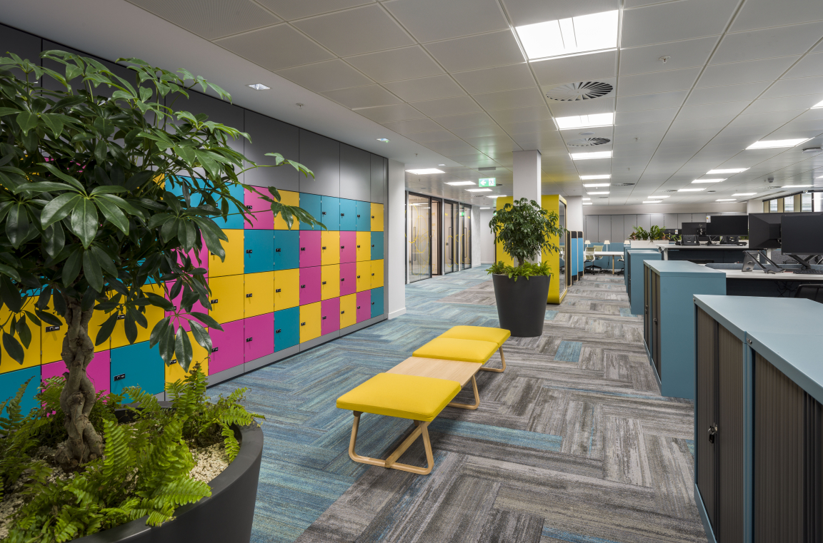
"This included changes to the base building, such as the introduction of Circadian lighting and enhancements to the fresh air provision. We worked hard to source products and materials for their low VOC content, sustainability credentials, low maintenance and quality. Alongside this the agile layout and considered design incorporates the elements of WELL to provide a beautiful, effective, and efficient environment which places people at the heart."
Credit: SG Photography
Credit: SG Photography
Credit: SG Photography
Credit: SG Photography
Credit: SG Photography
Credit: SG Photography
Credit: SG Photography
Credit: SG Photography
What was the aesthetic inspiration behind the design?
"At Form we believe that buildings are the physical representation of a business’s culture so each design is bespoke.
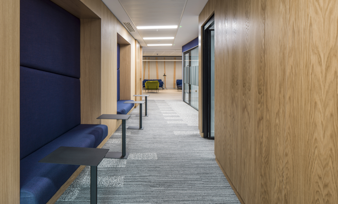
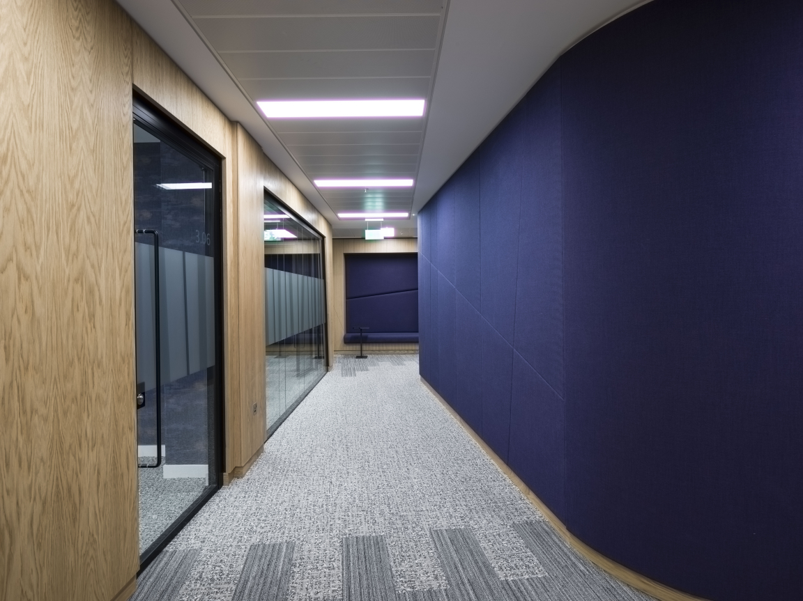
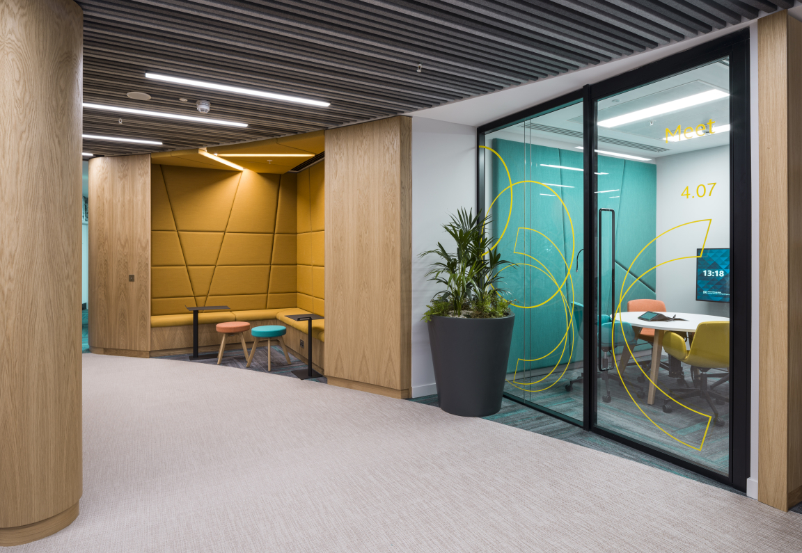
"Biophilic design was key to the aesthetic, not only with planting but references to nature through pattern, texture, natural materials and colour. The backdrop to the reception area was inspired by a Scottish birch wood and this coupled with light oak, soft greens and purples also gave the design cultural context as an Edinburgh based office. This also connected to the fantastic views of Edinburgh Castle. This sense of place and community engagement was also a key element of Well.
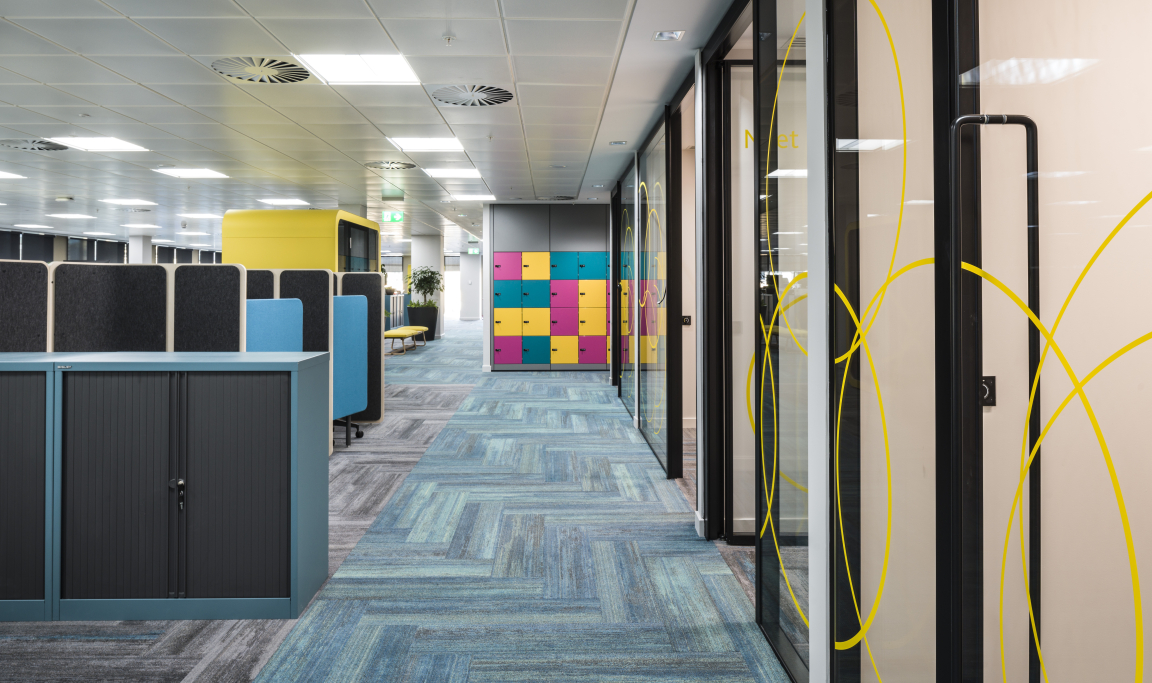
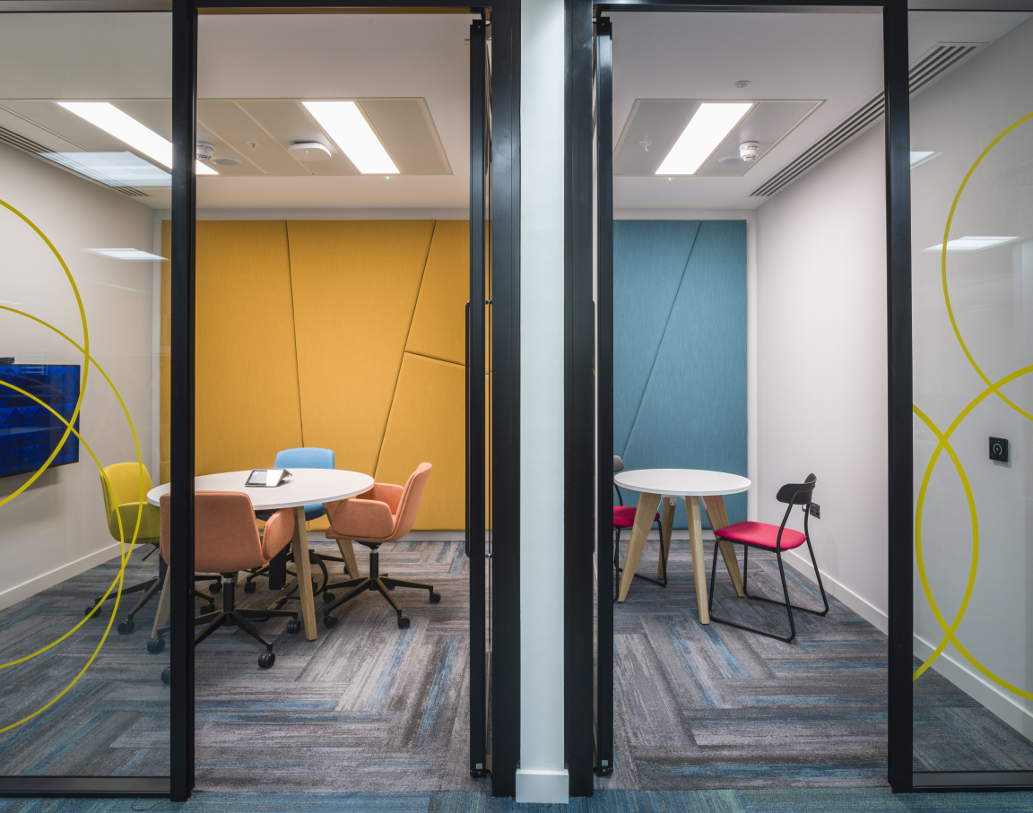
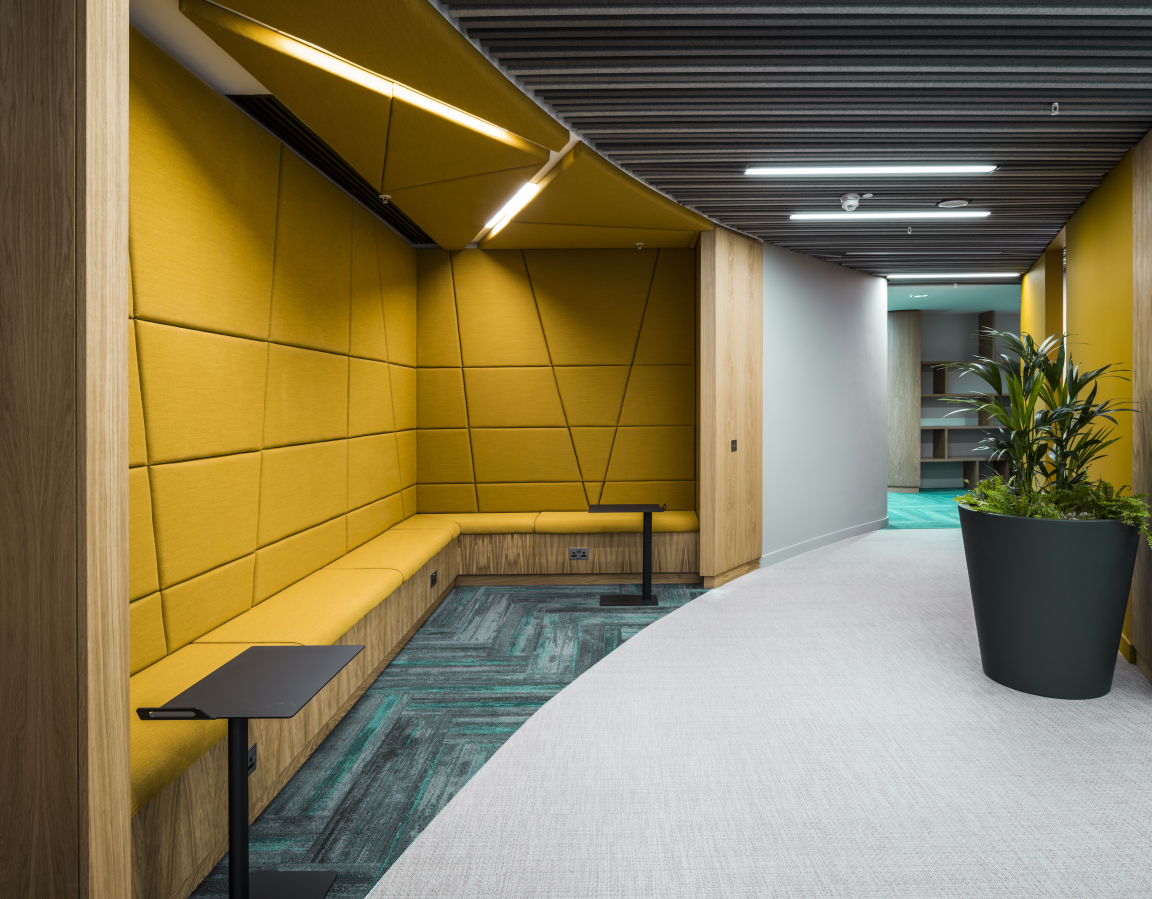
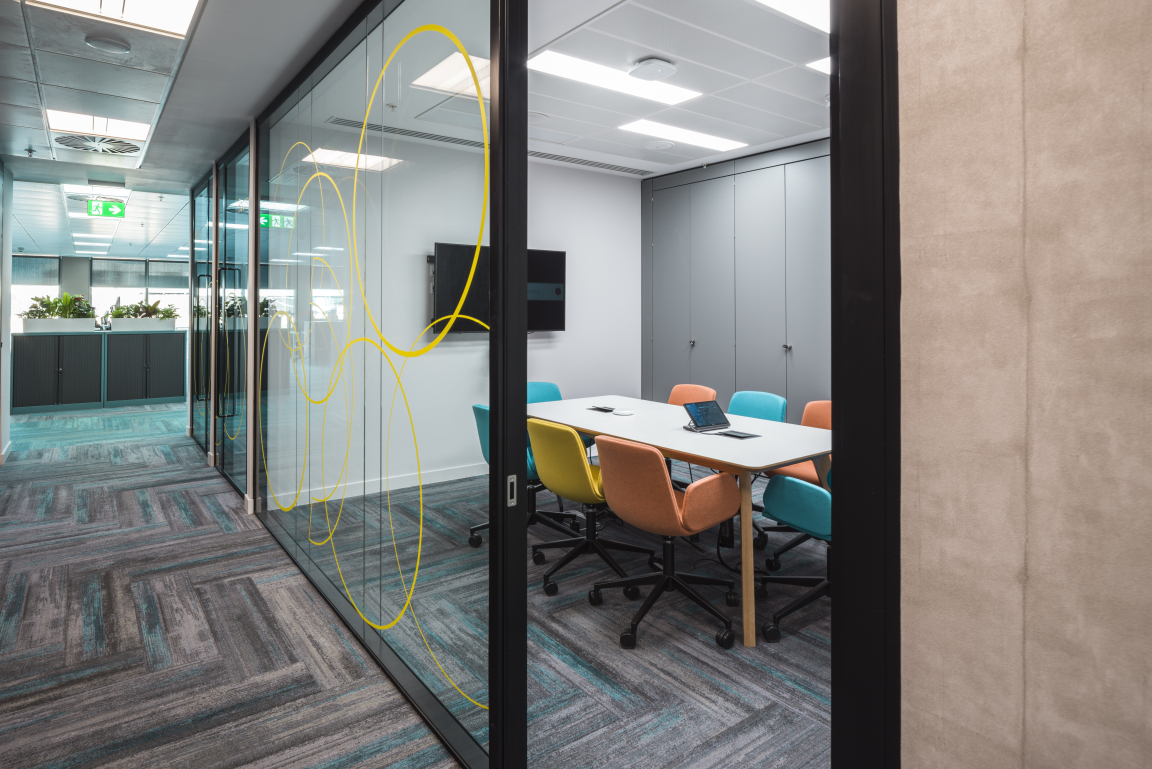
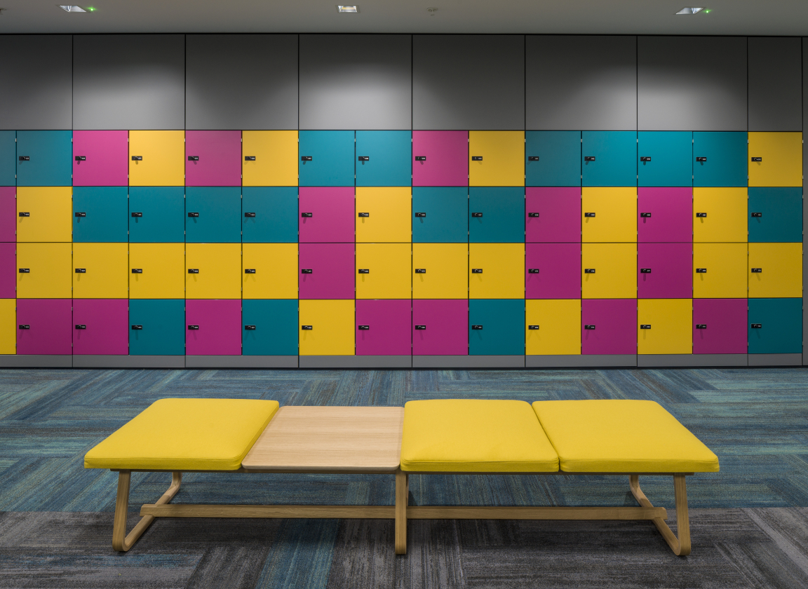
"Pinsent Masons also went through a rebranding exercise through the design process with a shift away from a corporate feel with heavy reds to one which is more relaxed and brighter. The brighter palette was used to define key areas such as collaboration and breakout spaces."
What are the key design features?
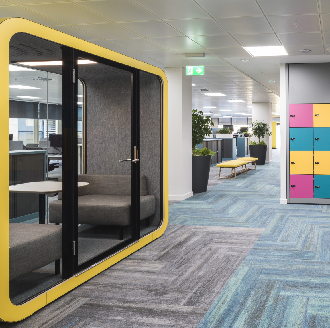
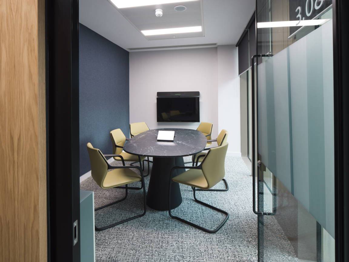
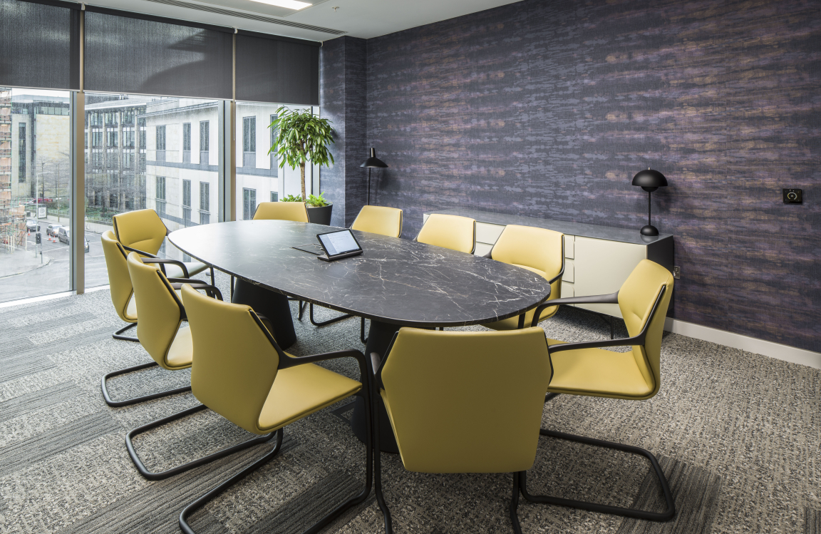
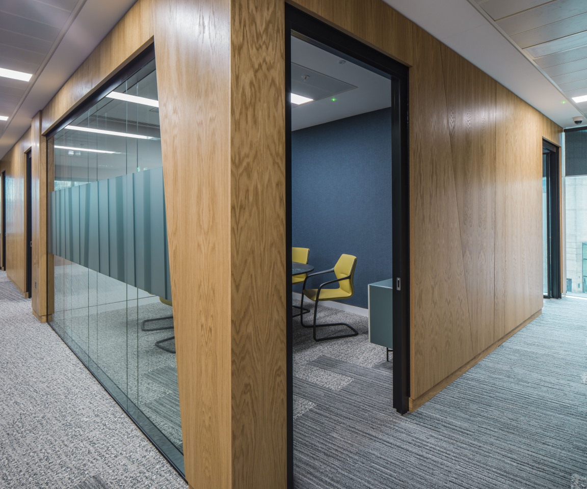
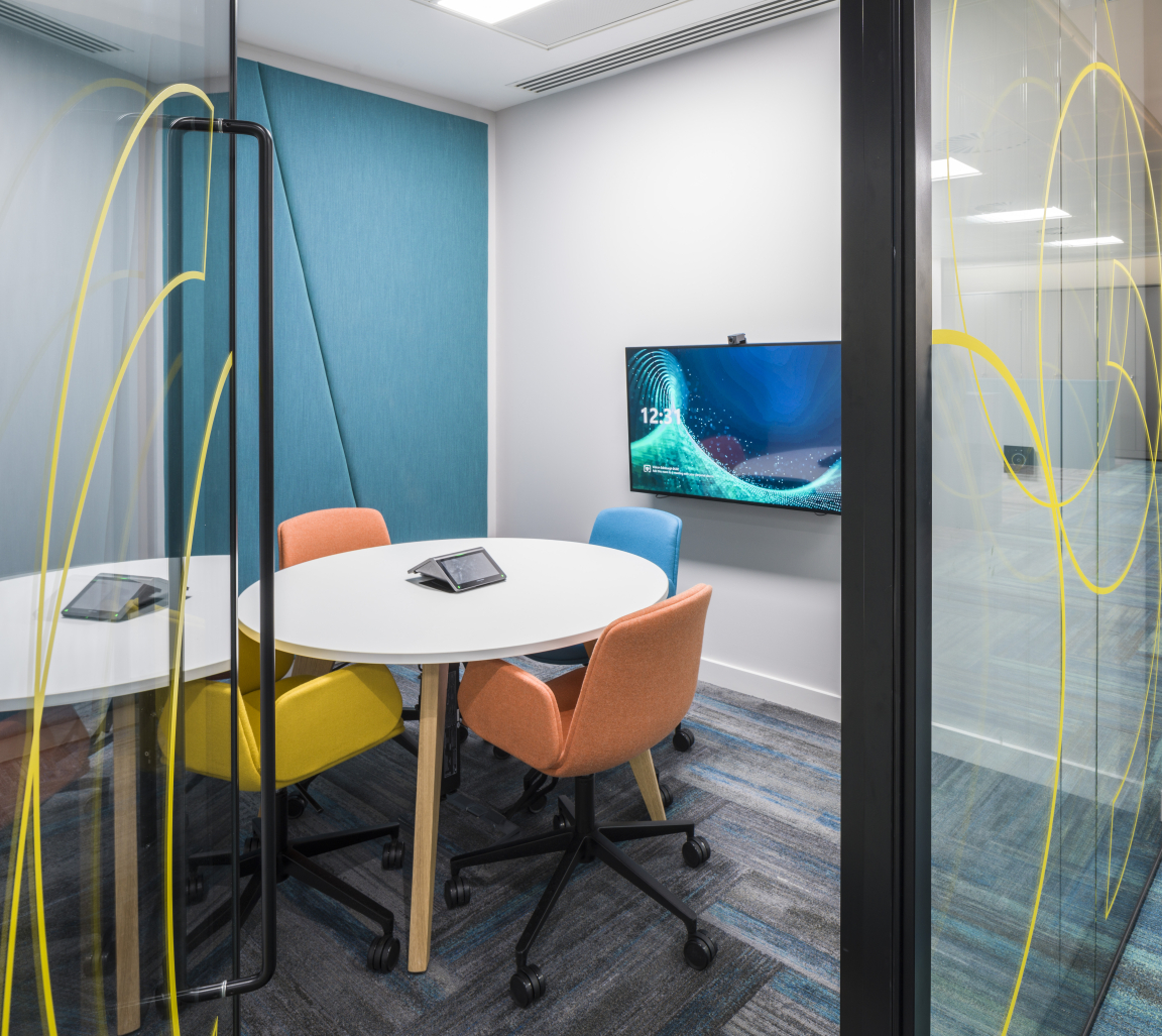
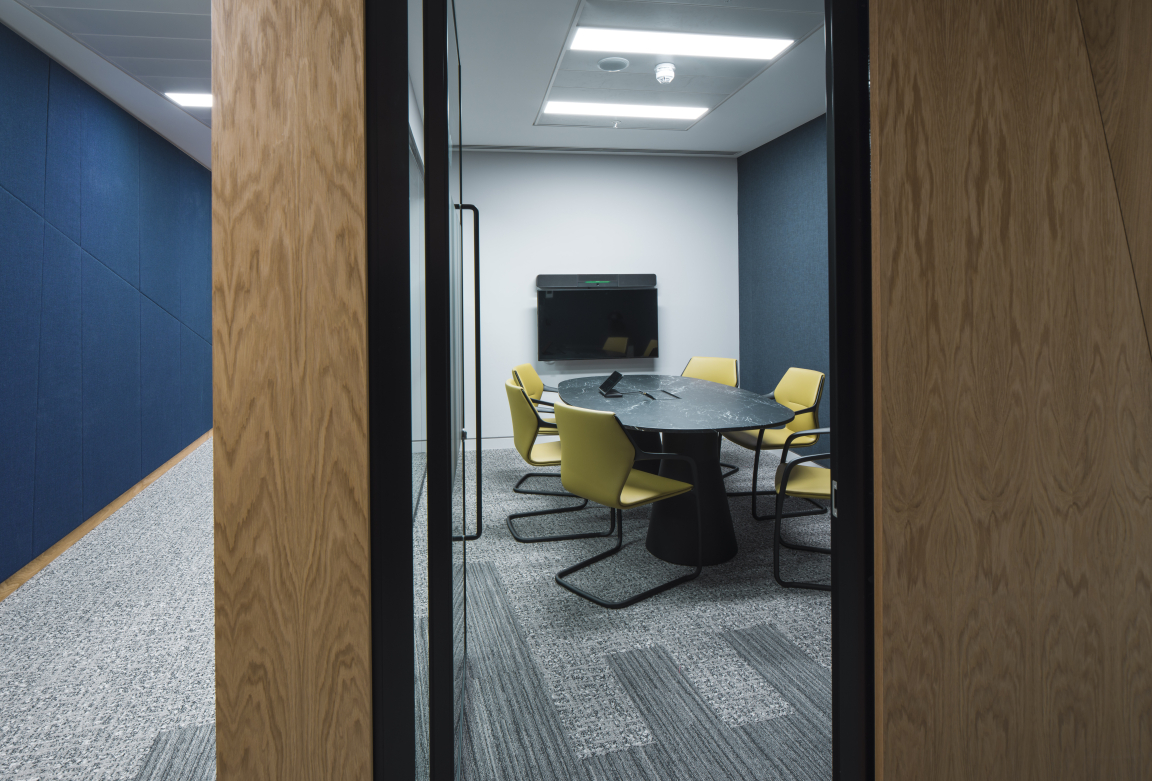
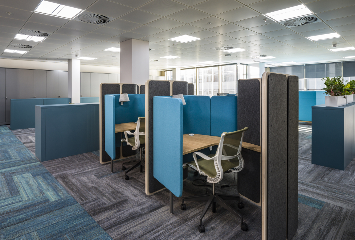
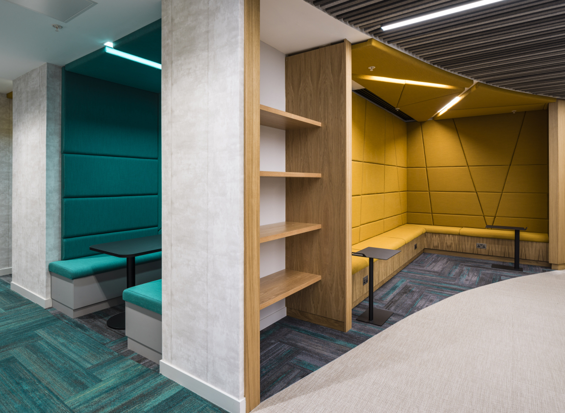
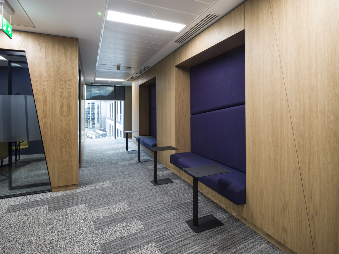
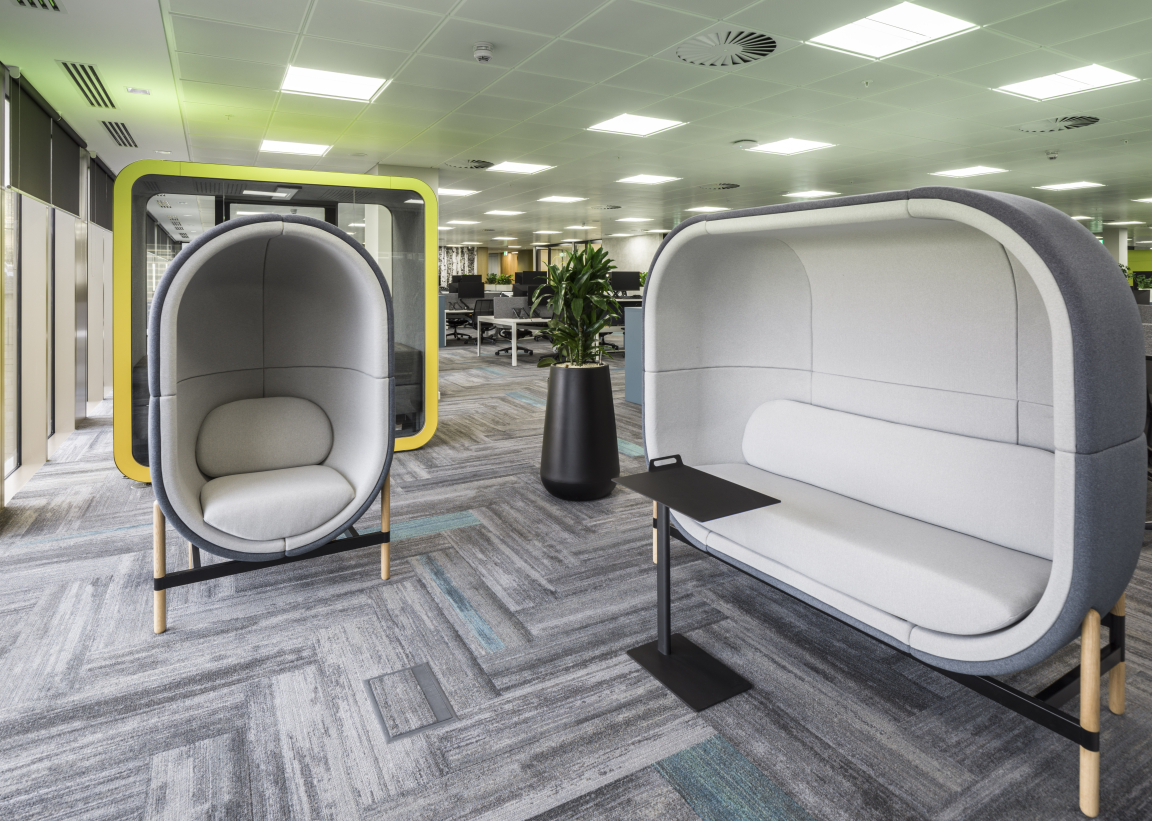
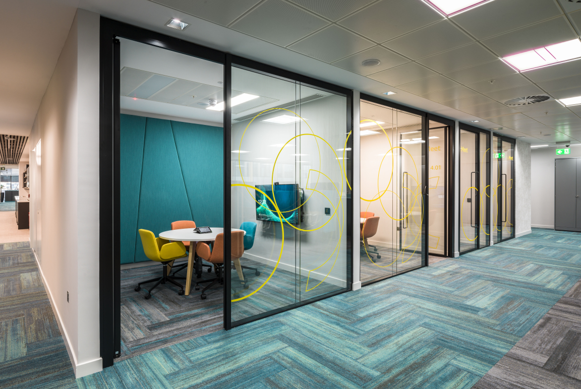
"Creating a workplace which fully supports Pinsent Mason’s agile working practices by providing the right choice of work settings was key. These include niches to take calls, focus rooms for concentrated work, booths for MS Teams calls, wellbeing zones, meeting rooms with plug and play AV to flexible seminar rooms. Critically many of the spaces provide acoustic separation. With the exponential rise in the adoption of video calling for meetings noise disturbance is one of the biggest issues within workplaces so these spaces away from the open plan are vital.
"How the key spaces were split over the two floors was also important. To encourage collaboration, it was felt best to have all the staff on one floor with the client suite and large breakout on the half floor.
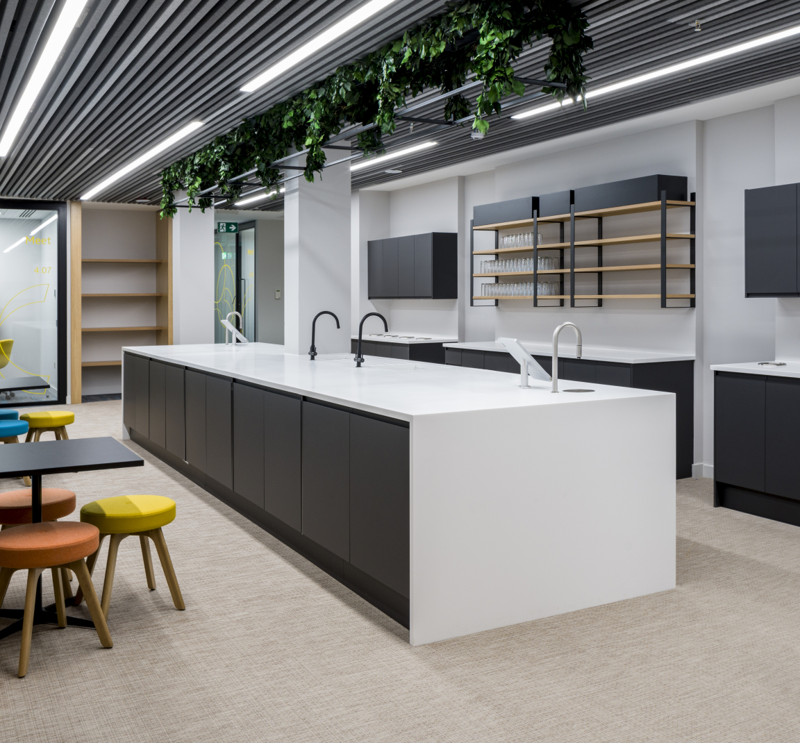
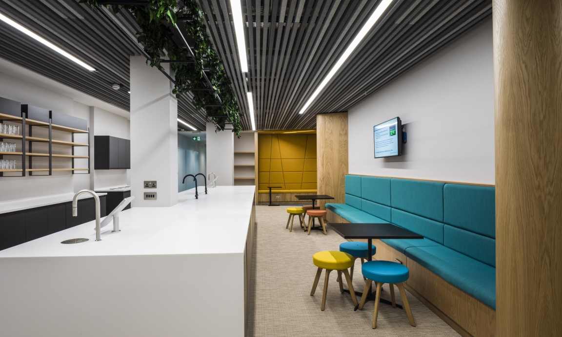
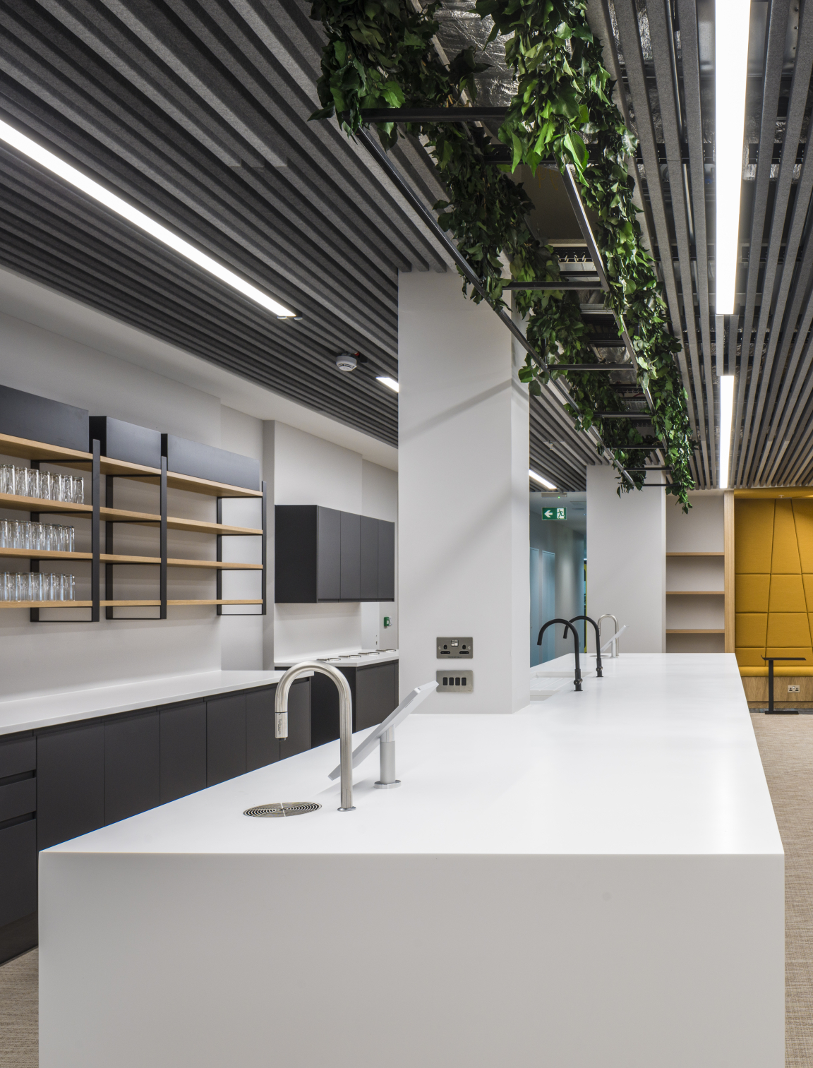
"Providing a people focused design was central to the design. From research which has been conducted since the Covid pandemic it is evident that on one of the things people missed was the social interactions with their colleagues. A central tea-prep with a large island unit is deliberately placed at the entrance to the staff floor to provide an opportunity for those unplanned collision moments between staff whilst making coffee. There is also a large breakout space with a deli bar with lots of natural light.
"Wellbeing and a connection with local community was very important to the staff so this is designed as a multi-purpose space which can be used for activities such as yoga and events as well as eating, working and informal meetings. This space which has a de-furbished aesthetic with mesh rafts, finished in the new brand yellow, with planting integrated, helps to create an environment that acts as a counterpoint to the open plan."
Credit: SG Photography
Credit: SG Photography
Credit: SG Photography
Credit: SG Photography
Credit: SG Photography
Credit: SG Photography
Credit: SG Photography
Credit: SG Photography
Did the pandemic impact on the design?
"The pandemic was a pivotal moment in embedding hybrid working practices. The brief was revisited during the pandemic and the open plan was reworked to reduce the number of workstations and provide more alternative work settings to support this."
How did the furniture support the overall design vision?
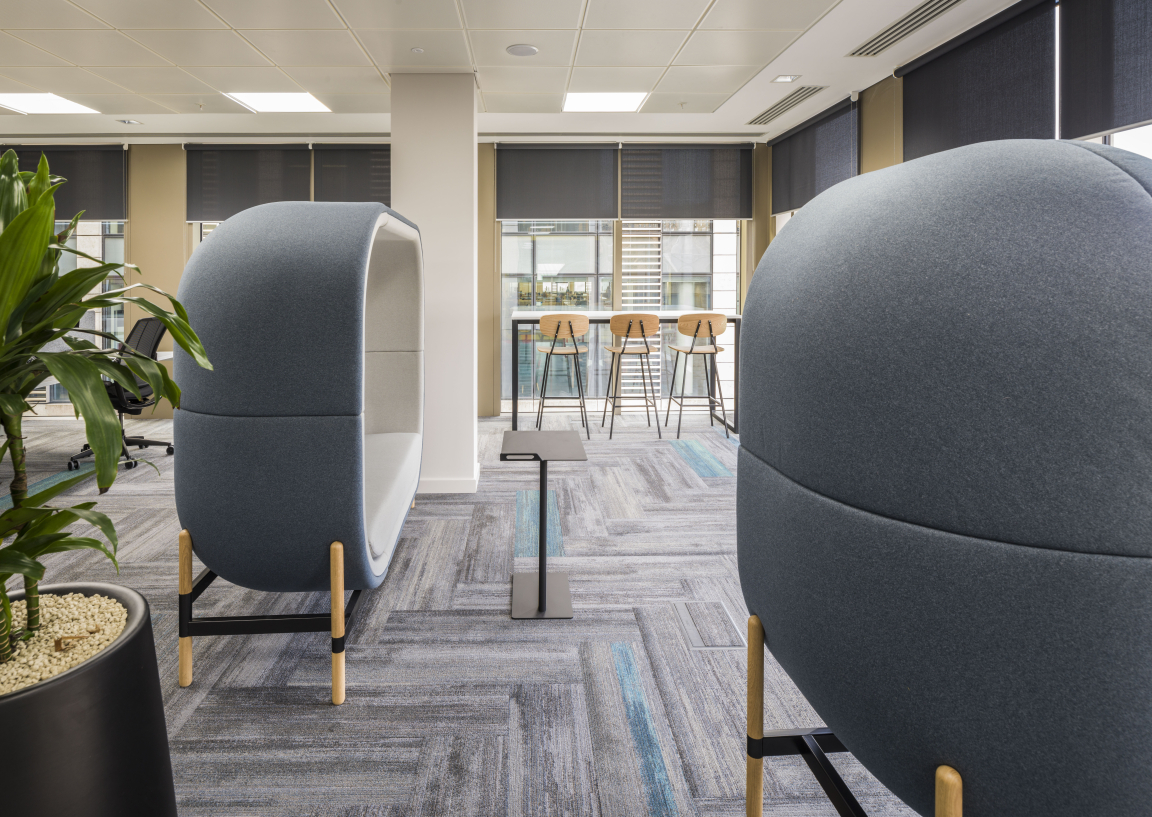
"The furniture was key to supporting alternative work settings and providing flexibility e.g. meeting pods, folding seminar tables. It was also integral to the overall aesthetic."
Credit: SG Photography
Credit: SG Photography
Credit: SG Photography
Credit: SG Photography
Credit: SG Photography
Credit: SG Photography
Credit: SG Photography


