Phoenix Wharf crafts candy-coloured fantasia at Bradford’s Oh So Yum!
Credit: Gary Britton
Bristol-based hospitality, retail and branding designers Phoenix Wharf have designed a new hospitality outlet for Harpreet Kaur, winner of this year’s BBC television series ‘The Apprentice’.
The new 144 sq m, 55-cover, sit-down ‘Oh So Yum!’ dessert parlour, located on Bradford’s White Abbey Road, will become the flagship for a brand that Harpreet and her business co-founder, elder sister Gurvinder, hope will become a national concern, set to "take over the dessert world".
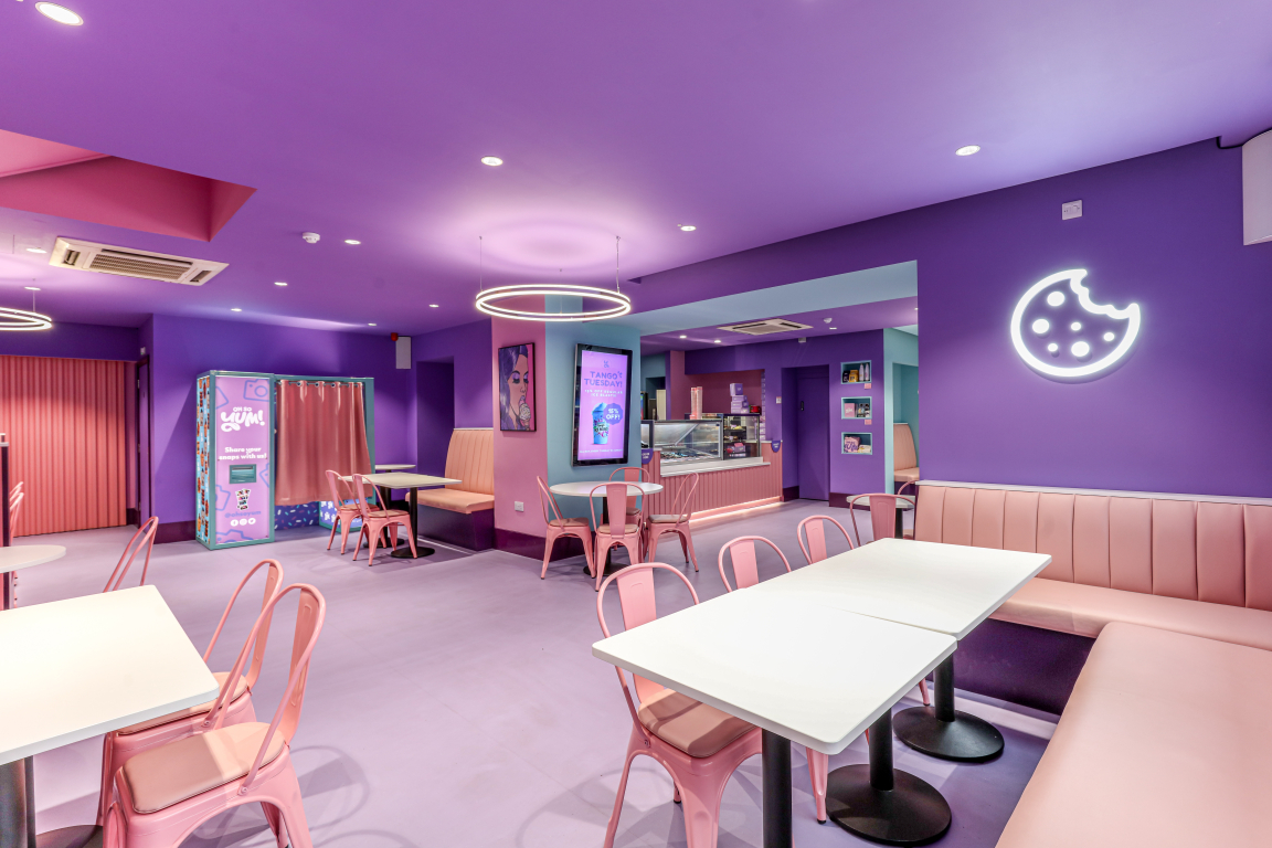
Two existing dessert parlours owned by the sisters in Leeds and Huddersfield, their home town, have now been re-branded as ‘Oh So Yum!’ outlets – having been formerly branded as Barni’s - with the Bradford site the brand’s new showpiece outlet, offering a full sit-down and sweet-treat takeaway offer, displaying the concept’s new branding (created by Halo using the name devised by Harpreet), as well as unveiling a candy-coloured fantasia for the interior, in an immersive, ‘wow factor’ space, inspired by Harpreet’s desire for a clean-lined, Willy Wonka-style interior experience.
Harpreet hopes the new outlet will help "put Bradford on the map", especially when visitors begin to flock to the district as a result of the successful City of Culture bid, adding "Bradford is such a huge city and loads of people come here to enjoy all the different food establishments, so we thought it would be the next best place to open."
The store will offer a range of sweet treats – from crêpes, shakes and cookies to waffles and ice cream - as well as halal, gluten-free and dairy-free products. An accompanying range of merchandise is available both online and at the store, including mugs, hoodies, aprons, tote bags, moneyboxes, cups, stickers and notebooks. The premises will also serve as the company's new headquarters and the packing centre for a burgeoning national online delivery service, all run from new offices on the building’s first floor.
Phoenix Wharf was initially introduced to the client by F&B specialists Seed Consulting, joining an existing creative team on this quick-turnaround project, including build partners Equinox. Phoenix Wharf then created the scheme’s interior design, developing the look and feel using Halo’s brand guidelines – and also did some graphics work on the scheme, including the menu design. "This was a really fast-and-fun project to work on", Emma Carter, Associate Creative Director at Phoenix Wharf, commented. "We’re delighted with the end result and hope it will be just the beginning of Harpreet and Gurvinder’s dessert empire!"
Credit: Gary Britton
Credit: Gary Britton
The site on Bradford’s White Abbey Road was formerly a retail premises. To create a totally immersive customer experience for the new store, permission was requested to paint the external fascia, which was duly granted, so that the brickwork shopfront surround is now painted candy pink, with branding in pink and white lettering (including the store name and ‘dessert parlour’, to clarify the new concept for new customers) on purple signage located over the entrance and two immediately-adjacent windows. Additional advertising banners feature on the building’s upper floor for maximum visibility. The main entrance, slightly to the right of the storefront, has one window to each side plus a longer window to the left, all featuring lightboxes for product photography and brand messaging displays.
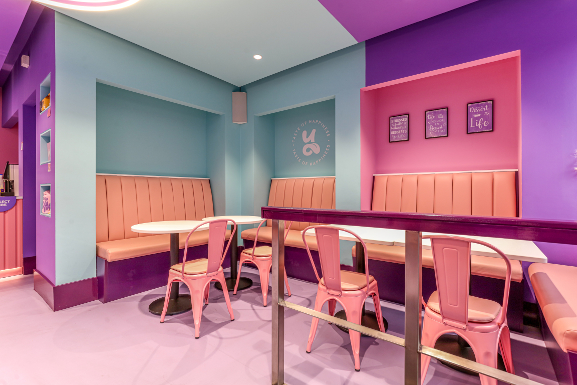
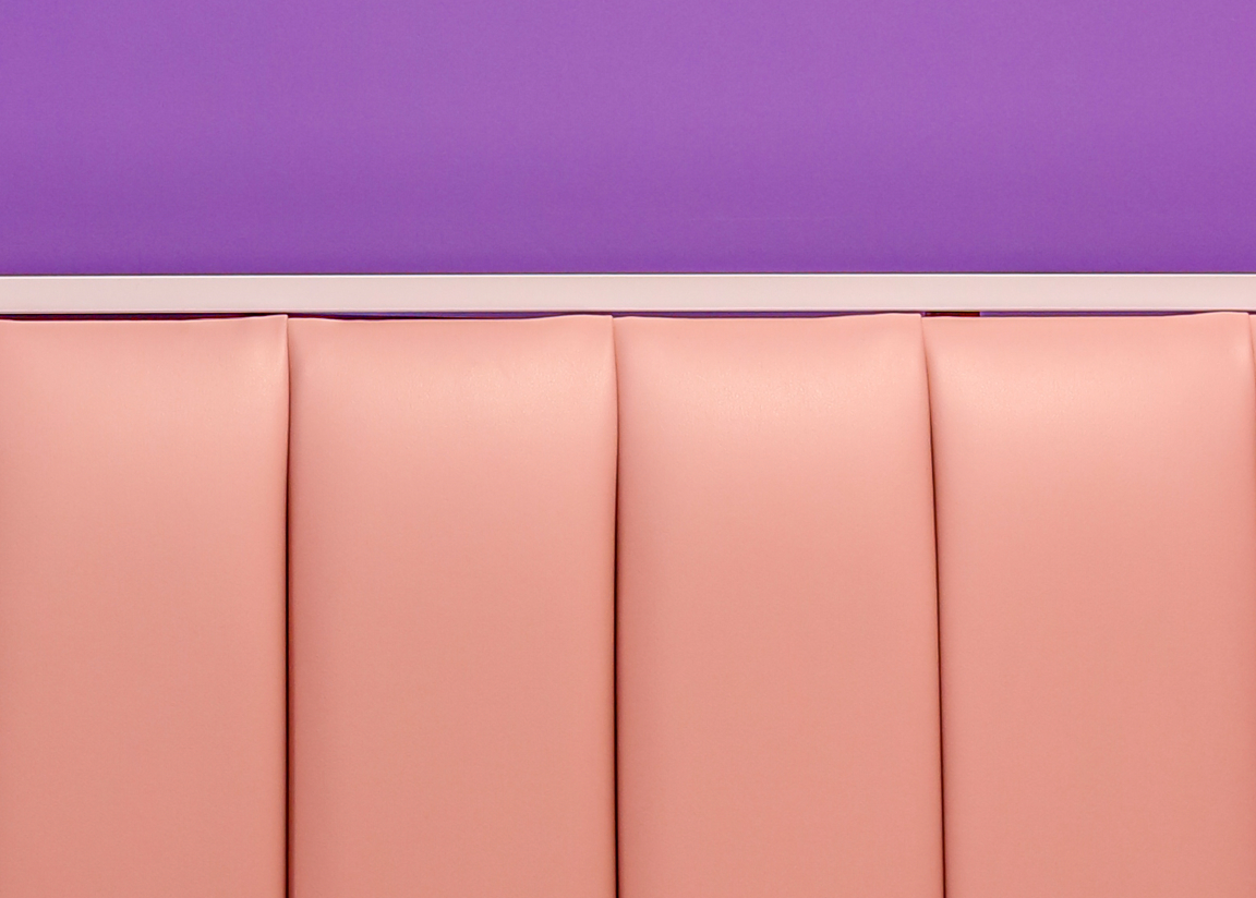
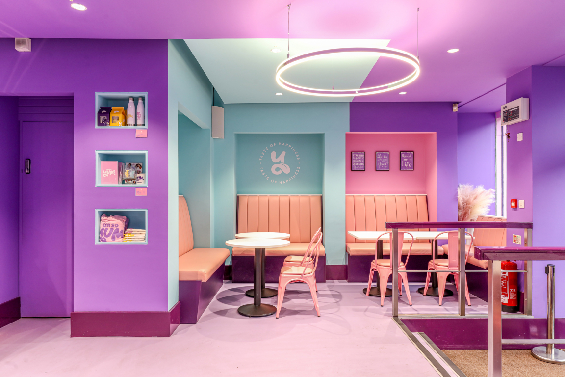
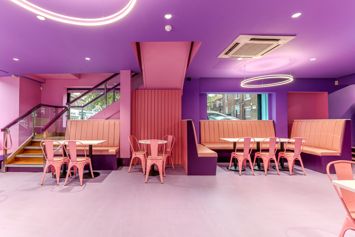
The 360° fantasia feel continues inside the store, with the candy colourway used for not only furniture and joinery, but for all surfaces. The space features flooring tiles from Marmoleum (the Forbo Eternal in lavender and coral, together with Polyflor Polysafe Ultima in iron ore), whilst the ceiling is painted in a deeper shade of purple. The all-pink furniture is a mix of bespoke-designed banquettes, upholstered in faux leather, and loose chairs. And the third colour in the main palette – a warm peppermint green, is used sparingly for sections of the wall – with pink also used again here, creating constant visual interest and allowing for easy segregation into different seating areas and activity zones.
The first such zone is a waiting area for 4-5 people immediately to the right of entry, with a banquette seat, partially inset into a peppermint green recess, servicing both takeaway customers and those waiting to be seated if the main area is full. High-level shelving allows for display and storage of merchandise - with further merchandise areas set into the walls elsewhere. All merchandise is displayed with a QR code to encourage online purchasing and to prevent dust gathering on stock, but customers can also ask to purchase in-store if they prefer.
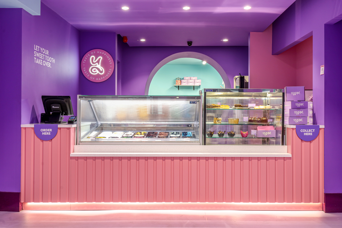
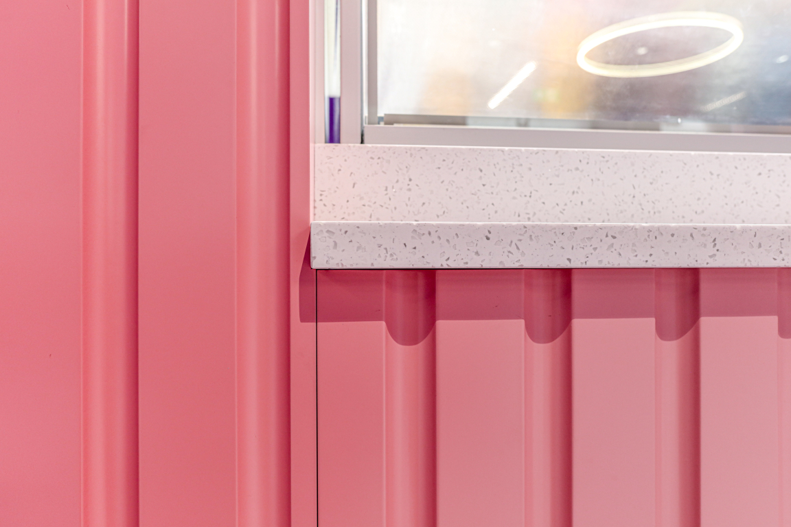
The counter area, where customers order, is situated directly opposite the entrance and is highly visible immediately on entry, showcasing the food display and ice-cream cabinet. Low backs to the bench and banquette seating ensure clear sight lines. The counter front is pink, with a vertical tongue-and-groove panelled finish, underlit at its base. Lighting throughout features lights from the Hacel Lighting range, including the main circle chandelier lights which are the Explora® Halo Pendant.
Credit: Gary Britton
Credit: Gary Britton
The back counter features a coffee machine, alongside an ingredients display, with space for prepping drinks for service and the ‘Oh So Yum!’ branding applied to the wall in pink neon. The logo marque, using just the ‘Y’ of the identity, also features in a neon illuminated sign on the right of the entrance wall on a purple wall section and again on the back wall of the back-of-house kitchen, against the peppermint green. The back-of-house area beyond the counter and back wall features a wash-up station, together with a prep area, including under the counter fridges, all hidden from customer view. The waffle and crepe stations face forwards and can be glimpsed by customers, adding a theatrical dash to the experience.
The first floor business offices are accessed via a stair to the far left of the space, with walls clad in pink-painted plaster to integrate the stair with the ground floor treatment. Usable space is maximised with seating incorporated directly below the staircase.
Harpreet Kaur commented on the design, "Phoenix Wharf were so easy to work with, both in their ability to realise my vision for the brand and the way in which they worked so well with the existing team. I loved their creative concept development too, so that the parlour is full of clean lines, intelligent use of space and fun colour adjacencies. We’re now open, products are flying off the shelves and we’re hoping the people of Bradford and beyond will really take Oh So Yum! to their hearts!"
Credit: Gary Britton
Credit: Gary Britton


