Run For The Hills transforms a Georgian bank into a chic, loft-style office space
All photography courtesy of Run For The Hills
London-based design studio Run For The Hills has transformed a formerly unloved and dilapidated Georgian bank in the heart of Birmingham into an urban chic, loft-style office space.
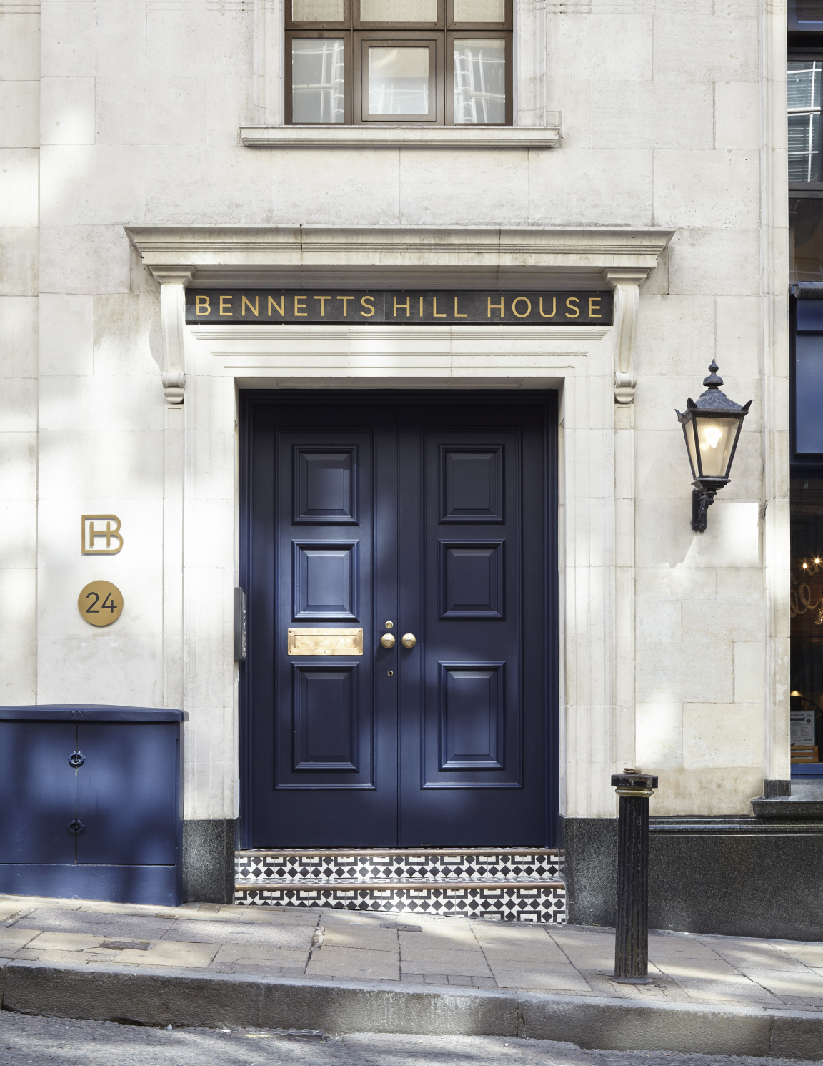
Drawing inspiration from Georgian facades and private members club entrances, the exterior of the property is now befitting of the young, vibrant clientele it hopes to attract. The front door, repainted in an inky dark Paint & Paper Library blue, is adorned with bronze ironmongery; an antique-style bell, door knocker, letter plate and buzzer.
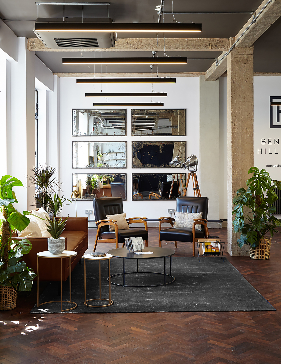
Above and around the main sandstone entrance, statement new signage in blackened steel and antique brass give visitors a hint of the premium design within. The main lobby features oversized antique mirrors, flanked by the project’s eponymous dark blue painted walls.
Called Bennetts Hill House, it's the second collaboration between Run For The Hills and property developer Dunmoore, following the success of the redevelopment, styling and rebranding of the Wireless Factory warehouse style workspace project in West London.
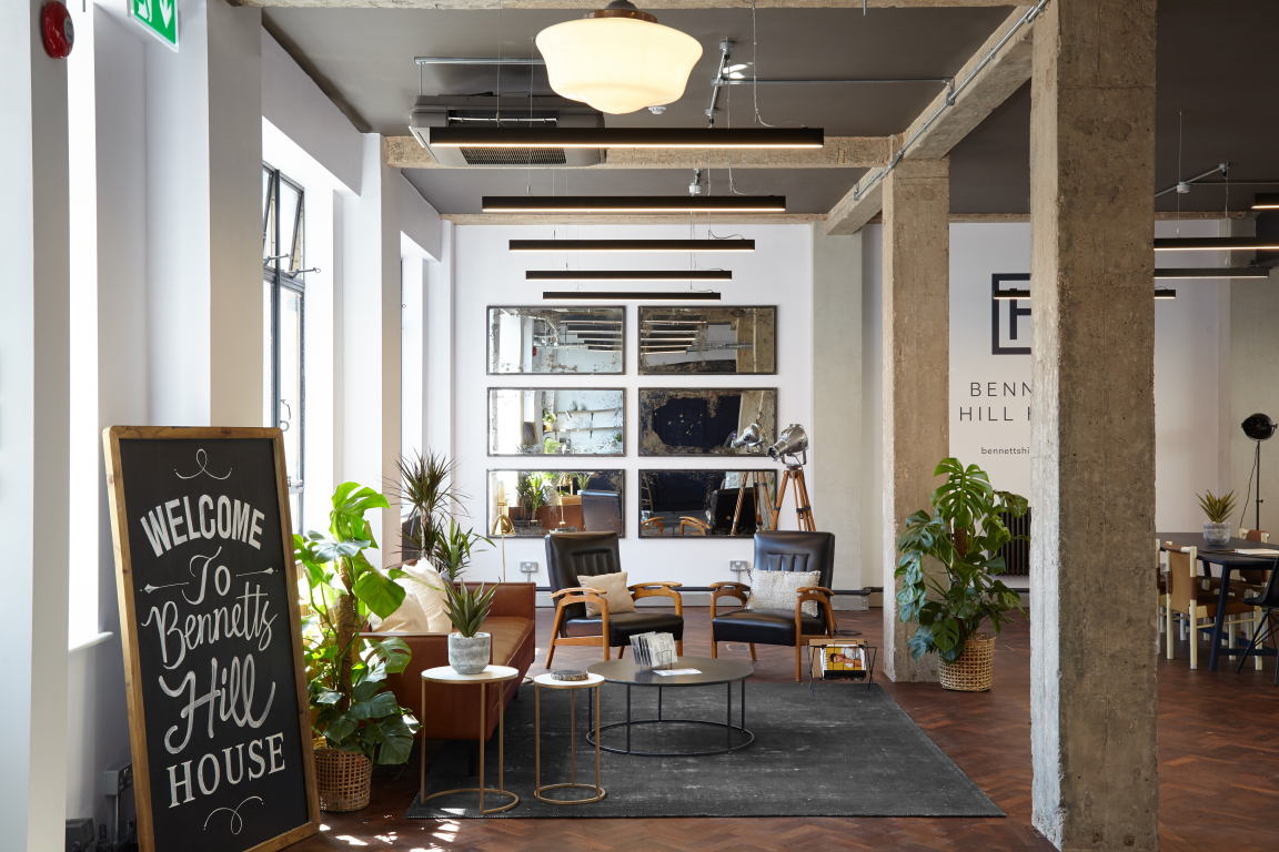
Led by Creative Directors Anna Burles and Chris Trotman, Run For The Hills’ holistic approach, includes working on everything from the interior design of Bennetts Hill House to the origination of the branding, logo and entire visual identity and website – from the exterior signage and the "to let" board outside, to the company board in the main lobby and internal way-finding and signage throughout the building.
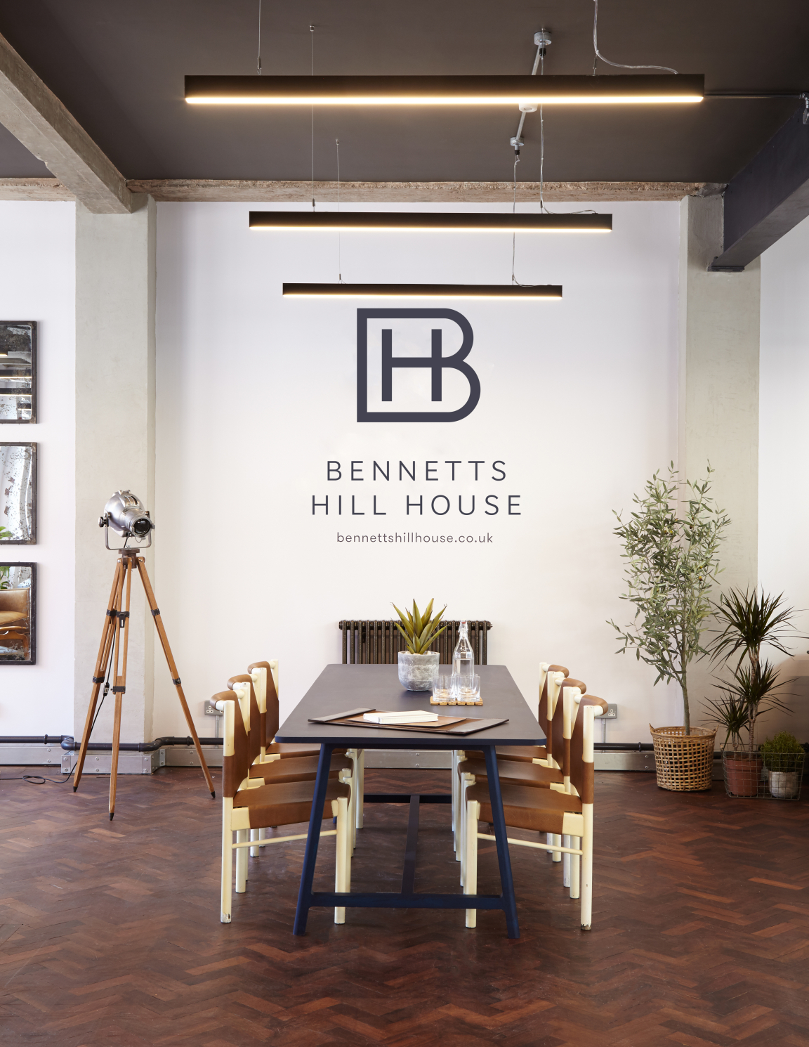
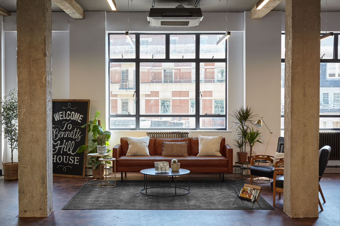
"The brief from our Client, Dunmoore, was to create a taste of Soho/Shoreditch in the heart of Birmingham," says Anna Burles. "We wanted to create a space that felt urban and cool but also sophisticated and appropriate for the heritage Georgian building. Our monochromatic scheme of deep midnight blues, urban greys, off-whites, chalk and clay is dramatic but with an elegant, utterly timeless feel which would appeal to men and women."
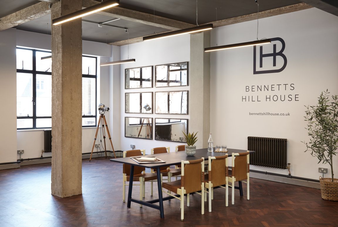
Leading the branding side of the project, Chris Trotman adds: "We kept the branding sophisticated and sleek, with a Member’s Club feel, in keeping with the interiors, using a palette of dark blue and white. Our signage designs, in die-cut metals, have been kept discreet and minimal.
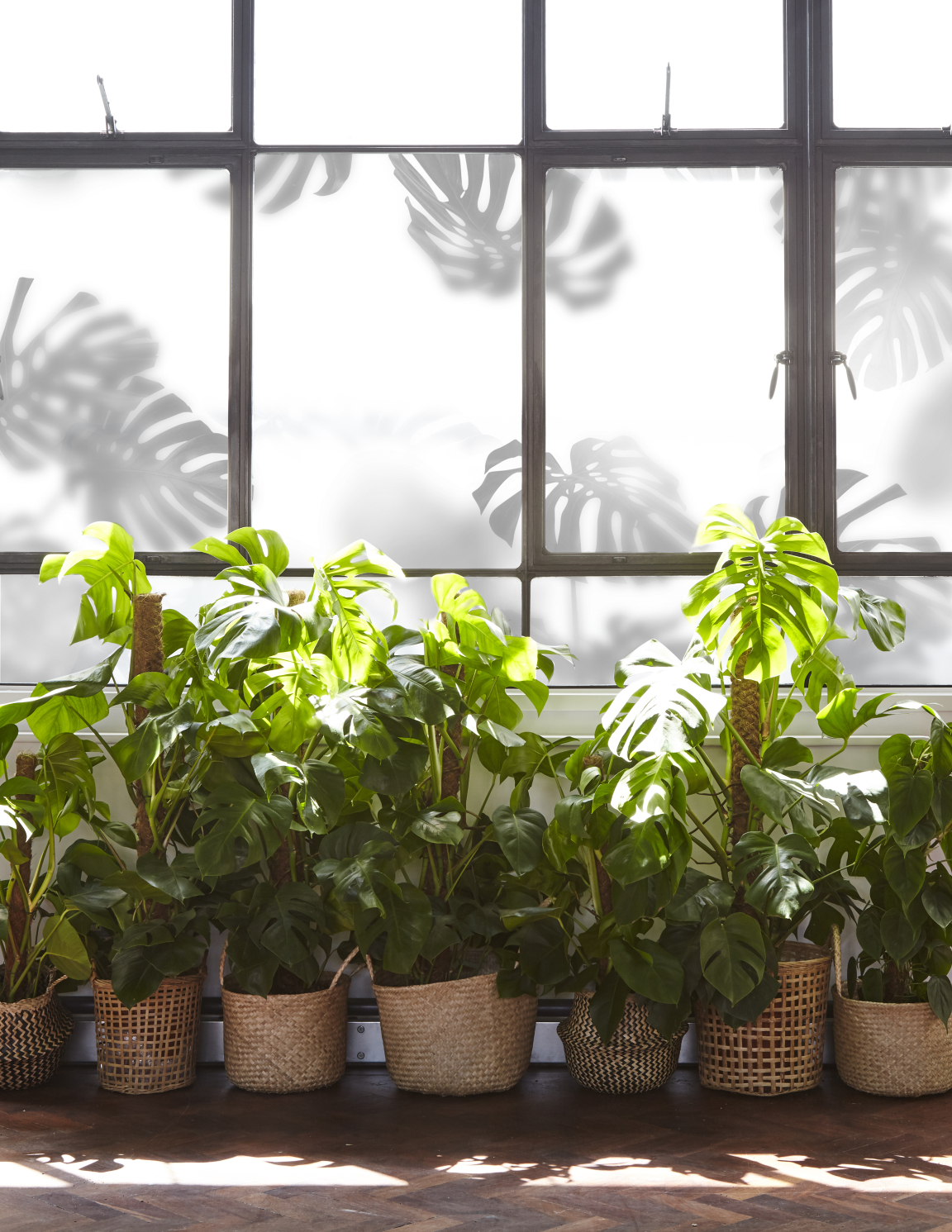
"The atmospheric Monstera semi-opaque plant graphic created for the Crittall style windows of the show suite is a particular favourite motif that we have used within the interiors and on the website, connecting the marketing campaign to the physical space."
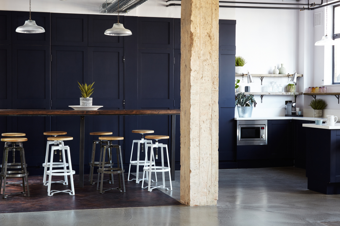
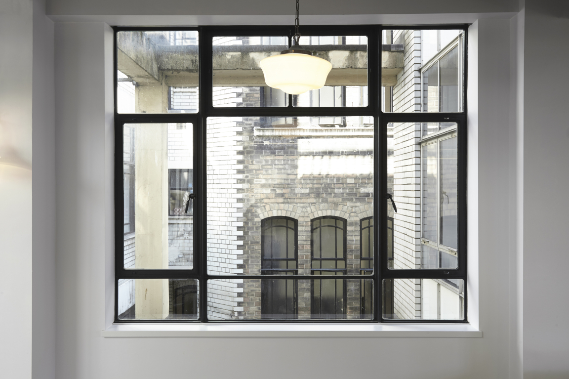
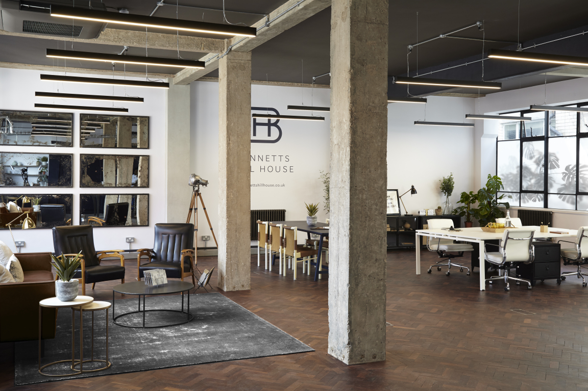
The new open-plan offices feature super high ceilings with exposed concrete pillars, exposed steel beams and oversized vintage blackened steel mirrors. The "studios" also feature large, steel- framed Crittall windows on all sides, allowing swathes of natural light to flood through the space.
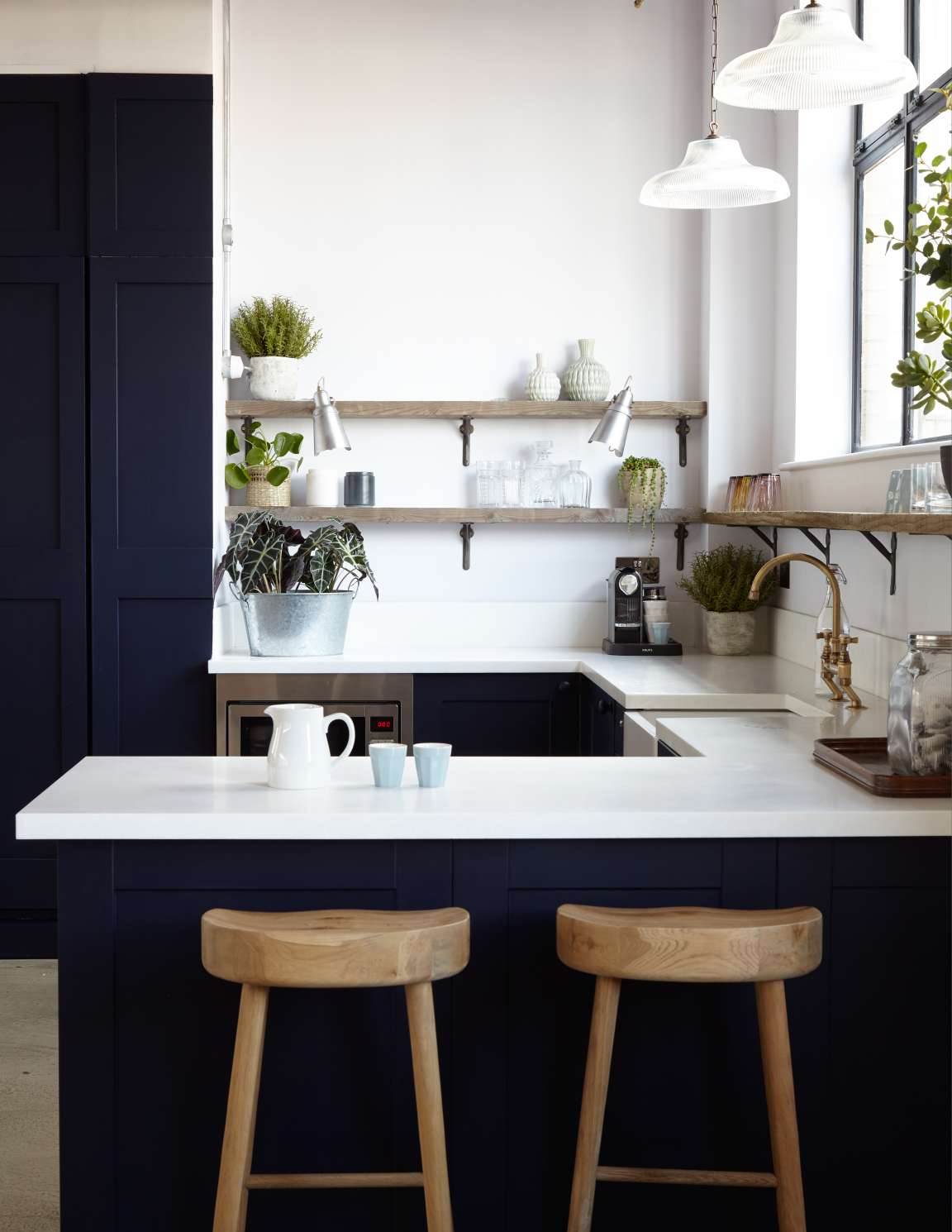
The show suite on the fourth floor also showcases the stylish shaker style kitchens designed by the interiors team, featuring crisp marble worktops, super dark painted cabinets and doors, antique brass taps, butler sinks and apothecary style cabinet handles. Rather than overhead cupboards, the kitchens have reclaimed timber open shelving with cast iron brackets, making a style statement and keeping things feeling light and airy.
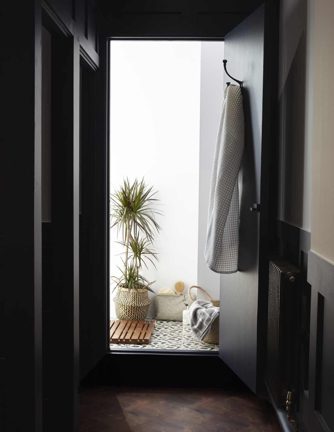
Each floor of the building also has beautifully styled WCs and private showers, featuring the original reclaimed parquet from the Georgian Bank’s original fit out, and new dark painted geometric timber panelling, new Victoriana style sinks and high-level cistern WCs, with industrial cool wall lighting and tilting mirrors. All of which would be much more at home in a boutique hotel than your average workspace.
To find out more, visit runforthehills.com.


