Sheila Bird Studio x Runway East: Vibrant colour, mood-boosting patterns, prints and hidden rooms.
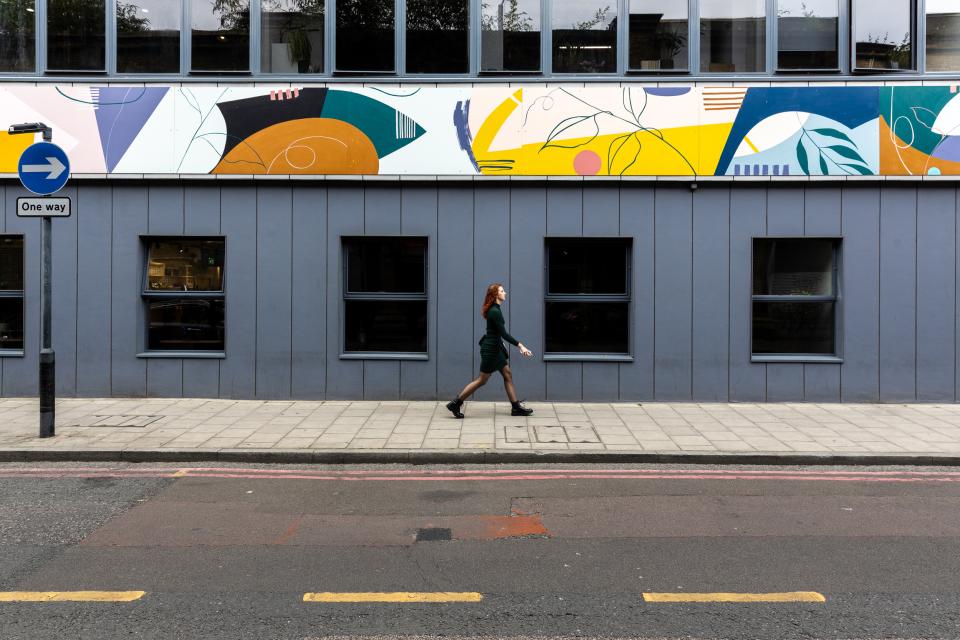
Runway East London Bridge
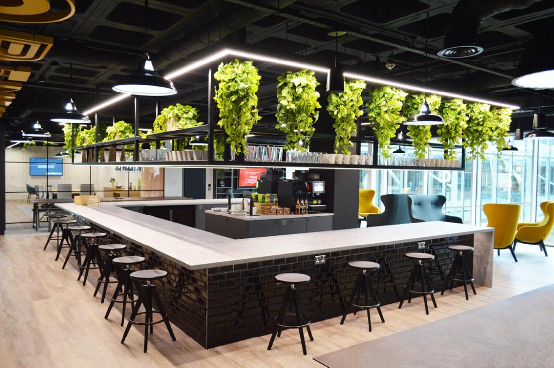
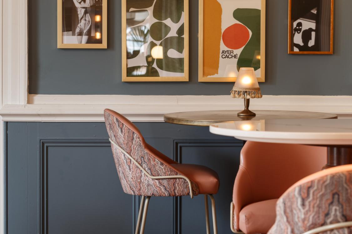
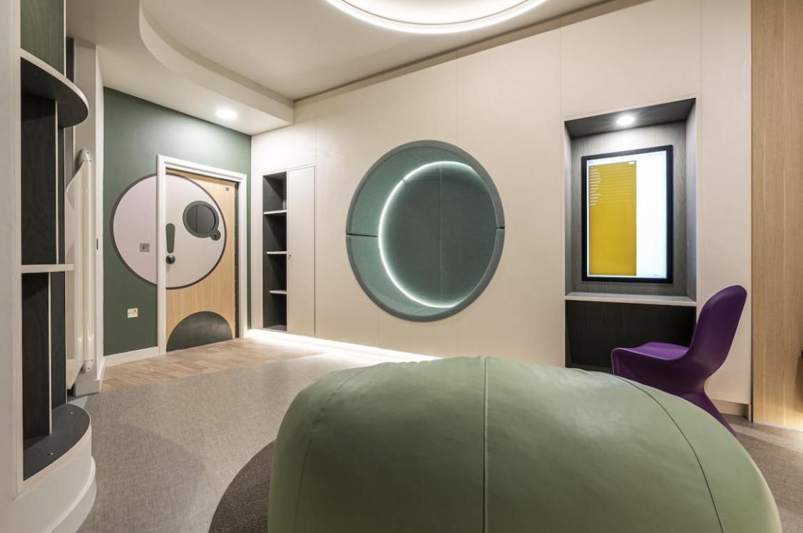
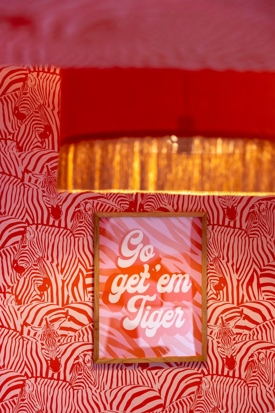
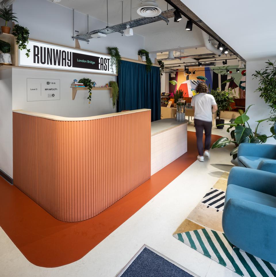
Our friends and neighbours Sheila Bird Studio recently supported co-working stalwart, Runway East, in reimagining its London Bridge and Shoreditch sites, injecting a bold set of design features that both celebrate and nurture community.
After sharing a sneak peek of the project with us, we were hooked, and keen to know more. Here, Jon Humphreys, co-owner and creative partner of Sheila Bird, explains all...
How did the project come about?
"Runway East is a co-working community that provides space for high growth start-ups, operating in Bristol and London. CEO Natasha Guerra contacted us to act as the design lead to define what their interior brand could be as they grow as an organisation. As part of a company rebrand, they wanted to work with people who understood how brand and space could move in the same direction. There was an understanding that the co-working / flexible office sector is moving at pace and customer expectations are rising so they needed to evolve and carve their own niche in an increasingly busy market.
"Above all it was their passion for community building and the care about the happiness of their tenants that made us say yes. That’s right up our street and we could really tell that they meant it. Starting with two fantastic new flagship sites in London the challenge was to define their vibe and bring them two very different buildings."
Who drove the boldness of the scheme – did that come through in the client brief, or was it an injection of Sheila Bird’s signature style?
"I’m not sure we have a signature style as most of our projects are quite different from each other. Rather than imposing a style upon our clients we see our job as a translator of their individual cultures and personalities and help to bring these qualities to life in a space. So, the process is very much a dialogue to build an understanding of what they are all about. The Runway East vibe is bold, playful and full of personality, so we enjoyed challenging each other to discover what exactly that means for them."
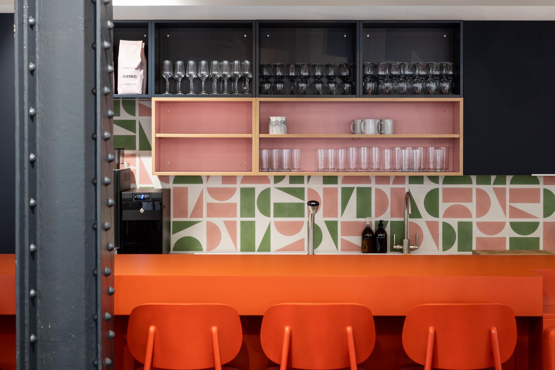
Runway East Shoreditch
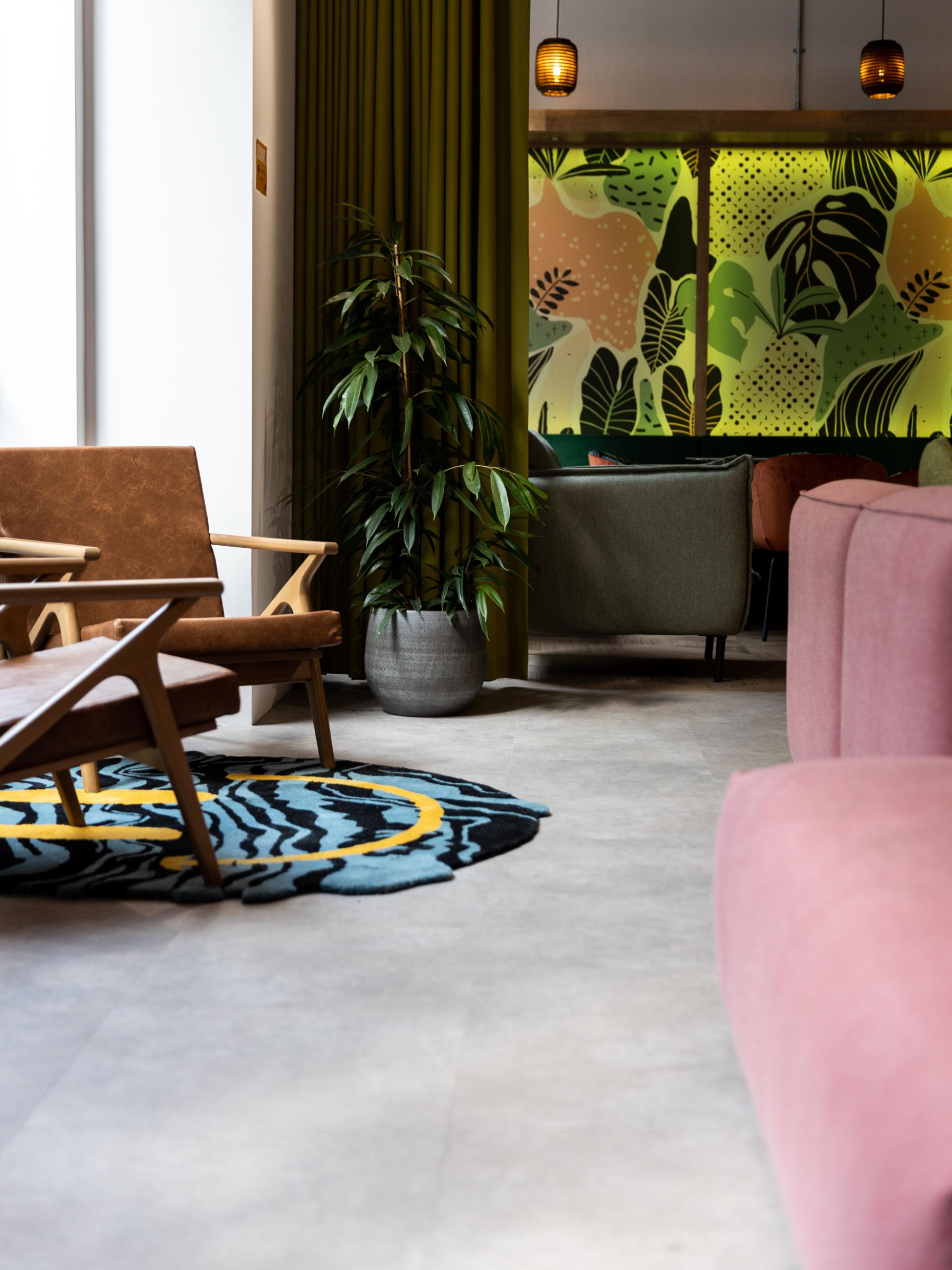
Runway East Shoreditch
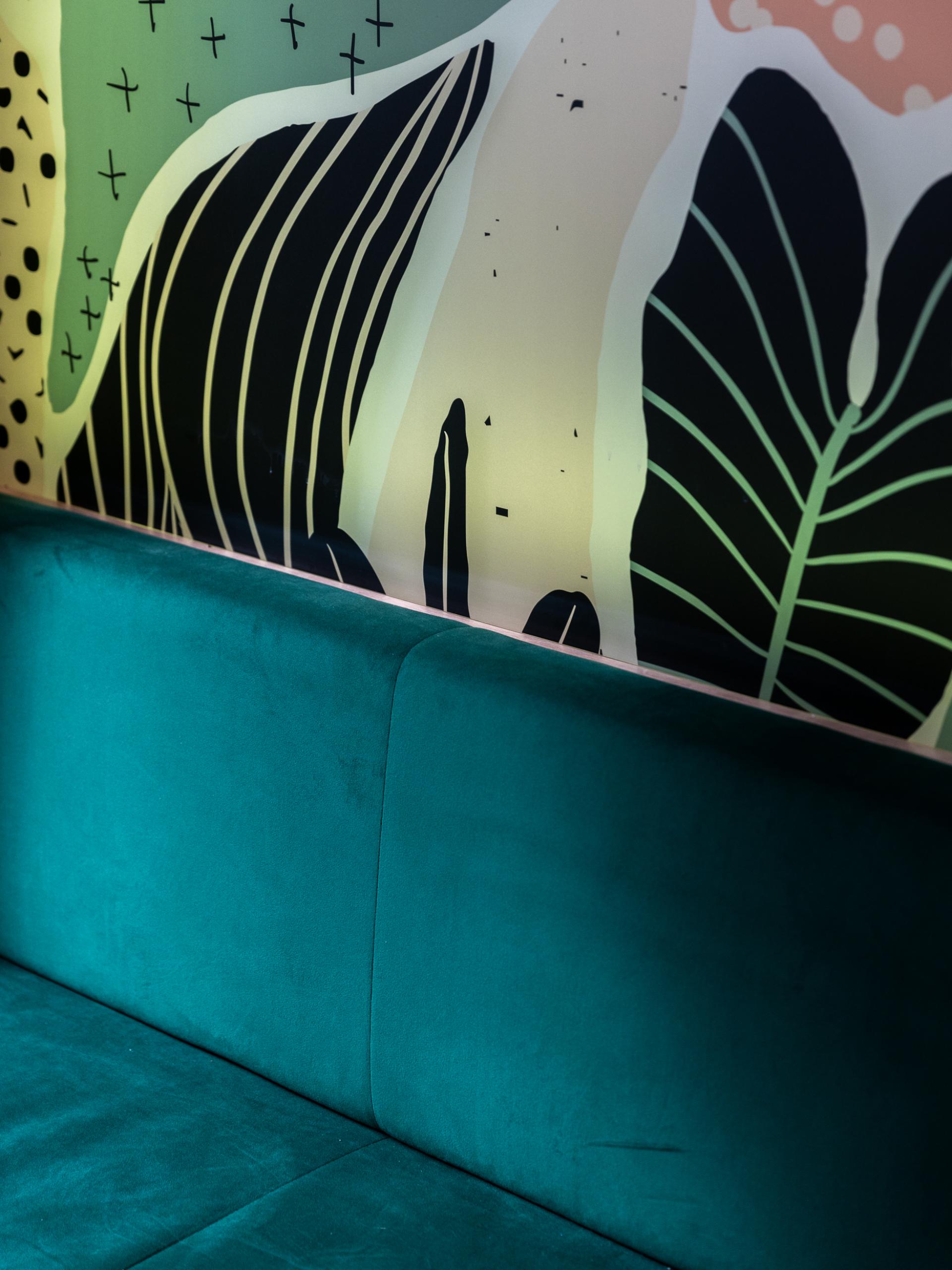
Runway East Shoreditch
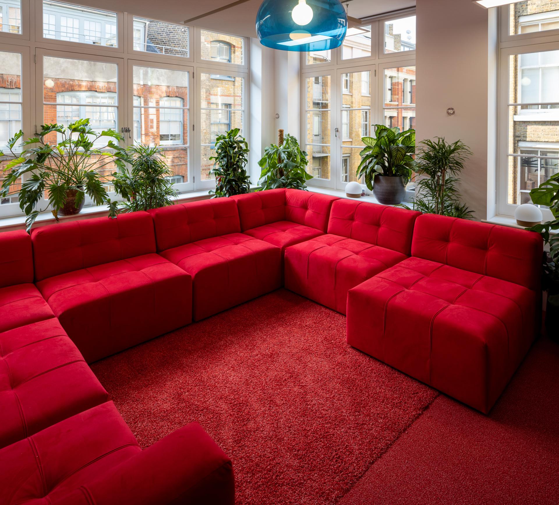
Runway East Shoreditch
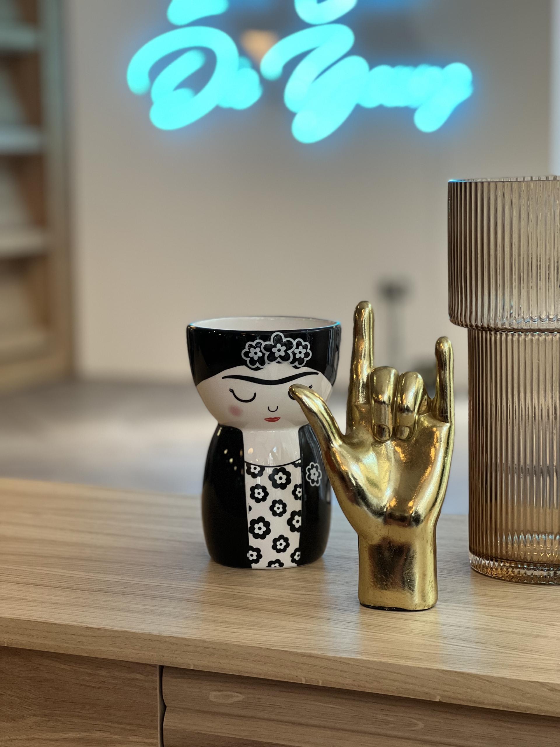
Runway East Shoreditch
The scheme mixes bright colour with pattern and statement pieces – there’s something showstopping at every turn! Did you have a lot of fun putting it all together?
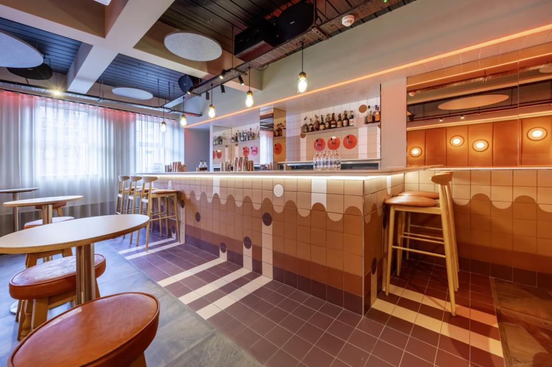
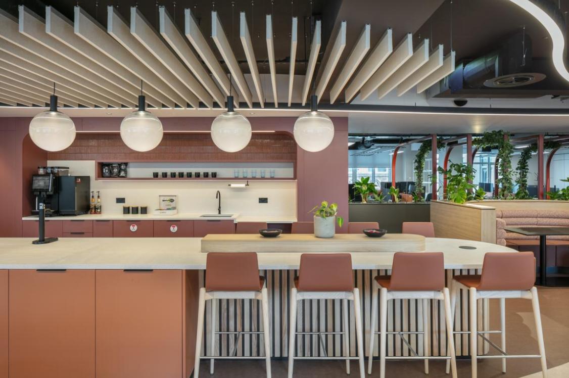
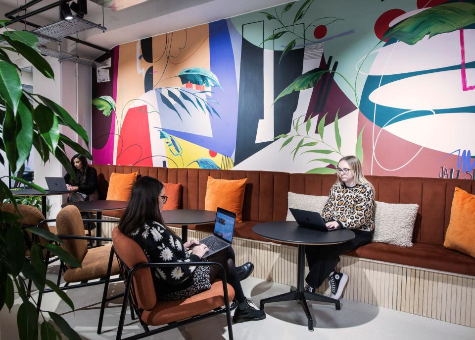
"We had a lot of fun working on these projects. RWE are all about creating communities so there is a lot of emphasis on the shared spaces that bring people together to create a strong sense of belonging. These communal spaces flow throughout the building across 6 floors so it was important to give each one its own unique character and purpose and promote movement and interaction up and down the building.
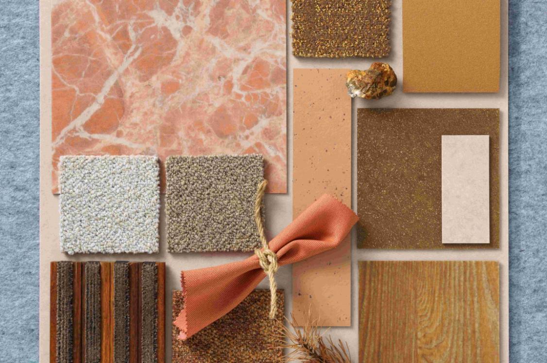
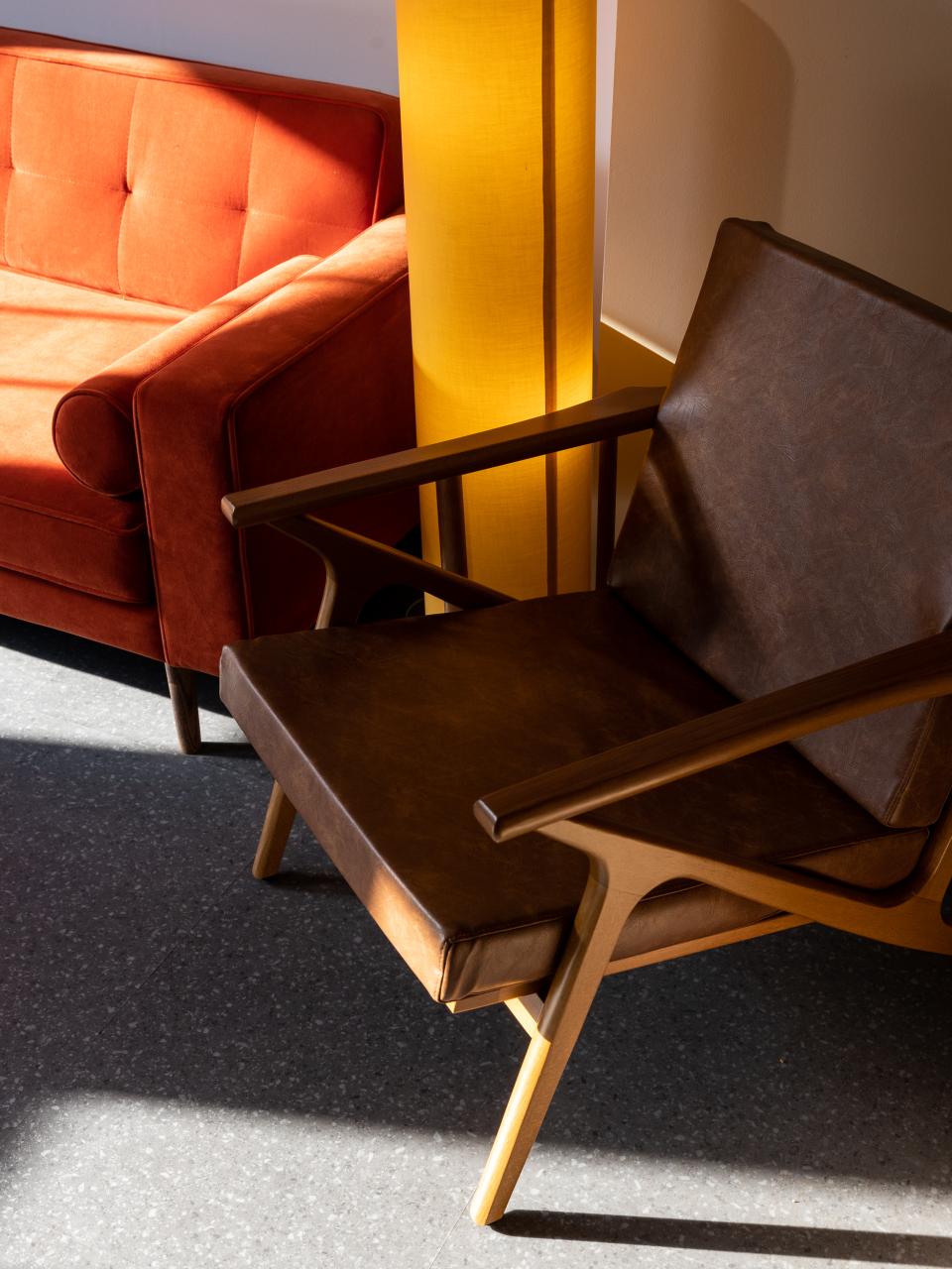
"We developed a broad but defined colour and material palette for the entire building that we were able to dial up and down in different areas to create different personalities, e.g. on the 4th floor there is a space devoted to playing board games which dials up more muted, pastel tones, and on the 2nd floor there is a space that is all about chatting which has been influenced by the luxurious sunken conversation pits of the '60s."
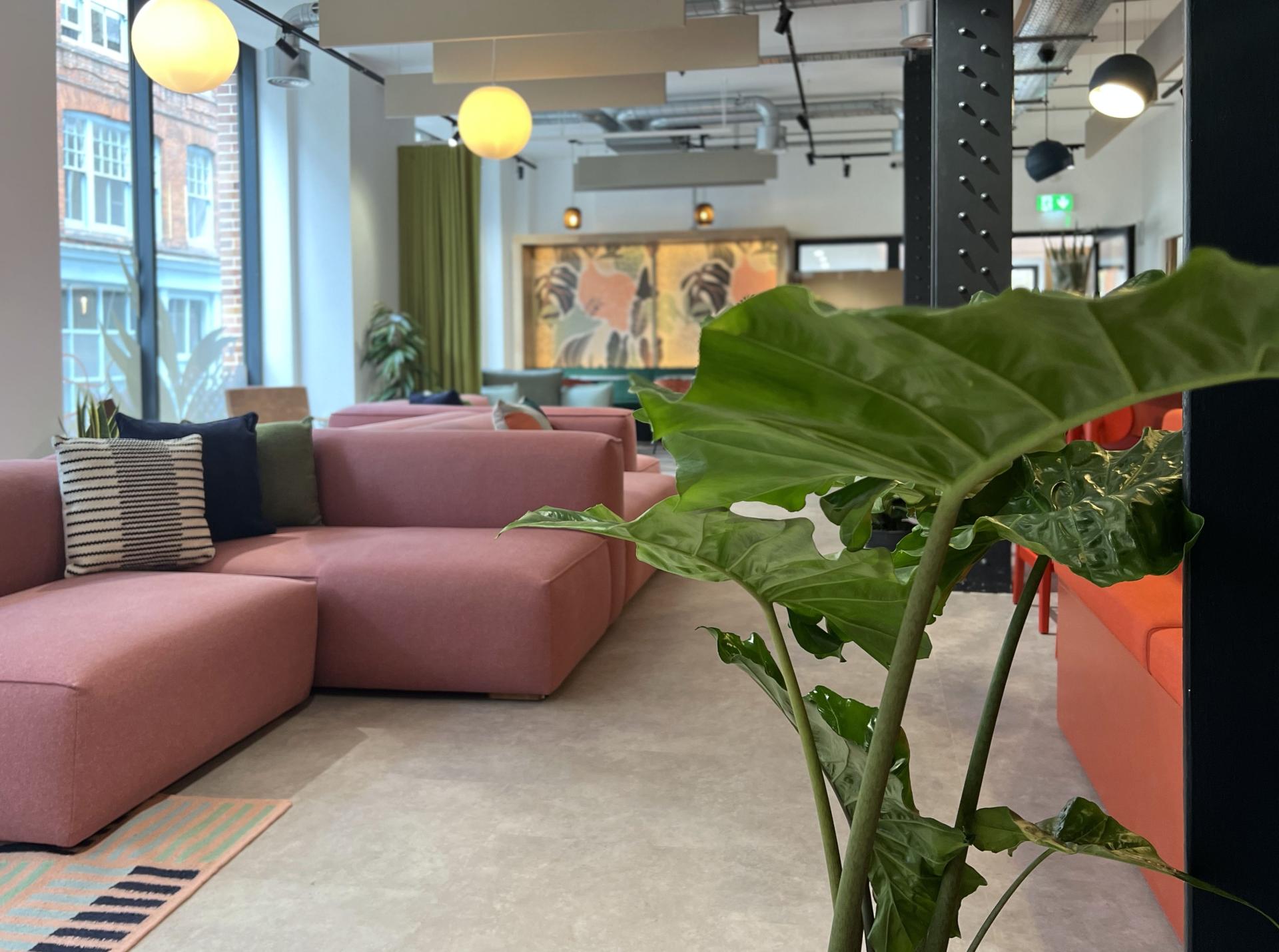
Runway East Shoreditch
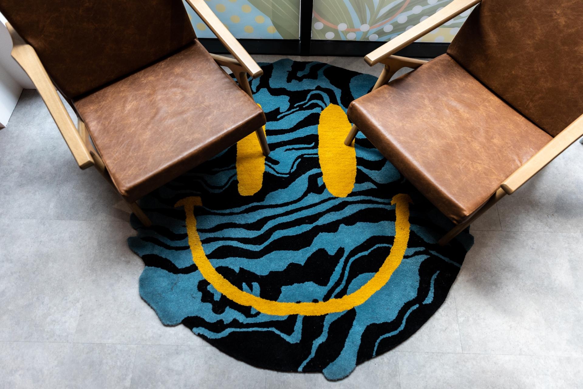
Runway East Shoreditch
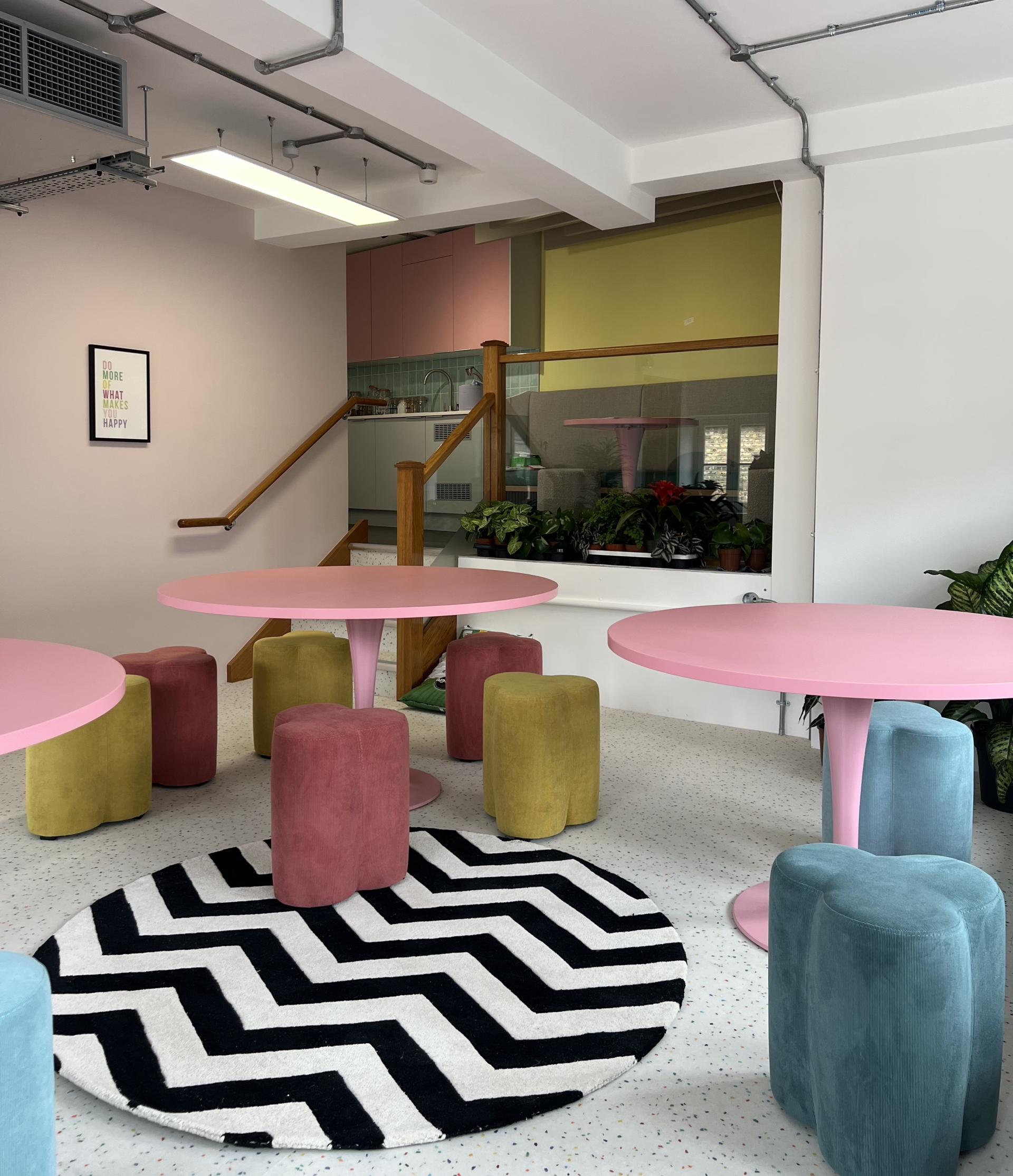
Runway East Shoreditch
Runway East Shoreditch
Runway East Shoreditch
There are some theatrical elements such as a hidden room – can you tell us more?
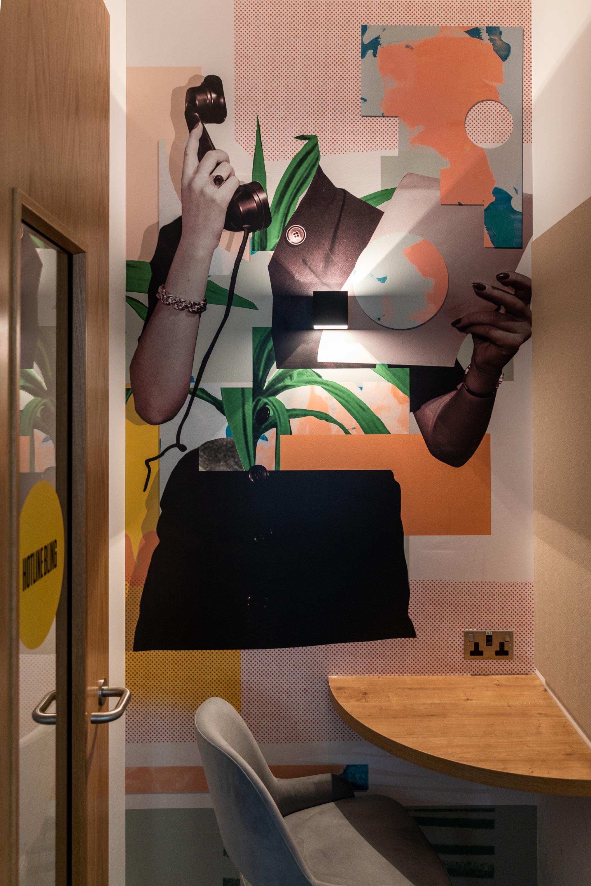
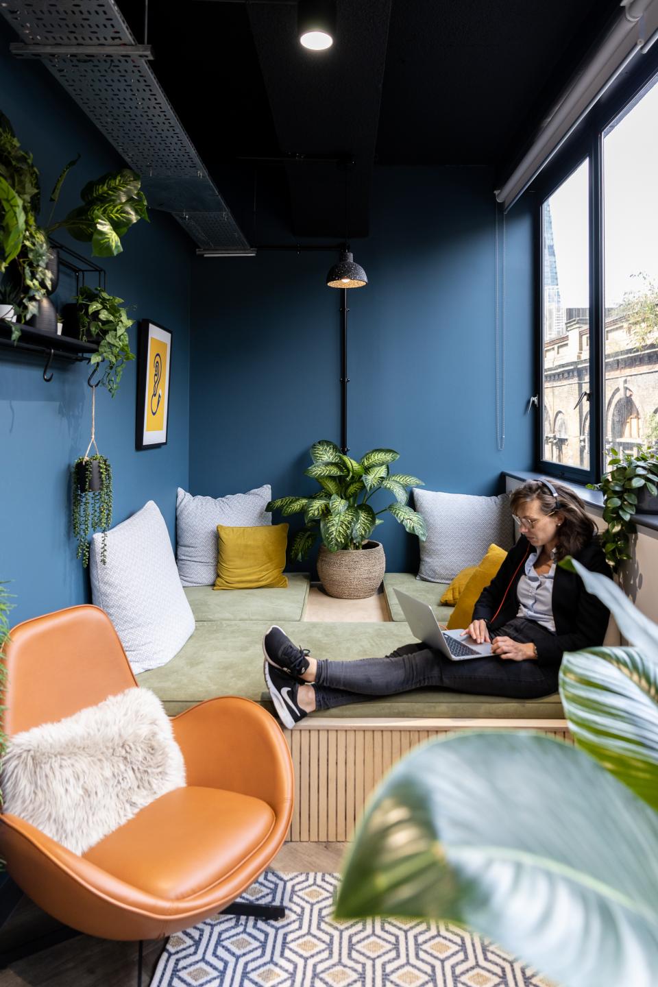
"There were quite a few little nooks in the building that offered good opportunities to create private one person spaces for focussed working, phone/zoom calls etc. As with the communal spaces, they are not all the same, there is variety to keep things interesting. Some have large windows and are flooded with light, others are darker and more intimate. We have a dedicated library on the ground floor so we thought it would be cool to make one of the private booths nearby hidden behind a large door disguised as a bookcase. It has been rumoured there is a spaceman living in there, but that’s a story for another day..."
Do you have a favourite piece?
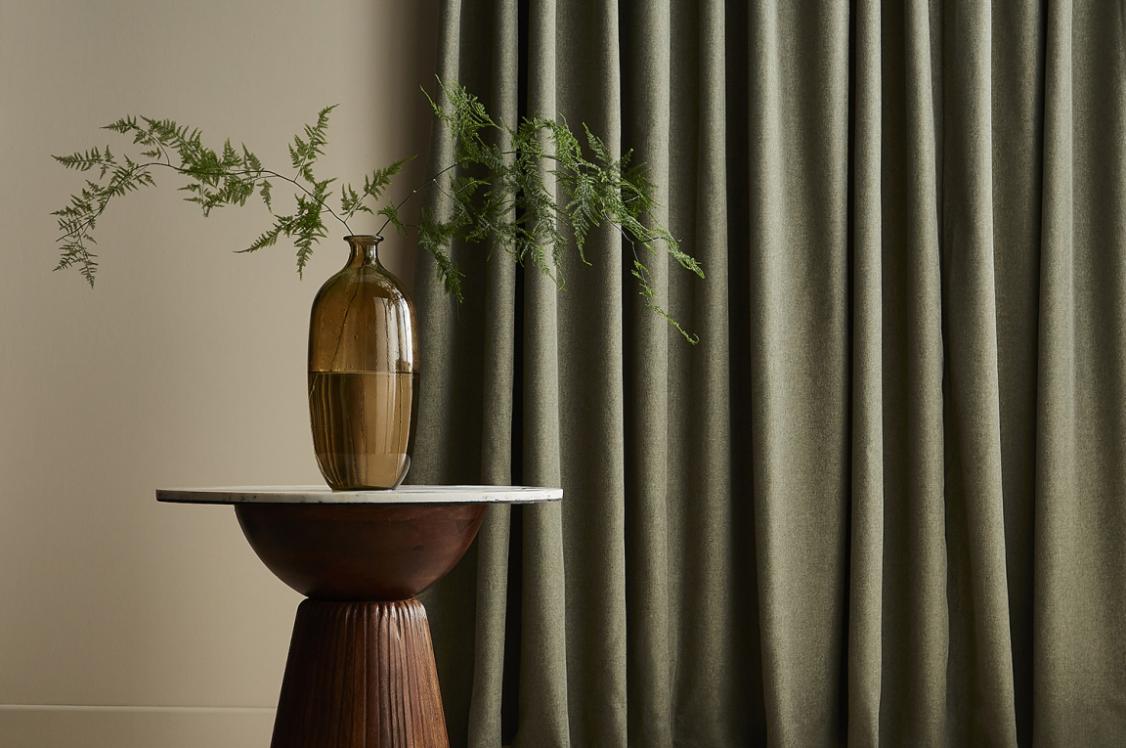
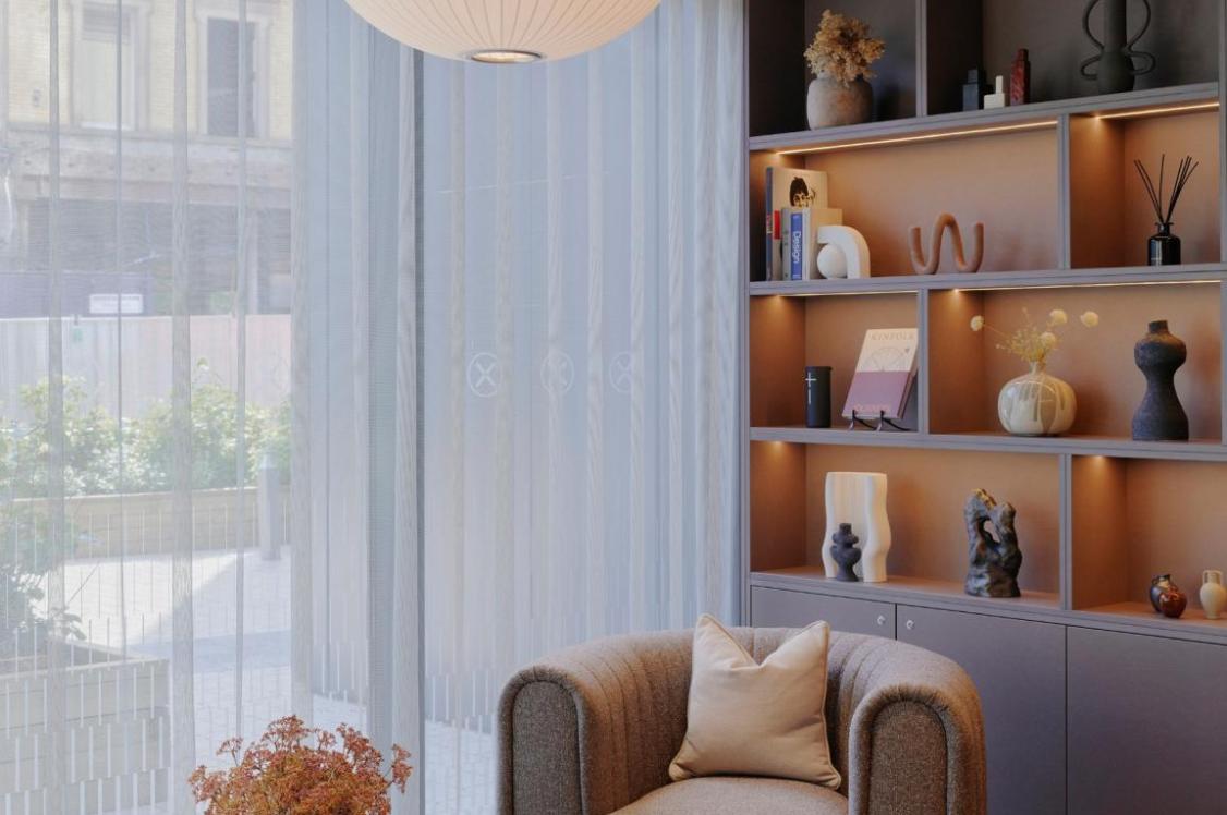
"There is a space on the ground floor that we nicknamed Karma Corner, a place inspired by nature with a lovely window seat that can be curtained off and illuminated in interesting ways. It’s a great place to chill out.
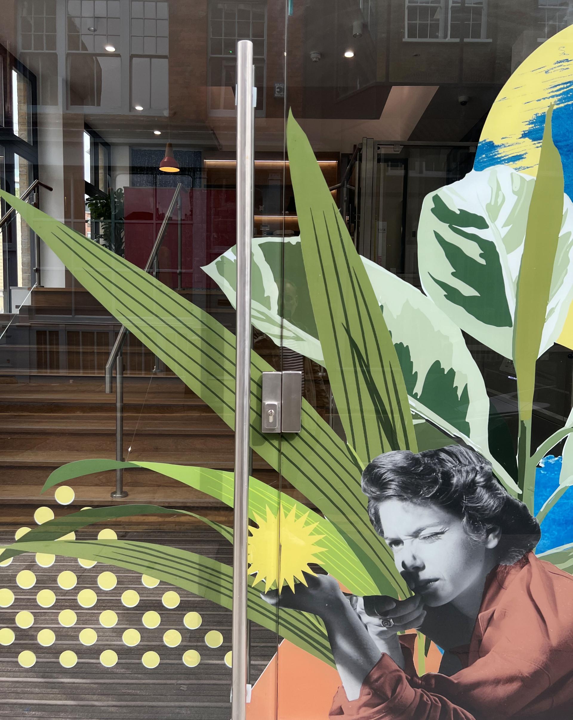
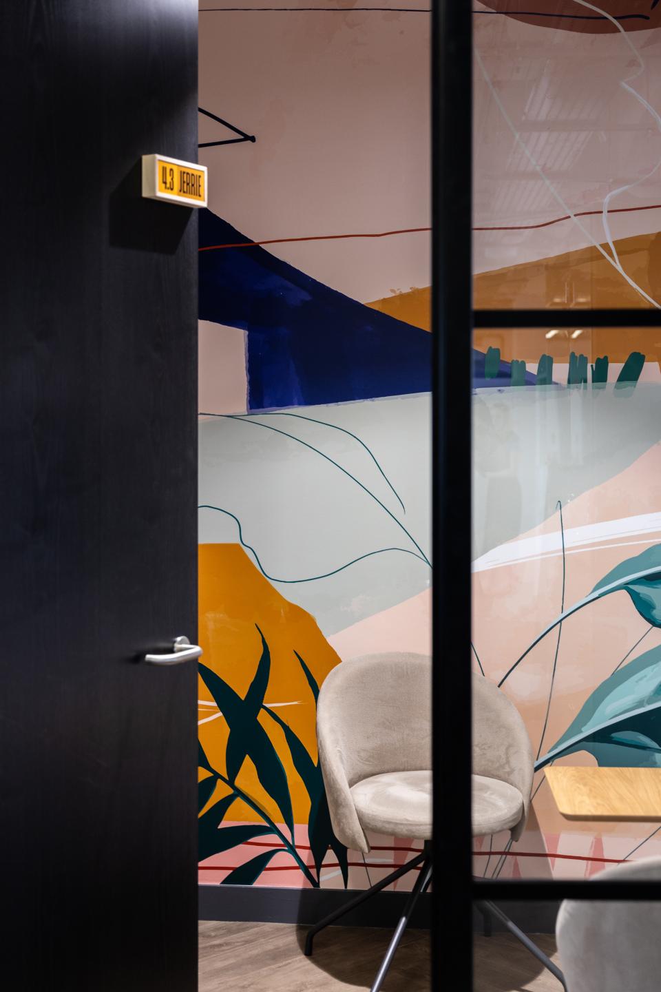
"With each of the buildings we have worked with a different artist to create murals, wallpapers and window vinyls that integrate into the design, so it was fantastic collaborating with artists Jo Hicks and Jazz Stan to bring those aspects to life across both London sites."
Runway East Shoreditch
Runway East London Bridge
Runway East London Bridge
Runway East London Bridge
Runway East London Bridge
Runway East London Bridge
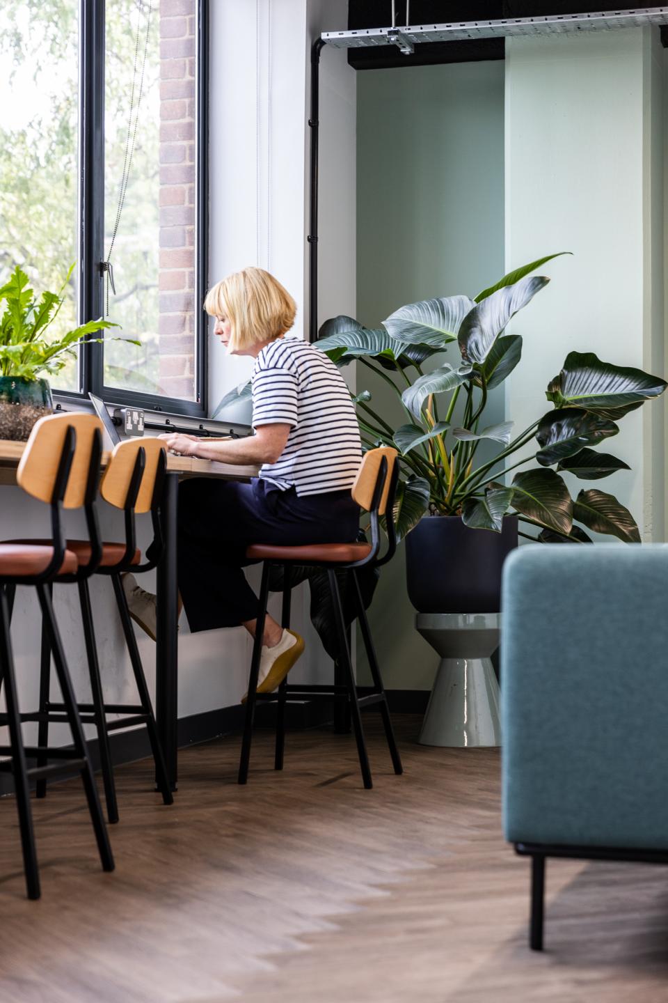
Runway East London Bridge
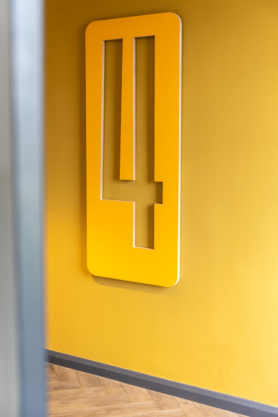
Runway East London Bridge
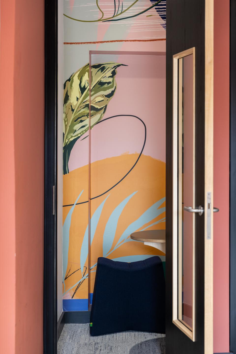
Runway East London Bridge
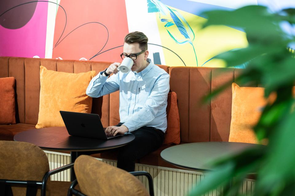
Runway East London Bridge
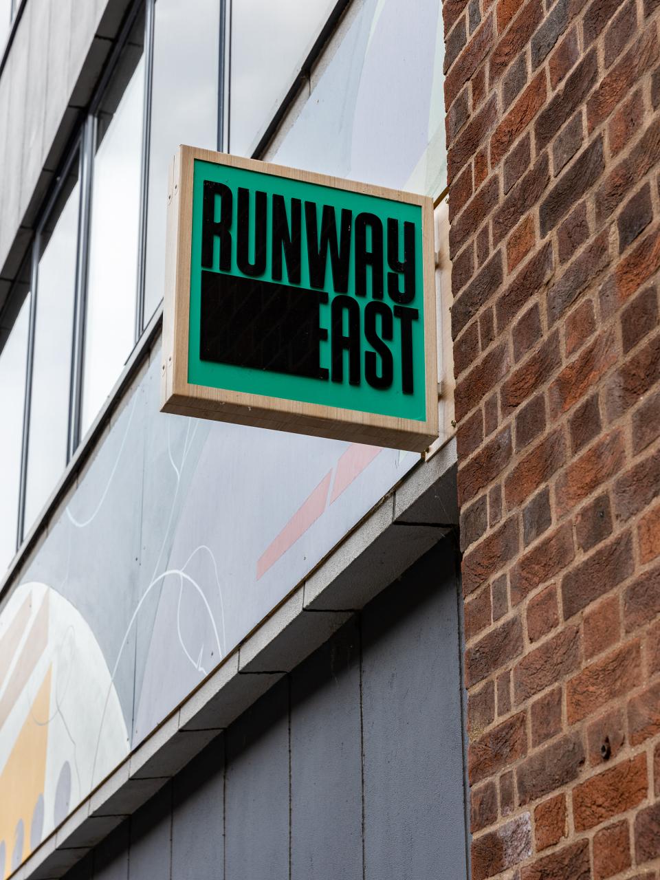
Runway East London Bridge


