SpaceInvader transforms Manchester’s One Piccadilly Gardens for Legal & General.
Credit: Jill Tate
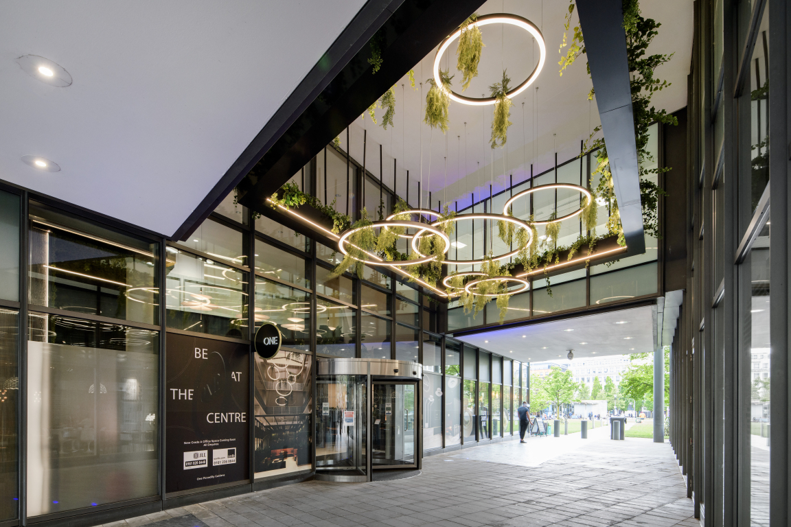
Manchester interiors agency SpaceInvader has transformed the look of one of the city’s landmark developments at One Piccadilly Gardens for client LGIM Real Assets.
The well-known building, originally designed by architects Allies and Morrison and developed in 2003 by Argent, faces onto the Gardens with high-impact red-brick frontage. The building is comprised of retail on the ground floor and office space above and was sold to Europa Capital in 2011 before being purchased by Legal & General in 2014.
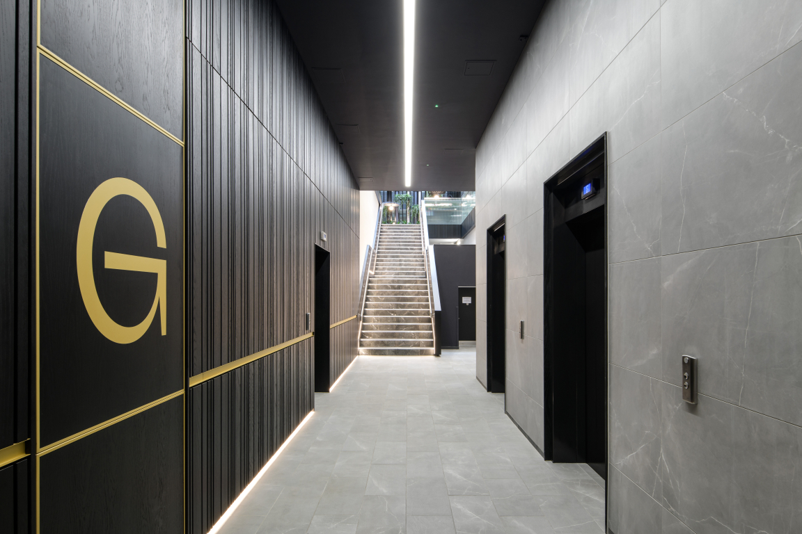
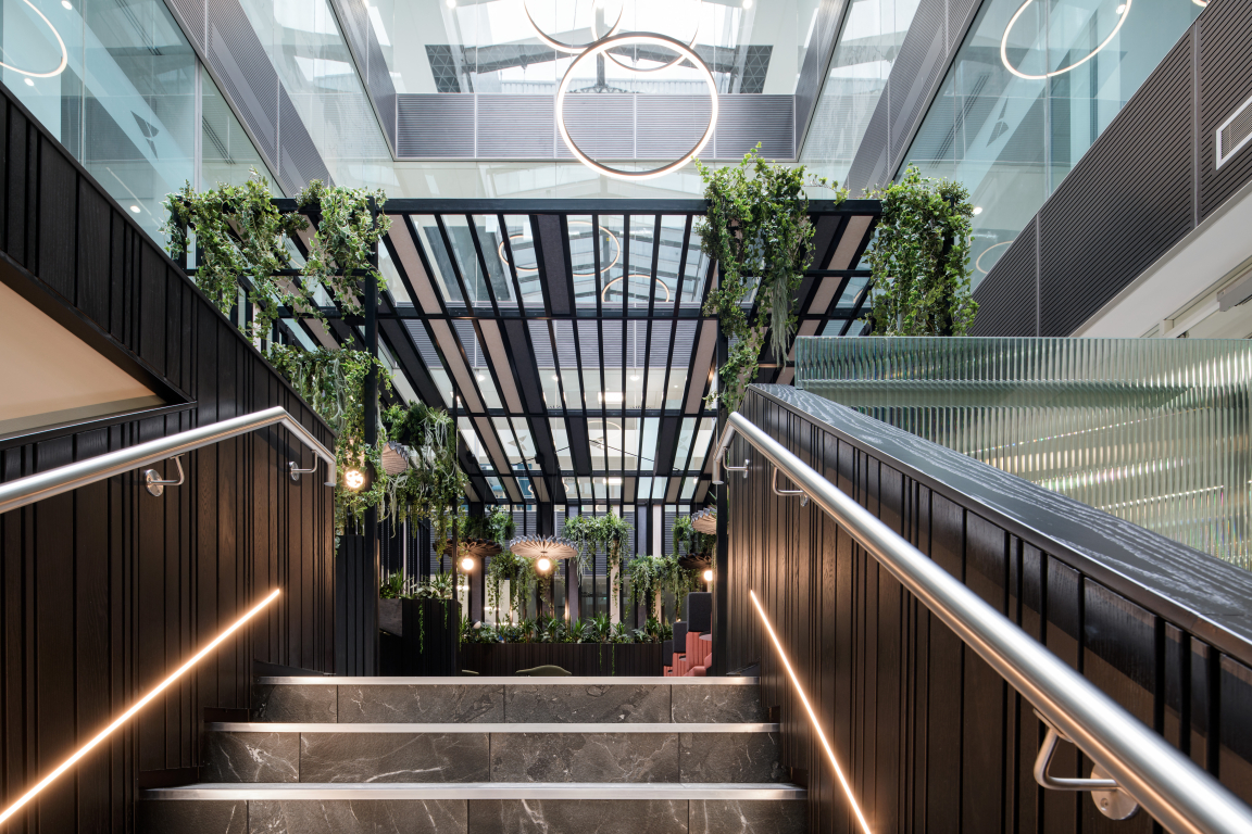
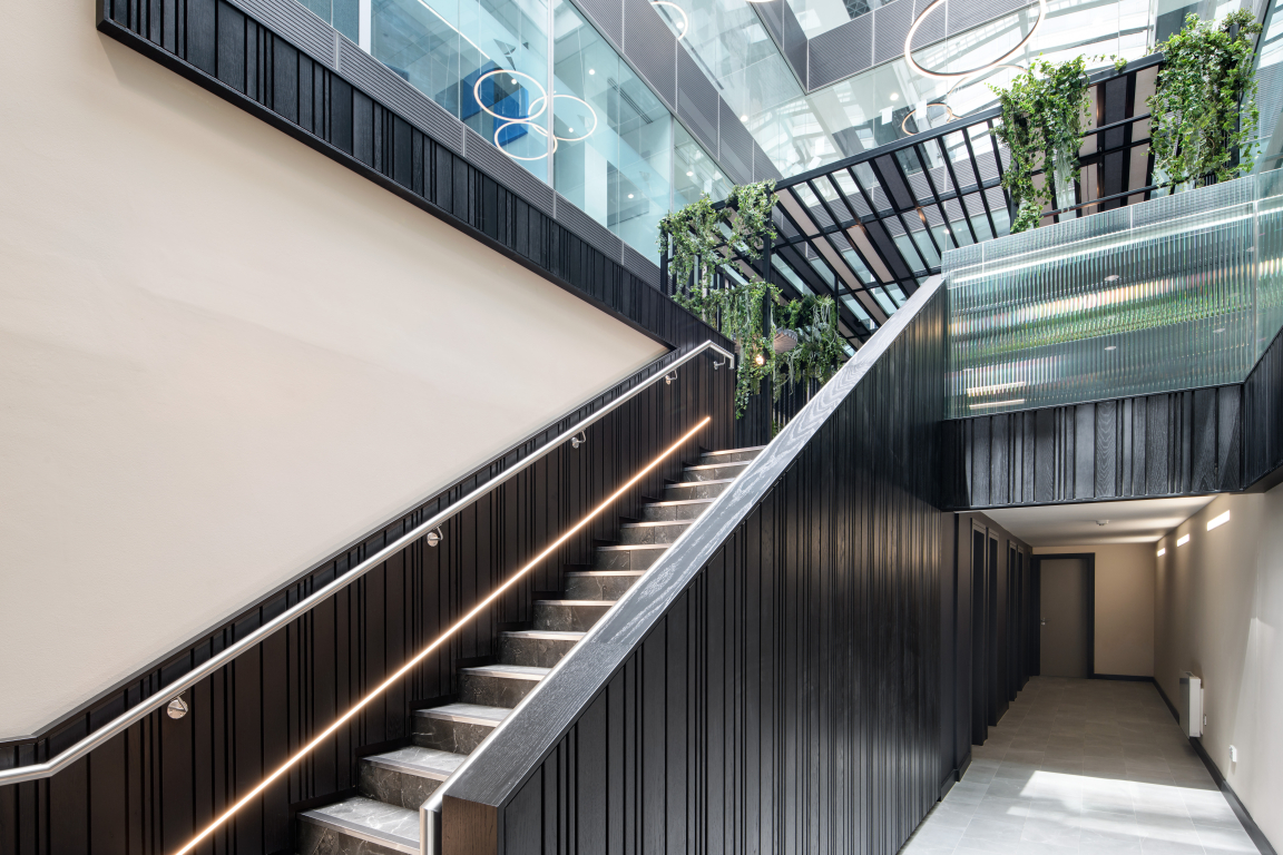
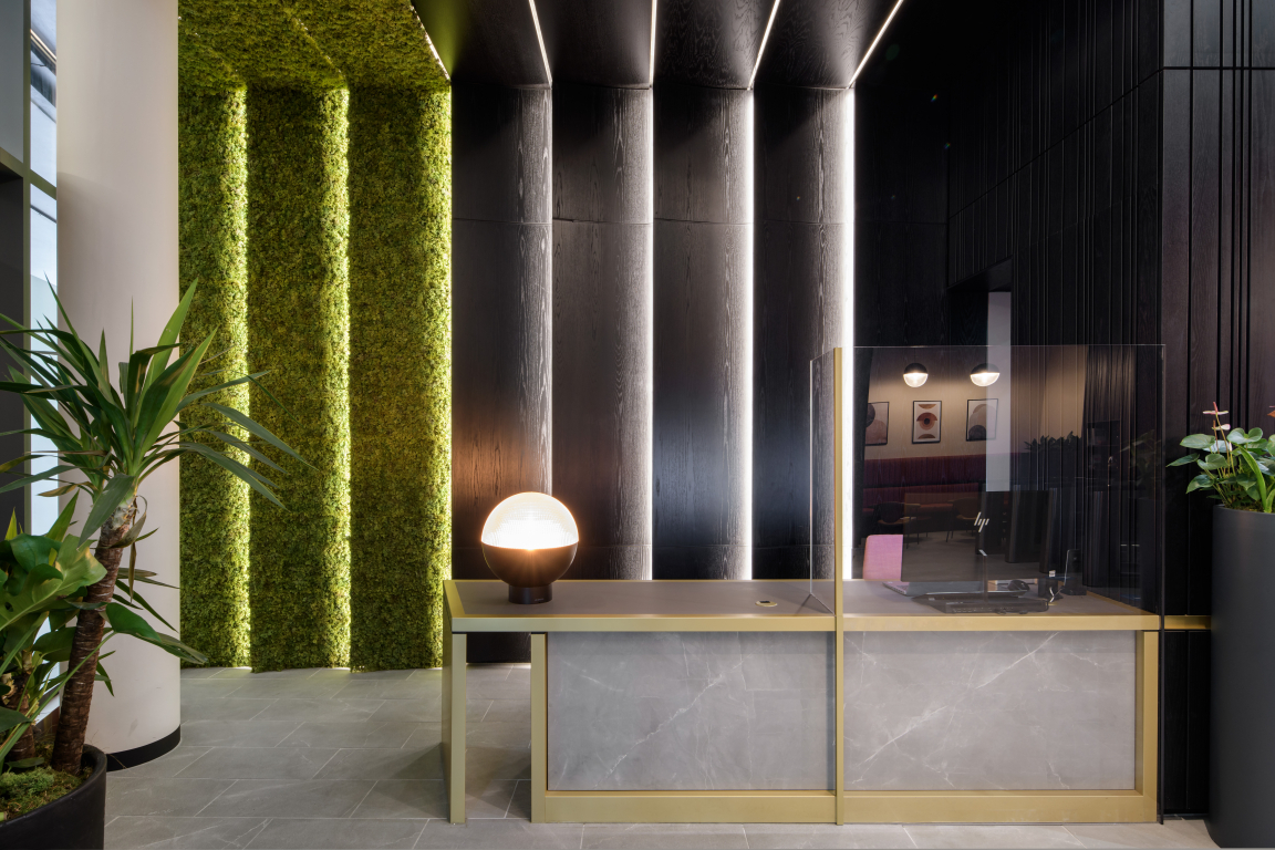
The brief to SpaceInvader for the new interiors of the six-storey, Grade A office building was to transform its look and feel into a more inviting, dynamic space that promoted a sense of welcome, wellbeing, flexibility and collaboration, via a scheme that would match the building fabric in terms of character and presence.
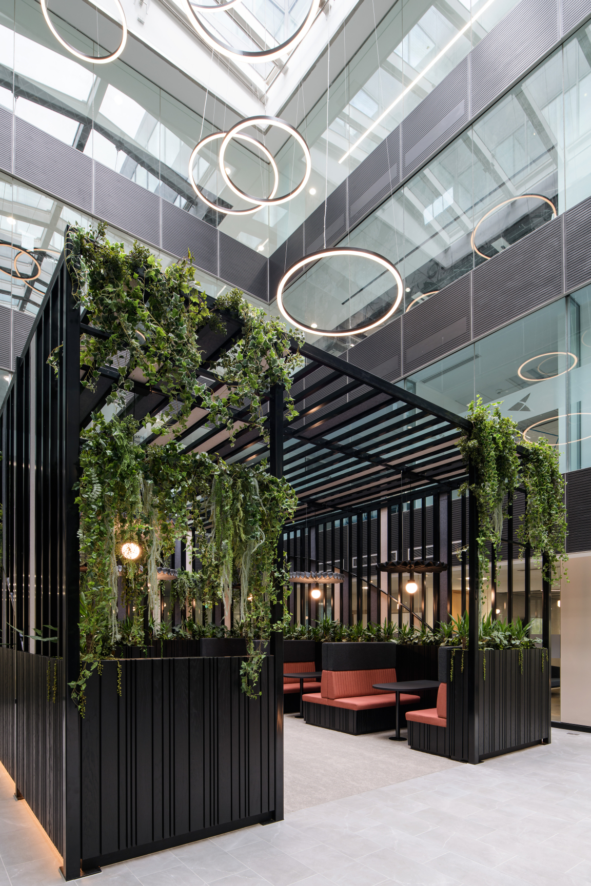
Credit: Jill Tate
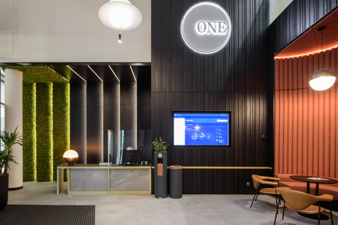
Credit: Jill Tate
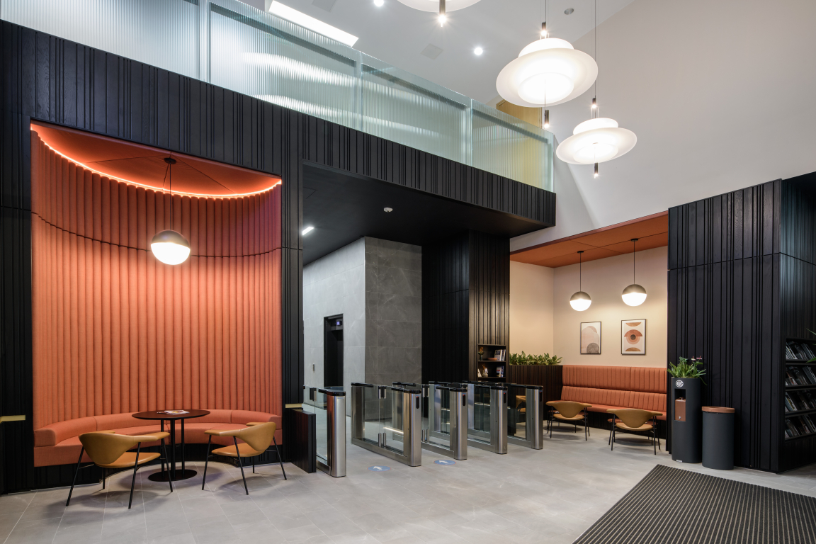
Credit: Jill Tate
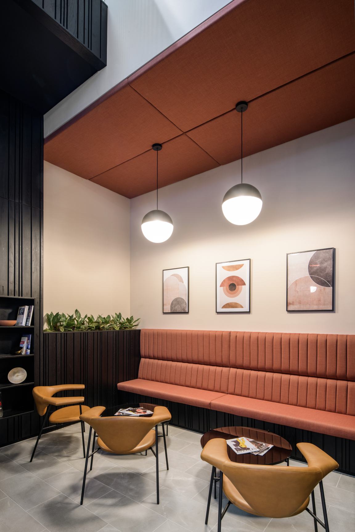
Credit: Jill Tate
"The transformation forms part of a bid to bring more life and love to this part of the city", SpaceInvader Founder John Williams commented, "helping to ignite a more vibrant surrounding area with a café culture feel. Legal & General took the decision to invest in the building in order to make a mark and help elevate the overall Piccadilly area."
The entrance to the office building is located on a cut-through that sees a lot of through-traffic but offered no real sense of arrival. Existing views through to the interior were rather dull and grey, resulting in an overall unwelcoming feel. Once inside, an existing, huge-scale reception desk functioned more as a barrier than a welcoming element, discouraging people from doing anything but passing straight on through the speedgates, in spite of a few additional arrangements of loose furniture serving as waiting areas. The double height diagonal void through the ground and first floors of the building was also not utilised to its best advantage.
"There was a great opportunity here", John Williams added, "to turn the personality of the offer around, working with rather than against the building. A new interior that was properly integrated with the building’s stature, location and material palette was called for, to make the most of the great corner location and views out. This was evidently a well-established building with real potential for change."
Credit: Jill Tate
Credit: Jill Tate
Credit: Jill Tate
Credit: Jill Tate
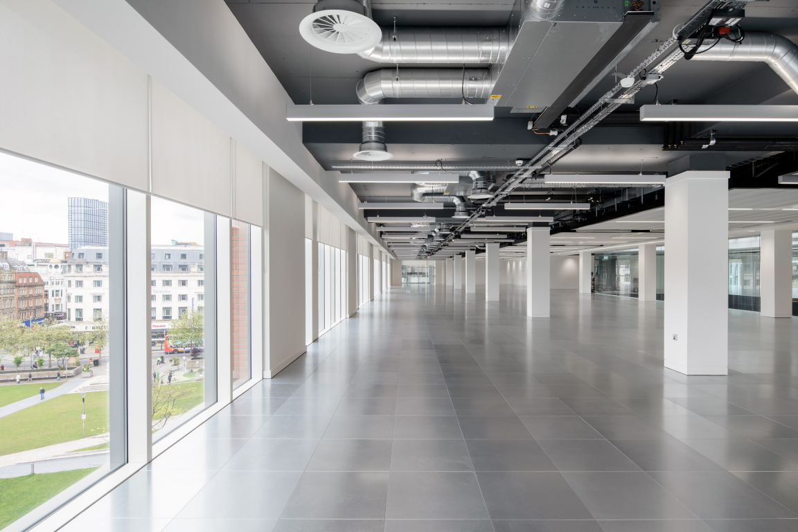
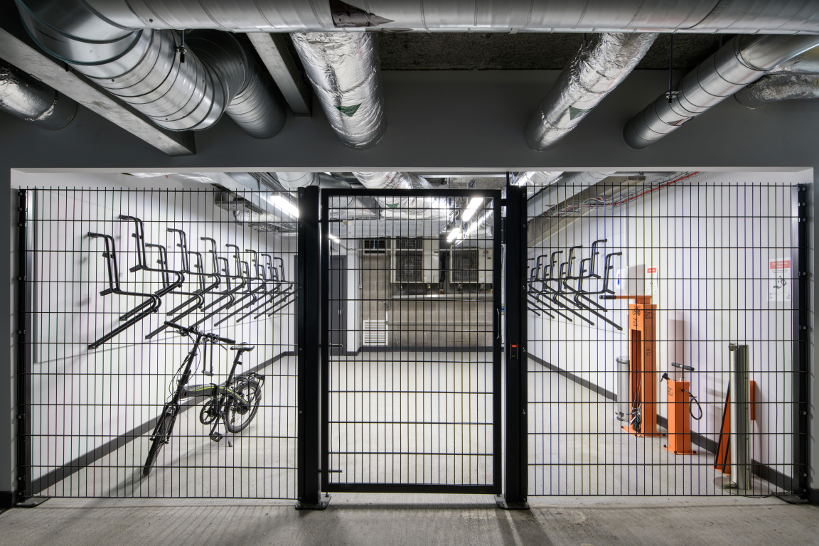
SpaceInvader were commissioned by Legal & General for the concept stage of the project and then novated across to commercial interior design, build and delivery specialist ADT Workplace for the construction delivery stage. The scheme’s project managers were Paragon. The full scope of interior design works covered the entrance, reception and atrium areas, a new upper basement bike store with adjacent changing rooms and shower space, the building’s lift core and circulation areas and a refreshed design for the non-tenanted office spaces on the third and fourth floors. SpaceInvader also designed the scheme’s wayfinding.
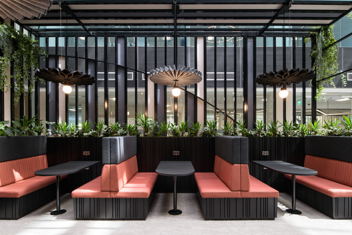
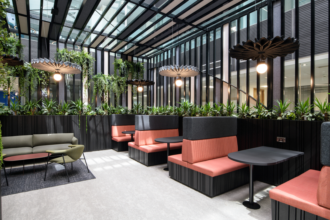
At the heart of SpaceInvader’s concept was the idea of creating a new community culture for One Piccadilly Gardens, featuring a series of attractive spaces for people to sit, relax, meet and collaborate. The mix of people coming in and using these areas is diverse, including tenants, their clients, prospective tenants and other visitors. The new design sought to create moments for pause and reflection as well as places for catching up and ad hoc encounters. Alluding to the site’s rich history, the design also needed to be timeless, with a non-exclusive appeal catering to a wide user and age-range demographic.
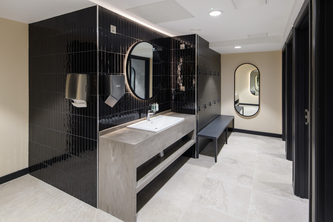
Credit: Jill Tate
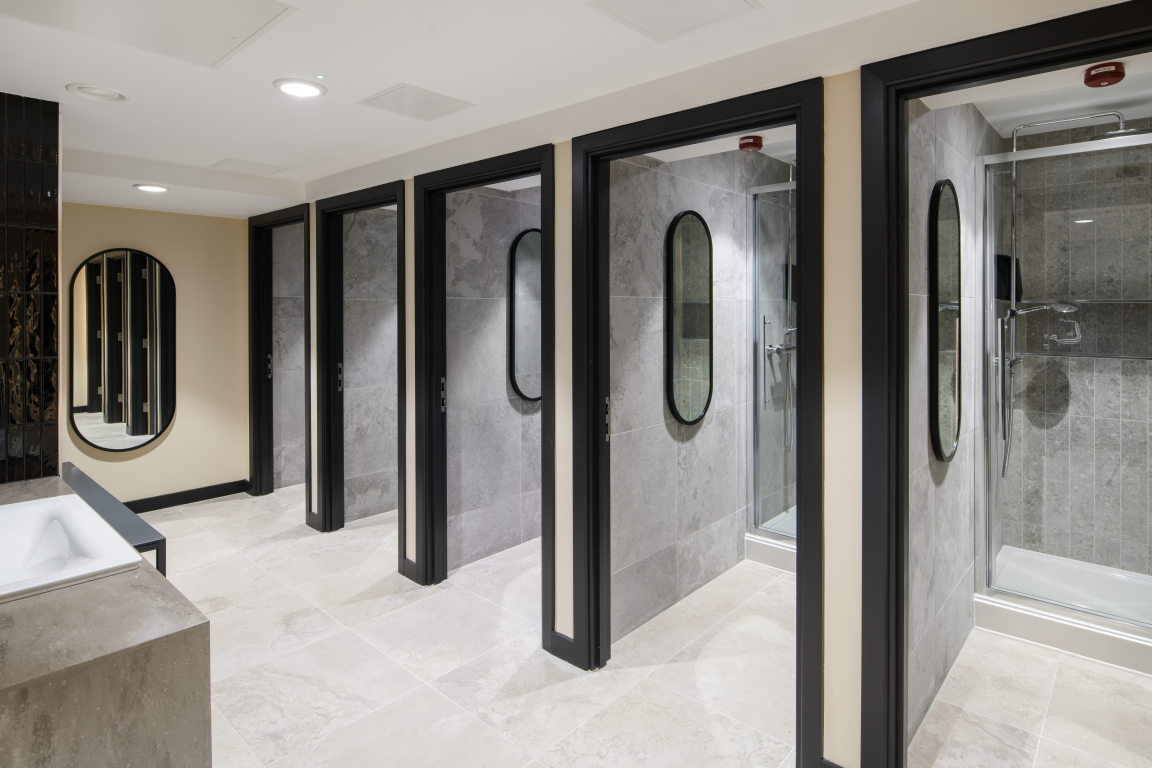
Credit: Jill Tate
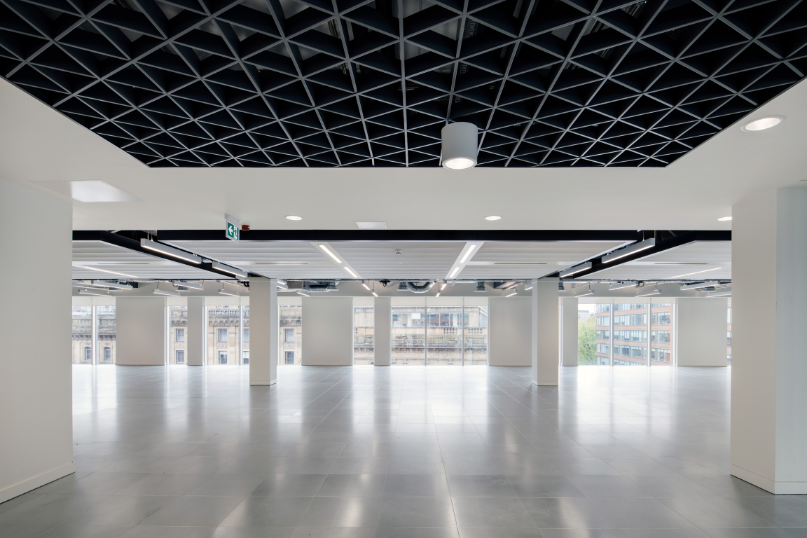
Credit: Jill Tate
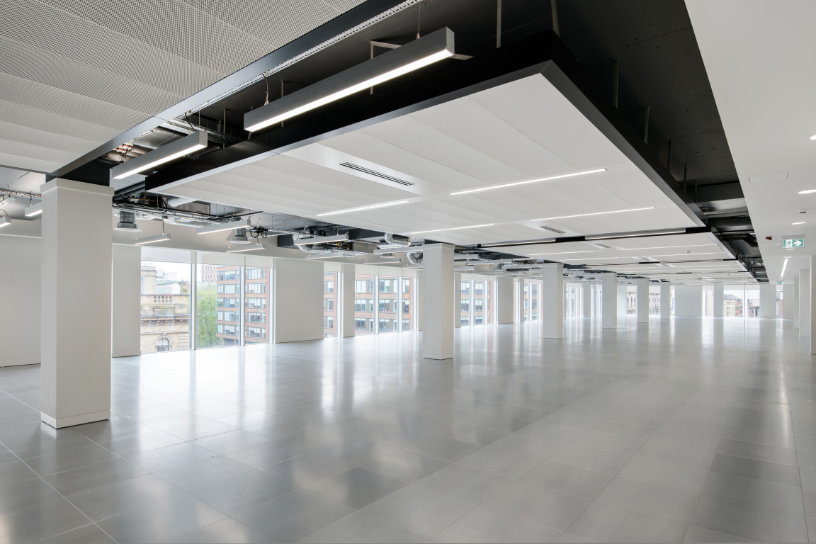
Credit: Jill Tate
The design language looked right back to the site’s interesting history in the 18th century, when the gardens were little more than a wasteland on the edge of the city. Known as the 'daub holes', the area was home to a wet pit and ponds, from which clay for the construction of wattle and daub walls was extracted.
"We were inspired both by the terracotta colour of clay and the outer red building façade when it came to creating the design palette", Regina Cheng, Senior Interior Designer at SpaceInvader, commented, "although, as it’s such a strong colour, the terracotta was to be used for highlights only.
We also looked at the origins of the word Piccadilly, which comes from a seventeenth-century frilled curved collar known as a piccadill. Roger Baker, a tailor who became rich making piccadills, lived in the area. The origin of the word is thought to be the Spanish ‘picadillo’, meaning pierced or punctured. Subtle references to this in the form of curves and punctures, especially using light, also formed part of our design language."
Credit: Jill Tate
Credit: Jill Tate
Credit: Jill Tate
Credit: Jill Tate


