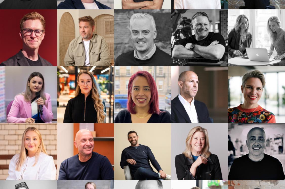
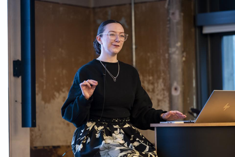
Stephanie Kyle, senior architect & inclusive design consultant, Floyd Slaski, on designing for neurodiversity and non-visible disabilities.
Credit: Victoria Middleton
Do you know the difference between accessible and enlarged washrooms? What percentage of the UK population has a disability? And how to use the terms "neurodiverse" and "neurodivergent"?
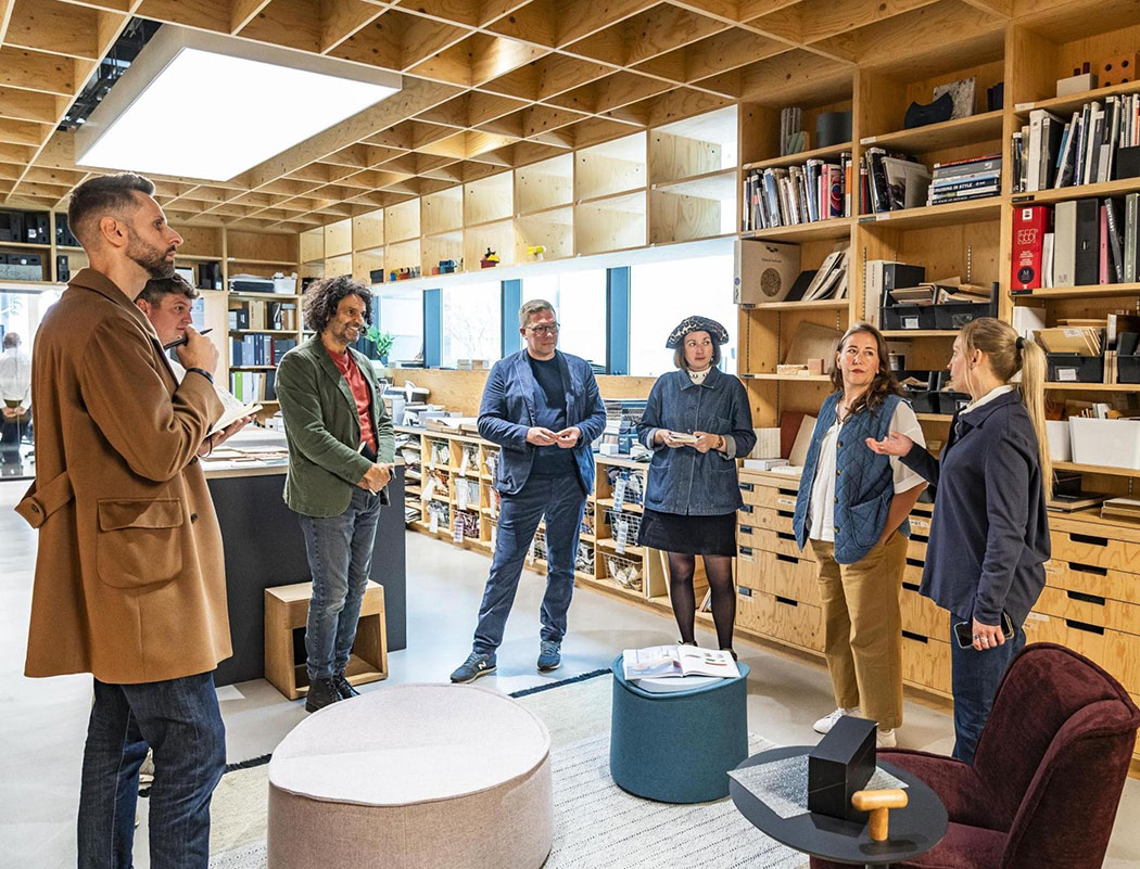
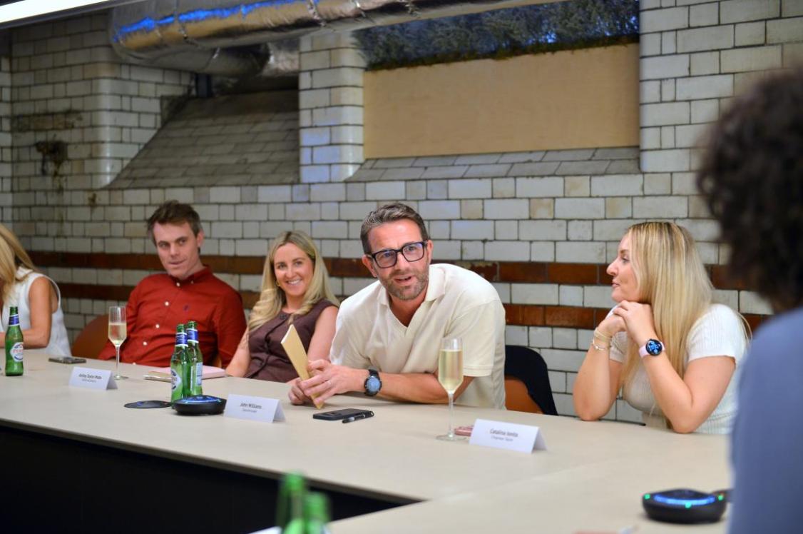
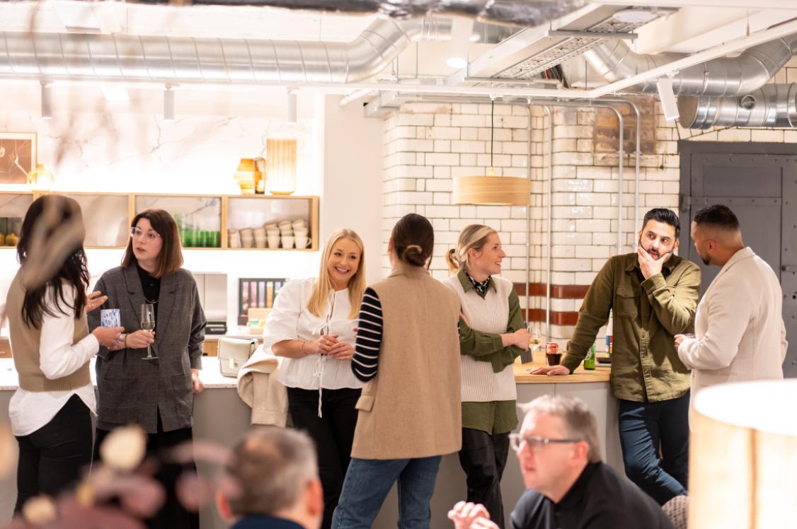
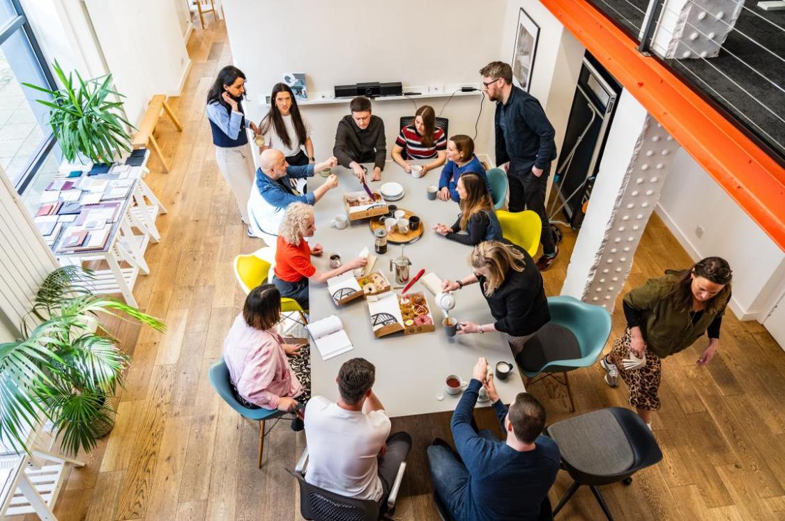
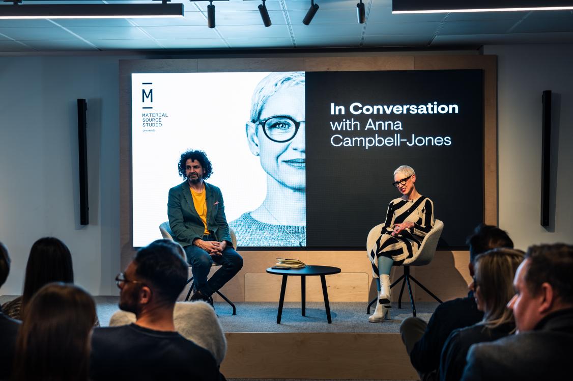
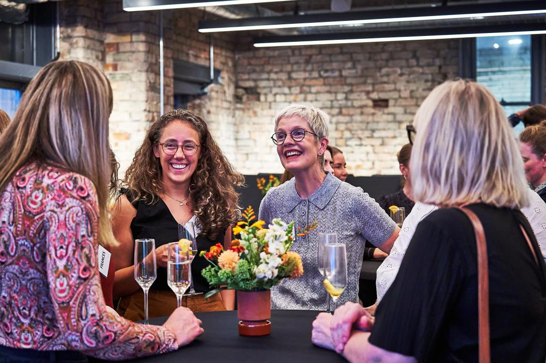
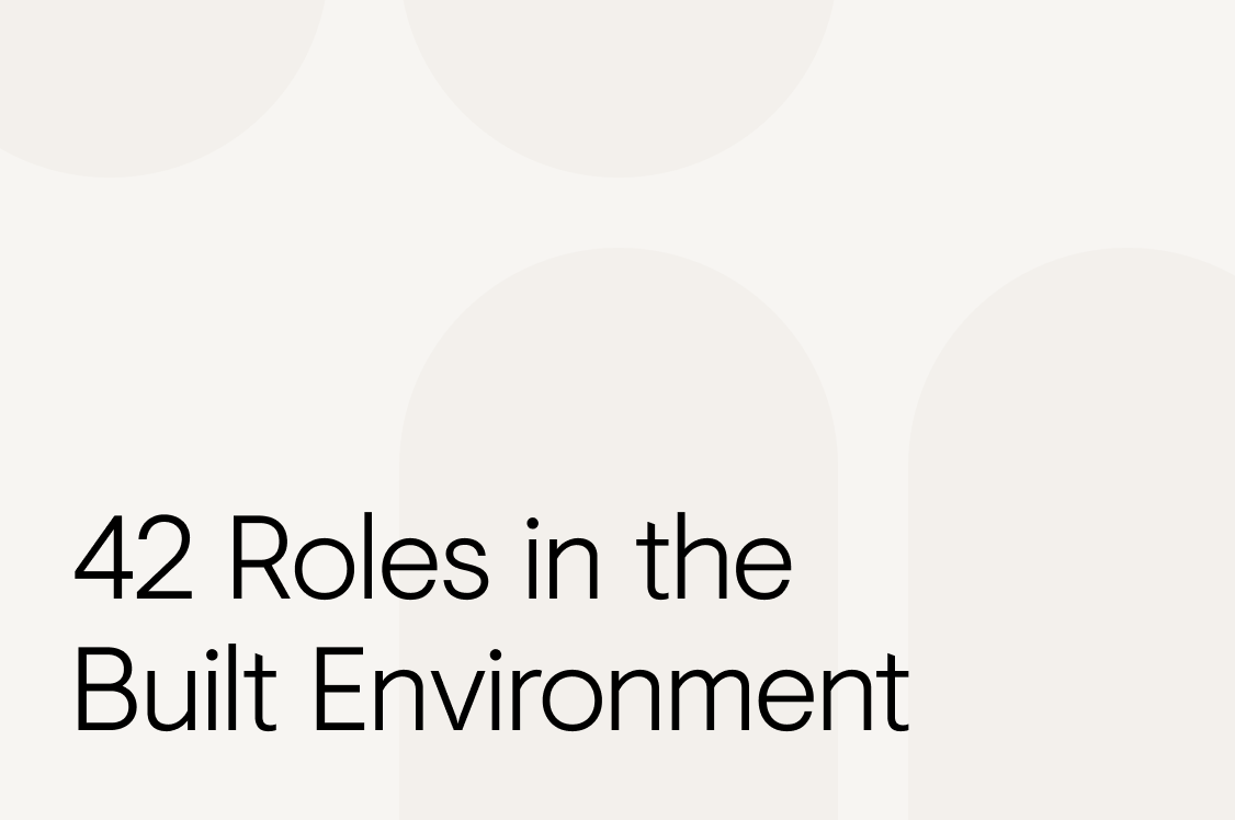
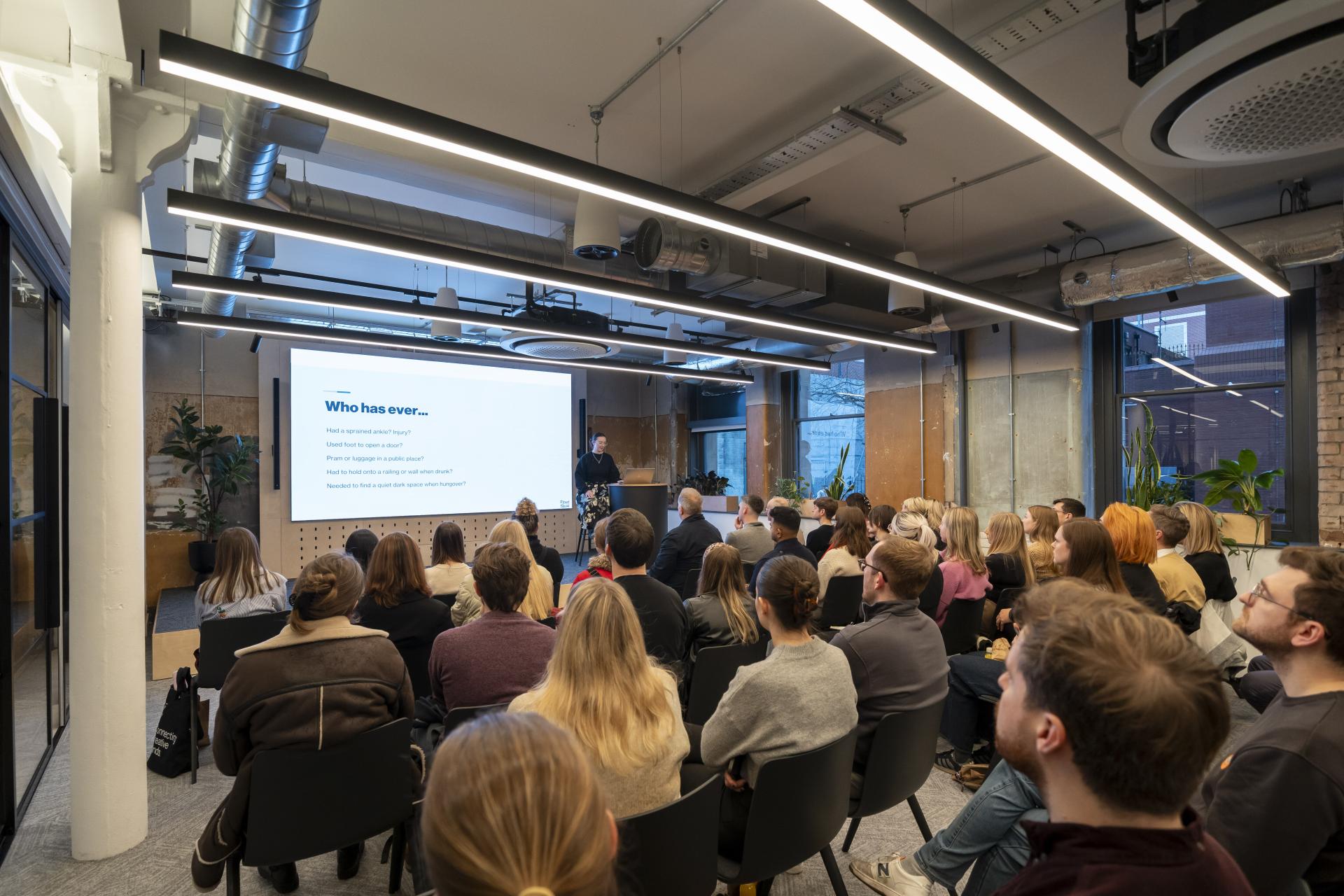
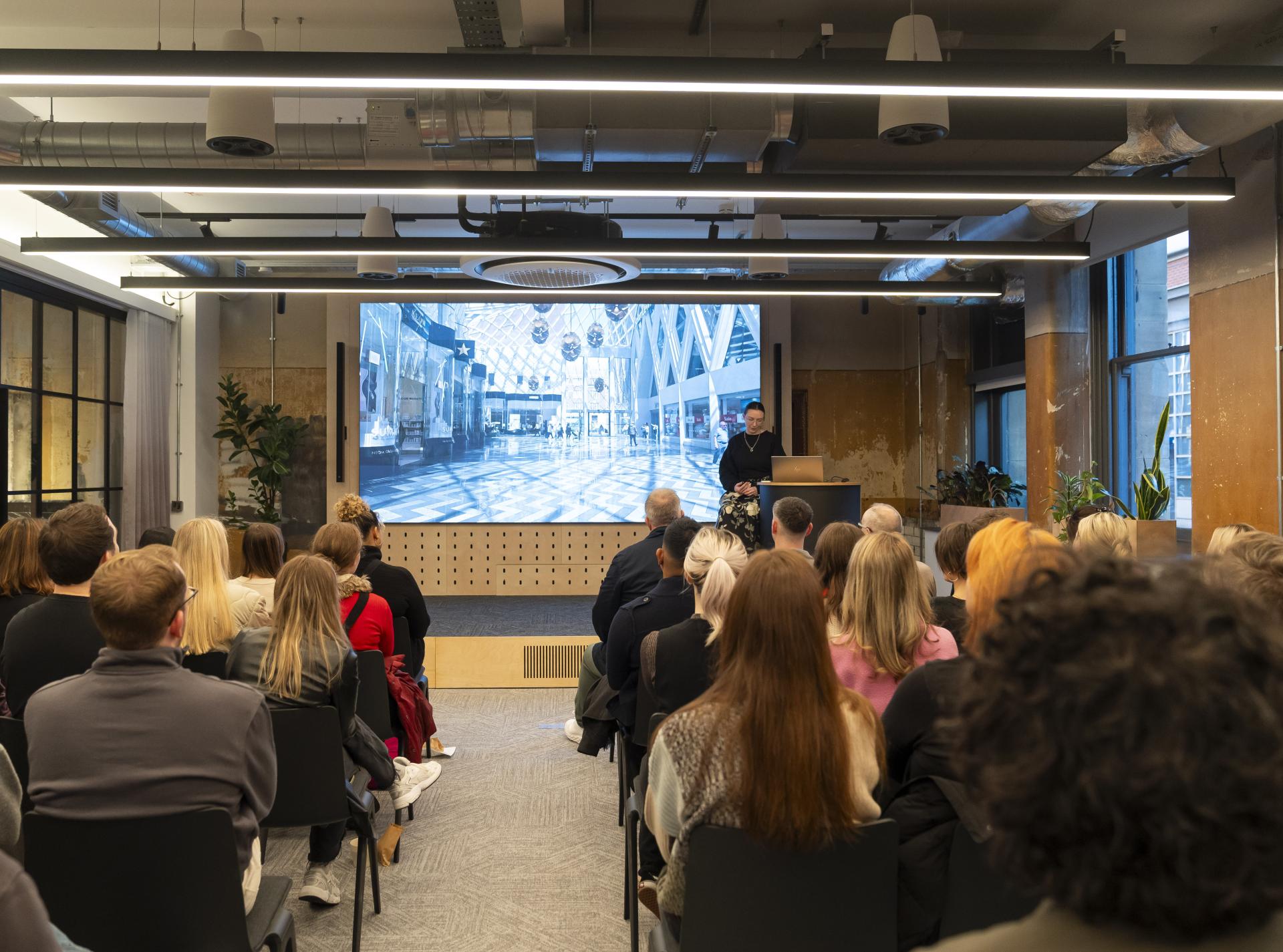
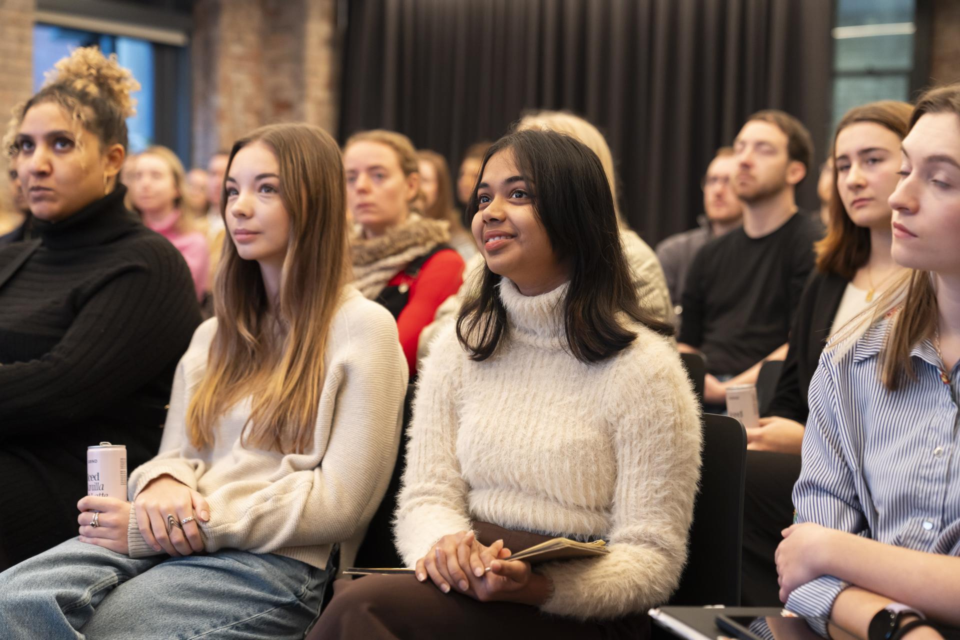
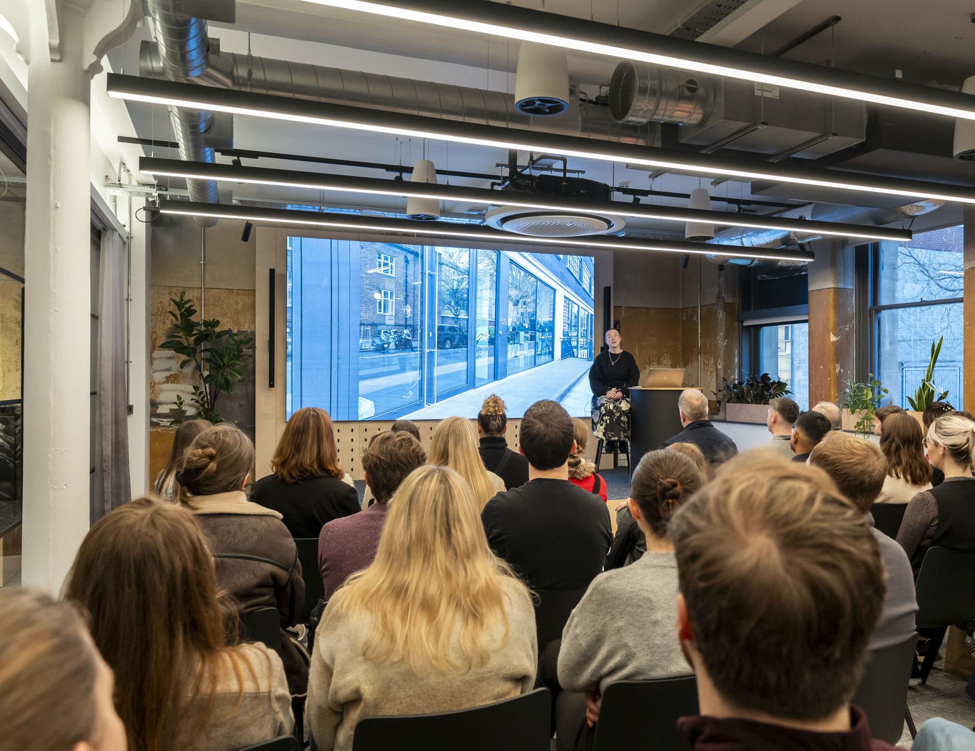
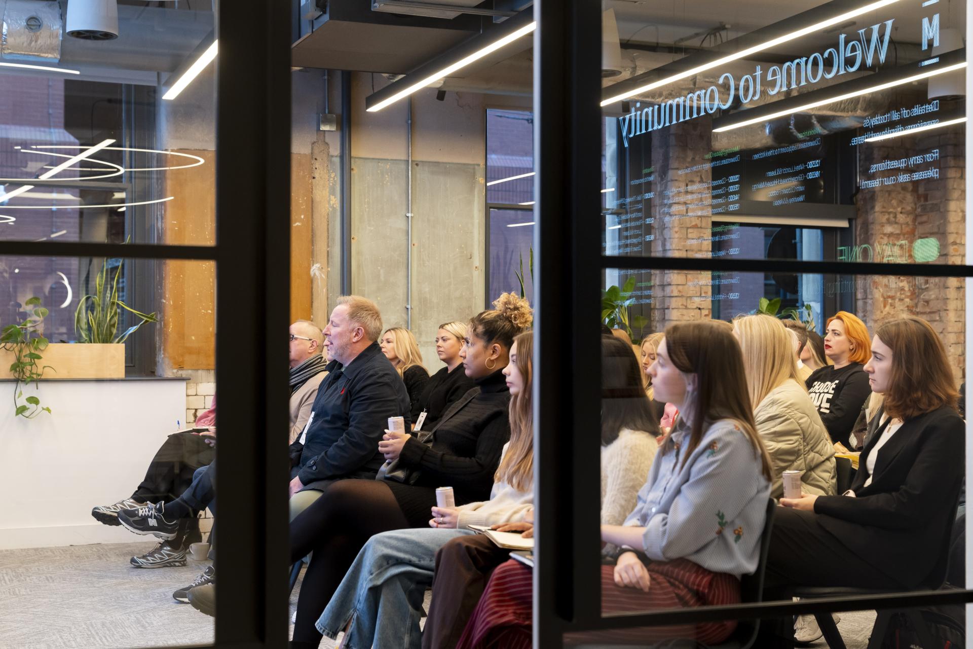
Kicking off our two-day Community event at Material Source Studio Manchester, a packed room of architects, designers, property professionals, and Partners, welcomed Stephanie Kyle to the stage this morning.
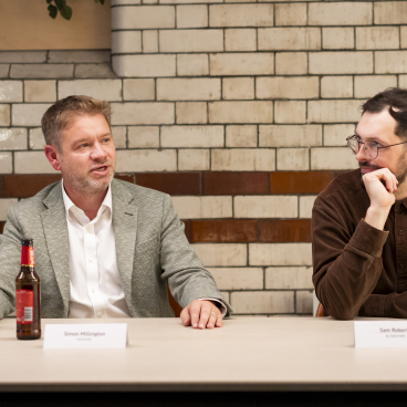
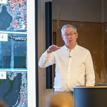
A senior architect & inclusive design consultant at Floyd Slaski, and 2024's AJ100 Change-maker of the Year, Stephanie is a sector leader, advising on the creation of inclusive, comfortable, and accessible spaces. Through an interactive talk, she demystified some of the terminology often used incorrectly, shared statistics to help put some context around people and their needs, and suggested practical ways designers can make a positive difference.
Can a space ever be 100% inclusive and accessible for all? Asked an audience member. "No", replied Stephanie, "it's impossible. But there's loads you can do to make people 95% happy." Ongoing research, she believes, is the key to understanding how we achieve this.
Credit: Victoria Middleton
Credit: Victoria Middleton
Credit: Victoria Middleton
Uncovering the challenges
The critical factor that leads to spaces being inaccessible, and frankly, stressful, for some, is when an architect or designer takes action without asking questions to the end user.
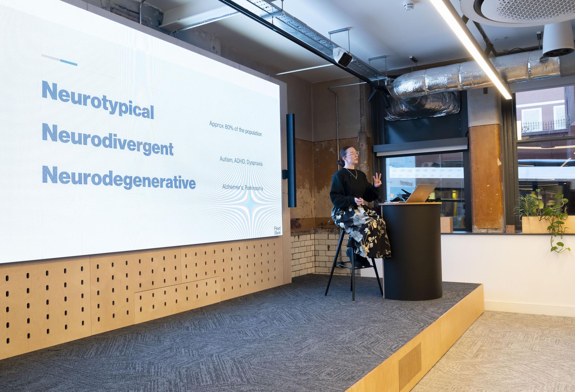
As Stephanie points out, whether a person is neurotypical (around 80% of the population), neurodivergent, or has a neurodegenerative condition, and/or has a disability - visible or non-visible - this will effect their needs. As will personal preference at different times of the day, and in relation to the task in hand. Ultimately - no assumptions can be made.
Society often perceives 'neurodivergence' as a linear spectrum, Stephanie shared. But in reality, it's much more complex.
"All neurodivergent conditions have a spectrum of their own."
And she urged us to acknowledge that not all disabilities are visible, in fact, 80% of disabilities are not. There are currently over 900 recognised non visible disabilities. Full time wheelchair users account for 3% of the disabled population, and while ensuring physical accessibility is, of course, paramount, Stephanie also calls for more consideration around designing for the disabilities we can't necessarily see.
Stephanie explained, the notion of usability has three facets: physical, cognitive, and sensory. If we make spaces more usable, inclusive and accessible, we make them more usable for all, she pointed out. Touchscreens, for example, were originally created for those with limited dexterity. But now we all love them, Stephanie said.
And just because some of us are not disabled now - we might be in future - or temporarily. Even taking the instance of drinking, Stephanie outlined that when under the influence of alcohol, our sensory processing is altered, and as such we don't receive information in the same way as we normally would. So on a minor scale, we can likely relate.
Credit: Victoria Middleton
Credit: Victoria Middleton
Credit: Tim Ainsworth
How can designers help?
There are certain triggers - internally and externally - that may catalyse meltdowns (outward showing reaction) or shutdowns (internal reaction) in people. This could be bold contrasting colours, uneven surfaces, clashing patterns, and, in general, when there's a lack of clarity, there's a problem.
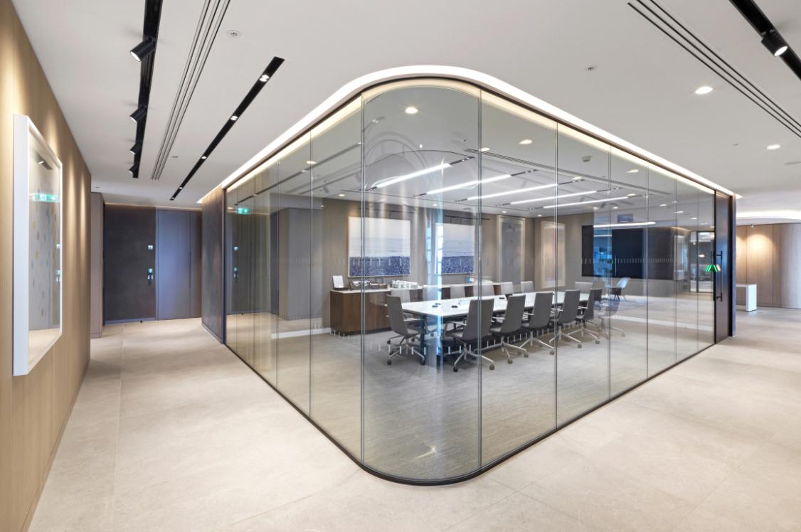
One particular example that's widely used, but problematic, is "manifestation" - particularly when the likes of white frosted graphics are used on reflective surfaces such as glass windows and doors - and light is added into the mix and they cannot be viewed clearly.
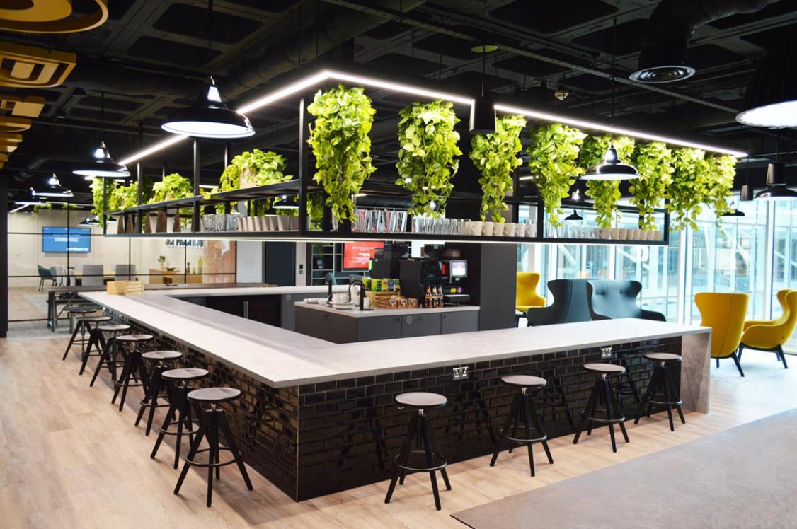
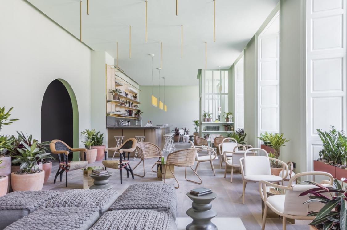
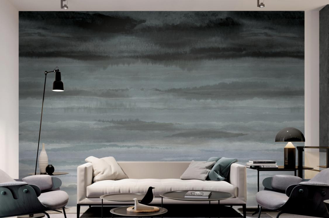
Other aesthetic-led decisions can also - often unknowingly - have a detrimental affect on users. Using block caps on signage rather than sentence case, Stephanie comments is a no-go. Hyperrealistic murals can cause confusion for many different types of people. Harsh borders on the floor can create boundaries to some. While biophilia, on the face of it is calming, adding too much of it can overwhelm.
The key is offering choice to users. Building in some spaces for people seeking sensory stimulation, and for those avoiding it.
"People's needs change."
Credit: Victoria Middleton
Credit: Victoria Middleton
Credit: Victoria Middleton
Some practical tips
To create interior spaces that are inclusive and accessible, Stephanie has some tips for designers.
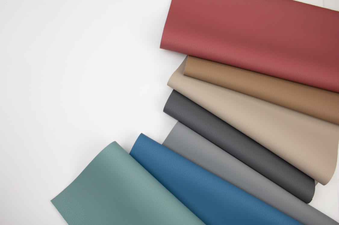
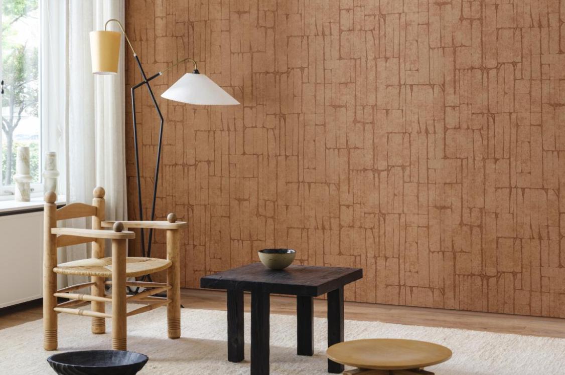
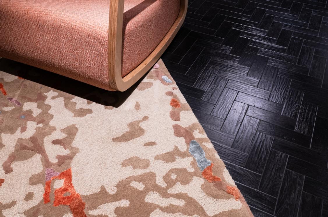
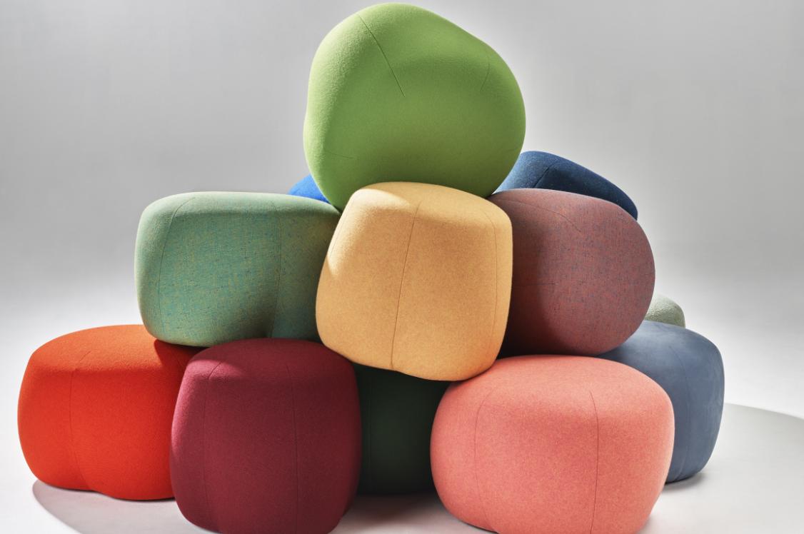
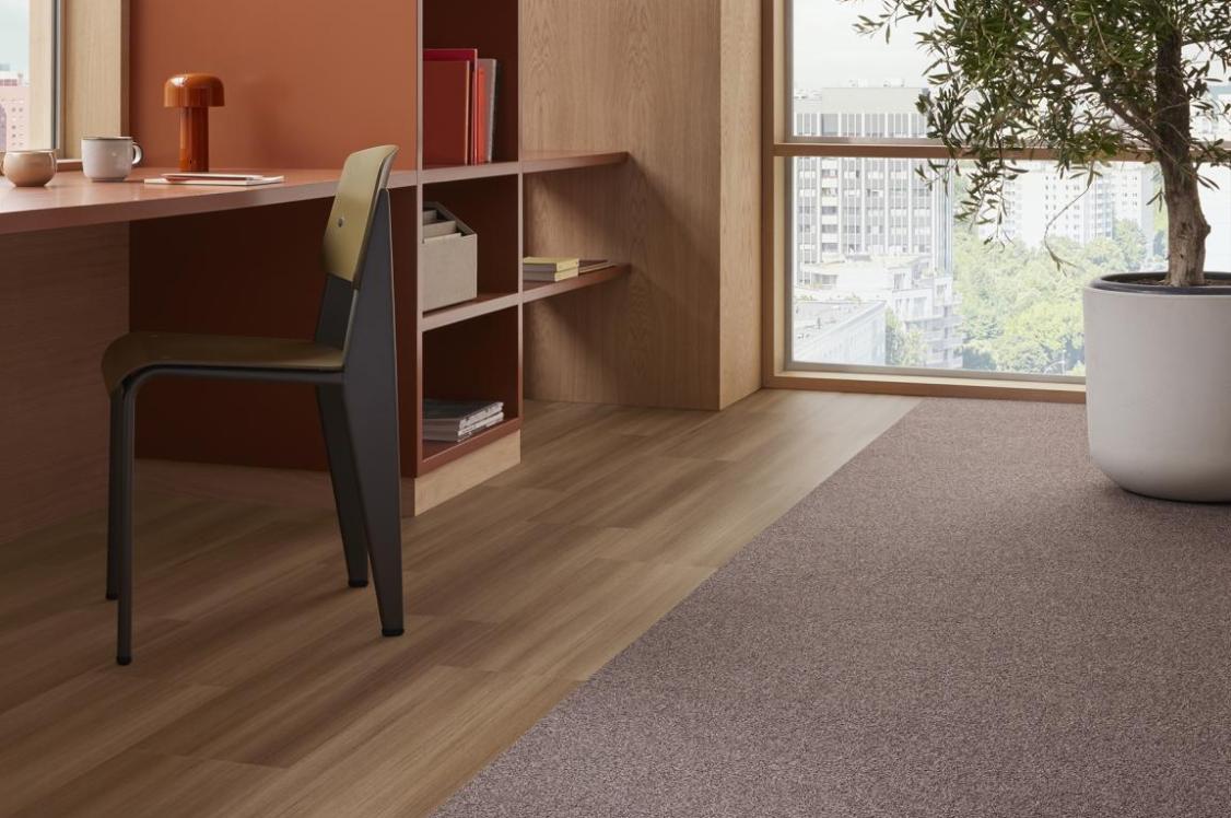
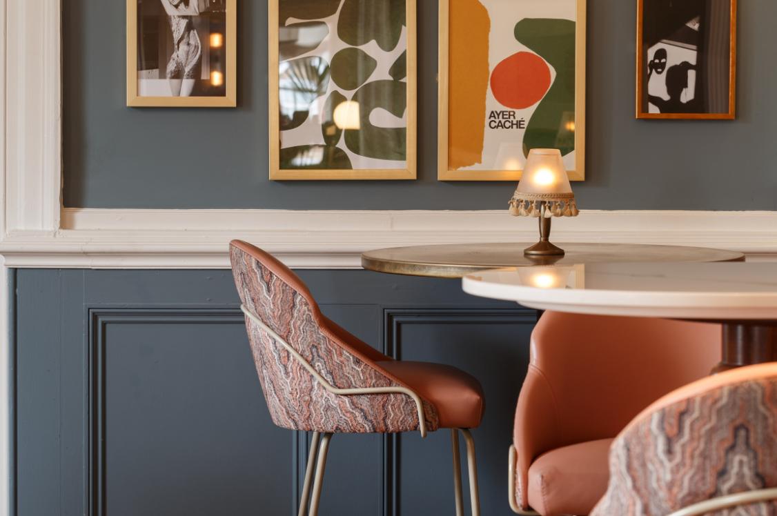
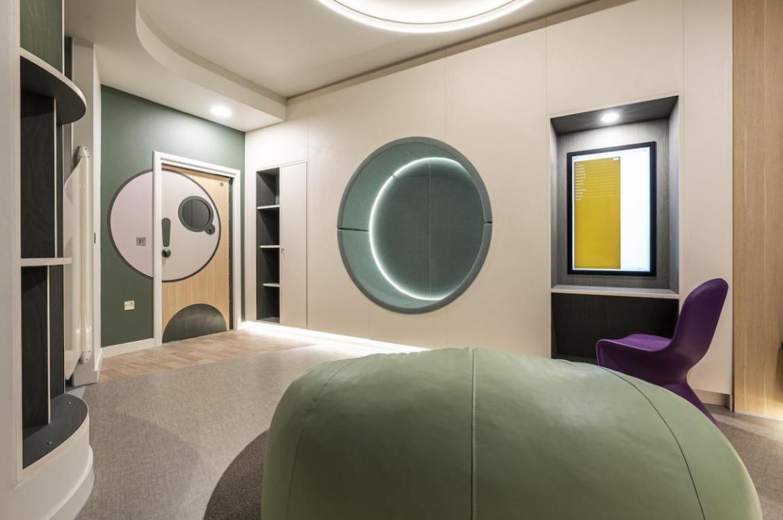
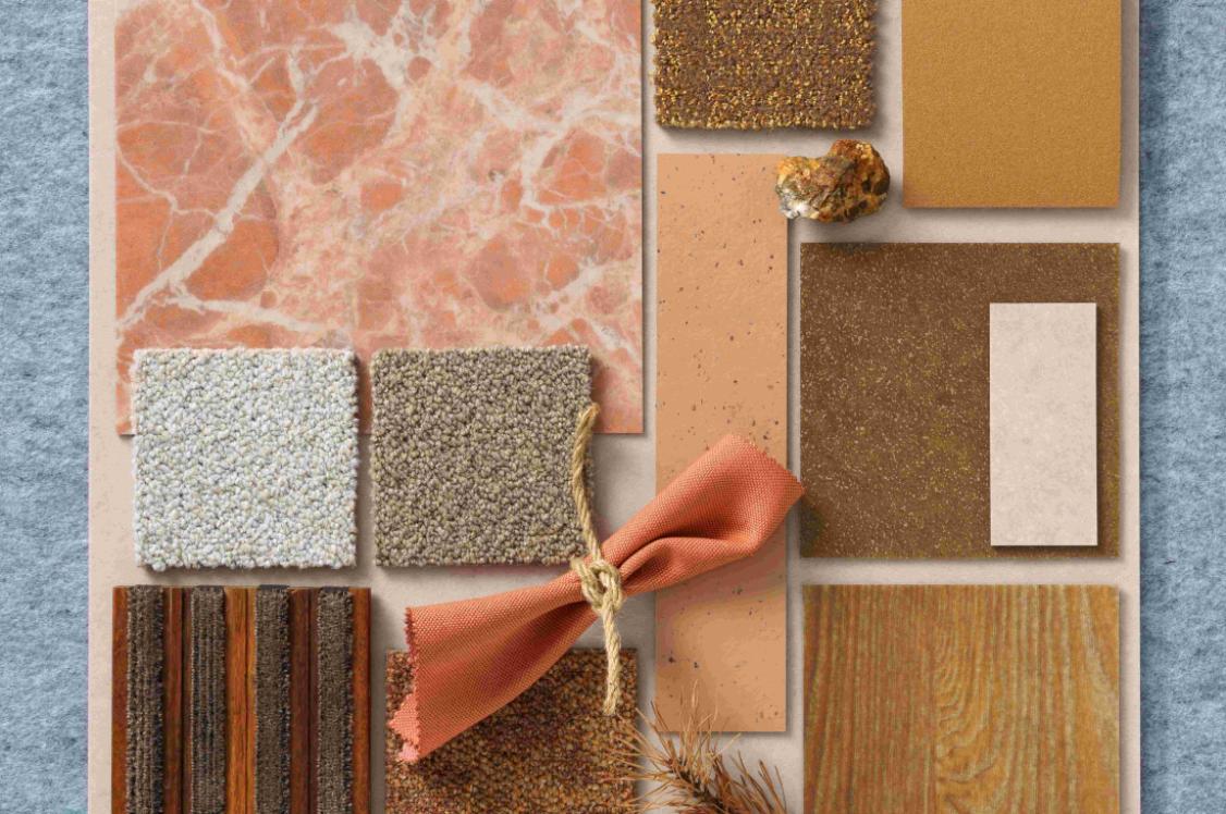
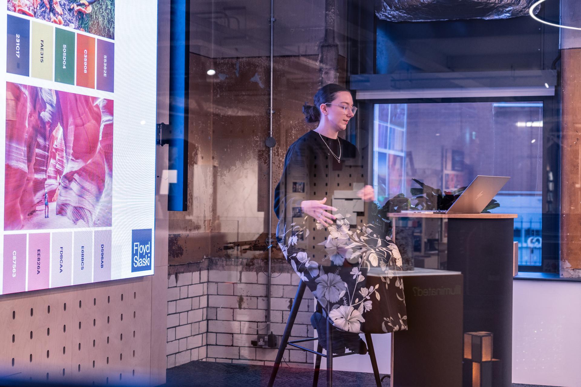
Choose low chroma colours - this will reduce some of the sensory stimulation - opt for a terracotta over a tangerine
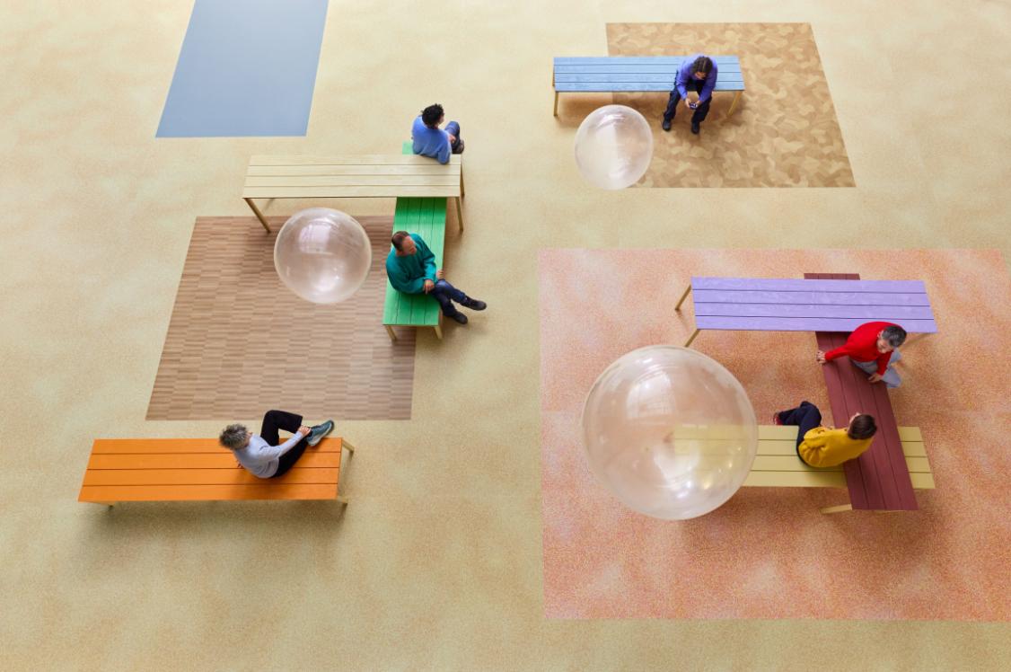
Don't be afraid to use colour, but consider quantity, proportion, and where it is placed
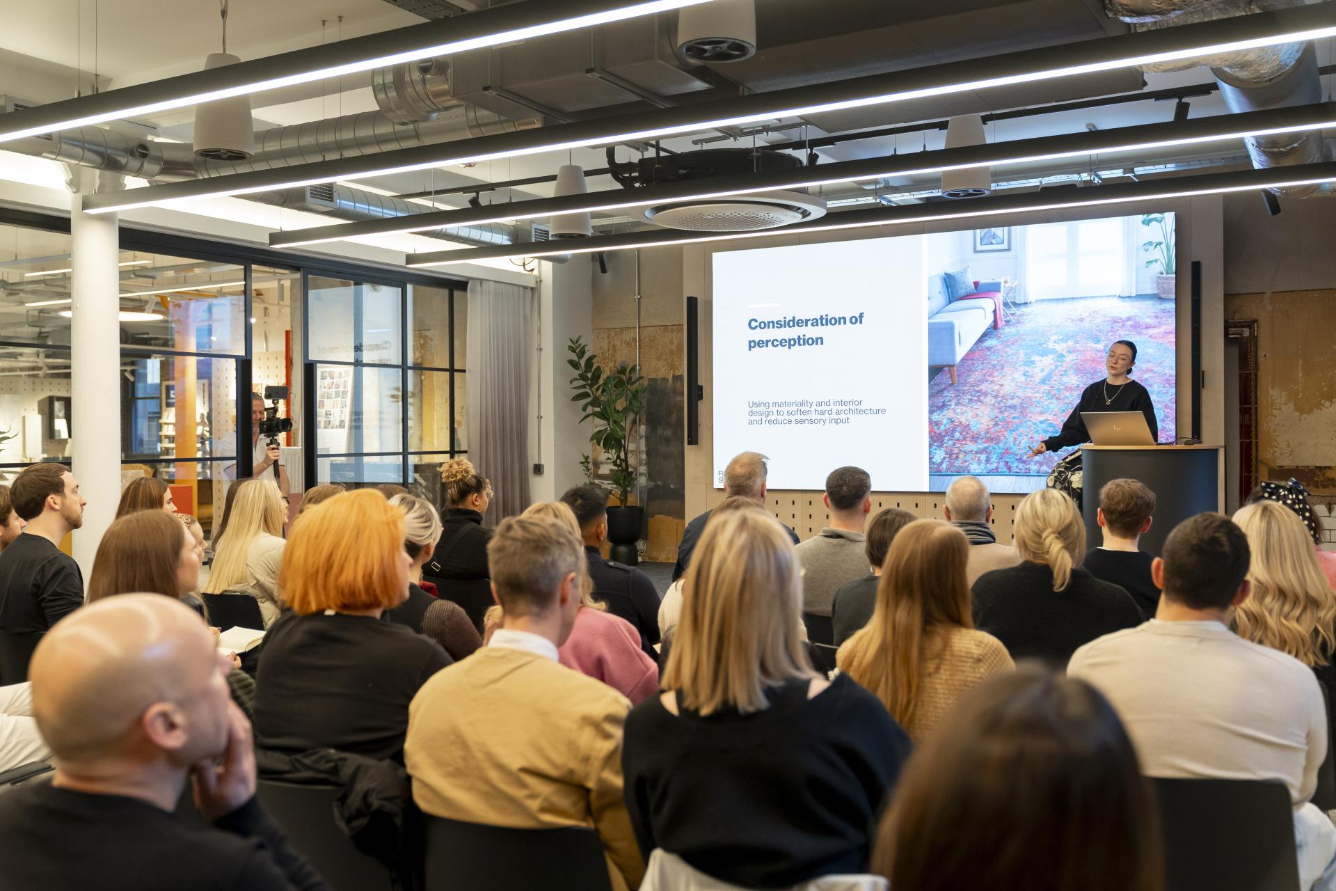
Consider perception - avoid hyperrealism as it could create a barrier and pose safety challenges
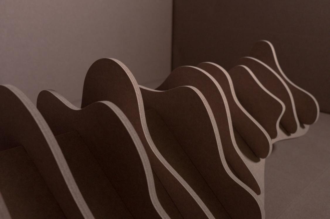
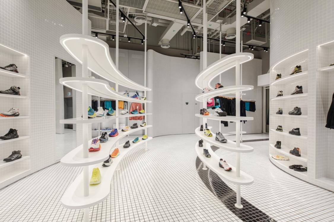
Choose natural geometries in shape and form - put in curves - straight lines and orthogonal shapes require more processing demand as they are perceived as important information so cause us to be on high alert
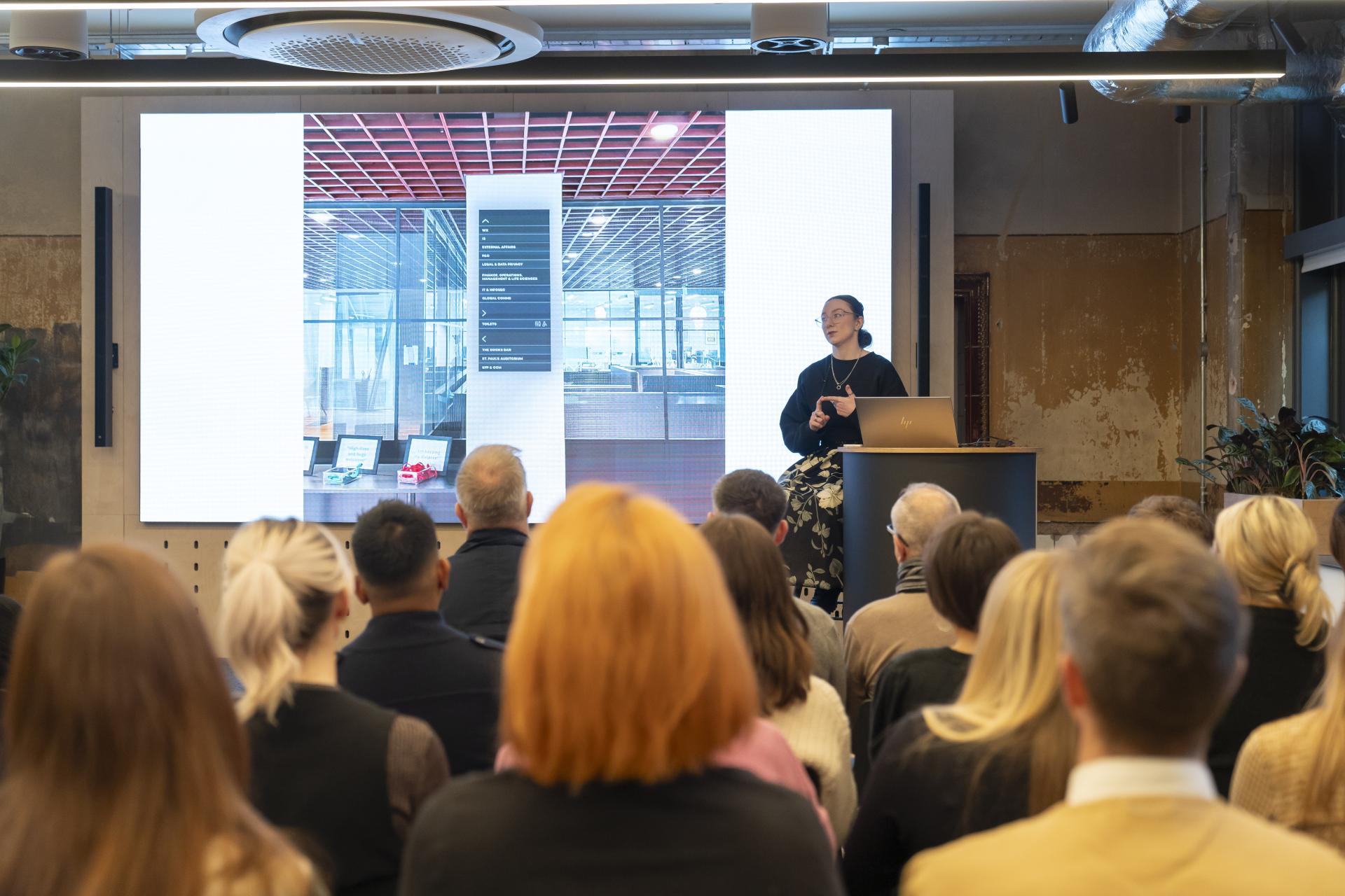
Implement multi sensory wayfinding - use elemental, visual, auditory, and tactile cues
Include transition spaces, allow the previewing of spaces, and add pause places
Ensure intuitive navigation and operation through colour coding - all blue doors in a hospital may be toilets, for example
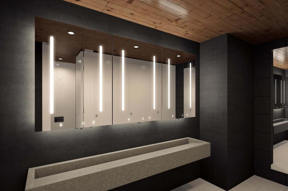
All of this can be designed into the furniture, paint, wall and floor coverings, and accessories, Stephanie says, in schemes of any size. And when it comes to washrooms, superloos are very much her preference, because they are flexible for many different uses by many different people.
Credit: Victoria Middleton
A huge thanks to Stephanie for delivering such an enlightening talk as part of Community, and to all who joined us. If you're local to Scotland, Stephanie will be talking at an upcoming Altro Forum at Material Source Studio Glasgow in January. Head to our What's On for tickets.
Community continues with lunch & learns, workshops, food, drinks and live music today, and kicks off again tomorrow (21 November) at 8am with a talk from John Whittaker, engineering director at the Graphene Innovation Centre at the University of Manchester. Join us.


