The Rosarium: Faber & Company's creative director Tony Matters on transporting guests to a reimagined version of Wonderland.
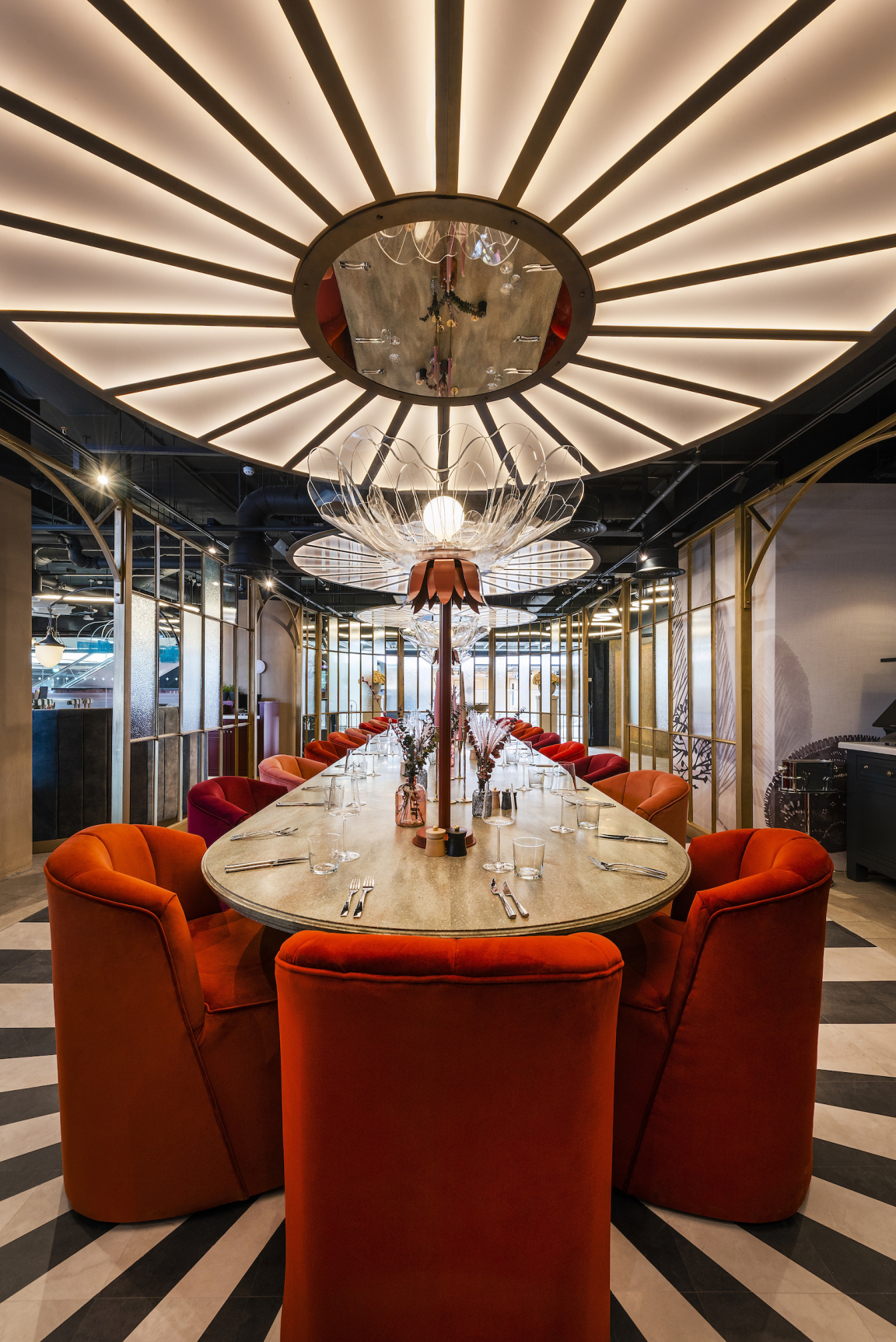
How do you get to Wonderland? Over the hill or under land? Contrary to the 1865 novel, those in search of adventure need not journey down a rabbit hole, but instead venture above Les Enfants Terribles' immersive show Alice’s Adventures Underground, at Labyrinth, Waterloo, where they will discover The Rosarium, a unique spin on the fictitious location.
The sister restaurant to the fantastical show, this unique dining space was dreamt up by Faber and Company, which specialises in the design and creation of one-off, location-specific restaurants and hospitality venues. From its studio and workshops, the talented team crafts 'Immersive Hospitality' experiences; designed to engage with meaning and emotion.
Founded by designer Tony Matters, in 2013, Faber and Company's approach places equal importance on the conception and realisation of an idea, all stemming from Tony’s background in designing and making. Here, Tony shares details of the creative concept for The Rosarium, which comprises a contemporary take on the quintessential English garden...
Firstly can you please give us a whistle-stop tour of the brief for The Rosarium?
“The idea of The Rosarium is that it sits above Alice’s Adventures Underground at Labyrinth, Waterloo Station. And the design brief is that it needs to stand alone as a restaurant to bring in customers that aren’t necessarily going to the show, but also make sense to people who are taking part in the theatrical experience.
“Customers who visit Alice’s Adventures Underground first will probably recognise some of the references more, whereas if you're just a regular customer coming in for lunch or dinner you wouldn’t necessarily immediately see a connection to the story…”
The restaurant is sister to the Les Enfants Terribles immersive show Alice’s Adventures Underground. How did you take inspiration from the classic story for the interiors while avoiding pastiche?
“We built the concept around an idea that wasn’t explicitly linked to the story but sat within the world of its creation. The structure of the concept was the idea of the quintessential English garden of the Lewis Carroll (its writer’s) era. You’ll notice that when you visit a stately home and tour the gardens there’s always a really clear threshold between the different areas. It might be an archway in a brick wall or some sort of opening in a hedgerow. But you usually have a series of formally arranged gardens or spaces that can be quite different…
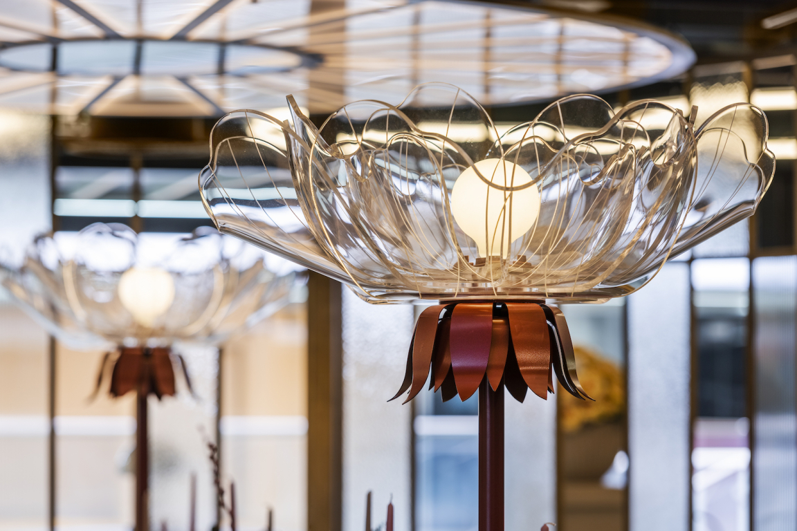
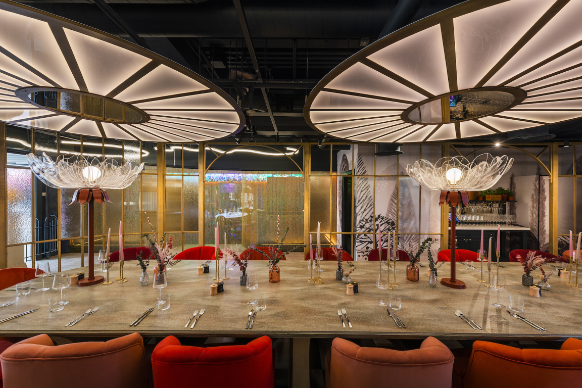
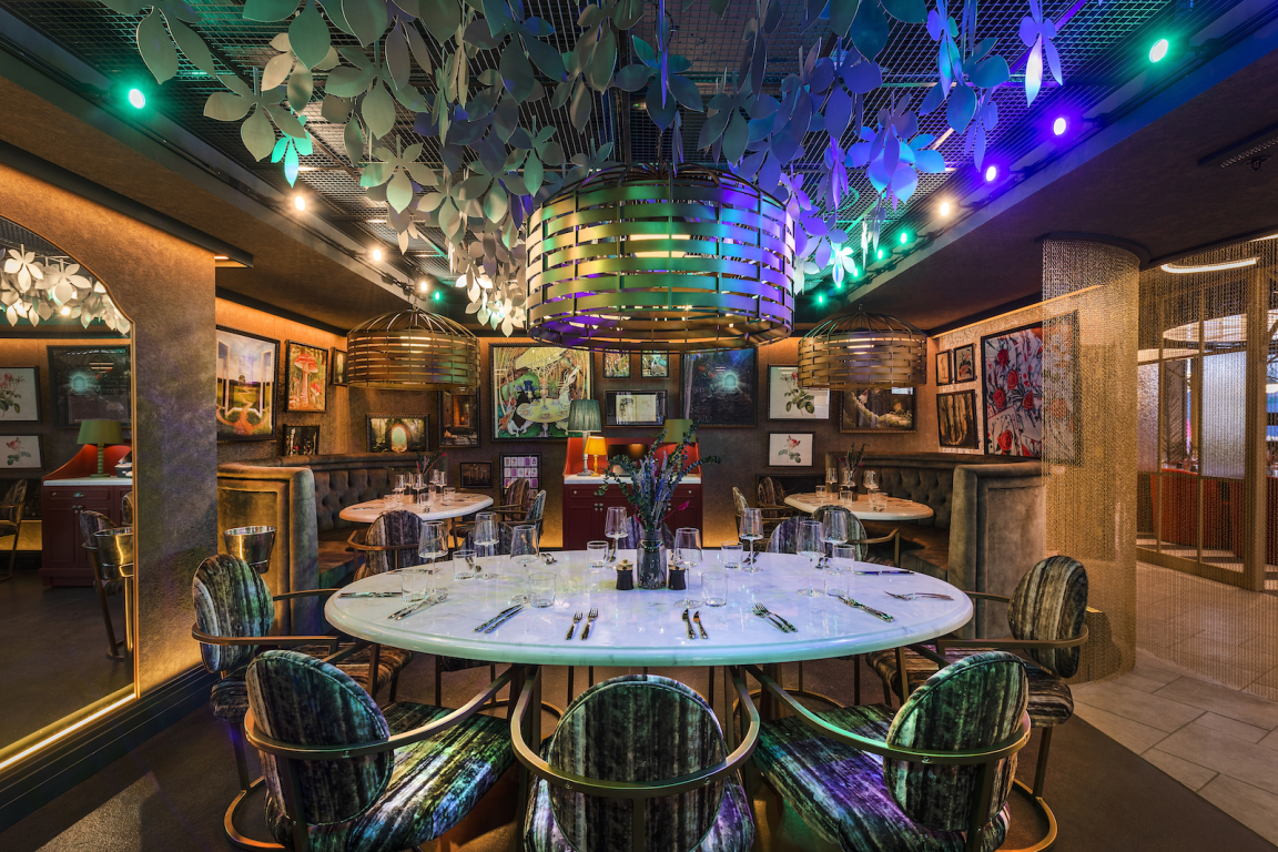
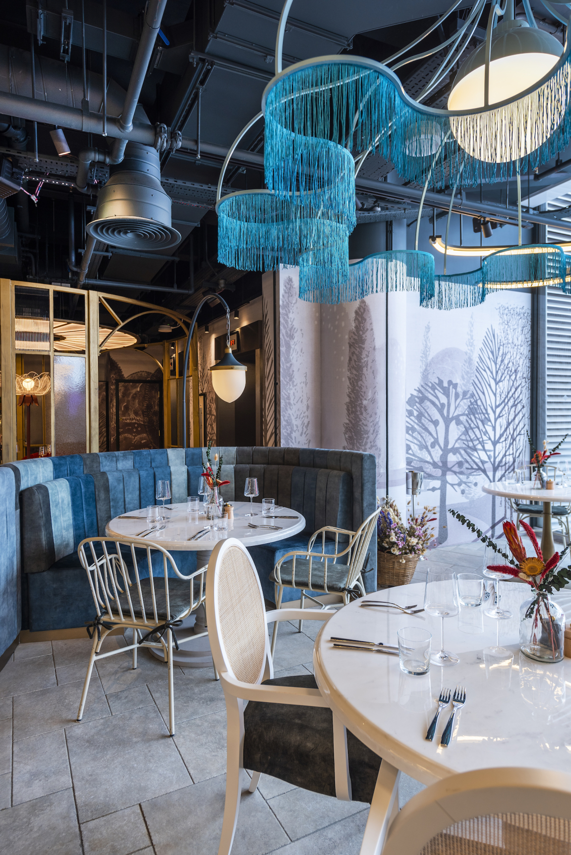
“As a reflection of this, we split the restaurant into three main zones. We’ve got the Terrace which, as its name suggests, is based upon an outdoor terrace and is the space you first enter. Then we’ve got The Glasshouse or 'Rosarium', which takes its inspiration from a Victorian glasshouse and features a large communal table with huge abstract rose centrepieces. And then the third area, The Secret Garden, is a sort of ethereal, hidden space.
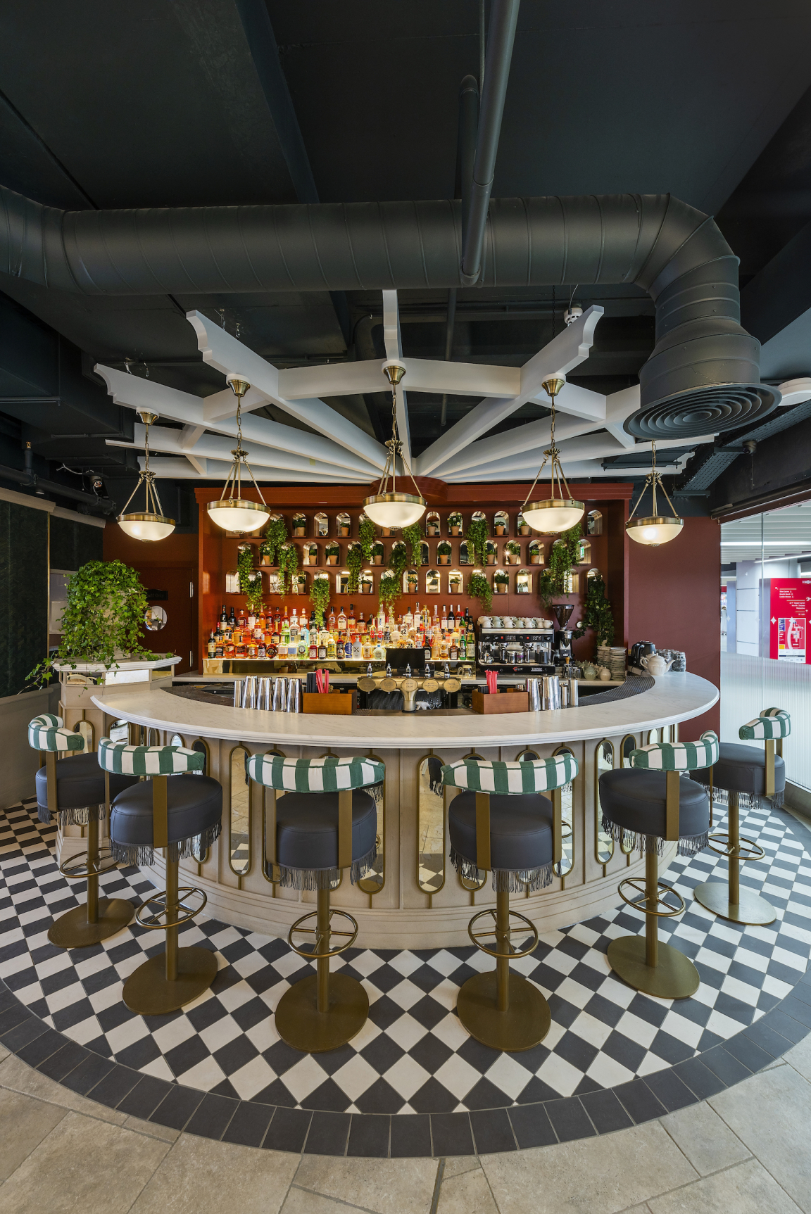
"We built the concept on those three zones. And we played around with things like the lighting in the terraced area. There’s an abstract reference where we created these curved lines that allude to cloud shapes in the sky. With the tables, they are essentially like outdoor furniture with parasols but instead of fabric they have glass lamps. And the design of the bar is like a piece of garden architecture with a stone-like finish. The visual language is the kind of thing you’d expect to find with ornate garden walls and traditional outdoor-style chairs. And I think The Secret Garden is where we lean into the story the most. The lighting here gradually changes colour, it cycles through the seasons in one evening. The idea is that you almost don’t notice it, it’s kind of in the background. You go in and it might be the yellowy-green of spring and then throughout the evening it gradually cycles through a series of colours and seasons."
What sources did you use for your creative inspiration?
“The English Garden was clearly our biggest inspiration for The Rosarium. We used that to pin everything down and it helped us to not be too literal with our design. Despite this influence, we didn’t want lots of fake planting. We wanted things to be done more architecturally, hence the large-scale roses."
We define an emotional landscape and then we craft an experience within that
How did colour play a role in the overall scheme?
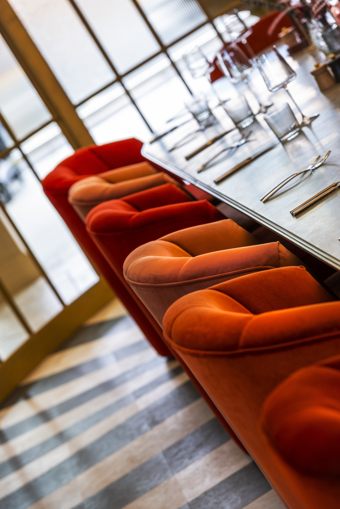
“We had an approach to colour which was, to use a horticultural term, ‘variegated’. For example, around the large communal table you’ve got twenty different chairs and each one is a slightly different shade of red, from more orangey and pinky hues to very bright red…It’s like in a garden where you’ve got this variation in colour. And another example of this technique is the fixed seating in The Terrace, where we used a variety of different greens to make up the fabric, again playing with different tones of the same colour."
And how did you make your material choices? Did sustainability impact?
“We sourced materials that we felt would deliver the concept, as that always guides us. For instance, we searched for tiles that almost feel like outdoor flagstones for The Terrace. And from a sustainability standpoint, as so much of our work is bespoke and made locally, this certainly helps."
Faber is renowned for its experiential F&B concepts - does end-user research inform your work?
"Every Faber project starts with the concept of a journey. And we consider every single step of that journey and how the customer will feel at each point. We call this Experience Mapping™ and as a result our designs are very end-user-focused. We define an emotional landscape and then we craft an experience within that."
What does the future of hospitality look like to you?
“Because the benchmark is continually rising for restaurants, it’s getting harder and harder to stand out and be different. It’s much more the case now that when you design a venue you’re creating an experience that has some sort of narrative or idea that weaves through it. I feel now that many of the most successful operators create a whole experience and consider every touch point and element of it. They weave in story, they weave in theatre, they weave in drama…I think customers expect more now when they go out for a night. They want something memorable, something to tell their friends about, and something that creates a desire to go back. We’ve been talking about the importance of this for a while now and I think more than ever operators are considering the complete customer experience, not just seeing things in isolation…."
What’s next for Faber?
“As our client base continues to grow, we are now looking at projects not just in the UK but internationally. We will continue to invest in and build upon our in-house expertise with tableware design, staff uniform design, graphics and branding, and of course interiors. It’s quite unusual for a design agency to be built upon this depth of service to a very specific niche, so we will continue to invest in what we do best: being the ultimate creative partner to the restaurant and hospitality sector."


