The workplace is envisaged as a ship in Bean Buro's latest project.
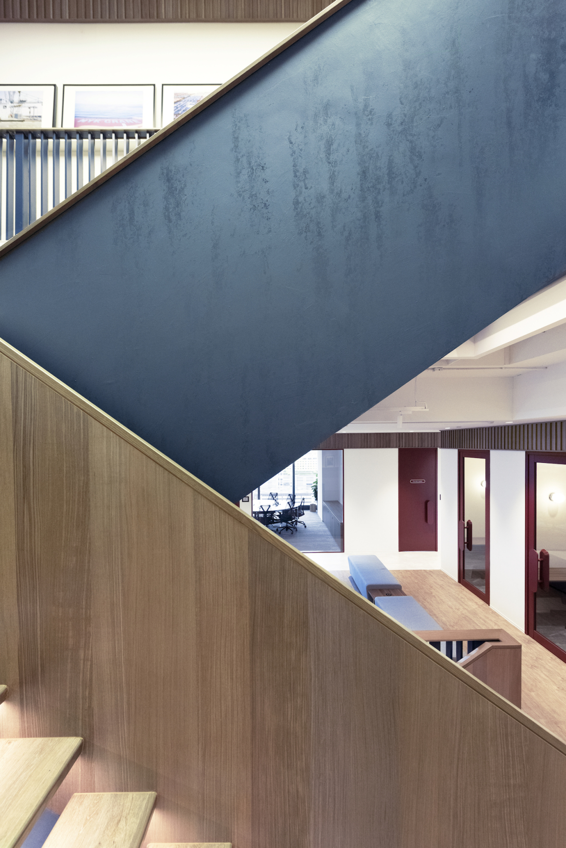
Bean Buro was tasked with designing a new headquarters with an internal staircase spanning three floors for Anglo-Eastern, one of the largest ship management companies in the world.
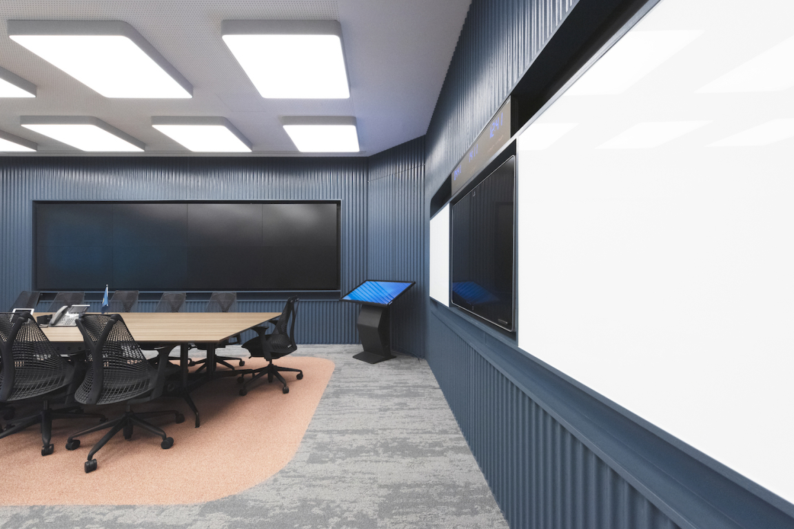
The company’s intent was to create a much more collaborative environment for their many different departments making up the company’s 600+ employees. The new headquarters would also have emergency response war rooms which are control rooms to deal with incidents at sea.
The end result is an agile workplace that’s capable of adapting to the ever-changing work culture in the post-COVID world.
The idea behind the design for this project stems from a photograph by Alastair Philip Wiper for his book ‘Unintended Beauty’. The photo depicts the cross section of a large ship, and Bean Buro was particularly inspired by the horizontal and vertical relationships in the architecture, as it reminded them of a small city within a ship. Through the image, the team began to envision this company as a very large ship with different levels and departments that interact with each other across the three floors.
Additionally, they were also very visually inspired by the Plimsoll Line on ships, a mark on the side of the hull used as a reference to indicate the maximum depth to which it can be safely loaded. The red area under the Plimsoll Line against the navy colour of the hull of the ship gave them the inspiration to convey the mood and feel in a manner that matches the sturdiness and robust identity of the company.
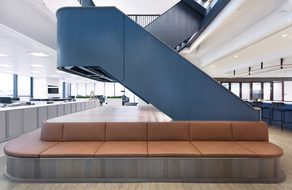
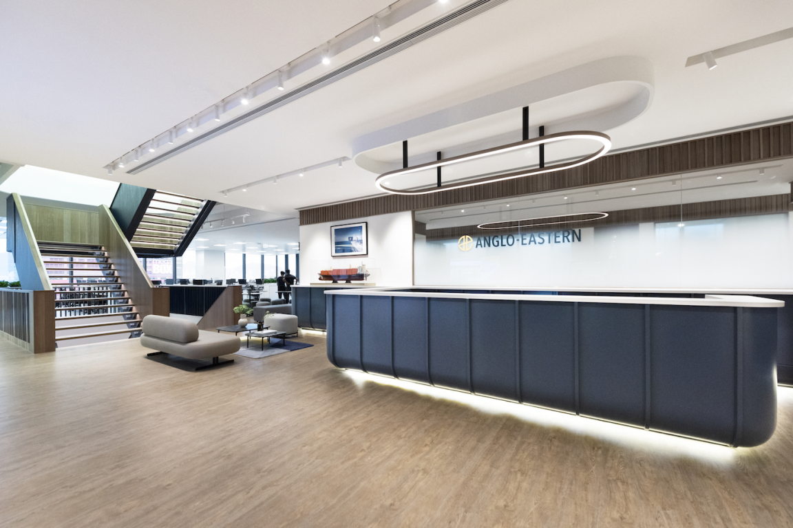
To improve connectivity, Bean Buro proposed a structural opening to allow vertical interconnection across the floors. The reception would be stationed on the middle floor so that employees and visitors would be able to descend the staircase to the largest pantry and multifunctional event area, or choose to go upstairs to the formal boardroom or executive lounge for co-working.
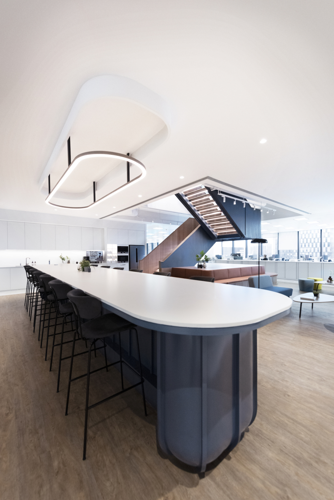
The concept was also to create as much agile co-working spaces as possible, particularly around the landings of the staircase on each floor where there is ample flexible seating equipped with power sockets and Wi-Fi to encourage a sociable and productive atmosphere for collaboration. For the multifunctional pantry area, all the furniture is loose and flexible, and the meeting rooms have operable partitions to further enlarge the space of the event area.
Employees are positioned close to the large windows of the building to enjoy an unobstructed view to the city while the enclosed rooms such as meetings rooms, the war room and collaboration booths are positioned closer to the core. During normal day-to-day, when there are no incidents at sea, the war room doubles up as a meeting room.
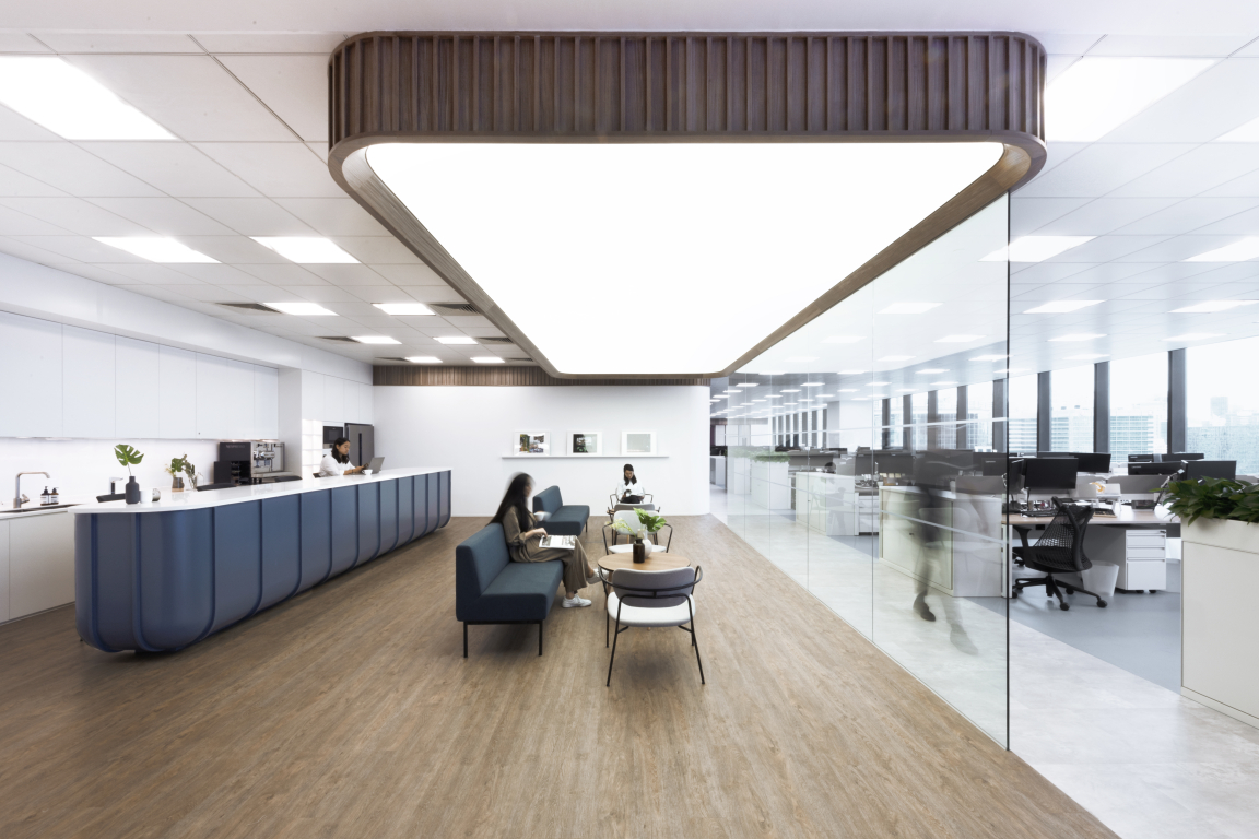
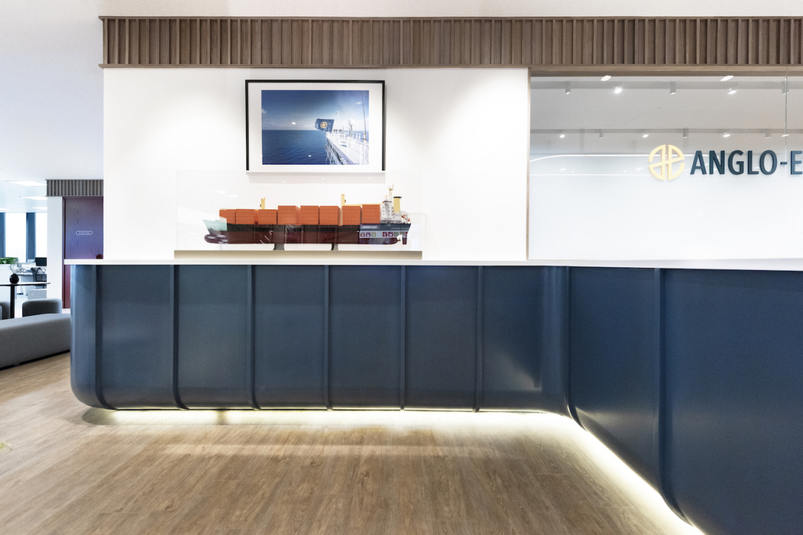
"We interpreted the structural rib of the ship to create the framework for the reception desk, pantry bar counter and construction of the staircase itself. We used the navy blue colour to represent a robust identity for these elements inspired by the hull of the ship. They are also rounded at the bottom, once again akin to the hull of a ship, allowing the joineries to feel elevated and lighter as a structural form. However, for the staircase, the inner surface is lined in timber to create a softer and more tactile experience for users. Each stair tread is also lit on the underside to create a fresh experience.
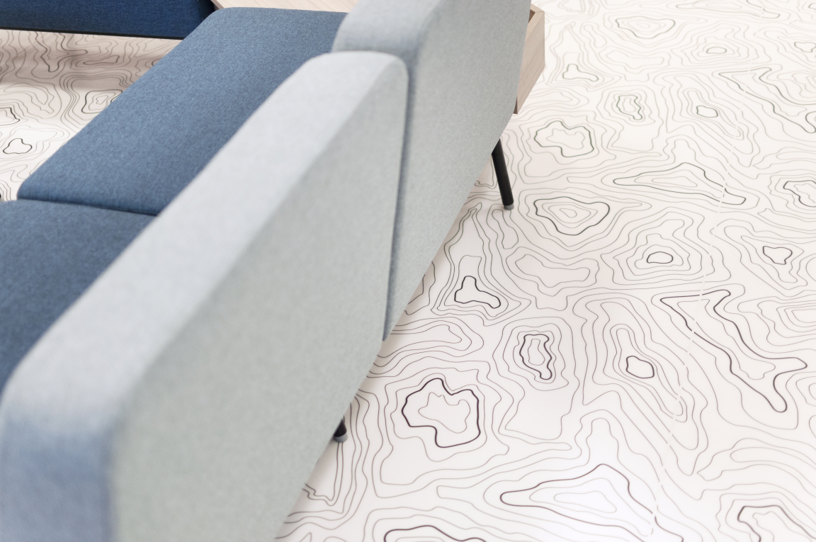
"We used different floor finishes for the various zones of the open plan workplace. For example, in some of the hospitality areas we created a graphical floor with contour lines inspired by nautical maps. We also designed bespoke floor signages depicting arrows and compasses inspired by geographical maps while the rooms are named after different islands in Hong Kong to guide users across the space in a refreshing manner."
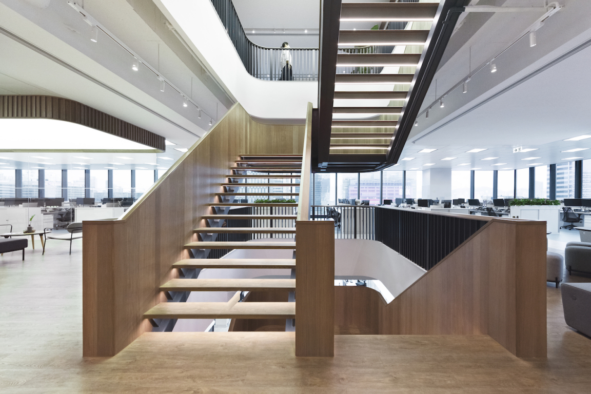
Natural timber finishes paired with dark navy are used to create legible contrast for the bespoke elements, such as the staircase, to emphasise the sturdiness of the sculptural element. The high-grade timber was also used to create the ceiling, as well as the bespoke furniture in all the enclosed offices for a cosy and homey mood and feel.
For all the partition frames, a crimson colour was used, inspired by the red region below the Plimsoll Line at the bottom of a ship’s hull to further strengthen the narrative of the project.
For the boardroom, which is adjacent to a co-working lounge, Bean Buro employed a switchable glass effect which allows users to, at the push of a button, make the glass either transparent or opaque depending on their privacy needs. They also made use of corrugated wall panels inspired by industrial structures in the war room to scatter sound or reduce echo.
At the top of the staircase, the team has created a large artificial skylight on the ceiling using a stretched PVC membrane. "The idea was to create a sense of airiness the top of the staircase to attract users to ascend to the top floor. We also used the artificial skylight effect on the lower floor, above the sociable pantry, where it is further away from the natural daylight coming in from the windows."
A large workplace for so many employees, a major consideration was in creating a layout composition that would enable them to work flexibly with some fixed seating, and to allow for potential expansion in the future.
"The main challenge, as with many workplaces for such a large corporate organisation, is using design to encourage employees to feel relaxed and engaged with the work environment. Our innovative design has achieved this objective successfully in the mood and feel with a large variety of flexible areas to work, allowing us to truly meet the brief in terms of creating a collaborative working culture."


