Toggle Hotel Tokyo invites guests to be on or off.
Credit: Shingo Nakashima / SS
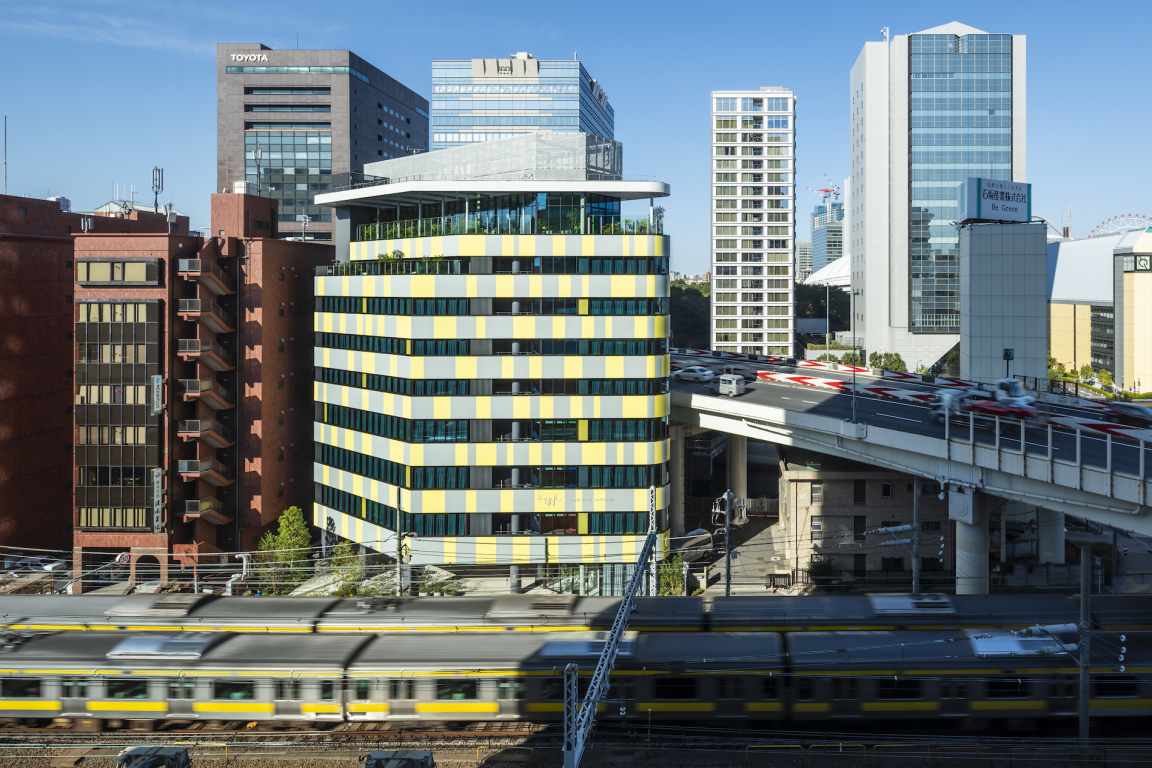
Toggle is truly an urban hotel, located in the heart of Tokyo. The triangular site is bound by the Metropolitan Expressway flying over an extension of the historic Imperial moat on one side, while the Chuo Line, the main railway line that crosses Tokyo, runs past on the opposite side.
The building was designed to be a new iconic landmark, which reflected Tokyo’s energy and vitality. So often one passes buildings on a train or in a car and they seem nondescript, so it was important for Toggle Hotel to stand out and become its own advertising. Something to recognise and help visitors locate it in Tokyo's urban jungle.
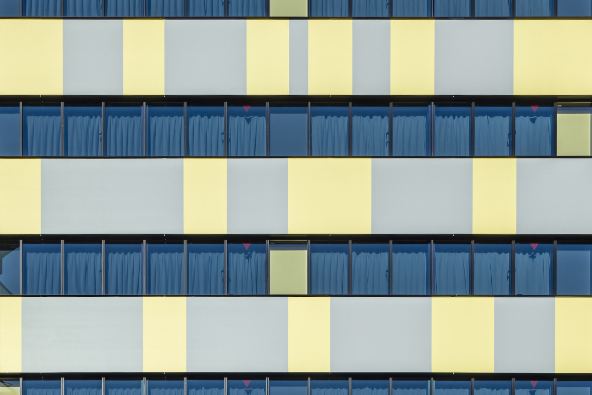
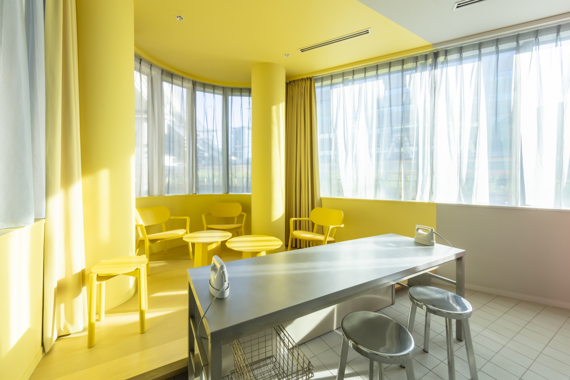
Responding to the grey monochrome urban setting the architecture and interior of Toggle Hotel is all about movement and colour. The architecture emphasises the horizontal movement of the cars and trains, with continuous window bands which trace the dynamism of the urban infrastructure and express speed. The fresh yellow and concrete grey pattern was inspired by the graphic patterns on the expressway.
Credit: Shingo Nakashima / SS
Credit: Shingo Nakashima / SS
Credit: Shingo Nakashima / SS
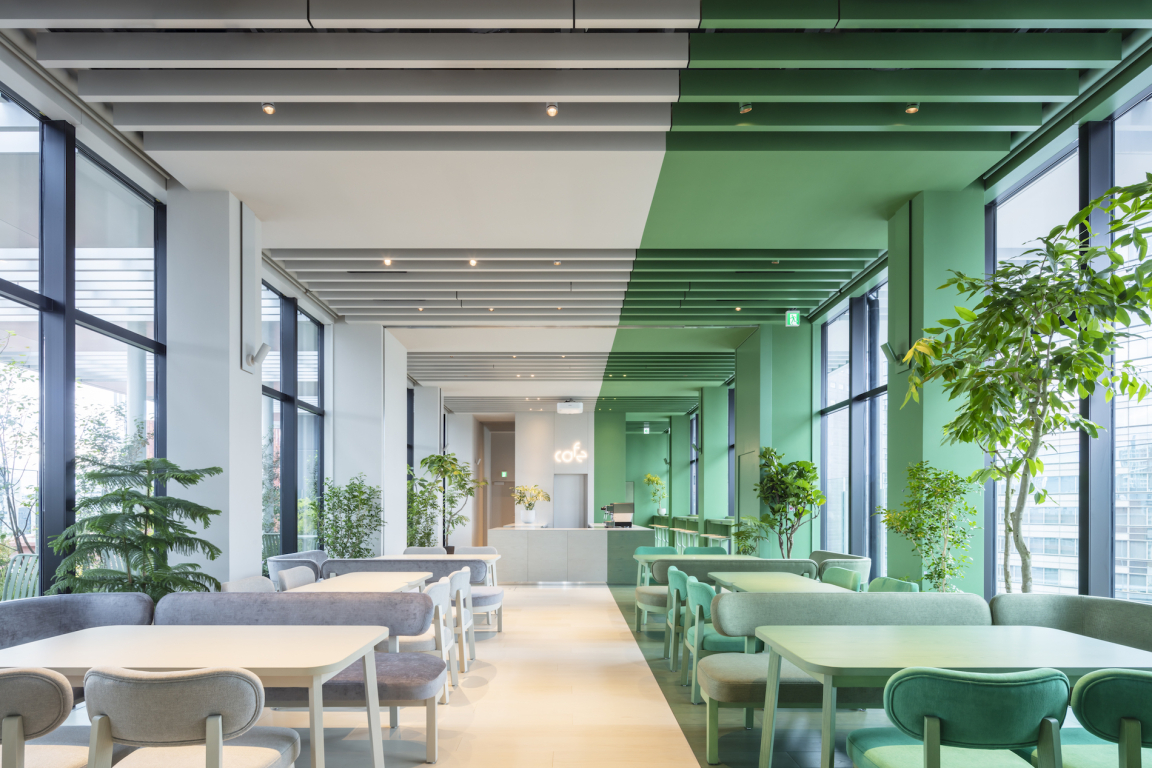
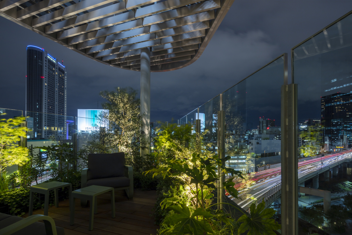
The reception lobby is located on the top floor of the building which also acts as the cafe and main social hub of the hotel. Glazed on three sides, generous green terraces give great views of the city and the 50,000 seat Tokyo Dome which is located nearby.
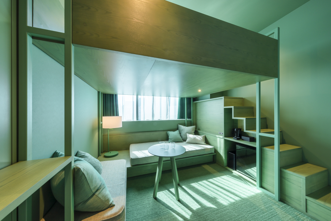
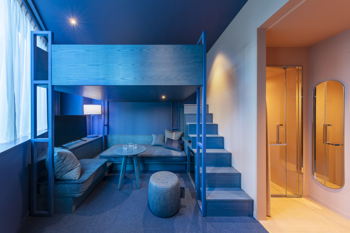
The hotel is positioned as a stylish, yet economical place to stay in Tokyo. Around 60 percent of the rooms have loft type beds which sleep three. Each floor of the hotel has a different colour combination, which is also reflected in the 10 types of rooms. KDa worked with the graphic design team artless who developed the logo, graphics and branding for the hotel.
Credit: Shingo Nakashima / SS
Credit: Shingo Nakashima / SS
Credit: Shingo Nakashima / SS
The hotel gets its name Toggle from the notion that guests can be ON or OFF. On for work or off for leisure - or equally off for work and on for leisure. "Whether you are staying at the hotel for business, leisure or just for train spotting, each stay is guaranteed to be colourful, different and fun!"


