Volare's interior transports visitors back to 1960s' Amalfi Coast.
Photography: Maarten Willemstein
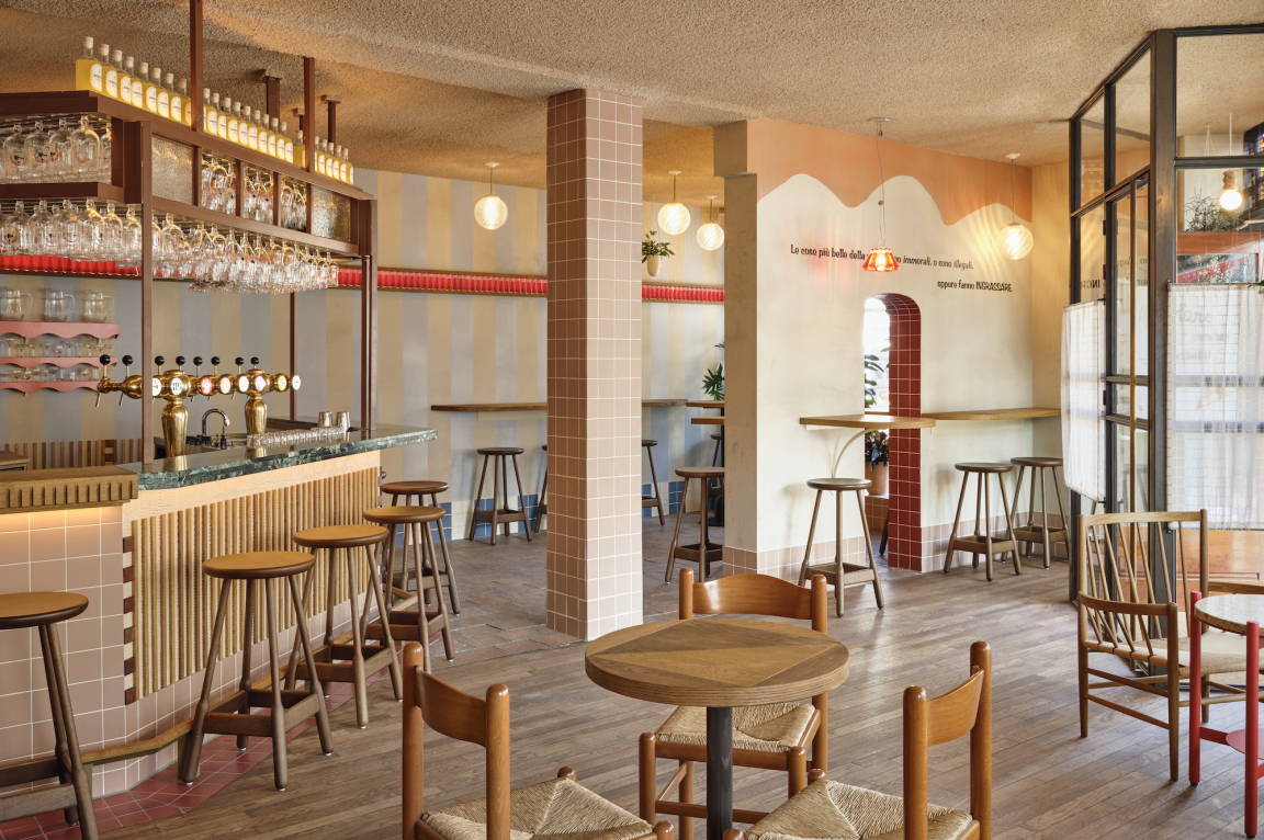
Entering Volare - a new Italian trattoria in Amsterdam West - feels like stepping straight into Italy. Traditional and playful graphics combine with a palette of soft red, orange, white and blue tones to transport visitors back to the Amalfi Coast in the 1960s.
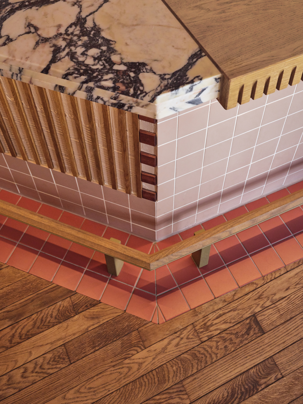
The golden age of this Mediterranean icon is elegantly recalled via original and timeless elements like ceramic tiles, chalk plaster, rough textures, striped patterns and cotton fabrics, wall recesses and wooden details mixed with Italian marble. Together they evoke white sandy beaches, colourful striped parasols blended with an easy-going vibe and the entertainment only Italians can bring to the table.
No matter the day of the week, the interior designed by Studio Modijefsky conjures up memories of Italian summers thanks to its soft colours and rough surfaces, arches and patios, and sensual swagger mixed with utter simplicity.
Photography: Maarten Willemstein
Photography: Maarten Willemstein
Photography: Maarten Willemstein
Legendary Italian architects seem to be the hidden directors of this project. Their way of playing with graphics and architecture pops up everywhere in the repetition of lines, shadows and wall slits. A harmonious balance between a simple background and cheeky elements gives a touch of freshness and uniqueness to a primarily traditional context. For example, the entire space is bordered by wooden shelves backlit by Italian cocktail bottles that create a different ambience depending on the liquor’s colour and the time of day.
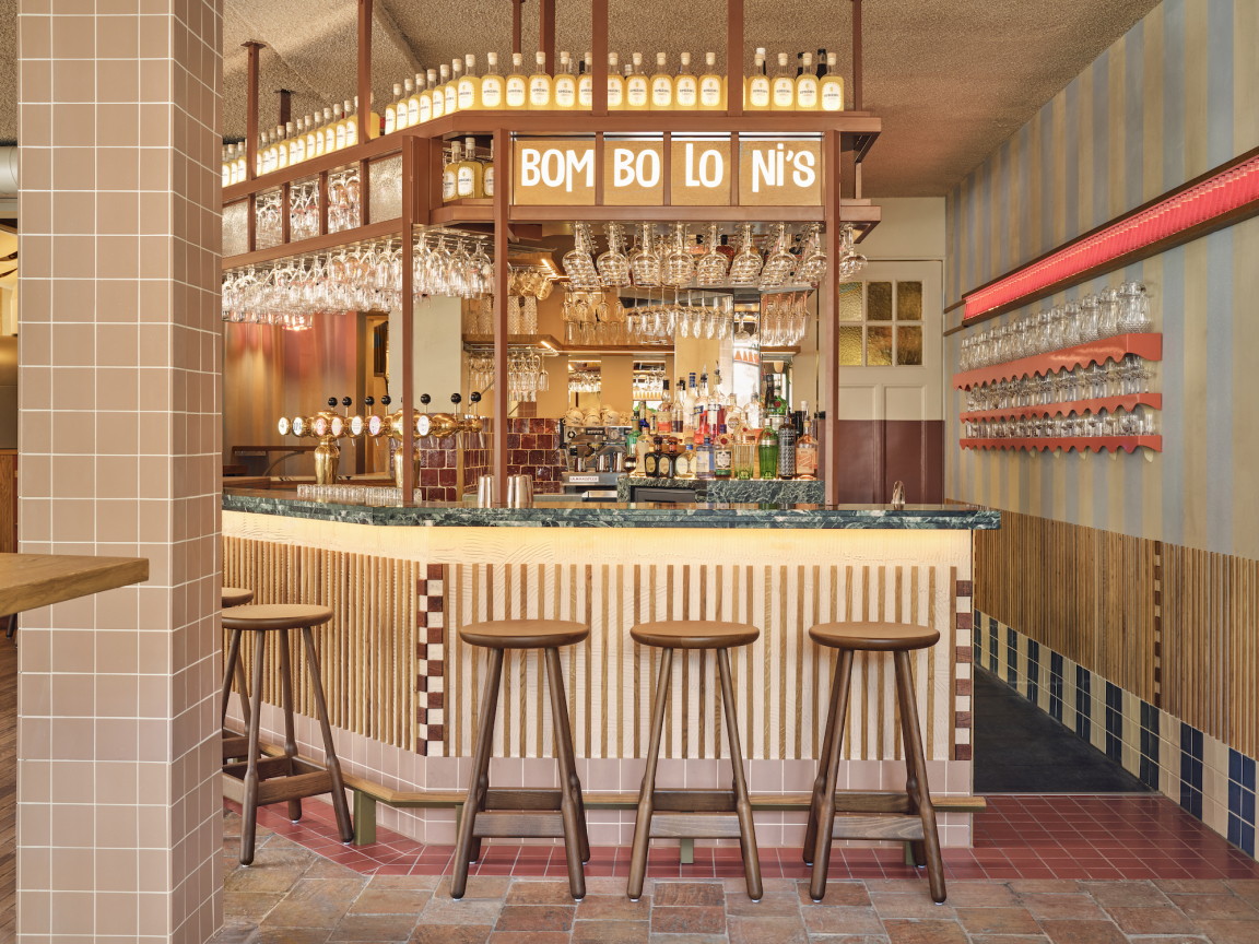
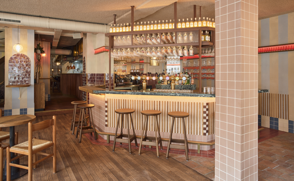
Mellow, delicate tints open the doors to an informal but refined cocktail bar where it’s possible to enjoy an aperitivo with a fine selection of appetizers. The bar’s structure follows the lines of the open kitchen, and its shape is an offset of the building perimeter.
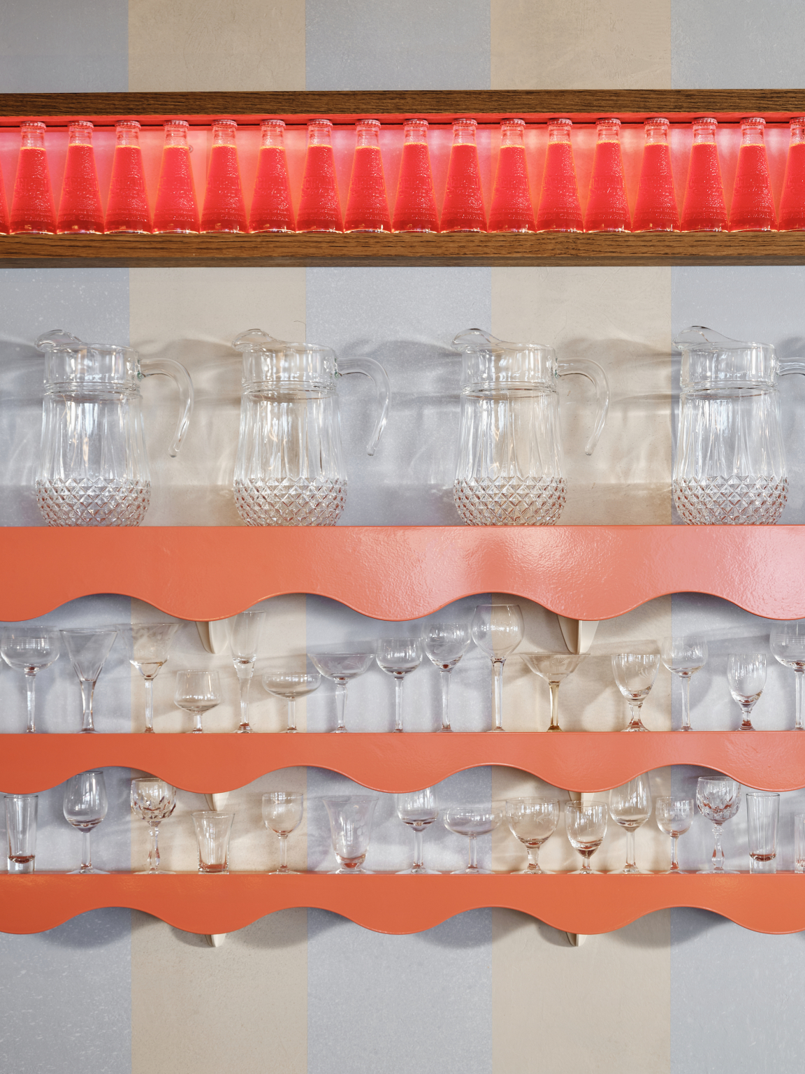
By demolishing all the non-bearing elements and preserving the masonry walls, the interior, which had been divided in two, is now united. Removing the extra volumes has cleared the visual pathways and created optimal sightlines. As a result, the bar design is a perfect balance between space and volume. The back bar is a totem upon which bottles are showcased between layers of wood, mirrors and marble. Behind it, vertical stripes are crossed by orange shelves holding pitchers and antique limoncello glasses. Together they form a sculptural yet tactile sensory effect.
Photography: Maarten Willemstein
Photography: Maarten Willemstein
Photography: Maarten Willemstein
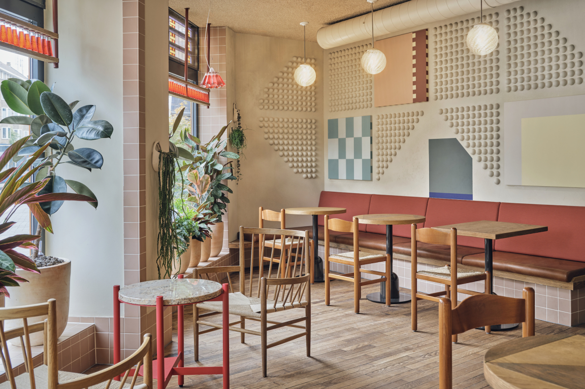
Walls and columns combine to form wall tables, ideal for people to enjoy a drink with a snack. High and low seating outline the entire bar area, together with the blue and white stripes, different tiles, and natural stones. The fresh graphics and shapes on the stucco walls go hand in hand with the Scarpa-inspired slits and neon light detail on the ceiling.
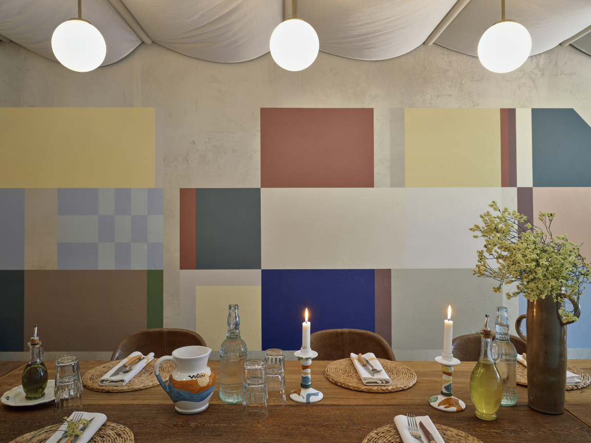
A single step leads to the patio area, where soft loose cotton fabric drapes from the ceiling in a regular rhythm. Here the striped pattern alternates between pastel yellow and beige. The latter, together with the graphics, delineates the pizza making area, and leads to the bespoke wooden wine cooling cabinet and the private dining area downstairs. This room for special events is illuminated by long lines of warm light spheres hanging from the ceiling, which is covered in soft textile for the entire length of the room. An irregular and illusory artwork on the left wall plays with perspective and tricks the eye.
Volare’s grand finale is the trattoria. An angular chef’s table welcomes guests to an interactive experience that provides a behind-the-scenes glimpse into the operations of a working kitchen. A symmetrical grid of silkscreen printed posters overlooks the custom benches, outlining the perimeter of the room. On the opposite side a light beige wall is segmented by stripes of mirror, creating a game of rebounds and reflections between the exterior and interior. The galaxy of details, textures and colours could be overwhelming, but instead of competing for attention, they relax the eye as well as intriguing it.
This game of light and colour symbolises Volare’s role as the place where inside and outside meet. The calm and beauty of its design form the perfect background for a truly Italian sensory and culinary experience: a modern trattoria that winks to the past but embraces modernity. In the best Italian traditions, Volare is somewhere to enjoy the good things in life in good company. As they say in Italy: aggiungi un posto a tavola!


