W Osaka by Concrete oozes cool from every corner.
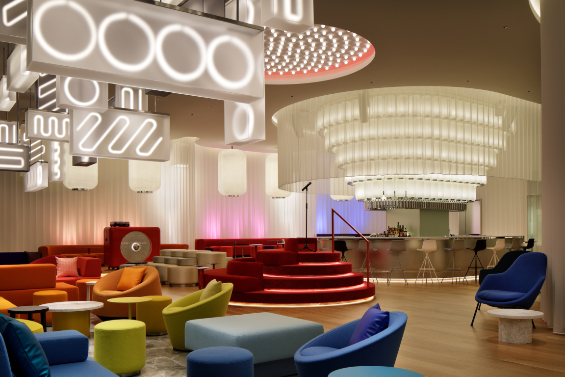
Copyright: W Osaka by Concrete
Every W hotel is designed for its specific location – with foreign designers invited to offer the fresh perspectives of an outsider.
For W’s first hotel in Japan, Sekisui House and Marriott International called on Amsterdam’s Concrete Architectural Associates – challenging designers from one of Europe’s most famous harbour cities to discover inspiration in an ancient harbour city on the other side of the world.
The sprawling metropolis of Osaka was once the imperial capital of Japan and the country’s economic hub. At its heart, the wide Yodo River flows into a harbour bustling with trade. Throughout its history, visitors contributed their cultures and technologies to the city – creating a prosperous port with an extroverted, lively and somewhat rebellious culture. All of this energy attracts international businesses and visitors.
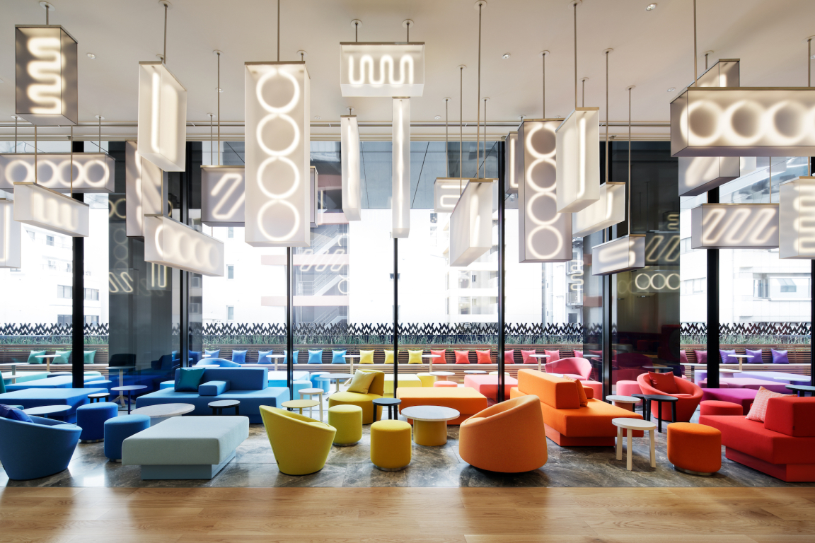
Copyright: W Osaka by Concrete
Copyright: W Osaka by Concrete
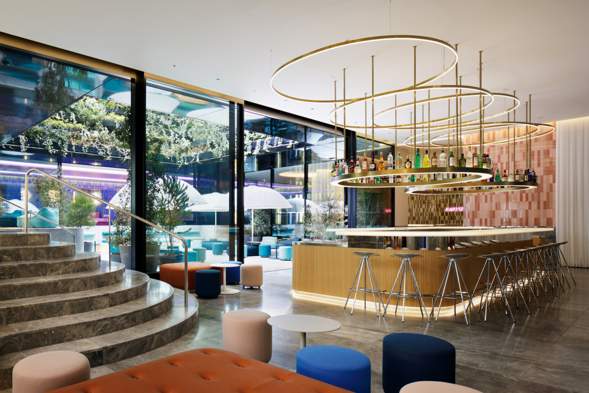
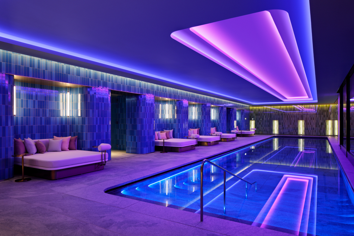
Concrete’s team of Dutch designers explored Osaka’s past, present and future, its urban and natural landscapes, and its fascinating culture. Visually, they discovered that Osaka is water and nature – but also neon and bright colours. They were struck by the contrast between the aesthetic of Japanese minimalism and the extravagance of an urban world saturated with colour. Especially in downtown Osaka and Dotonbori – Osaka’s nightlife district – the display of flashing neon is breathtakingly vivid and joyful.
Then there’s the simple beauty of nature. The pink of the much-loved cherry blossoms and the golden yellow of the ginkgo trees in autumn – which line Midōsuji Boulevard, where W Osaka is located.
Copyright: W Osaka by Concrete
Copyright: W Osaka by Concrete
The goal was to share the spirit of the city with the guests of W Osaka. And let the interior of the hotel tell a story that is, truly, Osaka. Celebrating the opposing – yet complementary – forces of extravagance and simplicity.
Being outsiders, Concrete Amsterdam absorbed the sights, sounds, flavours and thrills of Osaka – and found inspiration in both the simple and traditional, as well as the modern, obsessive and extravagant. Their creative cues included: circles, dots and balls; Pachinko - an arcade game; Asanoha - a traditional Japanese geometric pattern; cherry blossoms; tattoos; origami and kirigami; ginkgo trees; neon; emptiness and space.
Copyright: W Osaka by Concrete
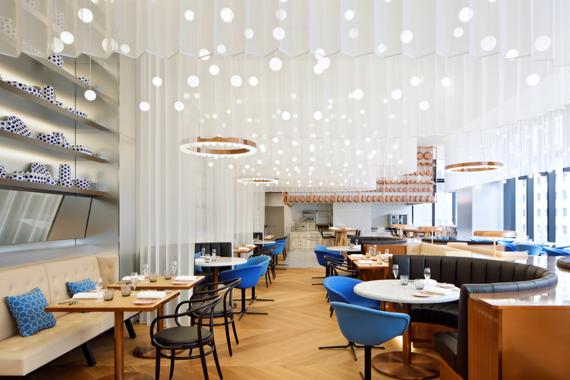
Copyright: W Osaka by Concrete
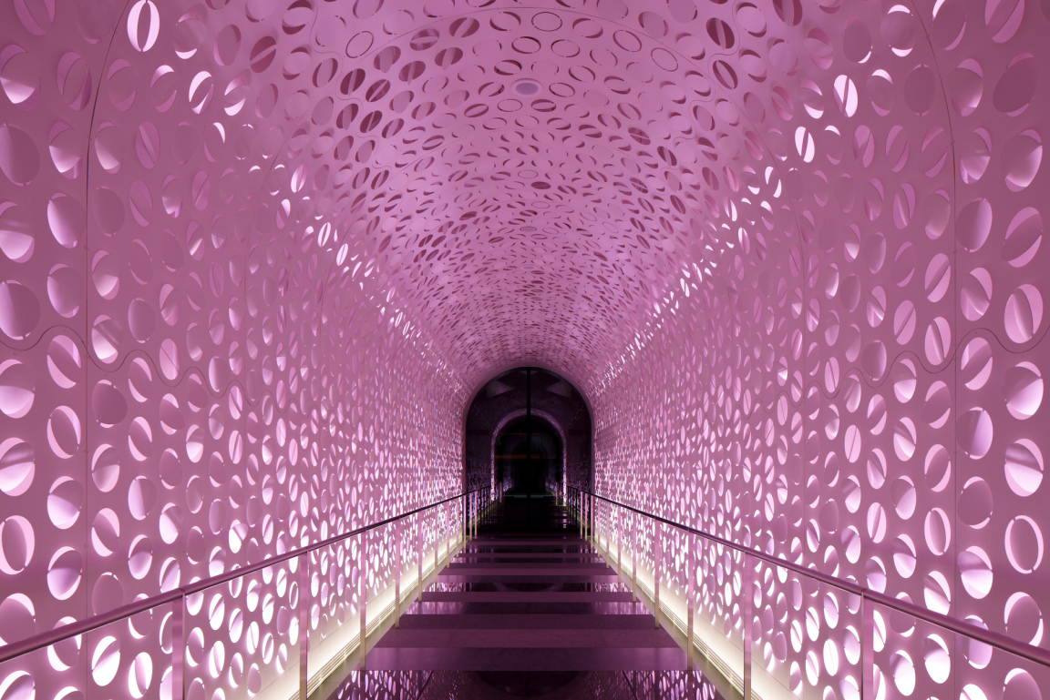
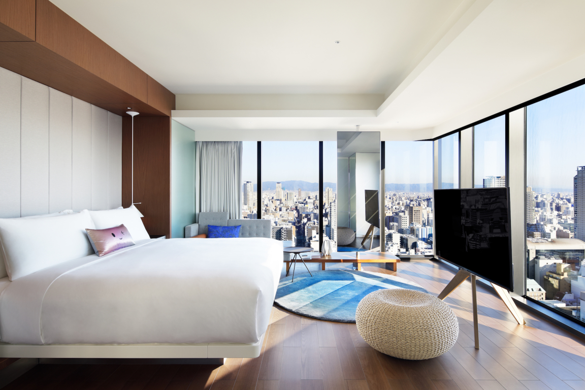
This translated into countless show-stopping design statements - from futuristic light tunnel in the entrance, inspired by delicate blossoms and the fine art of origami, and featuring more than 3000 circles laser cut into sturdy metal and folded randomly, to the brightly coloured living area and ambient guest rooms. The common thread throughout is 'experience'.
This is nowhere more evident than in Ukiyo. Down a long zigzag-curtain lined corridor hides a secret world accessible only to those in the know (and with a coveted reservation). An unassuming stainless steel portal frames a stainless door with a small fish emblem.
Guests need only wave their hand to activate the sensor, as the door opens into a narrow hallway clad in stainless steel and frosted mirror – leading them to W Osaka’s secret sushi restaurant, Ukiyo.
...Hotels just don't come much cooler than this.
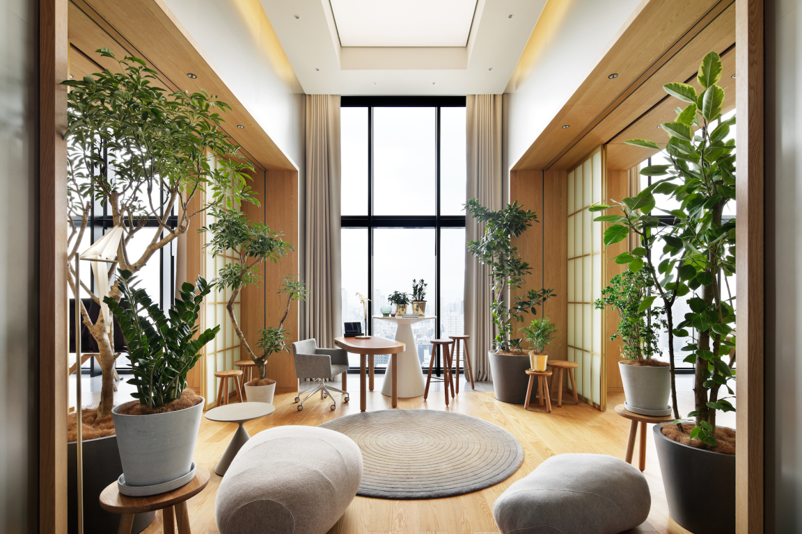
Copyright: W Osaka by Concrete


