Washroom wellbeing: Why the support of wellness is crucial in commercial washroom design.
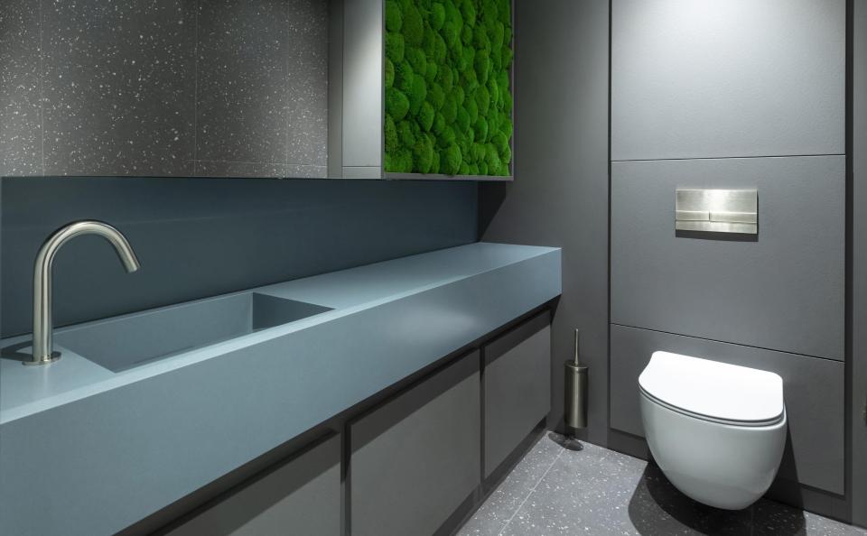
Bathrooms present the ideal place for facilitating quiet and contemplation. After all, they were originally created with privacy in mind.
In contemporary commercial washroom schemes, the call for wellbeing-boosting spaces is louder than ever before. In response, Concept Cubicle Systems explores how user experience can be enhanced in your next hospitality, workplace, public or education project...
Why bring the outdoors in?
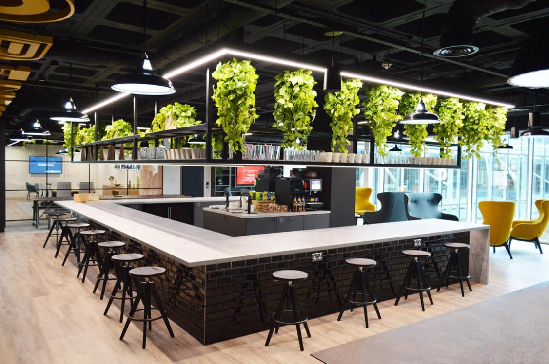
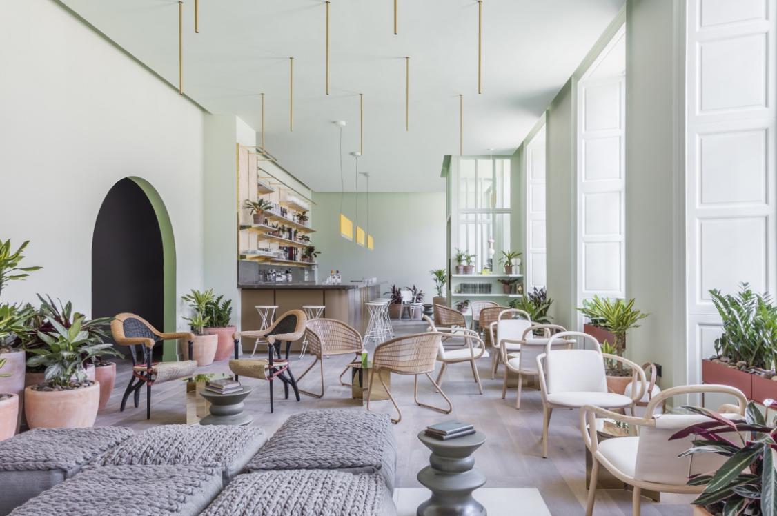
Although not necessarily a new trend, bringing the outdoors in has taken on a role of renewed importance, post-pandemic. During two years of being mainly housebound, gardens and parks became safe havens for many. And now, as we return to our places of work, socialisation, and relaxation, we’re keen to maintain this close connection to nature.
In commercial washroom schemes, the inclusion of natural elements can come in many forms.
Instil a sense of calm through colour
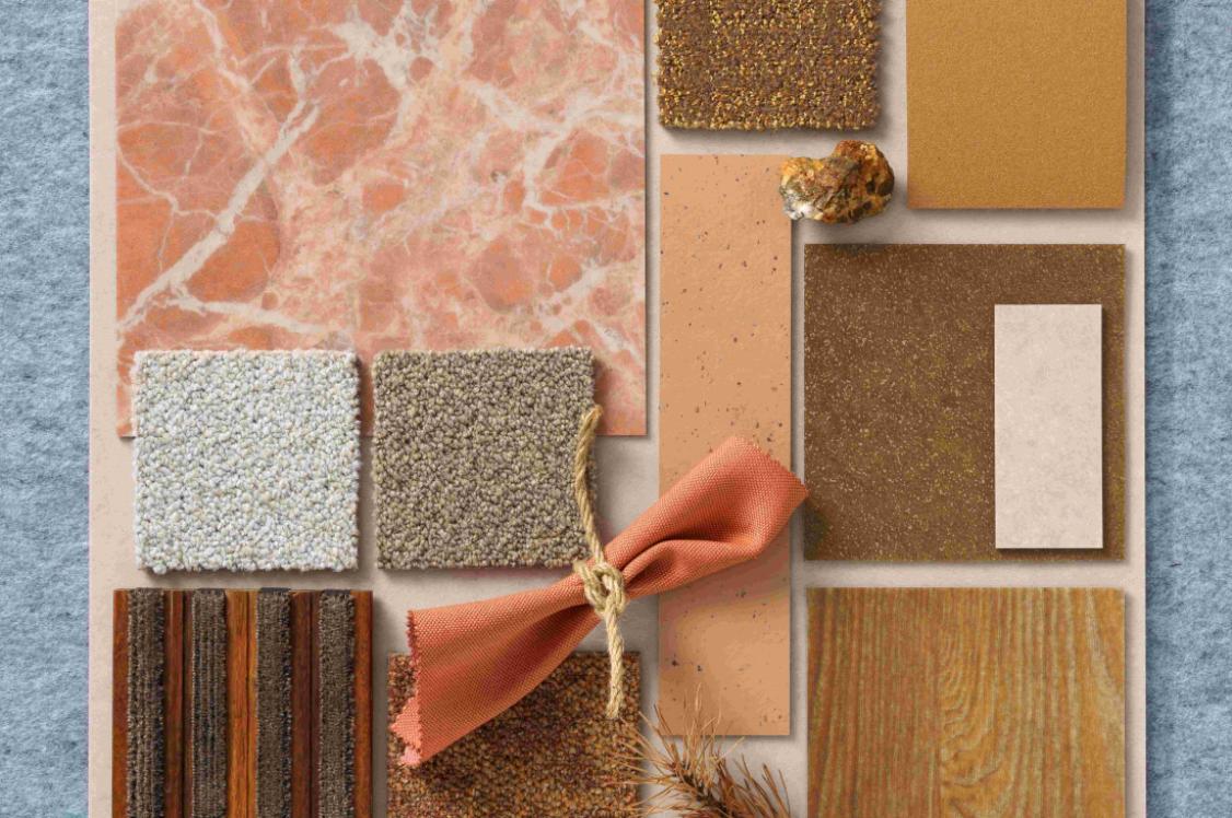
Mother Nature’s colour palette is rich and varied, serving as endless inspiration for interior schemes. At a time of social turbulence, the influence of natural hues can have a profound effect on our wellbeing. Speaking of Pantone’s past Colour of the Year, Greenery, executive director, Leatrice Eiseman, said: “‘Rejuvenate,’ ‘revitalize’ and ‘reassurance’ are all the things we look for in a very complex social and political environment.” Although the comment was made back in 2017, this sentiment still rings true today.
According to colour psychology, green is a balancer – an equilibrium between the head and heart. It also symbolises growth, renewal, and rebirth.
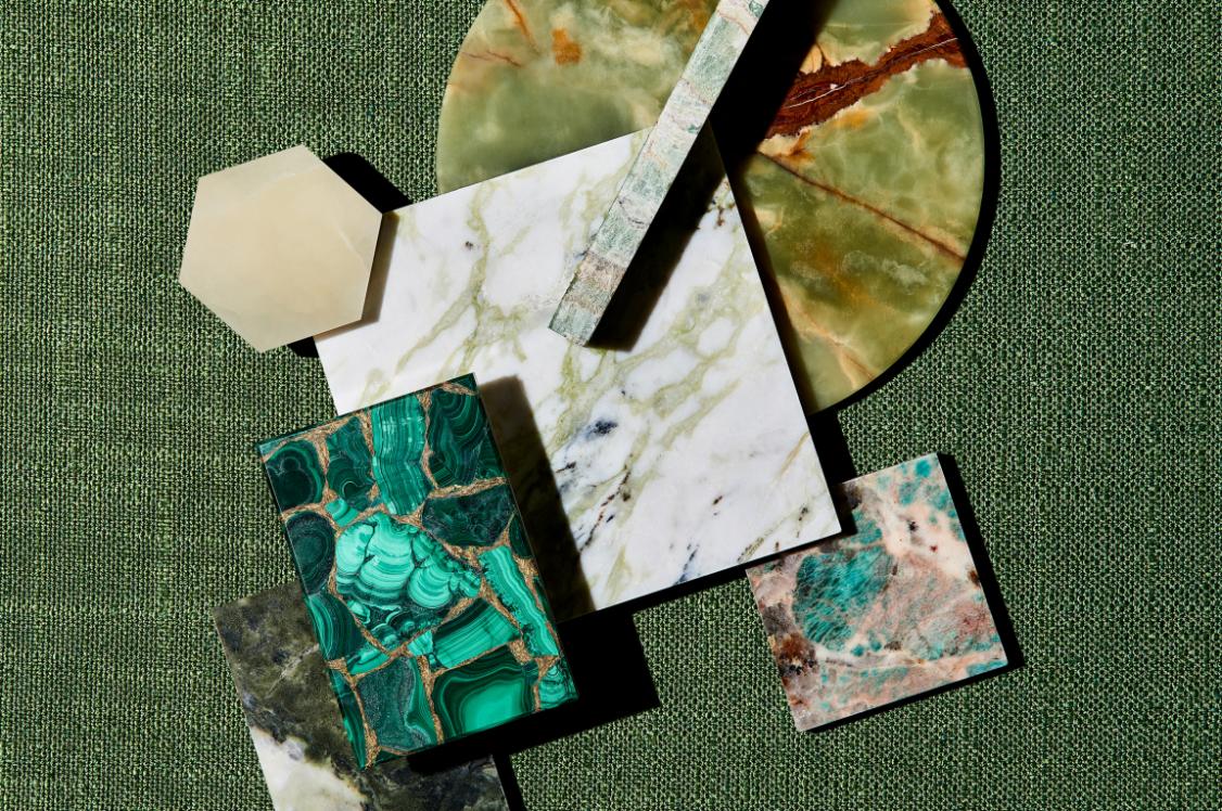
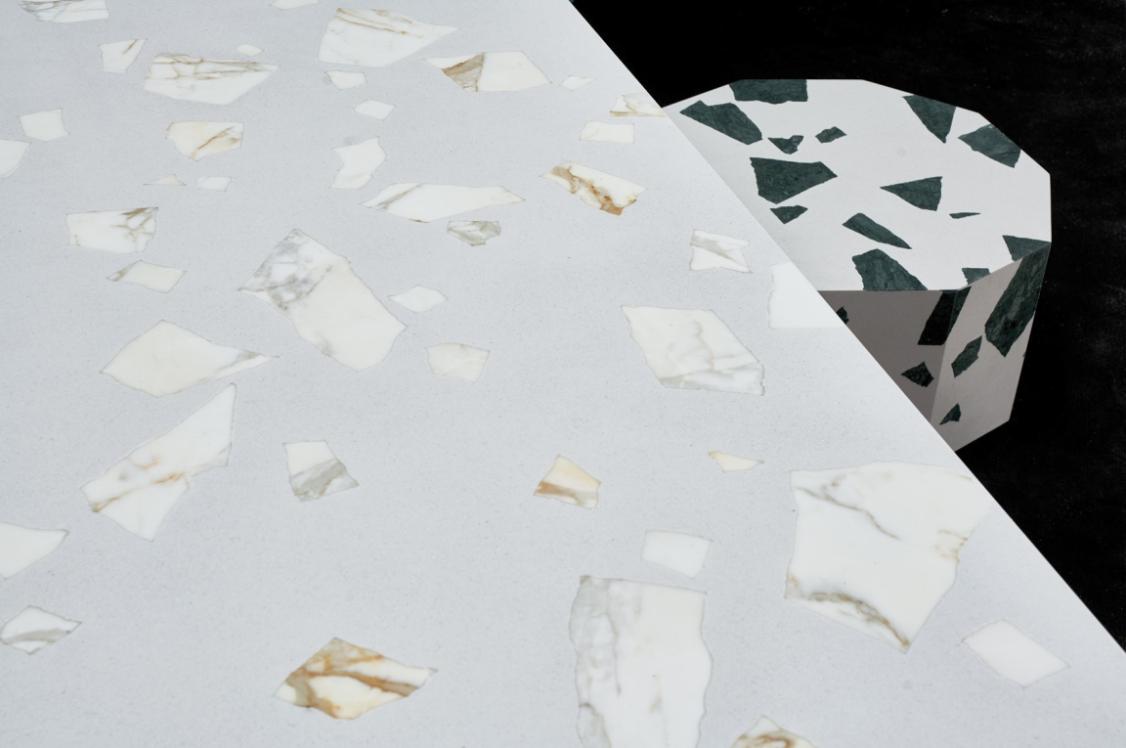
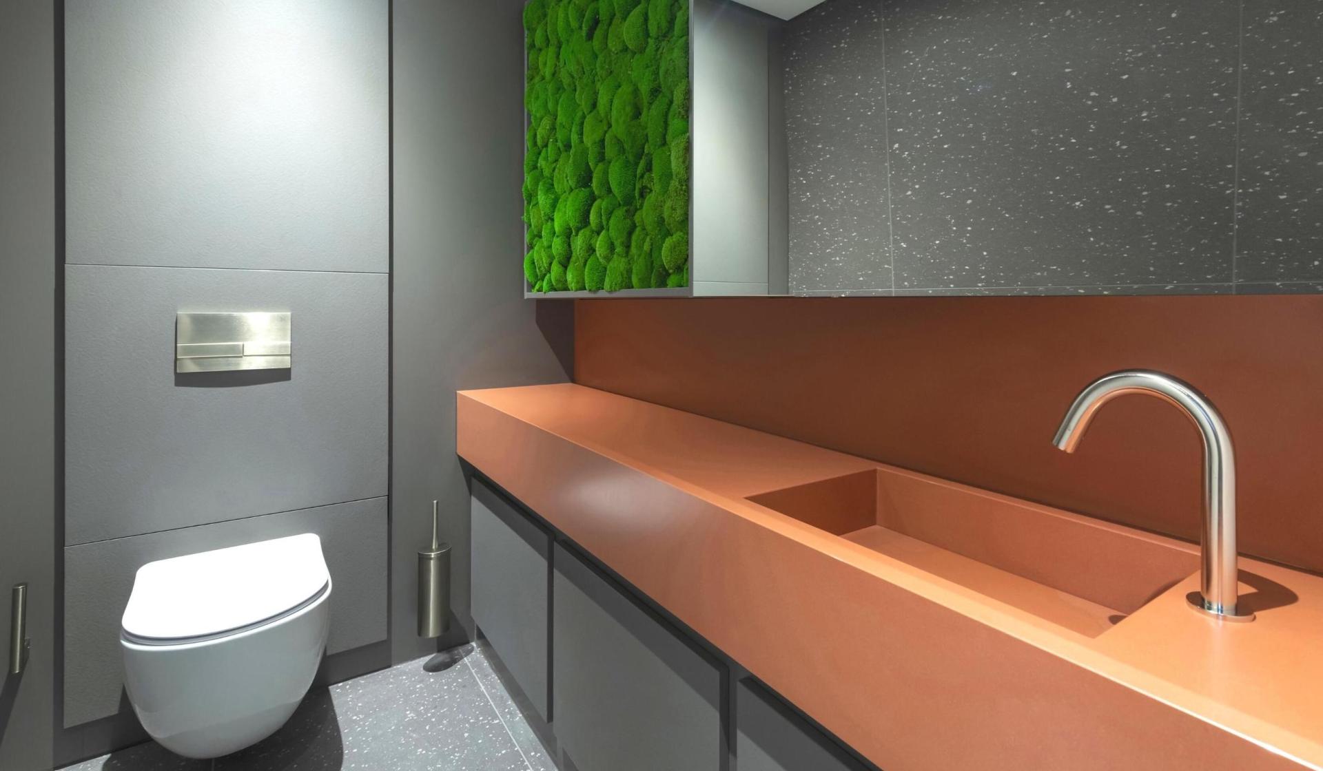
Inspired by this, Concept Cubicle Systems collaborated with Cosentino to launch the Sunlit Days Vanity Collection, which includes Posidonia Green. Taking visual cues from the beautiful greens of the Mediterranean, the fresh, mature shade supports the natural trend without overpowering a space.
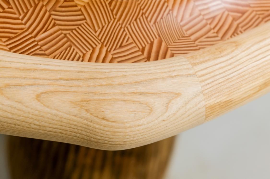
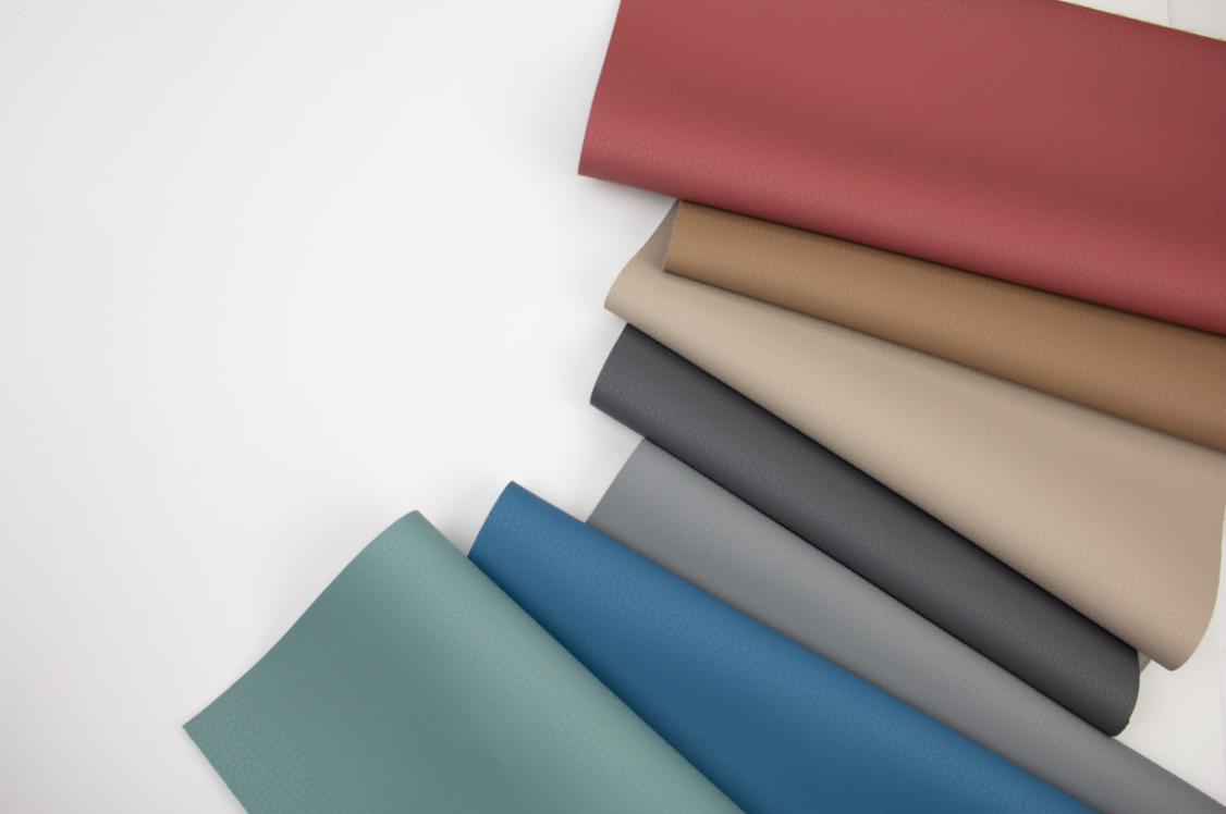
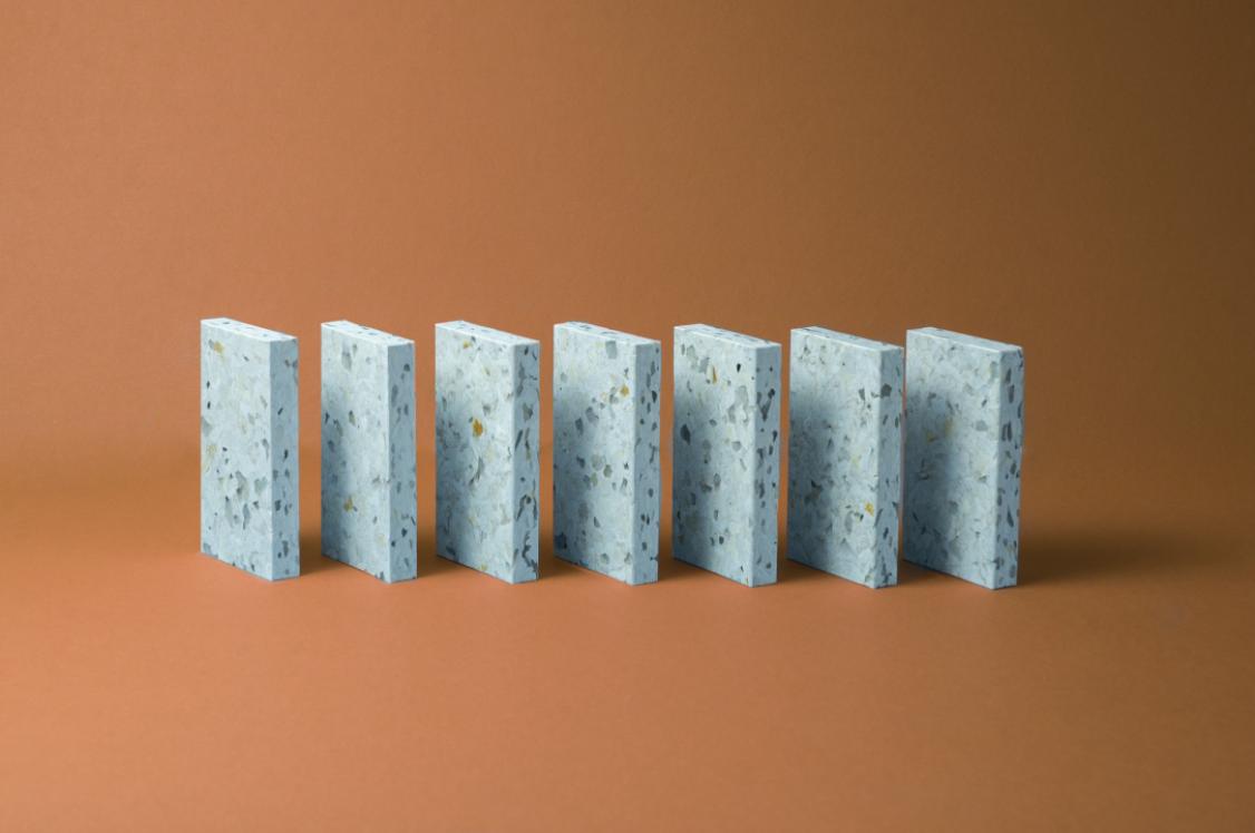
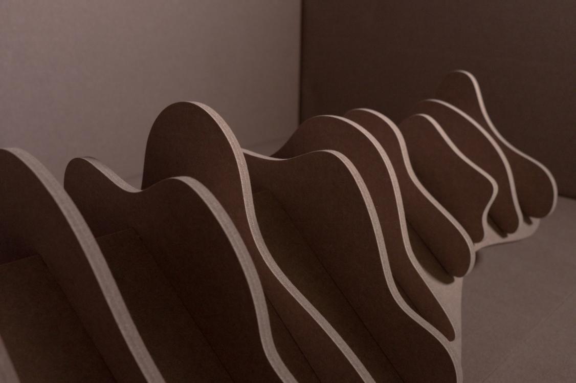
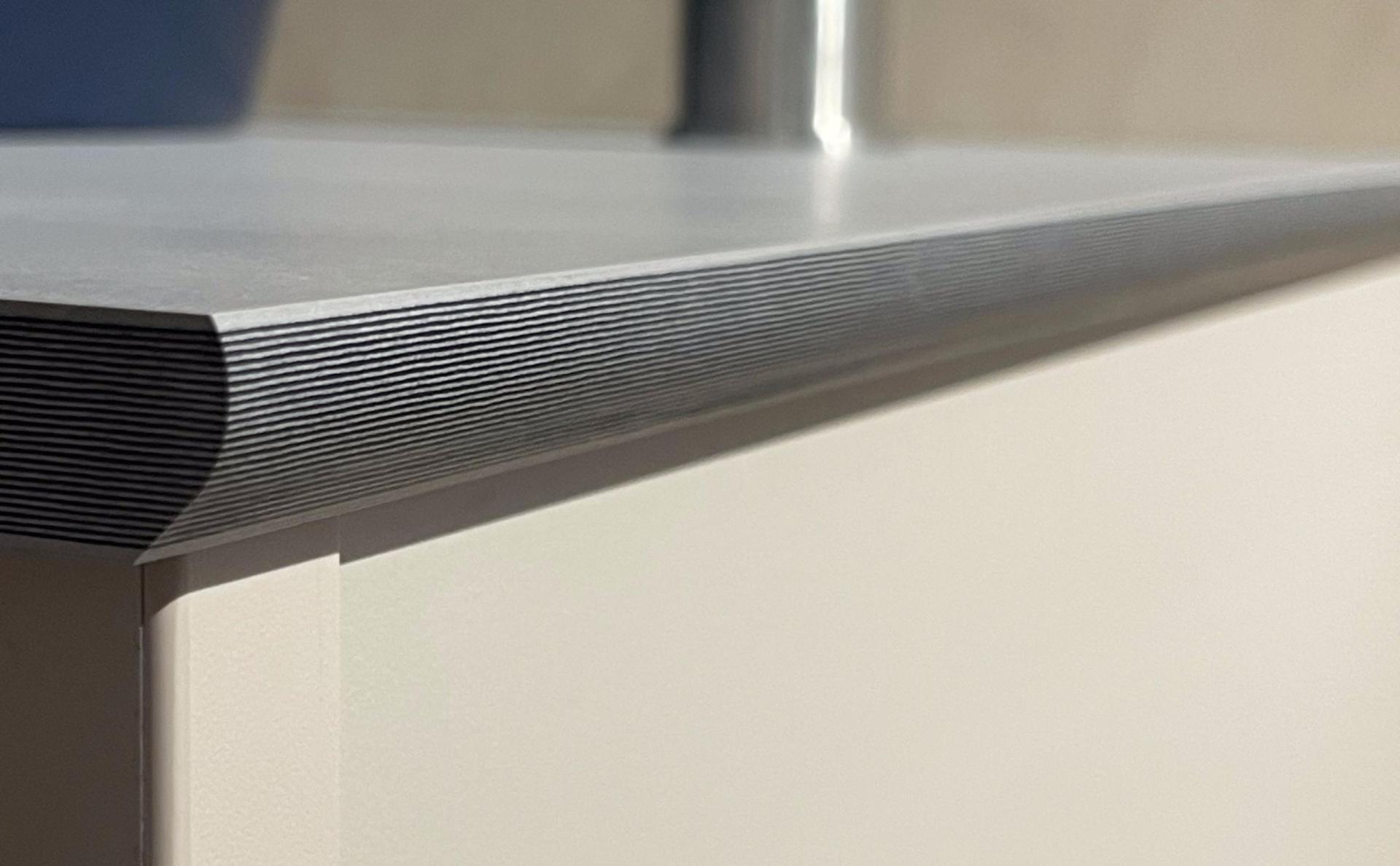
In addition, the new PaperStone® Vanity Unit, as well as boasting a nature-inspired colour palette, including Honey, Sand and Graphite, offers extra attention to detail through a multi-layered exposed edge – bevelled or cut straight – providing a nod to the aesthetic of natural wood.
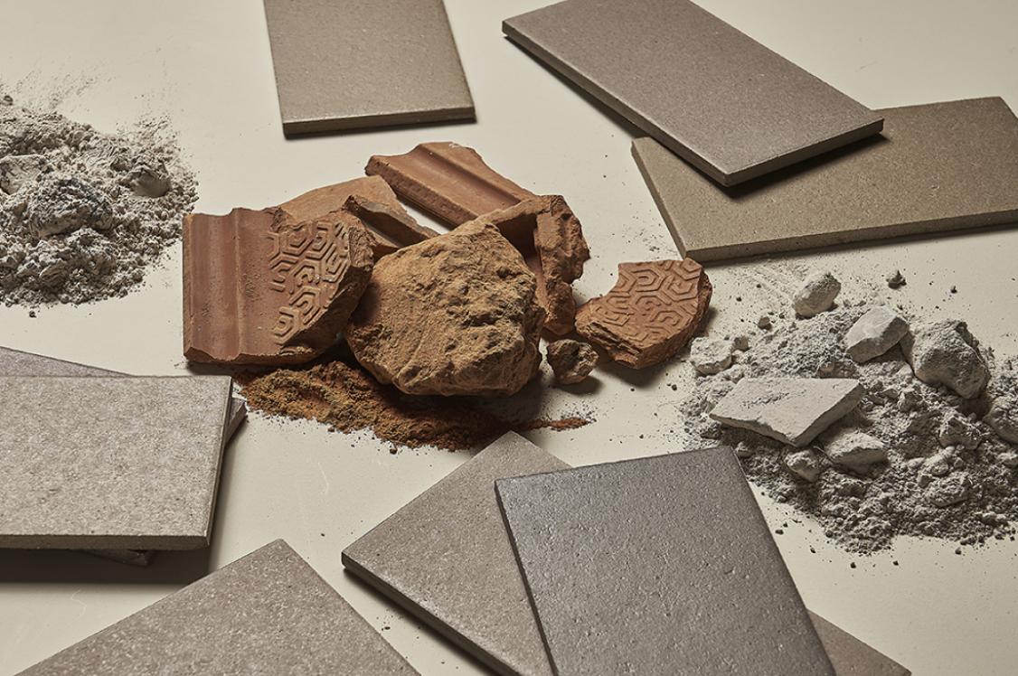
The unique material combines 100% FSC certified recycled paper and cardboard with PetroFree natural resin and pigments, resulting in a sustainable paper composite surface material that’s been heated and compressed to give incredible strength and endurance.
Ignite senses through textural tactility
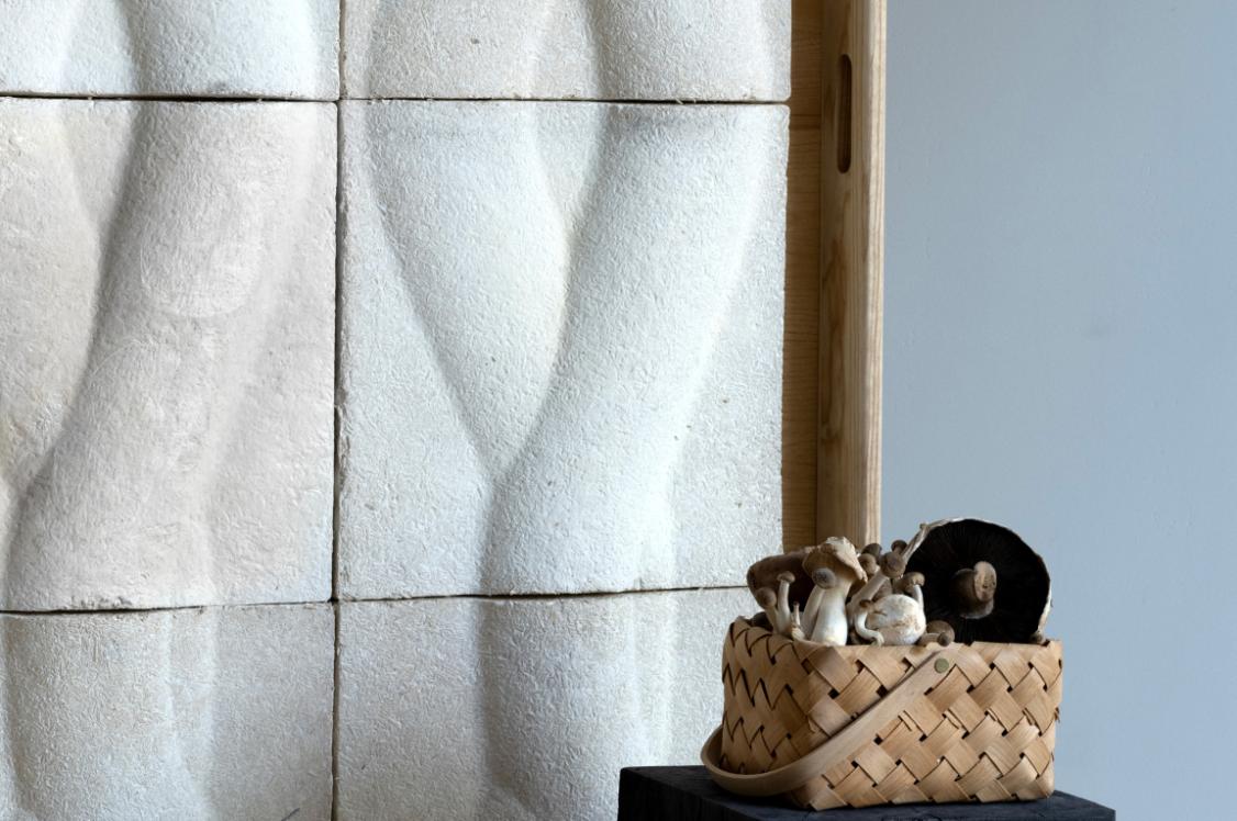
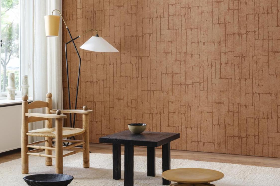
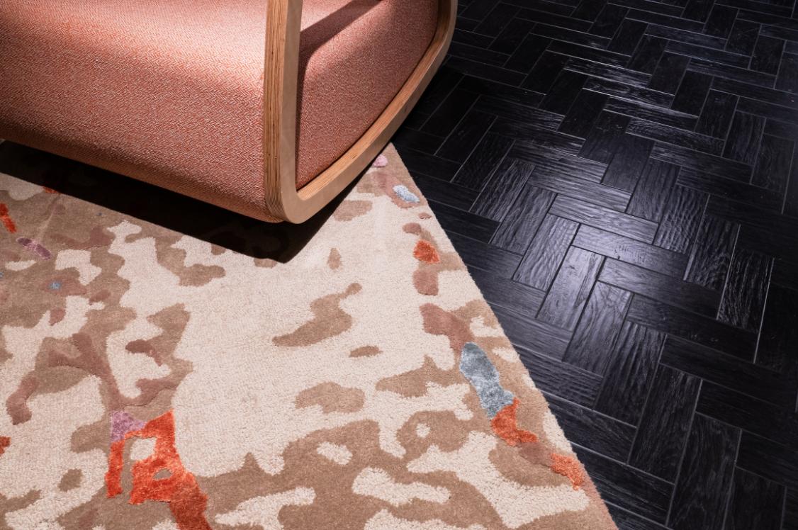
Texture reminds us of our deep-rooted symbiosis with nature, and as such, it’s a simple way of promoting wellbeing in washroom schemes. This could be done through the inclusion of ribbed tiles – such as the Flauti collection from Casa Ceramica, which also comes in a nature-inspired palette. The tiles’ ‘micro-structure’ allows light to reflect in different ways to give the feeling of gentle movement.
Textural appearance may also be considered when choosing other surface materials. As well as being built into a design, texture can also be implied. This was of particular importance when revamping the washrooms of Laneside Caravan Park, situated on the banks of the River Noe in the Peak District’s picturesque Hope Valley. With such stunning natural surroundings, the need to replicate this in the facilities was vital to the project’s success. In response Concept Cubicle Systems opted for a luxurious dark woodgrain finish for the walls, replicating the textural aesthetic of the surrounding area.
Let the light in
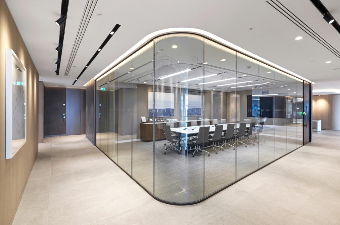
Having access to natural light is optimum in any scheme. However, it’s not always possible. In a project completed for Crown Agents Bank, the washrooms were situated across the 17th and 18th floors and had large windows showcasing the stunning views beyond. The Concept team designed a washroom configuration that maximised this – allowing as much natural light as possible to flood the space.
Where this isn’t an option, selecting a lighting solution that evokes the feeling of being exposed to natural light is a solid option.
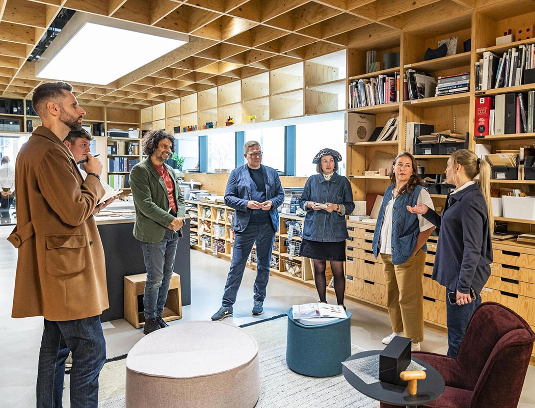
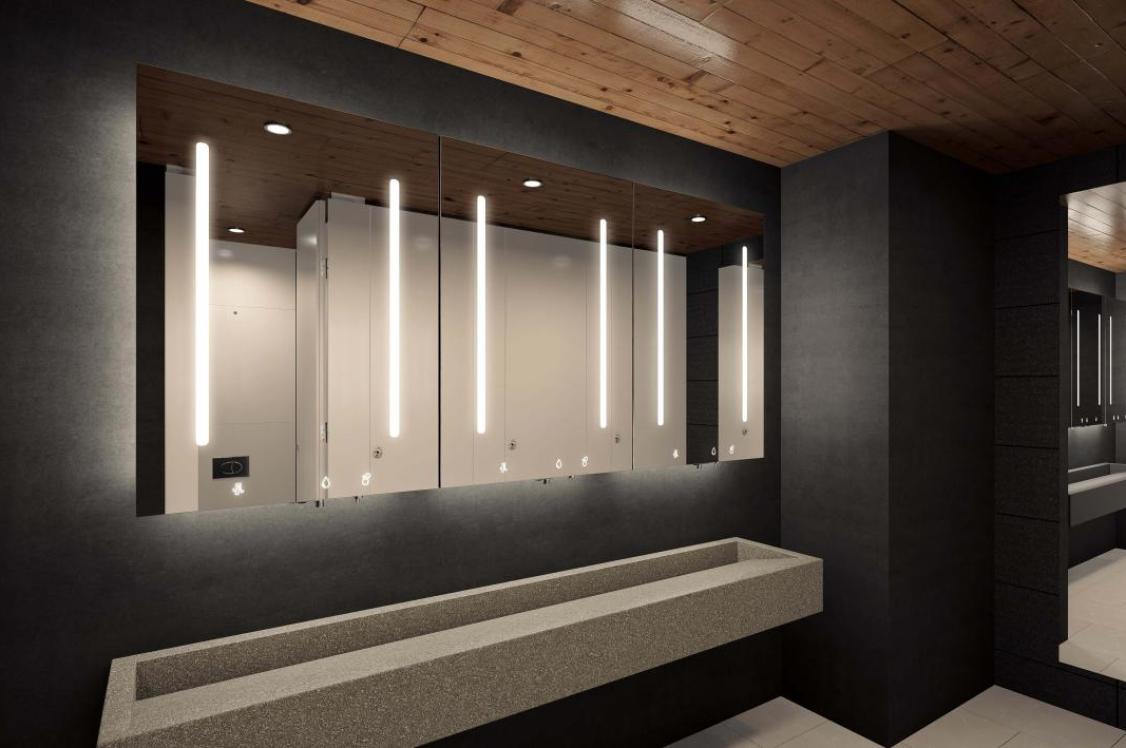
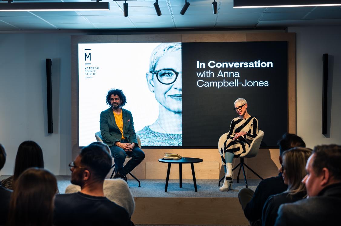
When installing the Superloo product in the basement bathrooms of Material Source Studio, the lighting design had to be curated with comfort and wellbeing in mind. Spots by Light Forms were chosen for their minimal appearance and soft beam. The ability for customisable positioning, supports all other washroom elements to create a welcoming and relaxed space.
In association with
Based in the North West, we create, supply and install personalised washroom and cubicle systems nationwide – each one exclusively devised with the client in mind.


