Material Source Studio Asks: EDI – Are we creating the right culture?
EDI is an expansive topic. Not only does it take into consideration three different areas. It also has two different meanings.
Some refer to it as: Equality, Diversity, and Inclusion. While others believe it means: Equity, Diversity, and Inclusion. Equality meaning to provide the same to all. And equity acknowledging that people need varying levels of support to succeed. Though the difference visually between these words is just a couple of letters, each route leads to a very different outcome.
Considering this conundrum metaphorically perhaps goes some way in highlighting just how complex, and mammoth, a task designers have on their hands in creating commercial environments that work for each and every person that uses them. If no standard has been set for the meaning of the acronym itself – for context, McKinsey has titled its section of reports on this topic, Diversity & Inclusion - how are designers supposed to explain EDI to their clients to get their buy-in, let alone approach it?
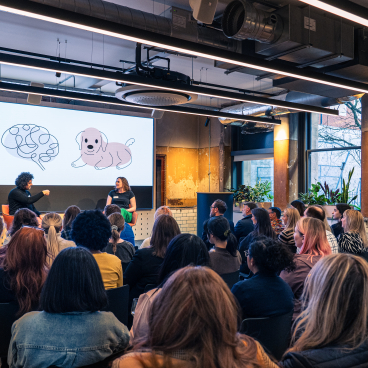
While equality may, on the surface, appear to provide options for the majority of people, without considering equity – allowing spaces to be adaptable and flexible for the neuro and physically diverse needs of all end users – a large portion of society is likely being alienated, and, in fact, disabled by their surroundings – as noted by Dr Stephanie Fitzgerald in our recent seminar on Designing for EDI. “We talk about people with disabilities, but it’s environments that disable people.”
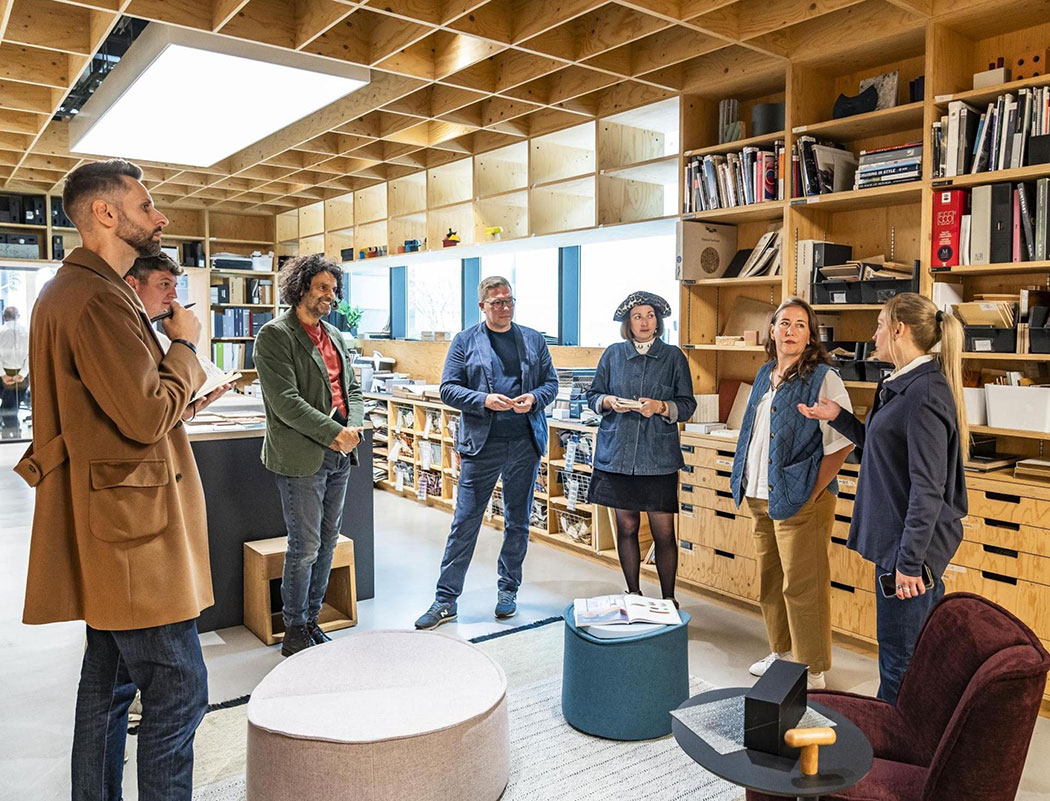
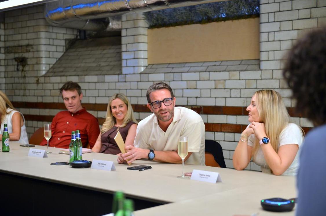
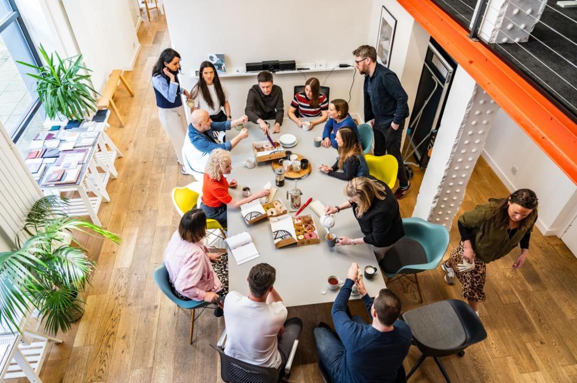
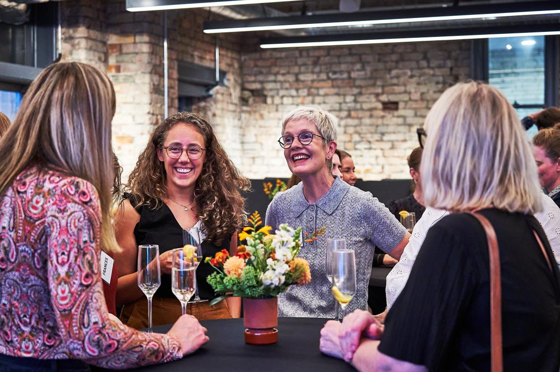
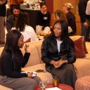
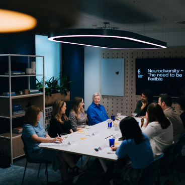
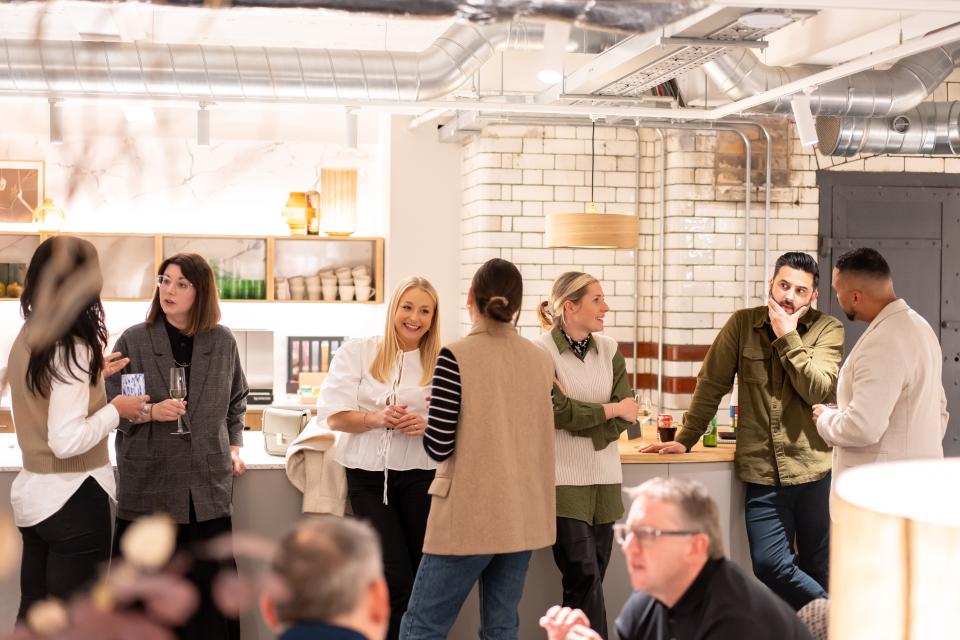
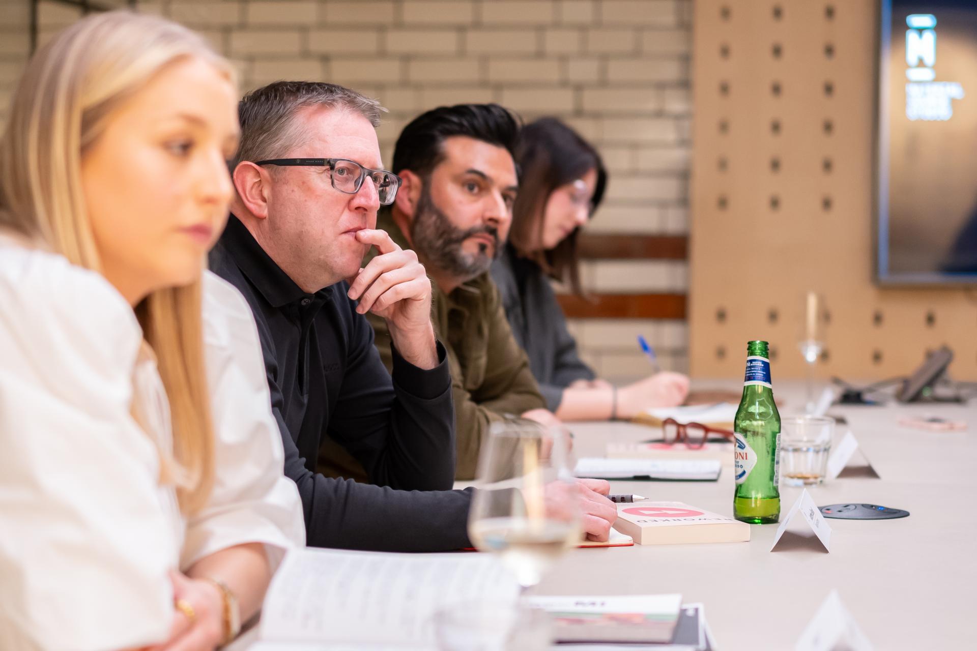
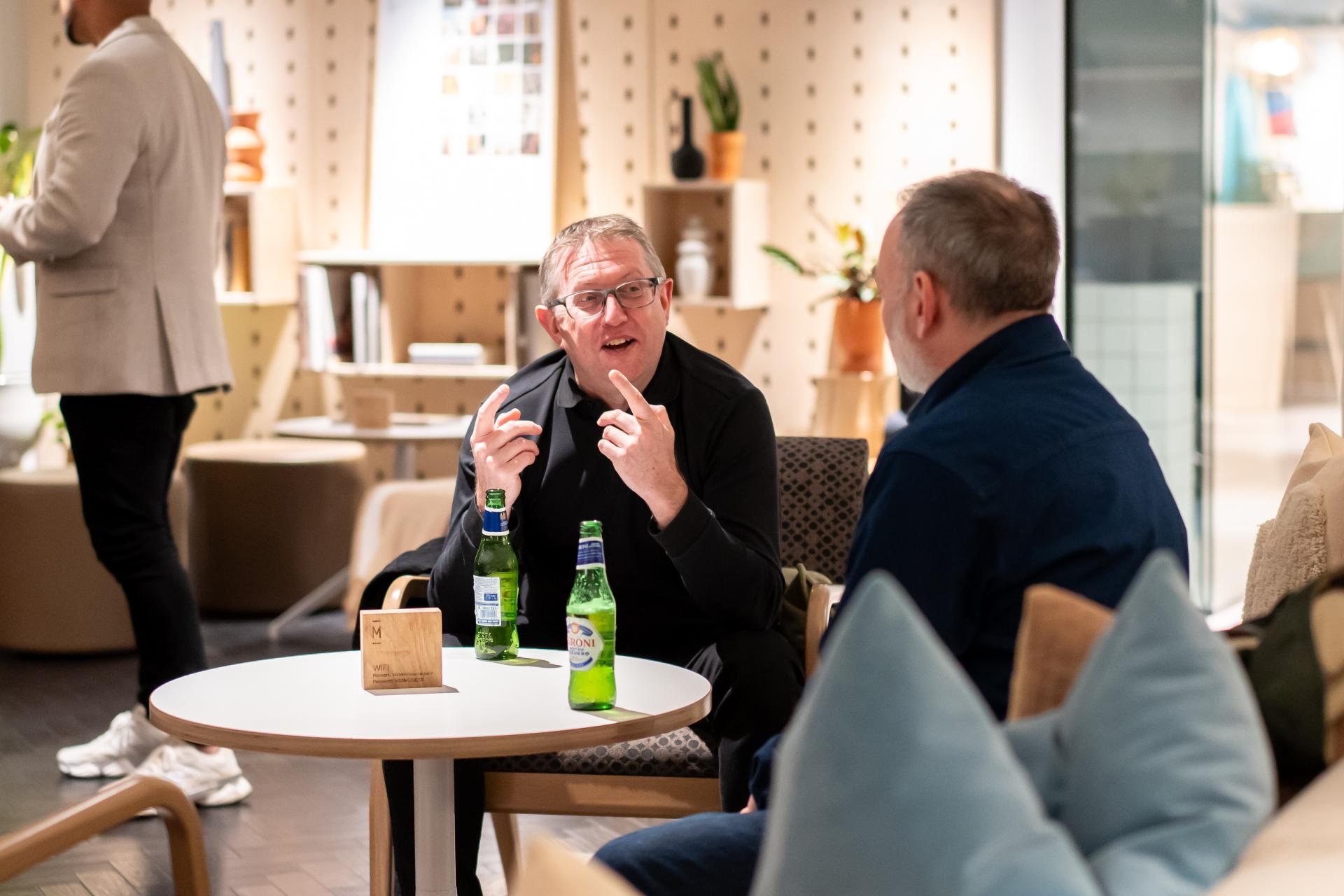
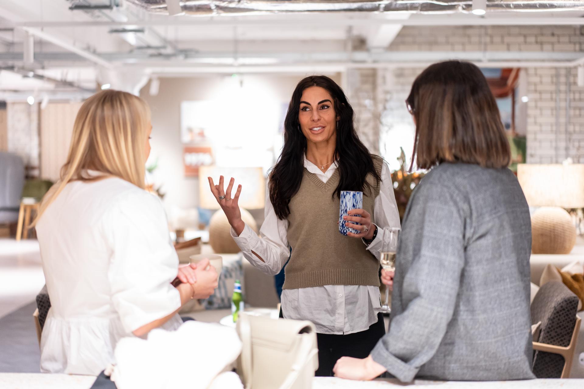
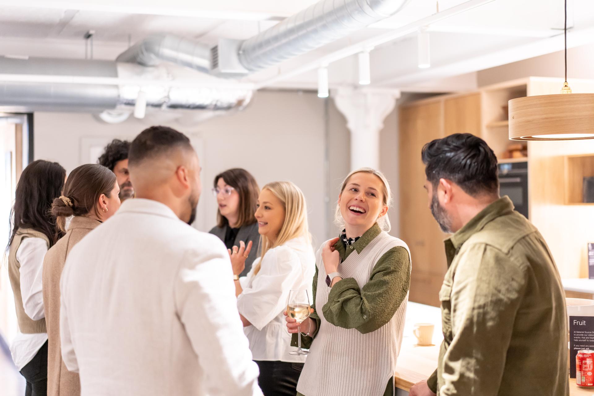
As part of our editorial and event spotlight on EDI this month – tied into a larger 2024 focus on sustainability for both the planet; through responsible materiality, and people; with an emphasis on the human mind – we brought together seven architecture and design professionals keen to share insight from their own experiences as part of our roundtable: EDI – Creating the right culture. Over the course of an hour, chair Material Source director, David Smalley, attempted to tease out the most important factors to consider, plus some best practice examples for the consideration of EDI – in all its facets – in commercial spaces.
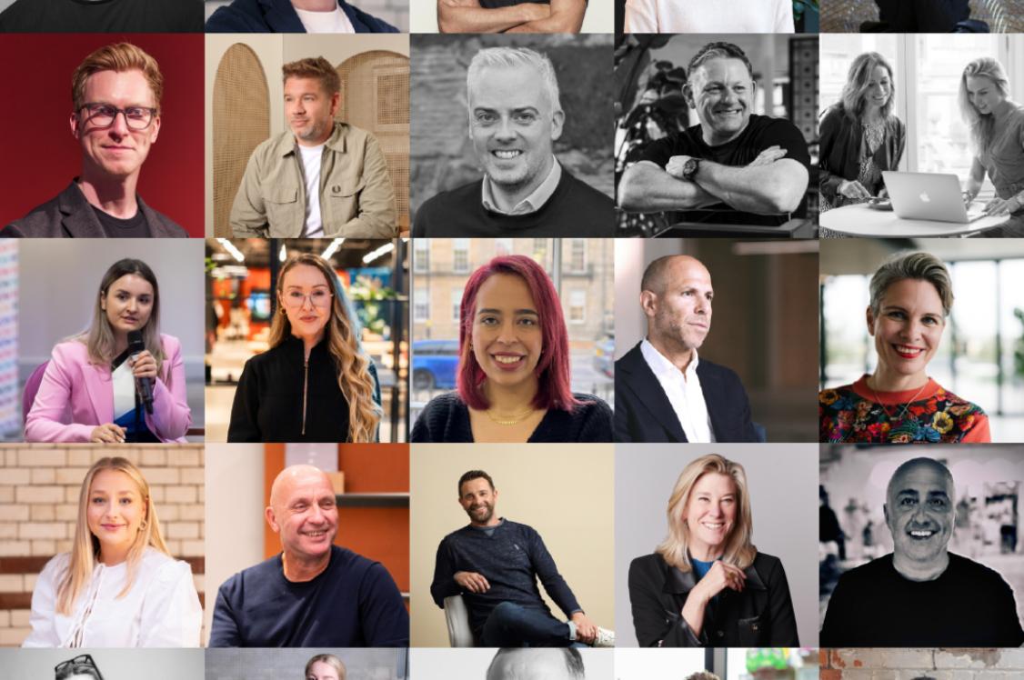
Our guests
Eleanor Strange, architect, AEW Architects
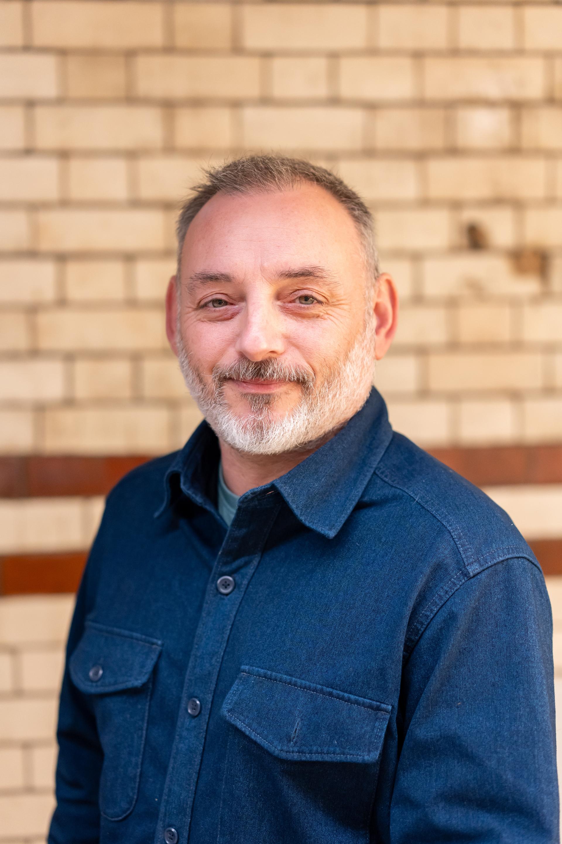
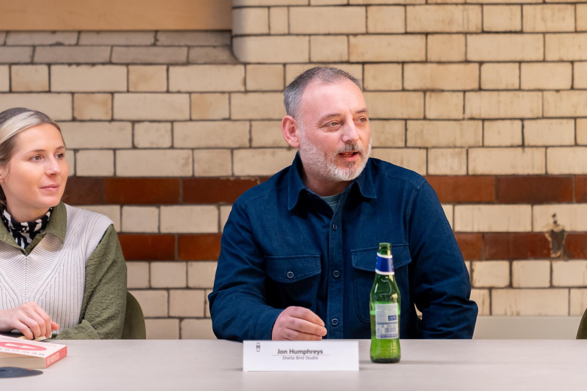
Jon Humphreys, creative partner & co-owner, Sheila Bird Studio
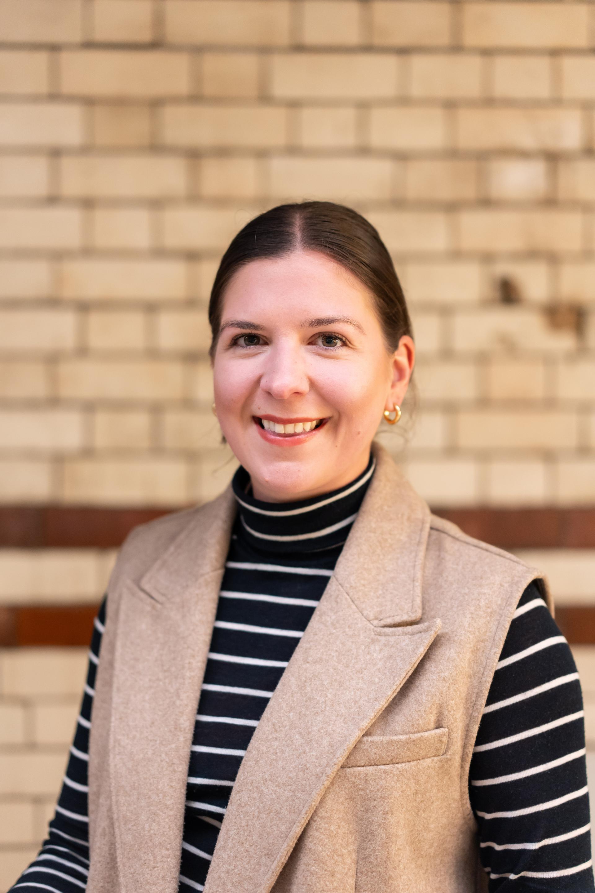
Sarah de Freitas, co-founder & creative director, AXI
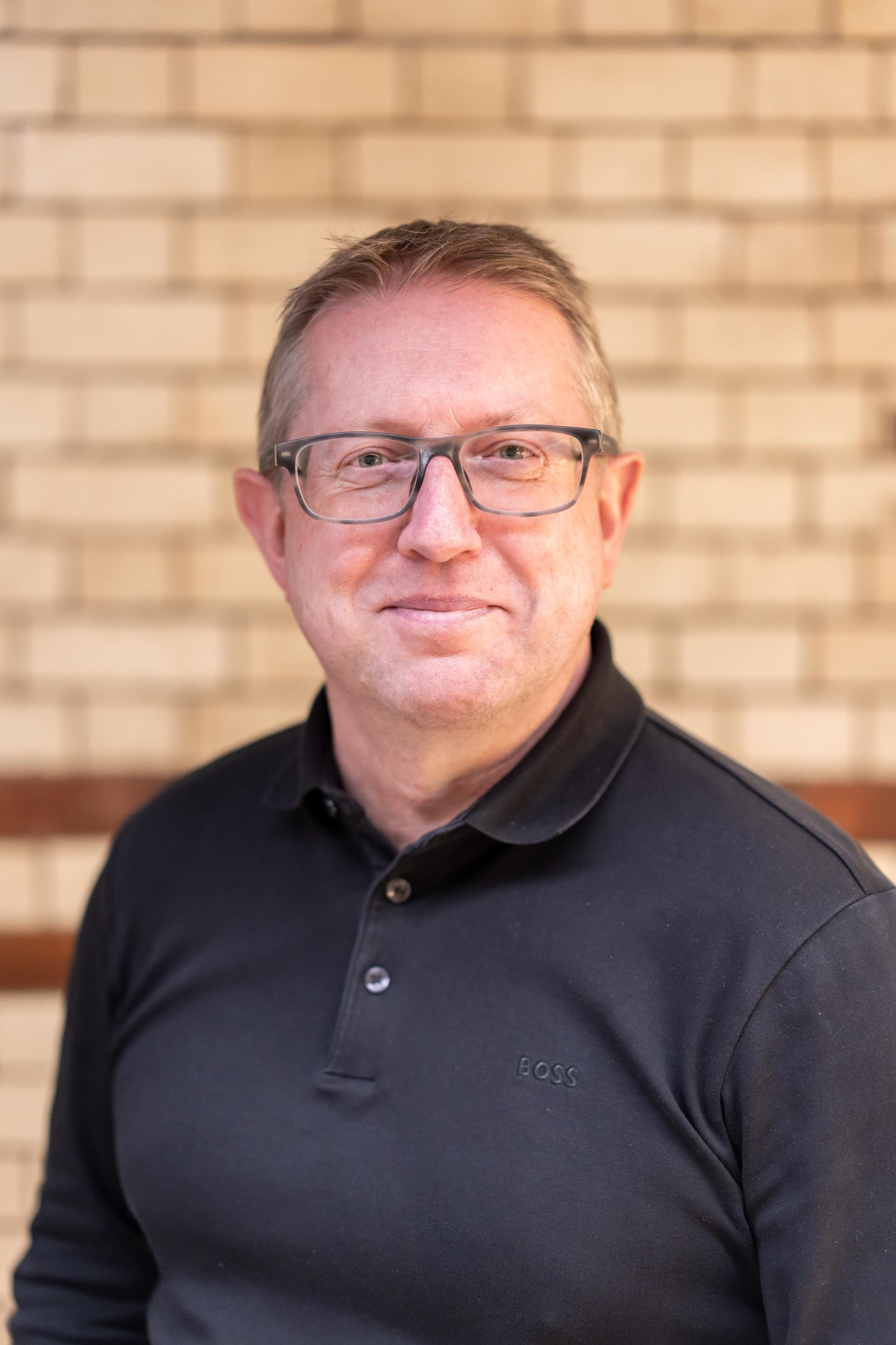
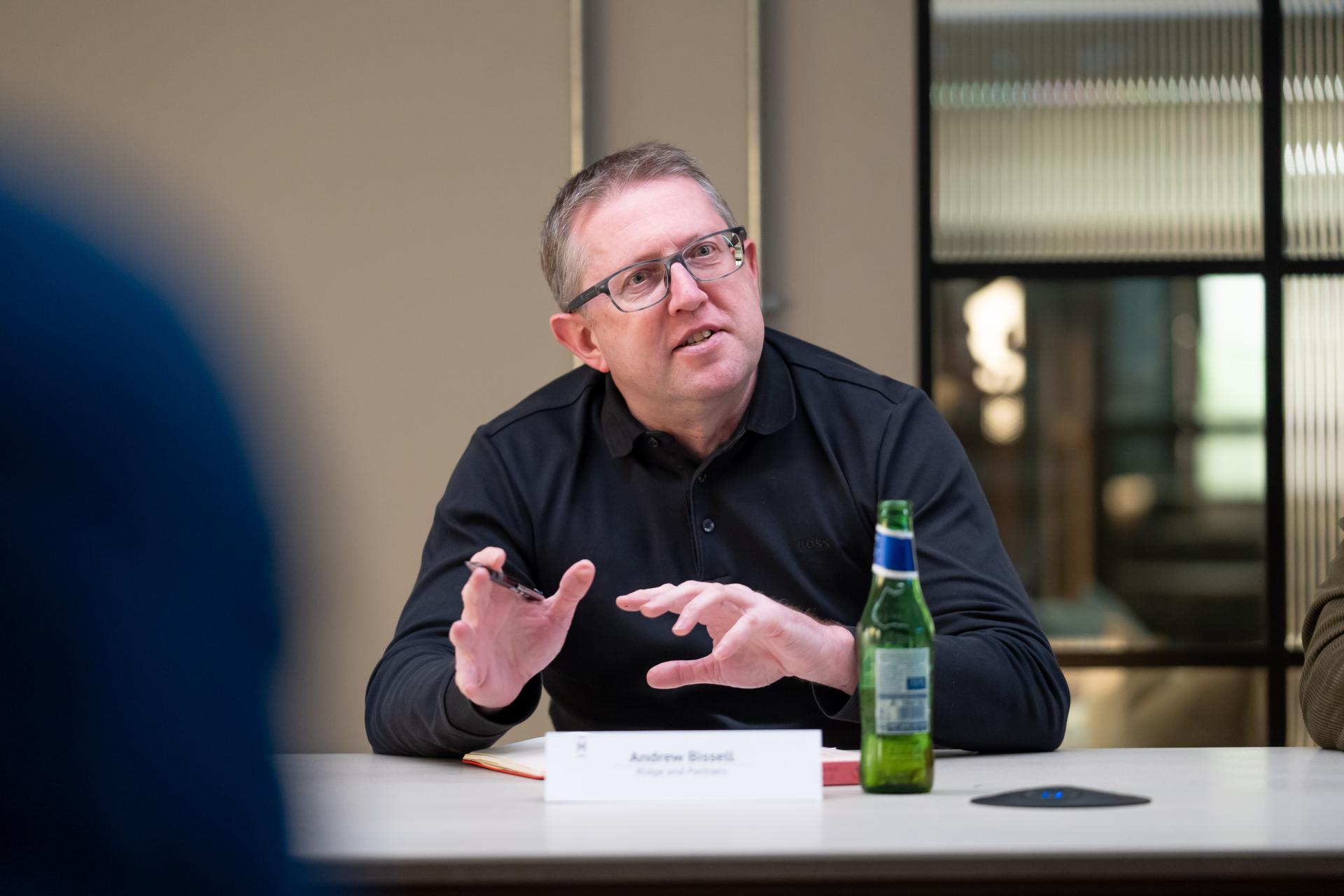
Andrew Bissell, partner, Ridge and Partners
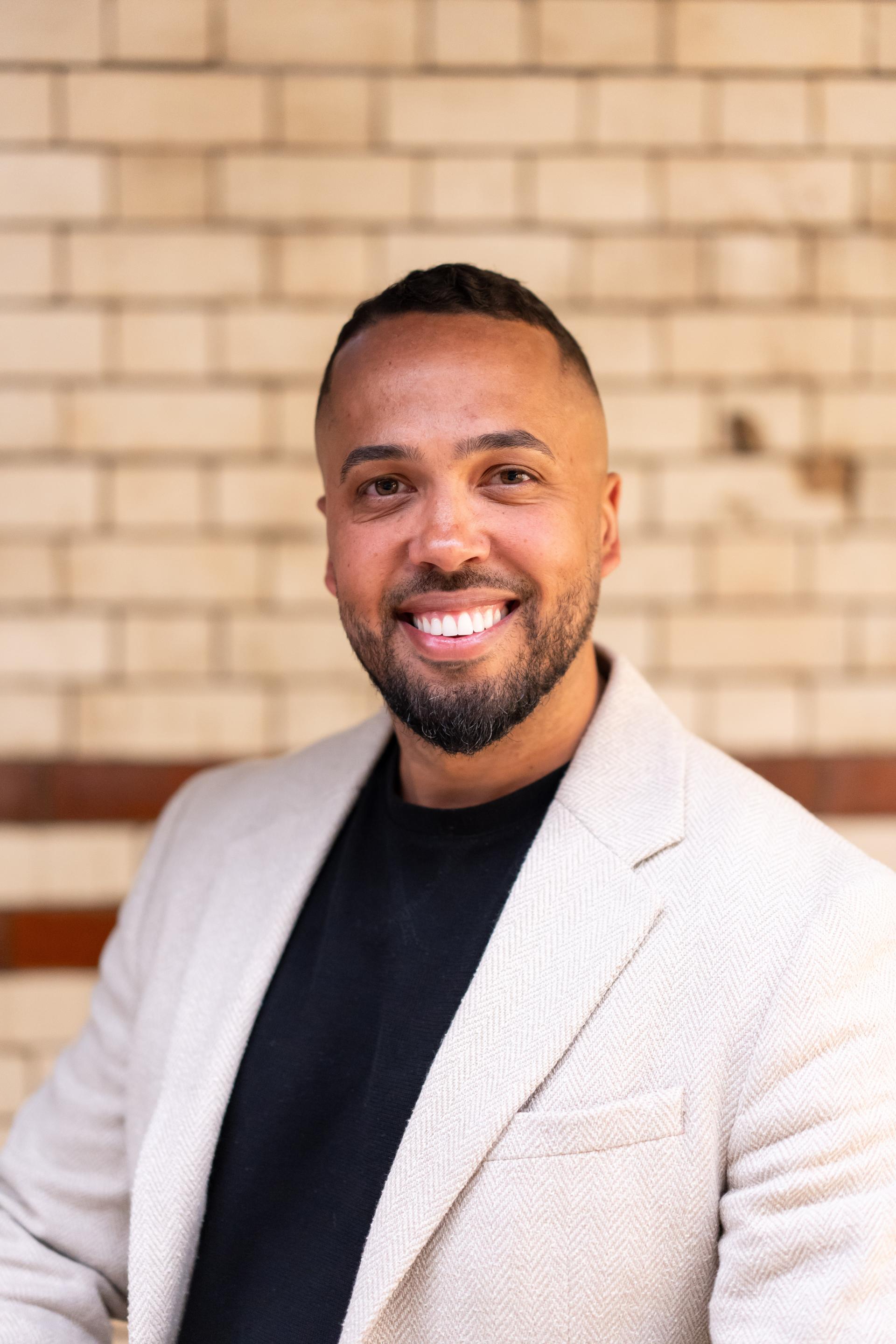
Ashley Salmon, owner & director, Zero Gravity Design
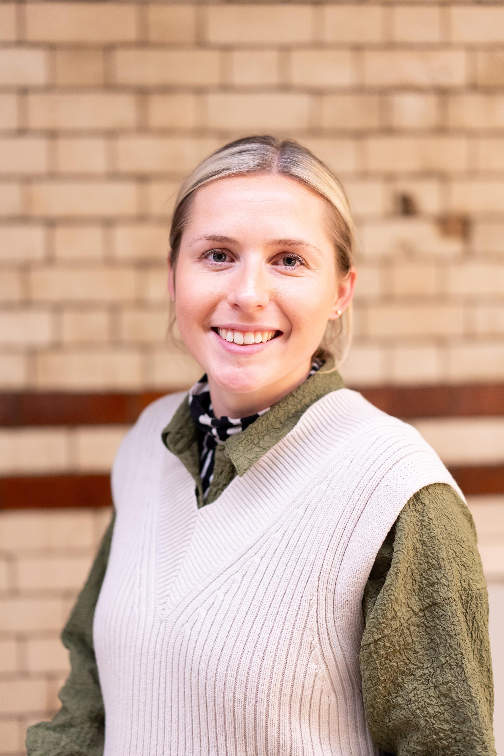
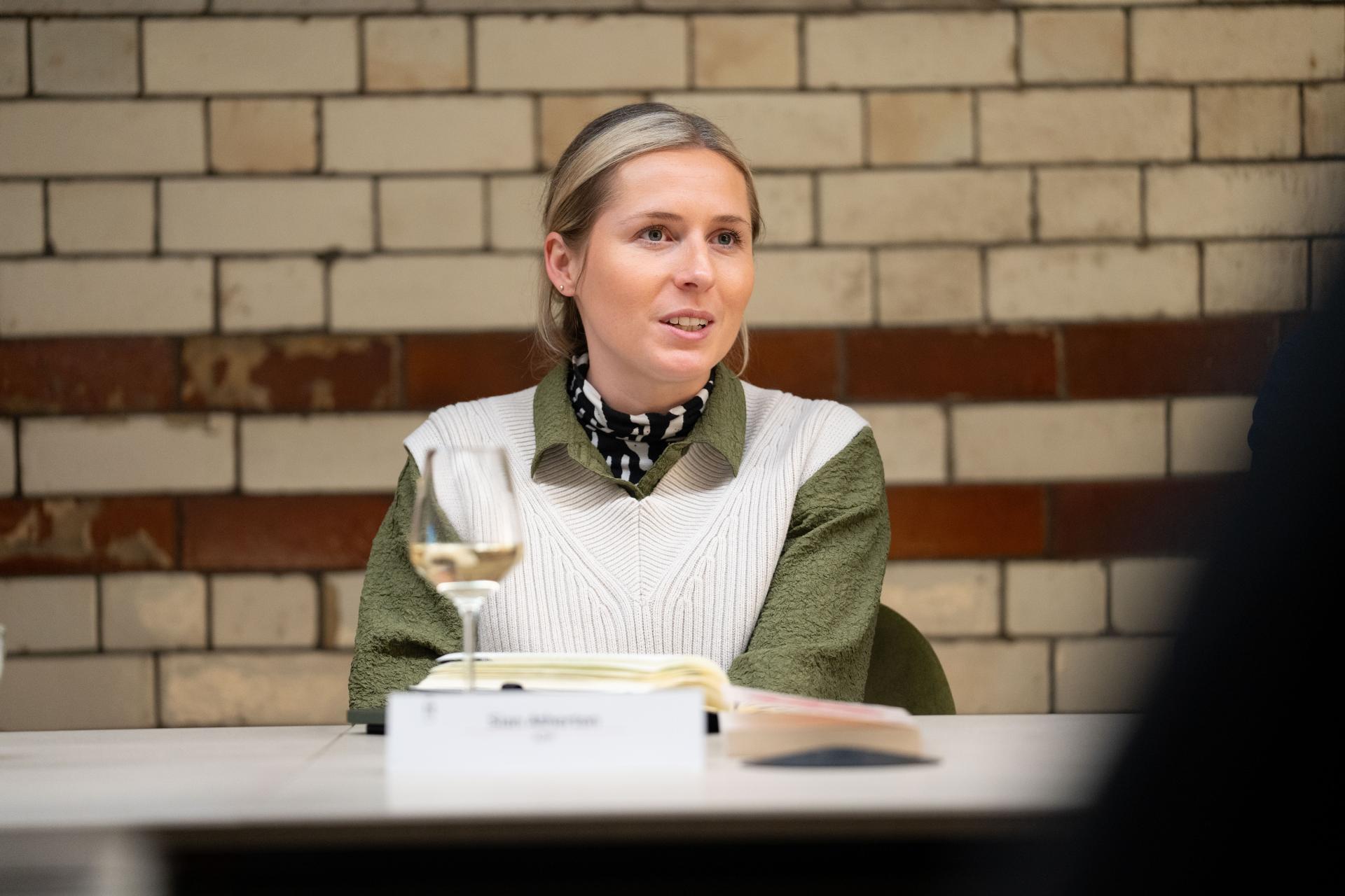
Sian Atherton, associate architect, ADP
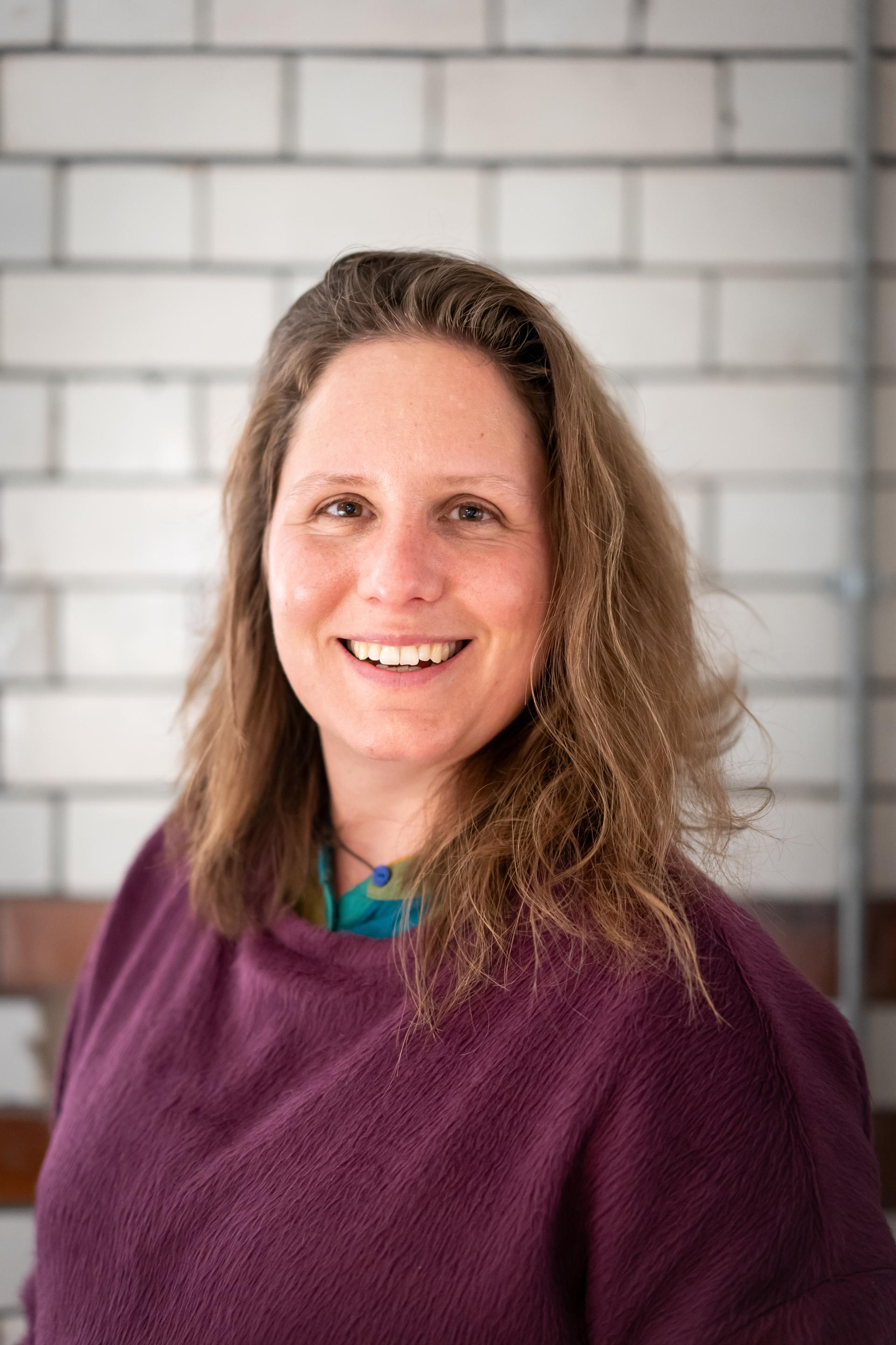
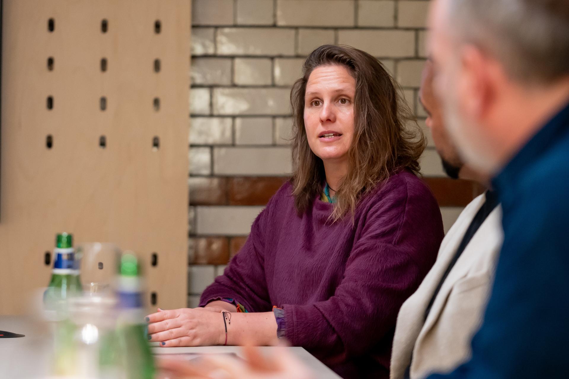
Dr Carolina Vasilikou, senior lecturer & EDI lead, Manchester School of Architecture
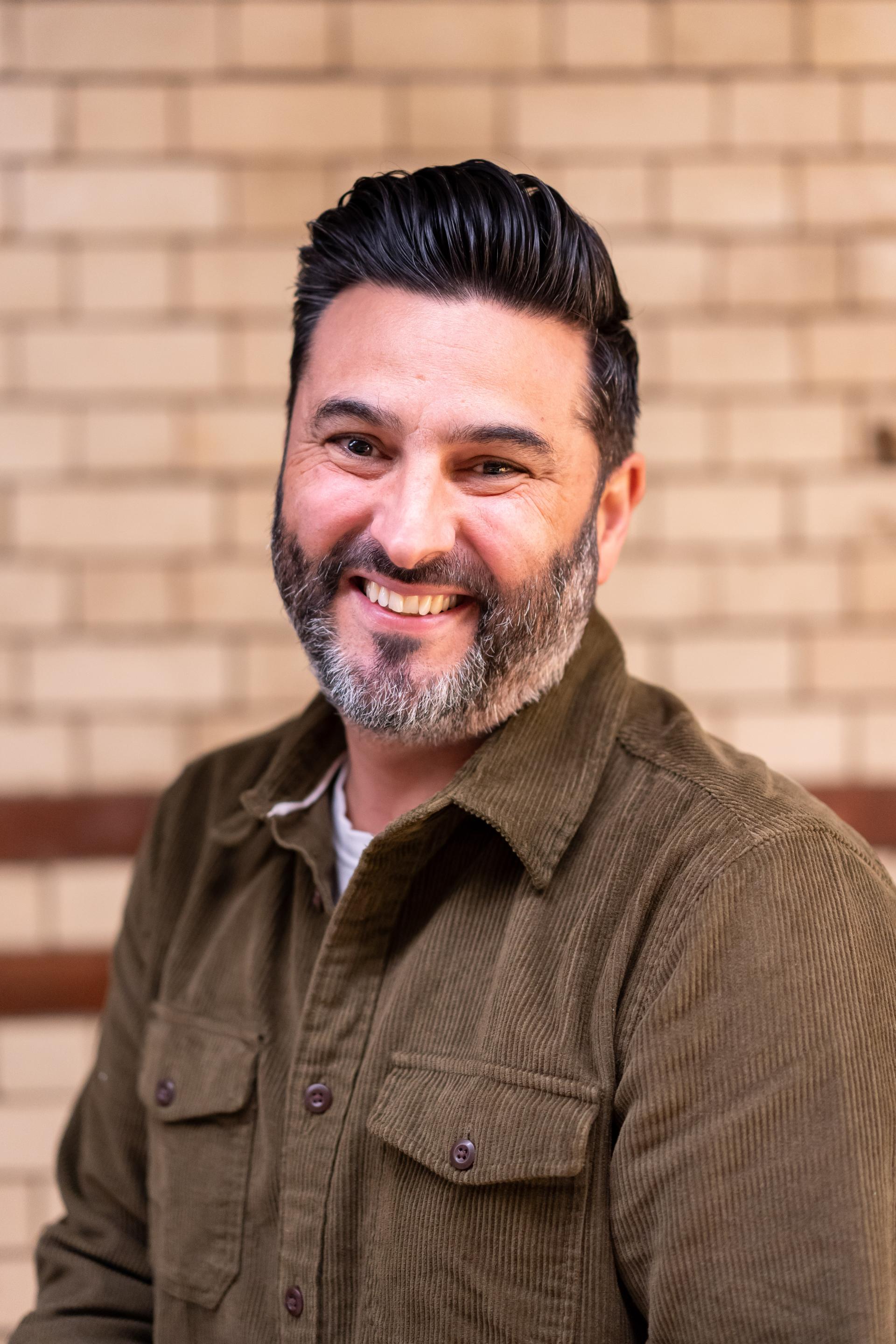
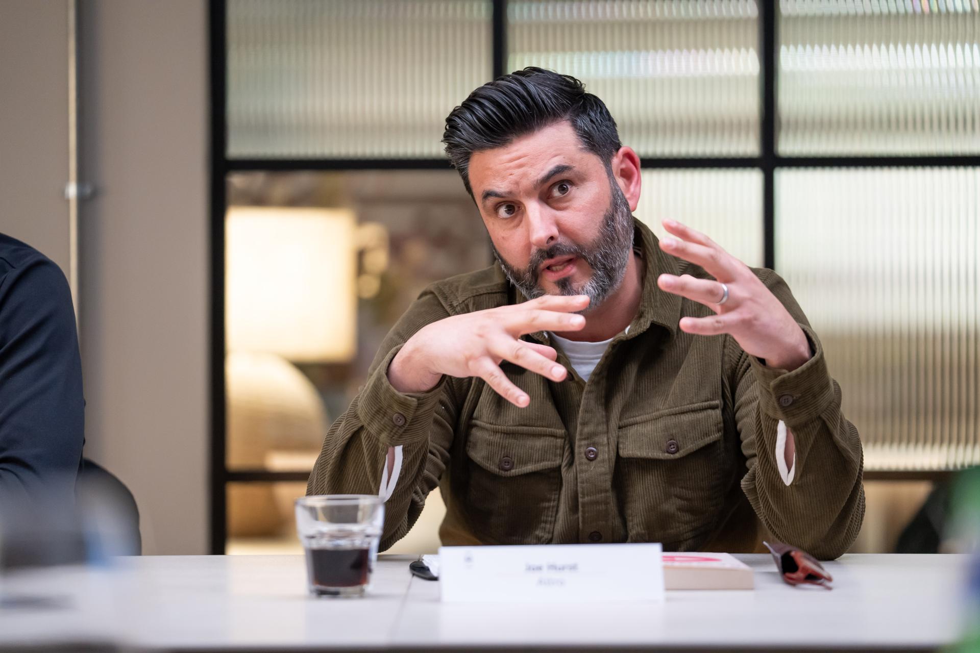
Joe Hurst, key account manager, Altro

David Smalley, director, Material Source Studio
A holistic approach for brain and body
“When we think about EDI then, what is it that we’re trying to achieve for the individual?” asked David, opening up the discussion.
“Physical accessibility for everybody”, replied Eleanor Strange, architect, AEW Architects.
Though this may be considered a given, even a regulation, Sarah de Freitas, co-founder & creative director, AXI, explained, “there are no strict rules in place for designers and architects – regulations are open to interpretation. It always seems to be about how far guidelines can be pushed in a negative way.”
Using a client experience, Sian Atherton, associate architect, ADP, added, “People need to be able to navigate a space independently. We’ve just completed an assessment on wheelchair users at a university campus, where in the event of a fire, they would need to wait at an access point for someone to assist in helping them to safety. How terrifying must that be?”
Tying into physical comfort, neuroception was also highlighted as hugely important by Sarah. “We must appeal to the subconscious – though a sofa might seem comfy, it could be facing the wrong way, or the lighting above might be poor – so actually, the user doesn’t find it comfortable at all. And they probably don’t know why that is.”
To rectify this, a holistic approach was said to be needed, referred to as “landscaping” by Ashley Salmon, owner & director, Zero Gravity Design, and it has to be flexible. “And offer a level of personal control”, stated Andrew Bissell, partner, Ridge & Partners, “a person needs to feel in control of a space because that’s what they do at home.”
Jon Humphreys, creative partner & co-owner, Sheila Bird Studio, brought up ownership – “creating spaces that people want to be in.”
Using Material Source Studio as an example, he commented, “I feel like it’s mine.” Everyone around the table concurred – “we all feel it belongs to us” – added Jon.
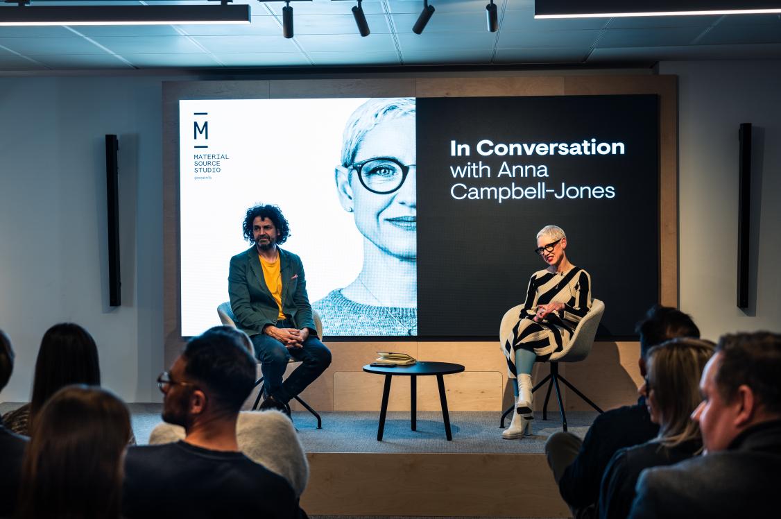
In the seminar on Designing for EDI, Dr Stephanie Fitzgerald offered a scientific reason as to why people may feel this way about a space such as the Studio – it’s because they feel “safe”.
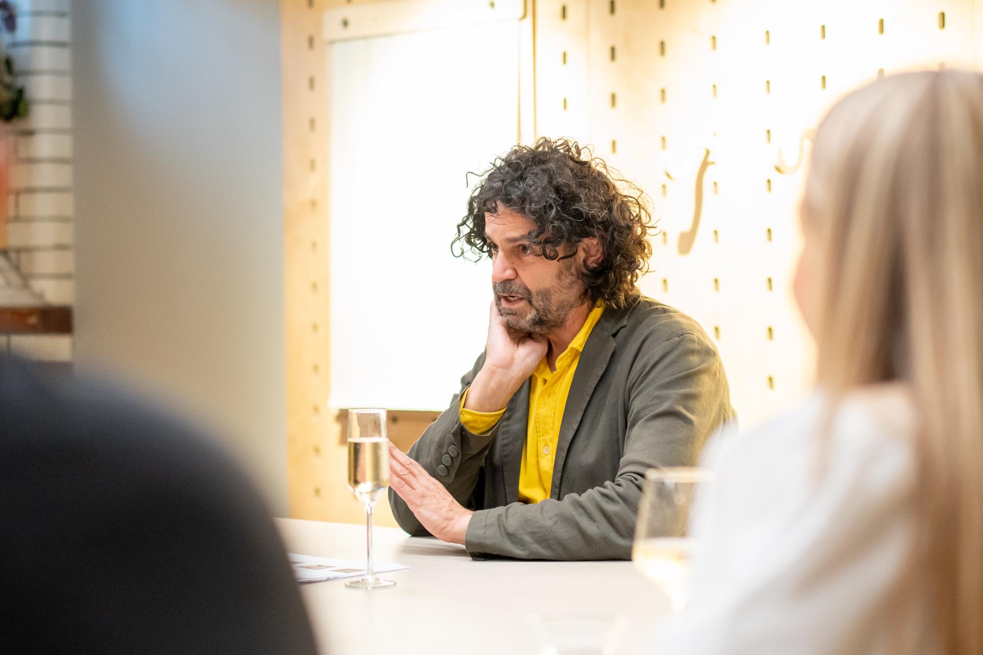
“Safe and brave spaces make a difference”, echoed Dr Carolina Vasilikou, senior lecturer and EDI lead, Manchester School of Architecture. “When people feel there is a space that includes them, they feel they can speak up to make adjustments for their needs.”

Feelings & thoughts
“When setting out to design a space, how do you as architects and designers go about discovering your intelligence?” asked David.
The group agreed this was mostly done through two routes – end user research, and data-backed studies.
“When you’re designing, it’s about thinking of the ‘hyper invisible’ as I like to call it by asking the question: ‘who has access?’ many times”, replied Carolina. “When you go through this exercise, you see that you’re going deeper, and deeper about who you’re designing for, or designing with. It’s refining your target audience through the design process to allow those that interact with a space to do so safely and with a sense of freedom.”
“It’s not about taking a floor plan to someone, or finishes, and saying, ‘what do you think of this?’ It’s getting down to feelings – asking people how they feel when they’re in a space, what they find comfortable, and what suits them”, answered Sian.
Jon agreed, “We have to understand people to unlock their feelings without necessarily talking about design. A workshop we’ve run in the past when designing a new workspace is to ask a cross-section of the organisation’s people to bring a picture of something they love – not an office.
“The result is that you get lots of interesting things – someone brought an image of a car. Then it gets us talking. We asked that person ‘what is it you like about your car then?’ and he said, ‘I can make all my phone calls in there, I have somewhere to put my coffee, it’s got the gadgets I need’.” Though that particular person may not have been able to communicate exactly what he wanted from an office, having this conversation ‘unlocked’, as Jon said, useful, and crucial, insight.
Andrew also believes this form of investigation is vital – often unearthing surprising findings. “When people started working from home in the way they do now, we asked 250 of our own team members what their lighting situation was like – were they close to a window? For example, which way were they facing? We found that 90% of people only had a light on for an hour per day. And that they were happy with less light, as long as it was natural light. When we investigated further, it was the control they had over their window, and their blind, and which way they faced that was so important to them. A sense of personal control. When we come into an office, there is an element of choice, but people do tend to sit at the same desk every day. We are creatures of habit, I suppose.”
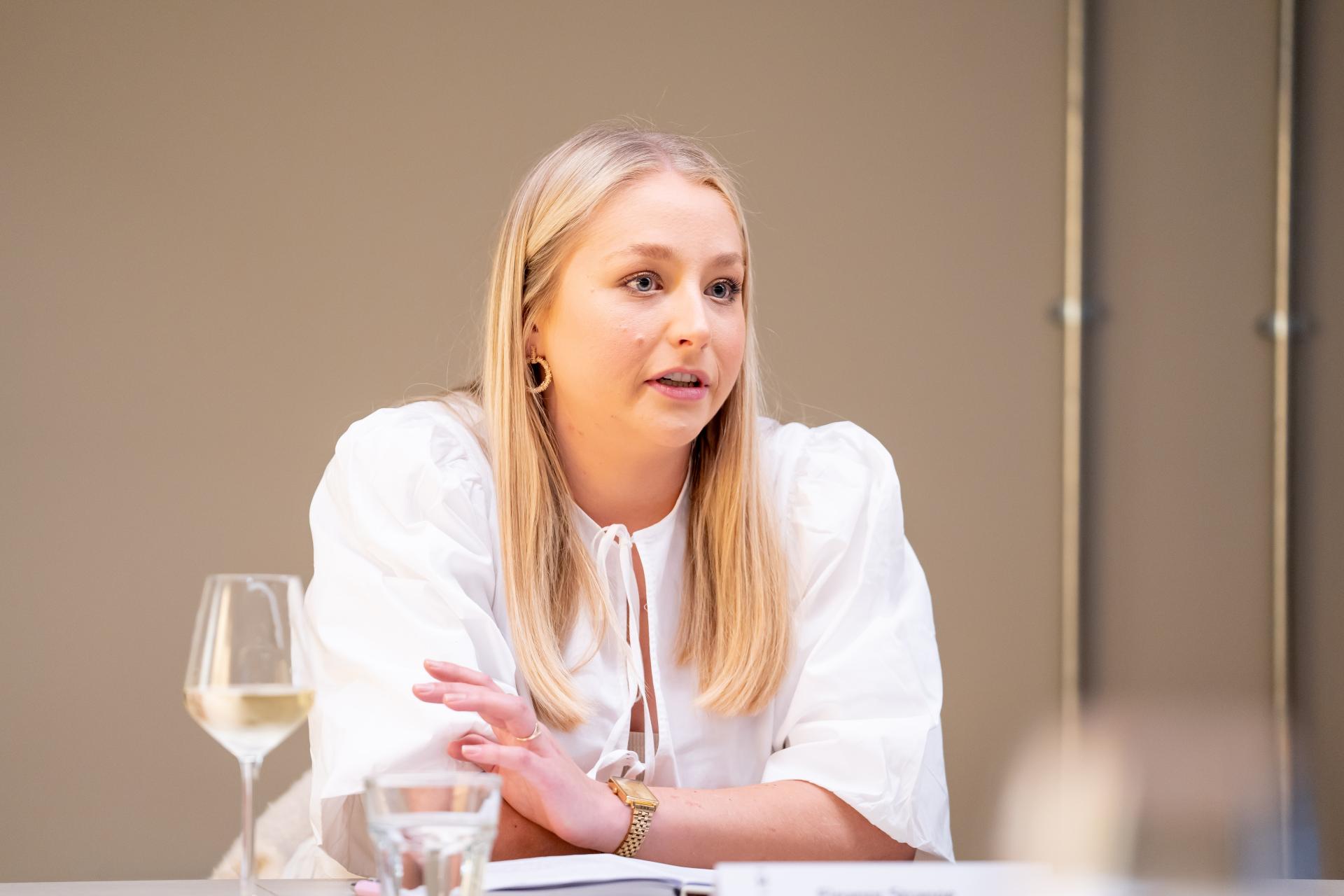
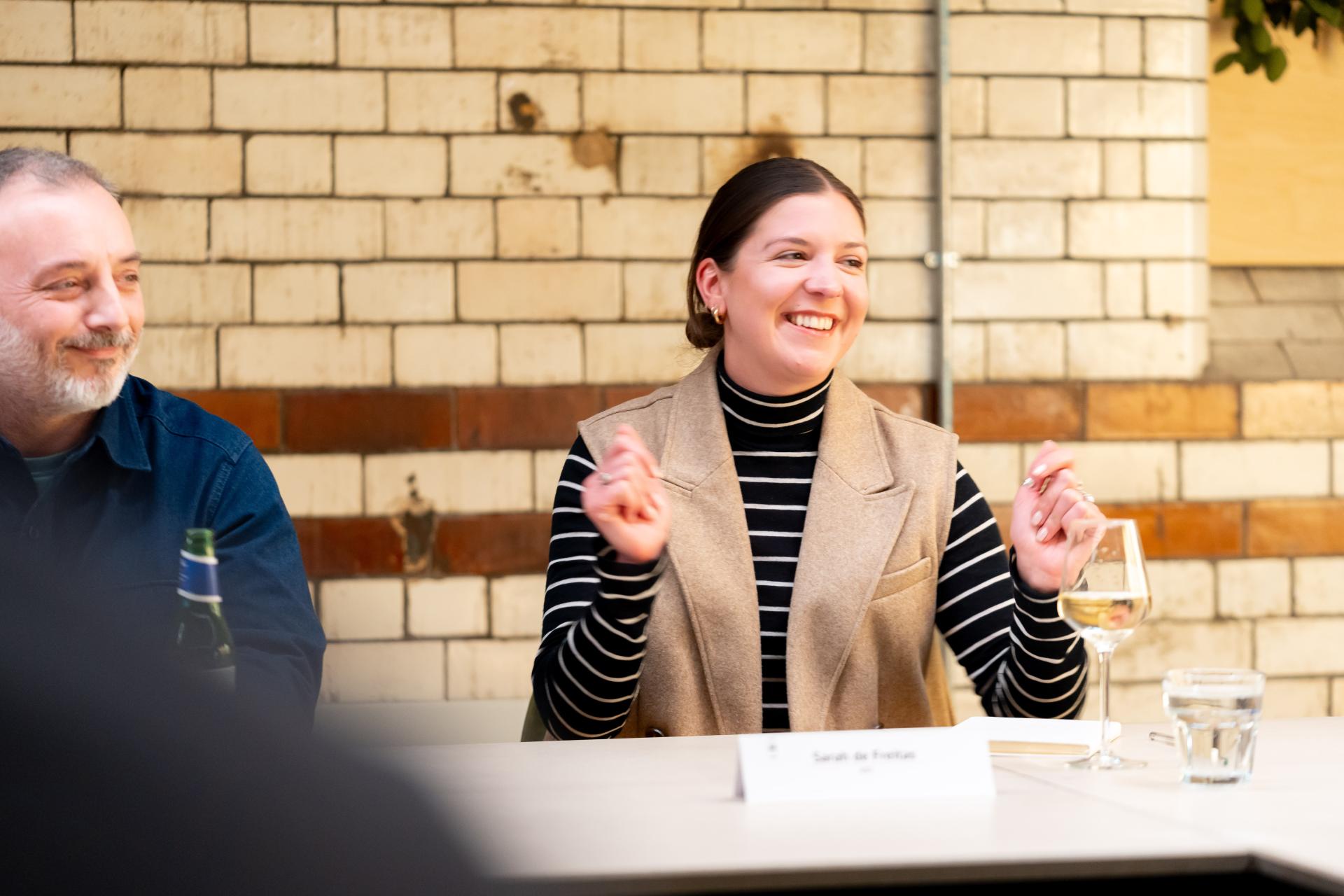
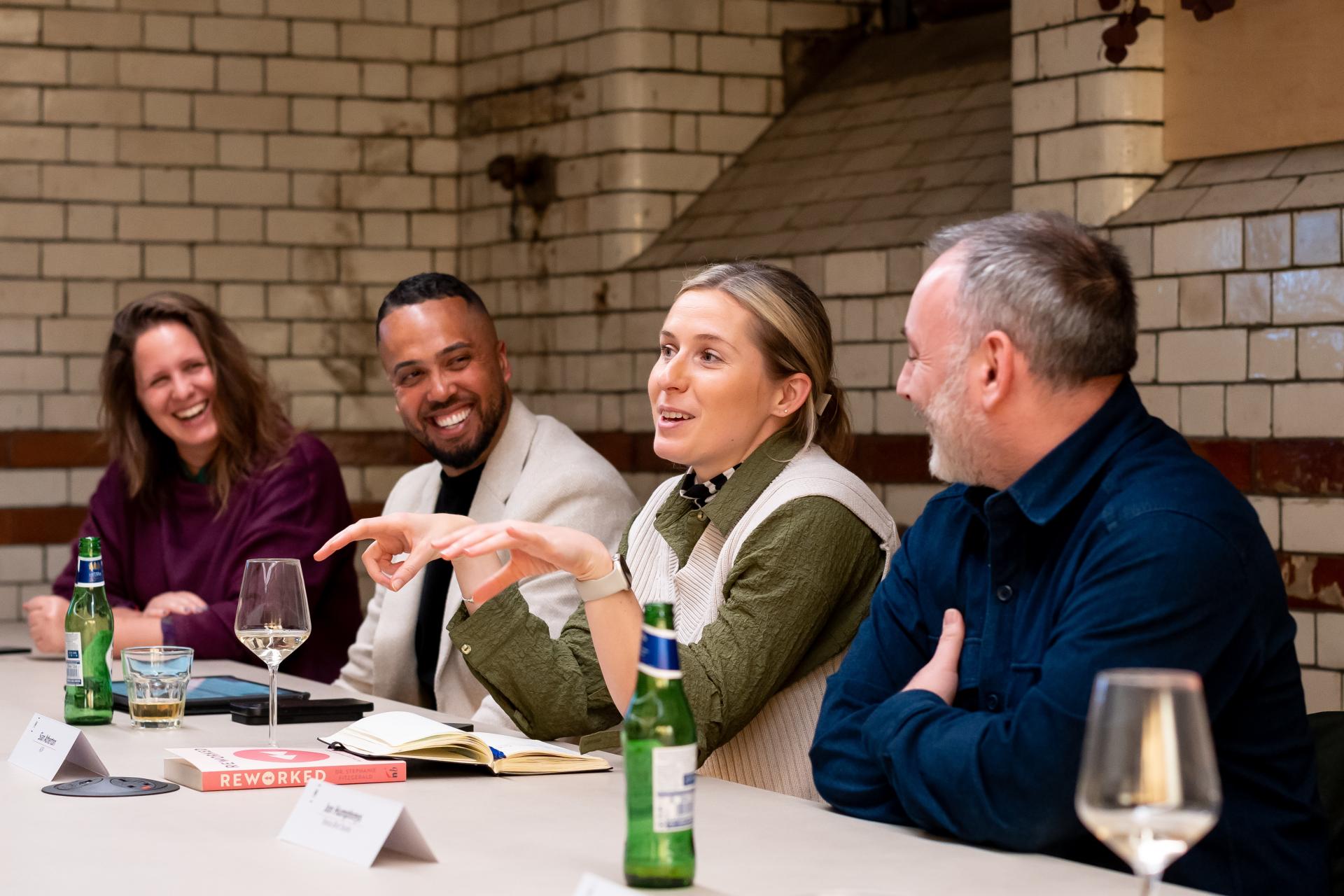
Rather than trying to prescribe an answer - because often, Eleanor suggested, “there isn’t one” – it’s about taking a more open approach. “Everyone can come up with a design solution, but when it comes to diversity, it’s more about an attitude towards design rather than to have the solution for everybody”, said Eleanor. “I really don’t think the perfect building exists. It’s about getting out there and meeting with end users, not just the clients, and asking what they need.”
Eleanor recommended The DisOrdinary Architecture Project as a useful resource hub in reference to changing designers’ attitude to the way they create. The collective believes that thinking differently about disability (and ability) can “open up the design of our built surroundings to new forms of creativity and critique.” Instead of treating disabled people as a ‘technical’ or ‘legal’ problem for architecture and urban design, DisOrdinary shows how starting from disability – from the rich differences that biodiversity and neuro-divergence bring – is a powerful creative force for design. “We want to start from difference to challenge assumptions about ‘what is normal’ in the design of our built surroundings.”
On the topic of thinking differently, Sian highlighted Rosalyn Dexter, author of ‘Design is a Mind-Field’, who specialises in the exploration of how space can be used to regenerate braincells. “When someone has dementia, something as simple as swapping the door on their accommodation to a door that’s similar to the one they had as a teenager helps them to navigate space because their long-term memory can be better than their short term.”
“As designers, we need to be working more with people with lived experience”, added Carolina, highlighting Natasha Trotman – a neurodiverse inclusive designer – for her dedication to promoting awareness around designing for neurodiversity “from the inside” – having experienced it herself.
This prompted Joe Hurst, key account manager, Altro, to mention Stephanie Kyle from Maber Architects, whom he described as “one of the most interesting people” he’s ever met. Stephanie is an architect and inclusive design consultant, advising other architects and clients on best practice for inclusivity. Her LinkedIn profile About reads, “I go above and beyond Part M/BS 8300/PAS 6463 requirements, looking at physical requirements, religion, gender-neutral facilities, safe space, hearing and vision impairment. I specialise in neurodiverse inclusive design and hidden disabilities such as designing for autism, ADHD, epilepsy, and chronic pain conditions”.
“She has created a real movement” continued Joe. “And if we are going to get to this Utopia moment, or a blueprint for EDI that we can improve on, we need this level of passion.”
And as well as looking to industry experts for inspiration and guidance, in the age of technology that we now find ourselves in, Ashley also considered the potential impact of AI as a tool, “We try to design for the sensory experience for each user’s individual personality now, but who knows where AI could take us in the next 5-years?
“I don’t think you can get away from sitting down with someone - looking at the whites of their eyes - trying to understand what’s right for them and the task at hand. I don’t see how technology will support us in doing this better.” Interestingly, The Alan Turing Institute includes AI as part of its EDI strategy, to help make digital spaces, as well as the physical, accessible “for all members of society”.
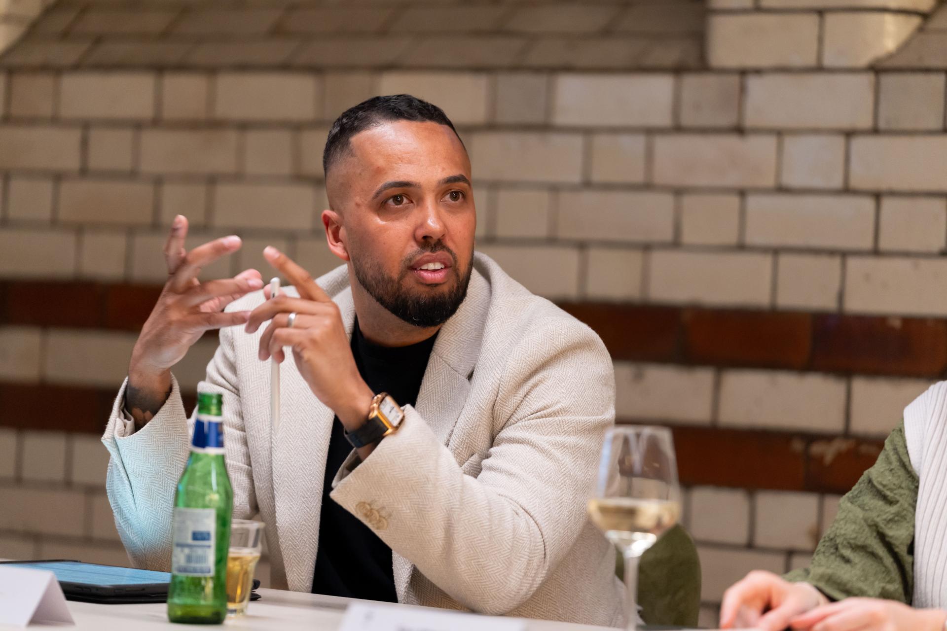
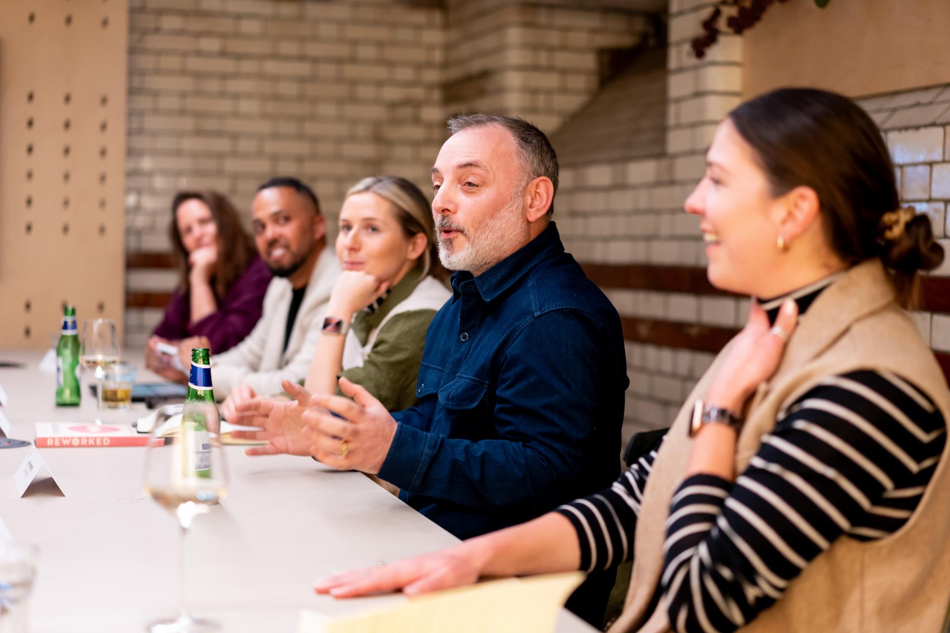
From concept to reality
“How does all of this impact the design of a physical space?” asked David – moving the discussion from the conceptual, to the tangible.
Andrew answered, “Every desk should be a good desk” – a sentiment that came out of a meeting with a restaurant client where the owner said of the design “every table should be a good table”.
In workplace design, Andrew shared that there is, in fact, a new British Standard which values how good a person’s view is – “this considers how wide it is, and how much nature or greenery can be seen”, he explained.
“So, what about hot-desking then?” David continued – “If every desk is a great desk, we might’ve created a solution with this!?”
“But if we’ve not spoken to the people using the desks then we don’t know that we have created the solution”, responded Joe – referring back to the need for end user engagement.
“It’s about splitting the categories of ‘good desks’. Some by the window, some high sets, some booths, some coffee table seats, and if you’ve got good desks in all those scenarios, hopefully you’ve got enough that when someone comes in, there’s a good desk for them”, commented Sian.
As was debated in the EDI seminar, hot-desking does appear to miss out a vital element of what is clearly coveted in the workplace: control.
Carolina shared an example from Manchester School of Architecture. “We are sharing desks, which is quite usual for a university. And what we’re finding is that staff and students are bringing in their own plants. That’s how they express a sense of ownership and care for their space.” However, she added, “These ‘green desks’ help create a positive environment that relieves stress”, so as well as serving the individual, they also contribute positively to the overall surroundings for all.
“Personally, I like hustle and bustle for when I’m being creative. But equally a nice walk in the countryside. It comes down to the task at hand”, added Ashley.
And as well as tasks, as Sian pointed out, it also comes down to roles. “I think that architects are quite compatible when sharing a workspace, but during lockdown, working alongside my developer partner made me realise some occupations are less so.”

No such thing as perfection
“We’re all so different, aren’t we”, said David, “and it’s finding that magical formula I suppose. Can the perfect environment exist?”
Continuing on the trajectory of compatibility, Sian responded, “Though we can’t create the perfect space, what we can do is engage with the people we know will be using those spaces. If we design for the most extreme needs in those circumstances, they need to be compatible.
“So when designing for someone that is partially sighted, strong contrasts are needed. But say there’s someone with Asperger’s also using the space, their sensory overload could be so easily triggered by a design combination such as a black cupboard with a white countertop”…
…“It’s felt as a physical pain”, added Joe, in regards to the sensory profile that someone with Asperger’s or Autism may have and find challenging in an environment designed in this way.
“And this creates a problem”, continued Joe. “If you’re just designing for one person’s needs, and then you try and replicate that, the thing you’ve done over there that’s good design might disable someone else. You have to be so careful that you don’t over personalise things so it’s actually more a generic space that’s adaptable.”
“When you’re trying to design an inclusive space, and don’t know where to start, I find that if you take people with many different needs then draw commonalities in their shared challenges, then you can create a design that encompasses what many people are looking for”, suggested Eleanor.
“Are there any sectors or categories where EDI isn’t factored in?” asked David.
“In the industrial sector, EDI just isn’t a priority. It’s frustrating”, shared Eleanor. “If I put in as part of my design to enhance end user experience, it would be value engineered out. That’s one of the barriers for architects – the clients don’t always have the same aspirations as we do. It’s hard to find a commercial client that’s on board with it.
“I won’t design a Cat-A office”, said Andrew. “You’re designing an empty space – there’s nobody there. And as soon as you put people and furniture in, the lighting doesn’t actually work anymore. But you can’t afford to throw it away. And it’s wasteful. Cat-B is the way to go. You can put the track in from the start, and then once it’s been decided what task will be performed, and where, a level of control can be applied.”
Andrew also noted that if lighting isn’t considered in the RIBA Stage 2 report, then it’s too late. “What gets signed off in the Stage 2 report [Concept & Design] – especially if it’s in a render - is what is expected to be seen at Stage 7.”
All around the table nodded in agreement.
Individuality versus the collective
“In all of this, flexibility is clearly vital?” suggested David.
“It’s great there’s an acknowledgment of diversity because we understand difference more”, said Jon, “but I can’t help wondering if it’s a result of our hyper individualistic society in the west? When we design spaces, they are for communities – not for the individual. It would be interesting to see whether spaces in the east deal with this differently.”
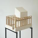
“Allowing workshops and experimentation through model making, bringing people together and taking them from their personal perspective to the collective – although it takes time – can be very effective” commented Carolina. “Through doing this at the university, we have seen that it’s usually the collective interest that wins. Everyone wins, or everyone loses.”
David continued, “businesses have a commercial objective, and that has to be achieved – likely through the collective?”
Andrew, offered a counterargument, “Designing for EDI is about someone’s performance and comfort, so what if the community isn’t for them? And they’re more productive from the periphery?”
Jon shared the details of a recent project completed for a security firm, where neurodiversity was a core consideration, and community was approached in a non-traditional way. “In their current workplace, the different teams were all in separate rooms, and the new space was open plan – and it was terrifying them. All the desks were faced to the wall, but they loved it. Our task was then to replicate this in a big, open environment. We ended up with a solution that may be considered quite old school with cubicles and partitions.”
Bringing the discussion to a close, for now, David summarised, “Perhaps the main takeaway here is that people are all different. Three years ago, most people didn’t think about neurodiversity. So the biggest thing to takeaway is acceptance. We are individuals, but we need to create communities.”
“It’s that tribe mentality”, concluded Ashley, “but everyone has their own superpower.”
The conversation continues in our next roundtable in Glasgow – stay tuned for our write up.
Many thanks to our supporter for this event, Altro – partners at both our Manchester and Glasgow Studios.
All image credits: Victoria Middleton


